Design Options to Reduce Conflicts Between Turning Motor Vehicles and Bicycles: Conduct of Research Report (2024)
Chapter: 6 Crash Analysis
CHAPTER 6
Crash Analysis
This chapter presents a summary of a macro crash analysis conducted to understand broad crash patterns related to bicycle-motor vehicle crashes at signalized intersections using state-level data, with a focus on crashes involving turning vehicles. It also presents the detailed results of the micro crash analysis which examined bicycle crashes, injuries, roadway design, operational variables, and related risk (e.g., accounting for exposure) at a relatively small scale (e.g., at 150-250 intersection sites) to clarify how exposure and various roadway design factors influence risk across a variety of facility types and site-specific contexts.
Macro Crash Analysis
The macro crash analysis was a descriptive crash analysis with tabulations on key variables of interest (land use, functional classification, crash type) to identify attributes that are linked to crashes and crash severity in three case-study states: California, Minnesota and Texas. The macro crash analysis was conducted to provide a base understanding of broad crash patterns related to bicycle-motor vehicle crashes at signalized intersections using state-level data, with a focus on crashes involving turning vehicles (see Appendix D – Macro Crash Analysis).
A summary of key findings from this state-level crash analysis, focused on crashes occurring at signalized intersections.
- In states that reported property damage only (PDO) crashes (Minnesota and Texas), PDO crashes accounted for less than 15% of crashes, indicating that the vast majority of crashes involving a bicyclist result in at least a possible injury, and too often a severe injury or fatality. This result is unfortunately expected when bicyclists, who are vulnerable road users, are struck by vehicles with larger mass and often velocity, resulting in a high transfer of kinetic energy. Texas had higher rates of serious injury and fatality (approx. 12%) compared to other two states (approx. 8%). This may be because Texas crashes are actually more severe due to wider/faster roads, larger vehicles, age/illness-related factors, or some other characteristic; however, it could also be because Texas police departments may be less likely to report lower severity crashes, or because Texas residents may be less likely to call the police to report lower severity crashes.
- Most crashes (approx. 80-90% in CA and MN and 60% in TX) occur in urban areas, and crash rates normalized by population are higher in urban areas than rural areas. For example, approximately 34% of the population lives in urban areas in Minnesota, but 78% of crashes occur there. This is consistent with higher rates of bicycling in urban areas (i.e., increased exposure). While there are many fewer crashes (both overall and when corrected for population) occurring in suburban and rural locations, crashes are more likely to be fatal or severe in rural and suburban areas compared to urban areas in both CA and TX. For example, in California 7% of crashes are severe in urban areas, while 10% and 14% are severe in suburban and rural locations, respectively.
- Major and minor arterials were present at the intersection for the overwhelming majority of crashes (between 87 and 96%); however, roadway miles of streets of this classification account or only 11-18% of street network in the three states, indicating that a disproportionate number of crashes occur at
- intersections that have a major or minor arterial. The small proportion of each state’s total roadway mileage consisting of arterials (and the accompanying intersections) suggests an even greater concentration of crashes on these functional class types than the crash statistics alone communicate.
- When examining combinations of functional classifications at intersections, locations where arterial streets intersect with either collector or local streets resulted in the highest number of serious injury and fatal crashes (60.8% in California, 69.1% in Minnesota and 60.4% in Texas of KA crashes). This finding may either be because of exposure (i.e., more people biking on these streets) or because these intersections provide less protection to bicyclists.
- In all states, the most common vehicle movement in crashes between a bicyclist and a motorist involved a motorist going straight (between 37% and 59%). These crashes also tended to have the highest relative severity, with 11.4%-15.2% resulting in death or serious injury. While the focus of this research is on conflicts/crashes between turning motorists and bicyclists, these findings suggest that there is a need for additional research on safety for conflicts between motorists going straight and bicyclists.
- In all states, the second most common motorist movement was a right turn, at between 22% and 32% of movements, followed by a left-turn, which represented 15% to 20% of all crashes. While left-turn crashes are less prevalent, they are twice as likely to result in a serious injury or fatality compared to right-turn crashes. However, even non-severe crashes erode bicyclist safety on the roadway and can discourage ridership, so our research will continue to examine both left- and right-turning crashes.
The findings from the macro crash analysis were used to refine the methodology for the micro crash analysis, which is described below.
Micro Crash Analysis
The micro crash analysis examines bicycle crashes, injuries, roadway design, operational variables, and related risk (e.g., accounting for exposure) at a relatively small scale (i.e., at over 570 intersection approaches) to clarify how exposure and various roadway design factors influence risk across a variety of facility types and site-specific contexts. This task used bivariate descriptive and multivariate statistical analysis to examine factors associated with bicyclist-motorist crashes at each intersection approach in four case cities. Descriptive analysis was conducted on data from all four cities: Austin, Minneapolis, Seattle and New York. Due to major differences in both crash patterns and bicyclist volumes in New York, the research team analyzed New York’s data separately from the other three cities. Important notes about the data and methodology are set out below. These are also summarized in Table 15:
- Negative binomial regression was used to explore the number of bicyclist—motorist crashes happening on each approach in the cities of Austin, Minneapolis and Seattle, where citywide bicyclist exposure estimates provided necessary volume data for most or all of the approaches in our study.
- The available crash data was used in each city, which resulted in the following variation:
- Minneapolis and Seattle: KABC crashes;
- Austin: KAB crashes only.
- The bicyclist—motorist crash types at each approach were pooled due to inadequate sample size for modeling specific sub-types (e.g., left hook).
- Data for each approach only include crashes that occurred after the intersection treatment was installed.
- The variation in years of data available per approach was controlled by using those years as a model offset.
Table 15. Summary of Available Data and Analyses for Each City
| City | Crash data | Exposure data | Included in descriptive analysis? | Included in statistical analysis? |
|---|---|---|---|---|
| Austin, TX | Provided by city; KAB crashes only, 2015—2018 | Citywide statistical model estimated in 2018 using prior data for Austin Vision Zero | Yes | Yes |
| Minneapolis, MN | Provided by state DOT; all severities included, 2015—2019 | Citywide statistical model published in 2018 using 2007—2014 data for UMN Roadway Safety Institute | Yes | Yes |
| New York, NY | Provided by city; all severities included, 2015—2019 | Annualized counts at spot locations, collected from 2012—2022 by City of New York | Yes | No |
| Seattle, WA | Provided by city; KABC crashes only; B and C coded together and inseparable | Citywide statistical model estimated in 2018 using prior data for Bicycle and Pedestrian Safety Analysis – Phase 2 | Yes | Yes |
Data and Sample Size
The unit of analysis for the micro crash analysis was the intersection approach. Project budget and scope dictated that this analysis compare bikeway types to a baseline of a conventional striped bicycle lane; for this reason, the dataset only included approaches with bicycle facilities. This research was not designed to assess the potential safety benefits of adding a bikeway where none existed previously, however other research has shown that adding facilities for bicyclists improves safety outcomes.
The primary outcome of this study was the number of crashes happening on the approach per year. Analysis variables included the bikeway type on approach, treatment at the intersection, estimated bicyclist exposure, relative location of the bikeway (left vs. right side of the street) and treatment (curb-tight or not).
Approaches were excluded from the analyses if they met any of the following conditions:
- missing the installation date,
- having been flagged in exclusion for having atypical geometry or other features that made them inadequately representative of the treatments under study, or
- having less than two years1 of crash data after the installation date.
A summary of sample size and exclusions for these reasons is presented in Table 16. Note that individual analyses may have excluded additional records due to variable missingness or other statistical modeling requirements.
___________________
1While safety analyses ideally use 3-5 years of crash data to evaluate facility safety performance, the newness of several of the facility types in this study precluded a longer study period, lest the sample sizes be too small for meaningful analysis.
Table 16. Sample size and exclusions
| City | Initial Number of Approaches in Dataset | Missing Install Date | Flagged in Review | Less Than 2 Years of Crash Data | Total Number Excluded2 | Sample Size3 |
|---|---|---|---|---|---|---|
| Austin | 237 | 10 | 62 | 30 | 90 | 147 |
| Minneapolis | 236 | 8 | 30 | 13 | 47 | 189 |
| New York | 227 | 0 | 54 | 57 | 75 | 152 |
| Seattle | 151 | 9 | 55 | 31 | 66 | 85 |
| Total | 851 | 27 | 201 | 131 | 278 | 573 |
Crashes
Our sample of 573 approaches collectively had 233 bicyclist—motorist crashes among them. The majority of which (162 or nearly 70%) were in New York City (Table 17). Additionally, 14 of the 21 severe bicyclist—motorist crashes were in New York (Table 18). Because the prevalence of crashes in New York is so much higher than in the other three cities, subsequent descriptive analyses are presented for Austin, Minneapolis and Seattle combined, with New York separate. This parallels the approach that was used for statistical modeling due to the poor availability of bicyclist volume or exposure data in New York relative to our other three case cities.
Table 17. Number of fatal and injury (KABC) crashes by city
| City | Total number of crashes | Average number of crashes per year | Total number of approaches | Number of approaches with 1+ crashes | Percentage of approaches with 1+ crashes |
|---|---|---|---|---|---|
| Austin (KAB crashes only) | 27 | 0.0466 | 147 | 18 | 12% |
| Minneapolis | 33 | 0.0393 | 189 | 31 | 16% |
| New York | 162 | 0.2258 | 152 | 77 | 51% |
| Seattle | 11 | 0.0302 | 85 | 8 | 9% |
| Total | 233 | 0.0893 | 573 | 134 | 23% |
___________________
2Some approaches were excluded due to multiple factors (e.g., an approach that is both missing an installation date and was flagged in review for atypical geometry). Therefore, the total number excluded may be smaller than the sum of the three exclusion category columns.
3This represents the sample size before accounting for variable missingness. Most descriptive statistics presented in this report have this sample size. The statistical model also excludes approaches due to explanatory variable missingness or facility and treatment types that have too small of a sample size to analyze (e.g., offset/protected intersections).
Table 18. Number of severe (KA) crashes by city
| City | Total number of severe crashes | Average number of severe crashes per year | Total number of approaches | Number of approaches with 1+ severe crashes | Percentage of approaches with 1+ severe crashes |
|---|---|---|---|---|---|
| Austin | 2 | 0.0034 | 147 | 2 | 1% |
| Minneapolis | 3 | 0.0032 | 189 | 3 | 2% |
| New York | 14 | 0.0193 | 152 | 12 | 8% |
| Seattle | 2 | 0.0047 | 85 | 2 | 2% |
| Total | 21 | 0.0078 | 573 | 19 | 3% |
Exposure
Austin, Minneapolis and Seattle were selected as case cities due to the availability of citywide bicyclist exposure models that had been previously developed. Austin’s and Seattle’s models were developed as part of their Vision Zero programs in support of development of safety performance functions. This was undertaken by members of the research team under a previous project. Minneapolis’s exposure model was developed by the University of Minnesota.
All of the models were estimated using standard procedures and a combination of permanent counter data and annualized short duration count data. Coverage was nearly citywide, with 90% to 100% of our approaches in these cities having an estimate of bicyclist volumes (Table 19). Because these are models and not individual counts, and because they are estimated for a point in time on count data collected over a period of years, they may be limited in their ability to express the full range of variation between high bicycling streets with high quality facilities and low bicycling streets with poor or no facilities. Note that any time the word “exposure” is used in this report, it refers to bicyclist exposure.
New York City was selected as a case city because it was the only place in the United States where there were several usable offset or protected intersections with an adequate crash sample at those locations. There was no citywide model of bicyclist exposure for New York City, so individual counts and, in some cases, interpolated values from counts conducted nearby were used.
Like the modeled exposure values in the other cities, New York’s counts were collected over a period of years that may not align perfectly with bikeway installation dates nor crash data collection windows. Measured or interpolated count data was used for about 20% of our study approaches in New York (Table 19). Additionally, bicyclist volume is measured or modeled at the intersection, not the specific approach, for all four cities.
Table 19. Number of approaches with exposure data (average daily bicyclists) by city
| City | Total number of approaches | Approaches with exposure data | Percentage with exposure data |
|---|---|---|---|
| Austin | 147 | 133 | 90% |
| Minneapolis | 189 | 187 | 99% |
| New York | 152 | 31 | 20%4 |
| Seattle | 85 | 85 | 100% |
| Total | 573 | 436 | 76% |
Table 20 summarizes average daily bicyclist volumes (annualized) by city, for intersections where bicyclist volume is known (measured or modeled). Average daily bicyclist volumes per intersection varied by city:
- New York had an order of magnitude more bicyclists than any other city in the study (1,778 on average versus 73-377 in the other cities).
- Seattle had the second highest number of bicyclists and the highest variation between intersections, with a standard deviation larger than its mean.
- The busiest intersection in Seattle had a comparable number of bicyclists as New York (max 3,894 in Seattle vs. 3,993 in New York), though its lowest intersections and its average were much closer to the other cities than New York.
The vast difference in bicyclist volumes between New York and the remaining cities, on top of the differences in number of crashes and availability of exposure data, reinforces our decision to analyze New York separately.
Table 20. Summary statistics of average daily bicyclist volumes by city.
| City | Average daily bicyclists | Standard Deviation | Minimum | Maximum |
|---|---|---|---|---|
| Austin | 175 | 139 | 14 | 806 |
| Minneapolis | 73 | 50 | 14 | 419 |
| New York | 1,778 | 1,255 | 37 | 3,993 |
| Seattle | 377 | 530 | 12 | 3,894 |
| Total | 285 | 12 | 3,993 |
___________________
4New York City only had counts at selected locations, versus citywide exposure models in the other cities; hence only 20% of our study’s approaches had bicyclist volume data, versus nearly 100% in the other cities.
Descriptive Results (All Cities)
Intersection Treatment & Bikeway Type
This section shows bivariate results of descriptive analyses for all variables considered to potentially affect safety performance in this project. Note that these variables and their relationships to intersection treatments safety performance are further explored through multivariate modeling in the next section of this report.
Our study focused on five different intersection treatment types:
- Bike lane outside of a shared thru/turn lane (conventional or buffered)
- Separated Bicycle Lane outside of a shared thru/turn lane
- Pocket or keyhole bikeway inside of a dedicated turn lane
- Mixing zone
- Offset or protected intersection
The first treatment – bike lane outside of a shared thru/turn lane – represents our “base case” for comparing other treatment types. Our team did not look at these intersection treatments relative to a “no facility” case because the purpose of the study is to understand treatment types that help make these treatments safer, rather than evaluate and compare the absolute safety effect. Further, modeled exposure may inadequately represent the degree of difference in volumes in areas with and without dedicated facilities, so focusing only on areas with facilities helps us work around this limitation.
Table 21 shows the number of approaches in our sample for each treatment type within each city. Offset and protected intersections were few in number – only five approaches in New York and five approaches collectively across the remaining cities had this type of treatment. This limitation is due to the relative newness of this treatment type in the United States. Very few instances of this treatment were found with enough history of crash data to use in this analysis.
Table 21. Number of approaches with at least two years of crash data by intersection treatment type
| Intersection Treatment Type | Austin | Minneapolis | New York | Seattle | Total |
|---|---|---|---|---|---|
| Conventional or buffered bike lane outside of shared thru / turn lane | 101 | 142 | 112 | 51 | 406 |
| Separated bike lane outside of shared thru/turn lane | 4 | 21 | 7 | 11 | 43 |
| Pocket / keyhole bike lane | 29 | 22 | 6 | 17 | 74 |
| Mixing zone | 9 | 4 | 22 | 5 | 40 |
| Offset / protected | 4 | 0 | 5 | 1 | 10 |
| Total | 147 | 189 | 152 | 85 | 573 |
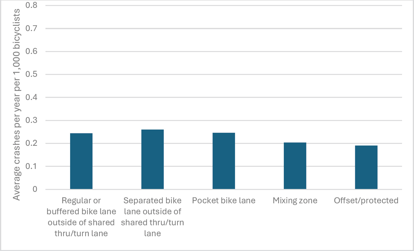
Table 22 and Table 23 summarize crashes and exposure by treatment type for Austin, Minneapolis and Seattle combined (Table 22) and New York alone (Table 23). Figure 5 shows the average crash rate per year per 1,000 bicyclists in Austin, Minneapolis, and Seattle and Figure 6 shows the same information for New York. The findings are summarized below.
- While offset and protected intersections have the highest raw number of crashes per year, normalizing this value by bicyclist volumes reveals that the rate per 1,000 bicyclists is considerably lower for offset and protected intersections than the base case of a bicycle lane (conventional/buffered and separated) outside of a shared thru/turn lane.
- In Austin, Minneapolis and Seattle, mixing zone treatments have the lowest crash rates per 1,000 daily bicyclists. The highest bicycle volume-adjusted crash rate in these cities occurs on the separated bike lane outside of a shared thru / turn lane with no special intersection treatments.
- Keep in mind, the bivariate analysis presented in Table 22 and Table 23, Figure 5 and Figure 6 do not control for other roadway factors. Separated bike lanes are more likely to be installed on higher volume, faster, and wider streets, and when we control for these factors in multivariate analysis, there is no significant difference in safety outcomes between separated bike lanes and conventional bike lanes. Additionally, separated bike lanes in these higher stress contexts are designed to eliminate often-severe crashes along segments – results not reflected in this study of intersection safety performance. However, our combined results do indicate that the base case scenario – a bike lane (separated or otherwise) outside of a shared thru/turn lane without any additional protection – does not appear to perform as well as offset/protected treatments that provide additional protection at the intersection. Thus, while bicycle volumes and stated preference research indicate that separated bike lanes are preferable for bicyclists, we can and should do more to protect them at the intersection, including through signal separation and other countermeasures.
- The exposure models may not adequately capture the change in volume that occurs when a higher quality protected bikeway is installed, leading us to underestimate the potential benefit of protected facilities. Indeed, this may be why the separated bike lane has a higher crash rate than conventional or buffered – because the exposure models we used cannot adequately capture changes in behavior leading to an underestimation of exposure. Nonetheless, volume numbers themselves illustrate another benefit of greater protection at the intersection – the average bicycle volume at the four offset and protected intersections was 422, much higher than the average volumes at other treatment types (136 to 268 bicyclists daily).
- While very few severe crashes occurred at our Austin, Minneapolis and Seattle approaches, all of these crashes occurred on approaches with conventional/buffered bike lanes or separated bike lanes outside of a shared thru/turn lane.
New York’s pattern of crashes and exposure was similar, but not identical:
- Pocket / keyhole treatments are much less common in our New York sample, and they exhibited both the lowest bicyclist volumes and the second-highest volume-adjusted crash rates per year (following only separated bike lanes outside of a shared thru/turn lane). With only two approaches in our sample that had volume data, these results should be interpreted with great caution.
- Offset and protected treatments had the greatest raw prevalence of crashes, though with only five approaches in the sample, and this treatment type having substantially higher bicyclist volumes than the other treatment types, the higher crash prevalence is likely a product of higher exposure. Indeed, the volume-adjusted crash rate per year at offset/protected facilities in New York is lower than any of the other treatment types.
- The crash rates per year across all treatment types in New York are an order of magnitude higher than the rates in the other cities. A majority New York approaches in our study had at least one bicyclist
- crash in the dataset (ranging from 50% to 100% by treatment type), compared to six to twenty five percent in the other cities. However, the volume-adjusted rates are more similar between all four cities, with slightly lower rates in New York on average.
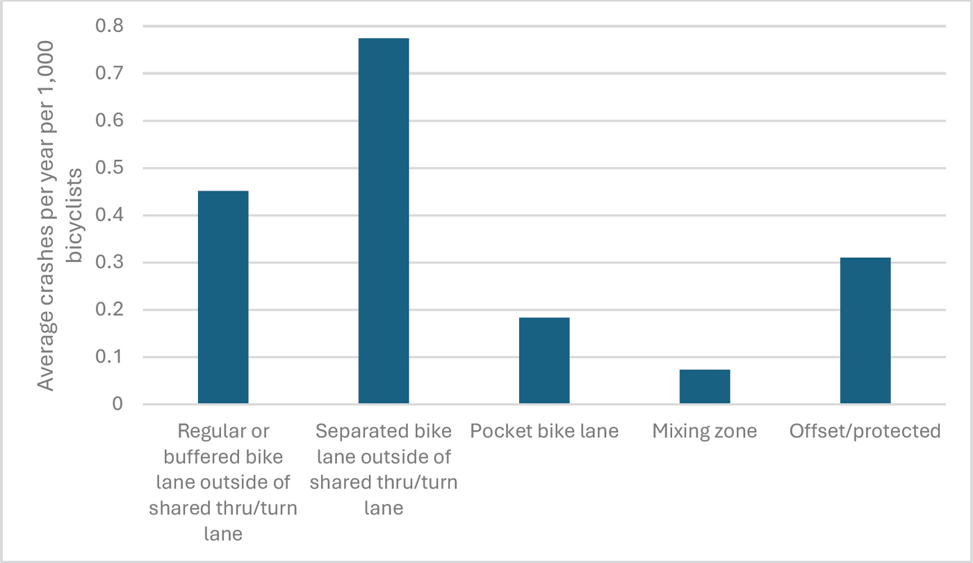
| Intersection Treatment Type | Approaches with Bicycle volume data | Pct of Approaches with 1+ crashes | Pct of Approaches with 1+ severe crashes | Avg (SD) Daily Bike Volume | Avg (SD) crashes per year | Avg (SD) crashes per year per 1,000 bicyclists |
|---|---|---|---|---|---|---|
| Conventional or buffered bike lane outside of shared thru / turn lane | 283 | 14% | 2% | 136 (165) | 0.039 (0.111) | 0.451 (1.356) |
| Separated bike lane outside of shared thru/turn lane | 36 | 22% | 3% | 213 (223) | 0.060 (0.116) | 0.774 (1.739) |
| Pocket / keyhole bike lane | 64 | 6% | 0% | 268 (558) | 0.020 (0.083) | 0.183 (1.235) |
| Mixing zone | 18 | 17% | 0% | 217 (282) | 0.053 (0.133) | 0.073 (0.172) |
| Offset / protected | 4 | 25% | 0% | 422 (347) | 0.250 (0.500) | 0.310 (0.620) |
| Total | 405 | 14% | 2% | 170 (281) | 0.040 (0.118) | 0.419 (1.347) |
| Intersection Treatment Type | Approaches with Bicycle volume data | Pct of Approache s with 1 + crashes | Pct of Approaches with 1 + severe crashes | Avg (SD) Daily Bike Volume | Avg (SD) crashes per year | Avg (SD) crashes per year per 1,000 bicyclists |
|---|---|---|---|---|---|---|
| Conventional or buffered bike lane outside of shared thru / turn lane | 11 | 64% | 9% | 1,057 (1,113) | 0.210 (0.203) | 0.244 (0.351) |
| Separated bike lane outside of shared thru/turn lane | 2 | 50% | 0% | 1,935 (937) | 0.331 (0.468) | 0.260 (0.368) |
| Pocket / keyhole bike lane | 2 | 50% | 0% | 262 (205) | 0.100 (0.141) | 0.246 (0.348) |
| Mixing zone | 11 | 73% | 18% | 2,185 (846) | 0.487 (0.480) | 0.204 (0.206) |
| Offset / protected | 5 | 100% | 40% | 3,015 (1,318) | 0.400 (0.245) | 0.190 (0.263) |
| Total | 31 | 71% | 16% | 1,778 (1,255) | 0.340 (0.354) | 0.222 (0.263) |
Type and Relative Position of Bikeway
Within the four intersection treatments presented in Figure 4, several different bikeway types were possible. The base case treatment and mixing zone treatment could be present with a conventional, buffered, or separated bike lane. The pocket or keyhole treatment could only be present with a conventional or buffered bike lane. Offset or protected intersections were only available for separated bike lanes in our final analysis sample.
Table 24 summarizes crash rates for various intersection treatment and approach facility combinations for Austin, Minneapolis and Seattle combined. Table 25 summarizes the same for New York. The patterns in these tables are mixed.
Within the base case intersection treatment type for Austin, Minneapolis and Seattle (Table 24), buffered and separated facilities have higher crash rates (both raw and volume-adjusted) than conventional bike lanes. This may reflect an inadequacy of our exposure models to fully capture the extent of increase in bicycling that occurs when these facilities are installed, the reality that these higher-quality facilities are often installed on streets with a need for such a facility – i.e., that have higher speeds and vehicle volumes, and/or the possibility that these higher-quality linear facilities need greater protection at the intersection to provide continuous safe passage. It also may speak to variation in facility quality and context within each type, possibly by city. For example, several of Austin’s separated bikeways that are included in our database are on extremely wide, busy arterials. City effects were tested in the multivariate model (shown in the next section) to provide additional insight for this relationship.
The volume-adjusted crash rates for pocket/keyhole facilities, mixing zone treatments and offset and protected intersections are lower than any of the base case treatment + facility combinations. Buffered bike lanes appear to perform better than conventional bike lanes when approaching a pocket or keyhole intersection treatment. The numbers of mixing zone treatments and offset/protected treatments in our sample are lower, particularly when stratified by approach treatment type. These very small numbers of approaches for each combination (n=9, 3, 6 and 5, respectively) may lead to volatility in the data. That said, the initial findings – while they should be interpreted with caution – suggest better safety performance than the base case, particularly given that the offset/protected facilities have very high bicyclist volumes.
In New York (Table 25), the low number of approaches with volume data make the results difficult to interpret, although it appears that buffering or separation, whether in the base case scenario or when associated with other treatments, leads to lower volume-adjusted crash risk than a conventional bike lane.
| Intersection Treatment and Bikeway Type on Approach | Number of approaches | Avg (SD) crashes per year | Approaches with Volume Data | Avg (SD) Crashes per 1,000 bicyclists |
|---|---|---|---|---|
| Bikeway outside of shared thru / turn lane | 330 | 0.041 (0.111) | 319 | 0.488 (1.405) |
| Conventional | 225 | 0.035 (0.103) | 216 | 0.342 (1.103) |
| Buffered | 69 | 0.053 (0.131) | 67 | 0.802 (1.932) |
| Separated | 36 | 0.060 (0.116) | 36 | 0.774 (1.739) |
| Pocket / keyhole inside of dedicated turn lane | 68 | 0.019 (0.081) | 64 | 0.183 (1.235) |
| Conventional | 45 | 0.021 (0.087) | 41 | 0.276 (1.541) |
| Buffered | 23 | 0.014 (0.069) | 23 | 0.018 (0.085) |
| Mixing zone | 18 | 0.053 (0.133) | 18 | 0.073 (0.172) |
| Conventional | 9 | 0.022 (0.067) | 9 | 0.039 (0.117) |
| Buffered | 3 | 0.000 (0.000) | 3 | 0.000 (0.000) |
| Separated | 6 | 0.125 (0.209) | 6 | 0.161 (0.254) |
| Offset / protected | 5 | 0.200 (0.447) | 4 | 0.310 (0.620) |
| Separated | 5 | 0.200 (0.447) | 4 | 0.310 (0.620) |
| Total | 421 | 0.040 (0.117) | 405 | 0.419 (1.347) |
Table 25. Crash counts by treatment type and bikeway type – New York Only.
| Intersection Treatment and Bikeway Type | Number of approaches | Avg (SD) crashes per year | Approaches with volume data | Avg (SD) crashes per 1,000 bicyclists |
|---|---|---|---|---|
| Bikeway outside of shared thru / turn lane | 119 | 0.179 (0.251) | 13 | 0.246 (0.337) |
| Conventional | 88 | 0.182 (0.258) | 6 | 0.336 (0.465) |
| Buffered | 24 | 0.128 (0.201) | 5 | 0.133 (0.095) |
| Separated | 7 | 0.323 (0.291) | 2 | 0.260 (0.368) |
| Pocket / keyhole inside of dedicated turn lane | 6 | 0.300 (0.303) | 2 | 0.246 (0.348) |
| Conventional | 6 | 0.300 (0.303) | 2 | 0.246 (0.348) |
| Buffered | 0 | N/A | 0 | N/A |
| Mixing zone | 22 | 0.418 (0.460) | 11 | 0.204 (0.206) |
| Conventional | 2 | 0.000 (0.000) | 0 | N/A (N/A) |
| Buffered | 1 | 0.000 (N/A) | 0 | N/A (N/A) |
| Separated | 19 | 0.484 (0.461) | 11 | 0.204 (0.206) |
| Offset / protected | 5 | 0.400 (0.245) | 5 | 0.190 (0.192) |
| Separated | 5 | 0.400 (0.245) | 5 | 0.190 (0.192) |
| Total | 152 | 0.226 (0.302) | 31 | 0.222 (0.263) |
For in-street facilities outside of a shared thru/turn lane (i.e., the base case treatment), conventional and buffered bike lane facilities might be curb-tight, or there might be extra space between the facility and the curb (e.g., bus stop, empty parking, wide shoulder, etc.). Because the curb-tight variable was only applicable for the base case treatment and non-separated facilities, the easiest way to analyze this curb-tight or non-curb-tight positioning was via an interaction variable between treatment type, facility type and curb-tight status. Therefore, some of the crash analysis results look a little different from conflict analysis results, since our outcome variable is a composite of these three inputs.
As shown in Table 26, non-curb-tight facilities have both a lower absolute crash rate per year and a lower crash rate per 1,000 bicyclists in Austin, Minneapolis and Seattle. The results from New York (Table 27) differ from the results of the other cities, which may be due to the distinct context and very small sample size.
| Intersection Treatment and Curb-tight Bikeway | Number of approaches | Avg (SD) crashes per year | Approaches with Volume Data | Avg (SD) Crashes per year per 1,000 bicyclists |
|---|---|---|---|---|
| Bikeway outside of shared thru / turn lane | 330 | 0.041 (0.111) | 319 | 0.488 (1.405) |
| Curb-tight | 191 | 0.049 (0.127) | 181 | 0.543 (1.514) |
| Non-curb-tight | 103 | 0.021 (0.068) | 102 | 0.289 (1.006) |
| N/A – Separated facility | 36 | 0.060 (0.116) | 36 | 0.774 (1.739) |
| Pocket / keyhole inside of dedicated turn lane | 68 | 0.019 (0.081) | 64 | 0.183 (1.235) |
| Mixing zone | 18 | 0.053 (0.133) | 18 | 0.073 (0.172) |
| Offset / protected | 5 | 0.200 (0.447) | 4 | 0.310 (0.620) |
| Total | 421 | 0.040 (0.117) | 405 | 0.419 (1.347) |
Table 27. Crash counts by treatment type and curb-tight bikeway status – New York.
| Intersection Treatment and Curb-tight Bikeway | Number of approaches | Avg (SD) crashes per year | Approaches with Volume Data | Avg (SD) Crashes per year per 1,000 bicyclists |
|---|---|---|---|---|
| Bikeway outside of shared thru / turn lane | 119 | 0.179 (0.251) | 13 | 0.246 (0.337) |
| Curb-tight | 30 | 0.261 (0.292) | 5 | 0.143 (0.094) |
| Non-curb-tight | 82 | 0.137 (0.221) | 6 | 0.328 (0.469) |
| N/A – Separated facility | 7 | 0.323 (0.291) | 2 | 0.260 (0.368) |
| Pocket / keyhole inside of dedicated turn lane | 6 | 0.300 (0.303) | 2 | 0.246 (0.348) |
| Mixing zone | 22 | 0.418 (0.460) | 11 | 0.204 (0.206) |
| Offset / protected | 5 | 0.400 (0.245) | 5 | 0.190 (0.192) |
| Total | 152 | 0.226 (0.302) | 31 | 0.222 (0.263) |
The relationship between bikeway location on the street and crash incidence, given that facilities can be located on the right side of a one-way or two-way street, or the left side of a one-way street was also examined. The samples in Austin, Minneapolis and Seattle included very few left-side facilities, the majority of which had the base case treatment type. Within that treatment type, both the raw and volume-adjusted crash rates are considerably higher for left side facilities (Table 28).
In New York, where one-way streets and left-side facilities were more common, a consistent pattern of left-side facilities having higher crash rates than right-side facilities was observed (Table 29). The small sample of New York facilities with volume data indicates that raw crash rates for left-side facilities are also higher in New York.
| Intersection Treatment and Curb-tight Bikeway | Number of approaches | Avg (SD) crashes per year | Approaches with Volume Data | Avg (SD) Crashes per year per 1,000 bicyclists |
|---|---|---|---|---|
| Bikeway outside of shared thru / turn lane | 330 | 0.041 (0.111) | 319 | 0.488 (1.405) |
| Right | 317 | 0.040 (0.111) | 306 | 0.472 (1.414) |
| Left | 13 | 0.077 (0.101) | 13 | 0.861 (1.157) |
| Pocket / keyhole inside of dedicated turn lane | 68 | 0.019 (0.081) | 64 | 0.183 (1.235) |
| Right | 65 | 0.020 (0.083) | 61 | 0.192 (1.265) |
| Left | 3 | 0.000 (0.000) | 3 | 0.000 (0.000) |
| Mixing zone | 18 | 0.053 (0.133) | 18 | 0.073 (0.172) |
| Right | 17 | 0.056 (0.137) | 17 | 0.078 (0.177) |
| Left | 1 | 0.000 (N/A) | 1 | 0.000 (N/A) |
| Offset / protected | 5 | 0.200 (0.447) | 4 | 0.310 (0.620) |
| Right | 5 | 0.200 (0.447) | 4 | 0.310 (0.620) |
| Total | 421 | 0.040 (0.117) | 405 | 0.419 (1.347) |
Table 29. Crash counts by treatment type and bikeway side of street – New York.
| Intersection Treatment and Curb-tight Bikeway | Number of approaches | Avg (SD) crashes per year | Approaches with Volume Data | Avg (SD) Crashes per year per 1,000 bicyclists |
|---|---|---|---|---|
| Bikeway outside of shared thru / turn lane | 119 | 0.179 (0.251) | 13 | 0.246 (0.337) |
| Right | 73 | 0.150 (0.233) | 4 | 0.000 (0.000) |
| Left | 46 | 0.226 (0.272) | 9 | 0.356 (0.356) |
| Pocket / keyhole inside of dedicated turn lane | 6 | 0.300 (0.303) | 2 | 0.246 (0.348) |
| Right | 3 | 0.133 (0.231) | 1 | 0.000 (N/A) |
| Left | 3 | 0.467 (0.306) | 1 | 0.492 (N/A) |
| Mixing zone | 22 | 0.418 (0.460) | 11 | 0.204 (0.206) |
| Right | 5 | 0.360 (0.537) | 1 | 0.000 (N/A) |
| Left | 17 | 0.435 (0.452) | 10 | 0.224 (0.205) |
| Offset / protected | 5 | 0.400 (0.245) | 5 | 0.190 (0.192) |
| Right | 5 | 0.400 (0.245) | 5 | 0.190 (0.192) |
| Total | 152 | 0.226 (0.302) | 31 | 0.222 (0.263) |
Intersection Skew
Both raw and volume-adjusted crash rates in Austin, Minneapolis and Seattle are higher for skewed intersection approaches, and the difference is larger for approaches with greater skew versus mild skew (Table 30). The pattern is reversed in the New York data (Table 31). This may be attributable to different grid patterns in New York versus other cities, and also possibly due to the smaller sample size. Any findings from a sample of one approach with volume data and mild skew, for instance cannot be meaningfully interpreted.
Table 30. Crash counts by skew angle – Austin, Minneapolis and Seattle combined.
| Skew angle | Number of approaches | Avg (SD) crashes per year | Approaches with Volume Data | Avg (SD) Crashes per year per 1,000 bicyclists |
|---|---|---|---|---|
| No skew (90-degree angle) | 193 | 0.033 (0.111) | 185 | 0.328 (1.152) |
| Mild skew (near 90-degree angle) | 164 | 0.045 (0.117) | 158 | 0.468 (1.331) |
| Skew present | 64 | 0.050 (0.134) | 62 | 0.569 (1.844) |
| Total | 421 | 0.040 (0.117) | 405 | 0.419 (1.347) |
Table 31. Crash counts by skew angle – New York.
| Skew angle | Number of approaches | Avg (SD) crashes per year | Approaches with Volume Data | Avg (SD) Crashes per year per 1,000 bicyclists |
|---|---|---|---|---|
| No skew (90-degree angle) | 118 | 0.255 (0.319) | 30 | 0.226 (0.266) |
| Mild skew (near 90-degree angle) | 13 | 0.185 (0.251) | 1 | 0.108 (N/A) |
| Skew present | 21 | 0.086 (0.174) | 0 | N/A |
| Total | 152 | 0.226 (0.302) | 31 | 0.222 (0.263) |
Left Turn Lanes and assumed Signal phasing
As noted in the Site Selection section, data about the type of signal head present at the approach, for approaches with left turn lanes was collected. While complete phasing data was not available, some inference from the signal heads was drawn. Simple 3-head balls were assumed to have permissive-only phasing, while signal heads with arrows were assumed to have protected-only and/or protected/permissive phasing for at least part of the day.
The presence of left turn lanes and protected phasing indicates facilities that could provide separation between bicyclists and left-turning motorists, but also likely correlation with increased left turning volumes – which are likely further correlated with overall vehicle volumes. Indeed, when left turn facilities are used as a proxy for left turning volumes in research, often a greater risk where these facilities are present is observed. This does not mean that dedicated left turn lanes or protected left turn phasing increase risk to bicyclists; rather, it could mean that bicyclists are exposed to more turning motorists and/or greater motor vehicle volumes in general.
In Austin, Minneapolis and Seattle (Table 32), both raw and volume-adjusted crash rates are higher where left turn lanes are present than where there are none. The raw crash rates are higher where left turn lanes and permissive-only left turns are present, though the volume-adjusted crash rates suggest a negligible difference versus a protected or protected/permissive phasing.
New York has far fewer intersections with opposing left turn lanes than the other cities in our analysis, and the overwhelming majority of left turn lane approaches in New York run permissive phasing (Table 33). This fundamental difference makes it is difficult to draw inference from this descriptive analysis.
| Left turn lanes and signal phasing | Number of approaches | Avg (SD) crashes per year | Approaches with Volume Data | Avg (SD) Crashes per year per 1,000 bicyclists |
|---|---|---|---|---|
| No opposing left-turn lane | 226 | 0.035 (0.106) | 224 | 0.373 (1.138) |
| Opposing left-turn lane with permissive-only phase | 45 | 0.057 (0.165) | 45 | 0.472 (1.459) |
| Opposing left-turn lane with protected-only or protected/permissive phase | 146 | 0.042 (0.116) | 133 | 0.489 (1.626) |
| Total | 417 | 0.040 (0.117) | 402 | 0.423 (1.351) |
Table 33. Crash counts by left turn lanes and assumed signal phasing – New York.
| Left turn lanes and signal phasing | Number of approaches | Avg (SD) crashes per year | Approaches with Volume Data | Avg (SD) Crashes per year per 1,000 bicyclists |
|---|---|---|---|---|
| No opposing left turn lane | 123 | 0.239 (0.307) | 27 | 0.255 (0.266) |
| Opposing left-turn lane with permissive-only phase | 24 | 0.161 (0.290) | 3 | 0.000 (0.000) |
| Opposing left-turn lane with protected-only or protected/permissive phase | 5 | 0.200 (0.245) | 1 | 0.000 (N/A) |
| Total | 152 | 0.226 (0.302) | 31 | 0.222 (0.263) |
Number of Lanes
The number of lanes on the cross street appears to correlate with safety. In Austin, Minneapolis and Seattle, the lowest crash rates are observed when the cross street has only two lanes (Table 34). As this number increases, so do both the raw and volume-adjusted crash rates. Notably, the raw rates show an inverted u-shape, with the highest crash rate at 3-4 lanes, a slight decrease for 5-6 lanes, and a very low rate on 7-12 lanes. Once normalized by bicyclist volumes, however, the crash rate increases through 5-6 lanes, and only a minor decrease on 7-12 lane cross streets is observed, possibly due to unexplained variation in exposure (i.e., even fewer people bicycling across these very large arterials than the exposure model data would suggest).
The New York results are similar (Table 35): although there are only four approaches with volume data in New York that have five or more lanes, the average volume-adjusted crash rate with these types of cross-streets is two to six times higher than approaches with a cross street of four lanes or fewer.
| Number of lanes on cross-street | Number of approaches | Avg (SD) crashes per year | Approaches with Volume Data | Avg (SD) Crashes per 1,000 bicyclists |
|---|---|---|---|---|
| 2 or fewer lanes | 91 | 0.033 (0.126) | 90 | 0.263 (0.965) |
| 3 to 4 lanes | 151 | 0.046 (0.121) | 147 | 0.439 (1.300) |
| 5 to 6 lanes | 134 | 0.042 (0.114) | 129 | 0.501 (1.549) |
| 7 to 12 lanes | 45 | 0.028 (0.096) | 39 | 0.438 (1.564) |
| Total | 421 | 0.040 (0.117) | 405 | 0.419 (1.347) |
Table 35. Crash counts by number of lanes on cross-street – New York.
| Number of lanes on cross-street | Number of approaches | Avg (SD) crashes per year | Approaches with Volume Data | Avg (SD) Crashes per year per 1,000 bicyclists |
|---|---|---|---|---|
| 2 or fewer lanes | 79 | 0.172 (0.244) | 15 | 0.155 (0.170) |
| 3 to 4 lanes | 53 | 0.275 (0.357) | 12 | 0.184 (0.204) |
| 5 to 6 lanes | 11 | 0.361 (0.382) | 1 | 0.894 (N/A) |
| 7 to 12 lanes | 9 | 0.244 (0.260) | 3 | 0.486 (0.484) |
| Total | 152 | 0.226 (0.302) | 31 | 0.222 (0.263) |
Posted Speed Limit
In Austin, Minneapolis and Seattle, the lowest crash rates occur on streets signed at 25 miles per hour (Table 36). There is some odd variation – for example – a reduction in the volume-adjusted crash rate at 35 to 40 mph, which could be due to correlation with other variables that statistical modeling could not identify. For example, it is possible that higher-quality bicycle facilities are installed on moderately fast streets, that the exposure models cannot adequately capture the variation in bicyclist volumes, and/or that these streets are associated with land uses in such a way that people are able to avoid them. Whereas roads signed at 45 mph or more, are more suburban and offer fewer alternate routes. Future research will need to investigate these findings further.
In New York, there is so little variation in the speed limit that it cannot be analyzed – 150 out of 152 approaches are signed at 25 mph or less (Table 37).
Table 36. Crash counts by speed limit – Austin, Minneapolis and Seattle combined.
| Number of lanes on cross-street | Number of approaches | Avg (SD) crashes per year | Approaches with Volume Data | Avg (SD) Crashes per year per 1,000 bicyclists |
|---|---|---|---|---|
| 25 mph or less | 85 | 0.030 (0.104) | 85 | 0.142 (0.850) |
| 30 mph | 172 | 0.040 (0.093) | 170 | 0.623 (1.589) |
| 35 to 40 mph | 55 | 0.038 (0.152) | 53 | 0.180 (0.741) |
| 45 mph or more | 107 | 0.050 (0.141) | 96 | 0.442 (1.451) |
| Total | 419 | 0.040 (0.117) | 404 | 0.421 (1.348) |
Table 37. Crash counts by speed limit – New York.
| Number of lanes on cross-street | Number of approaches | Avg (SD) crashes per year | Approaches with Volume Data | Avg (SD) Crashes per year per 1,000 bicyclists |
|---|---|---|---|---|
| 25 mph or less | 150 | 0.227 (0.304) | 31 | 0.222 (0.263) |
| 30 mph | 2 | 0.100 (0.141) | 0 | N/A |
| 35 to 40 mph | 0 | N/A | 0 | N/A |
| 45 mph or more | 0 | N/A | 0 | N/A |
| Total | 152 | 0.226 (0.302) | 31 | 0.222 (0.263) |
Statistical Model Results (Austin, Minneapolis and Seattle Only)
After the initial descriptive analysis, our team built negative binomial regression models to examine how these seemingly important associations compared to one another, once being adequately controlled for in a multivariate model. The duration of crash data measured post-installation at each approach was used as an offset in the model to address minor differences between Austin and the other cities.
After testing multiple models, the best fit result found significant associations between several roadway design and operations variables and the number of bicyclist-motorist crashes happening at each approach. This generally underscores the findings of the descriptive analysis in the prior section. As noted in the methodology section, this statistical model was estimated using Austin, Minneapolis, and Seattle data only due to the lack of network-wide exposure data in New York. Key findings follow below.
Bikeway Type
The multivariate model maintained the distinction in safety performance between the base case and other bicycle facilities. Because curb-tight status was only collected for bike lanes outside of a shared thru/turn lane, the facility variable in our statistical model was treated as an interaction between facility type and curb-tight status. Relative to the base case facility (curb-tight bike lane outside of a shared thru/right turn lane), both the non-curb-tight bike lane outside of a shared thru/right lane and pocket intersection treatments (where the bike lane shifts to be between a through lane and a dedicated turn lane) are significantly associated with fewer bicyclist crashes. It is possible that the extra space is de facto being used by motorists as a mixing zone or pocket/turn lane space that reduces conflicts with bicyclists – a topic for future research. Note that the effect of a true pocket treatment is stronger than these non-curb-tight bike lane treatments
(odds ratio (OR) 0.318 vs. 0.495, with the lower OR indicating a lower number of bicycle-motor vehicle crashes). The coefficients for both mixing zones and separated bike lanes outside of a shared thru/turn lane are not significant. Mixing zones in particular represented a relatively small number of approaches within our sample (n=18).
Posted Speed Limit
The coefficient for each speed limit bracket above 25mph is positive, suggesting that there are more crashes at higher speed approaches. In particular, the coefficient for >=45mph speed limits is significant. An approach with a posted speed limit of 45 mph or higher has over 13 times as many bicyclist—motorist crashes than one with a 25mph or lower speed limit. Further research into speed-related effects – especially using data about actual motorist travel speeds rather than speed limits – would be greatly beneficial.
Number of Lanes
The coefficient for each bracket of cross street lanes above 1-2 lanes is positive and significant, suggesting that there are more crashes when the bicyclist has to cross more lanes of traffic. While the coefficient for the highest bracket (7-12 lanes) is smaller than the two brackets in the middle (3-4 lanes and 5-6 lanes), the p-value is also higher. Rather than this finding indicating that these very wide roads are somehow safer, it is likely that this result is related to the relatively few approaches with 7-12 lanes compared to other brackets in our dataset.
Location of the Bikeway
Bikeways on the left side of the street continued to be associated with more crashes than those on the right side of the street. While the number of left-side facility approaches in our sample is small (n=17), the effect is statistically significant. Since left-side facilities are only installed for one-way approaches, an approach directionality variable (one-way vs. two-way) was tested, but it was not significant.
Skew
Approaches with skew present at the intersection continued to be associated with more crashes than non-skewed approaches. The relationship for mild skew (near 90-degree angle) is small and non-significant, whereas it is larger and significant for approaches with more substantial skew. Skewed approaches have 1.5 times as many bicyclist crashes as non-skewed approaches, which may indicate visibility challenges and/or issues with driver and bicyclist communication, behavior and expectations.
Left Turn Lanes
The presence of an opposing left turn lane is significantly associated with more bicyclist crashes. As noted in the descriptive analysis section, opposing left turn lanes are installed where motorist left turning volumes are higher, so this relationship may be due to a proxy relationship with turning volumes or other activity at the intersection rather than presence of the opposing left turn lane. While data on signal phasing operations was not available, the type of signal head present for approaches with an opposing left turn lane was observed. Signals with a green ball only (implying permissive left turns with no protected left turn phasing) have a stronger association with bicyclist crashes (higher coefficient; lower p-value) than signals with an arrow (implying the possibility of some protected left turn phasing and/or flashing yellow arrow operations).
Bus Stop Presence
This multivariate analysis included a variable for bus stop presence, finding that bus stops are significantly associated with bicyclist crashes. These are likely an indicator of general activity level at the intersection. There may also be transit-specific factors in effect, such as obstructed views or drivers passing transit vehicles inappropriately, though it is impossible to discern from the available data. Further research into the relationship between transit facilities and bicyclist safety is necessary.
City-Specific Variables
The influence of each city in the model was tested to examine whether city-specific trends may skew results. Austin has higher crash rates per approach on average than Minneapolis or Seattle, but it has a negative and statistically significant coefficient in our city indicator variable in the model. This may be due to the model adequately controlling for characteristics of Austin’s streets and bicycle facilities that make the aggregate totals different – for example, wider cross streets and faster approaches. It also may be due in part to Austin’s data only having KAB crashes available, whereas KABC crashes in Minneapolis and Seattle were used.
Other Variables
Various other variables in the model were tested such as variables related to traffic intensity on the approach (i.e., number of lanes, motorist AADT and a composite intensity variable). No other variables were significant, although some of the lack of significance – particularly related to traffic intensity – may be due to the fact that other variables already sufficiently cover these effects in the model (multicollinearity). The results of the model are shown in Table 38.
Table 38. Negative binomial regression on number of bicyclist—motorist crashes on approach
| Variable | Est | Std Err | OR | Z val | P val | Sig |
|---|---|---|---|---|---|---|
| Intercept | -5.589 | 0.590 | 0.004 | -9.478 | 0.000 | *** |
| Bike volume (log-transformed) | 0.459 | 0.090 | 1.582 | 5.111 | 0.000 | *** |
| Intersection Treatment Type | ||||||
| Curb-tight bikeway outside of shared thru/turn lane | Base case | |||||
| Non-curb-tight bikeway outside of shared thru/turn lane | -0.704 | 0.195 | 0.495 | -3.611 | 0.000 | *** |
| Separated bikeway outside of shared thru/turn lane | 0.202 | 0.225 | 1.224 | 0.899 | 0.369 | |
| Facility pocket inside of dedicated turn lane | -1.147 | 0.254 | 0.318 | -4.511 | 0.000 | *** |
| Mixing zone | -0.033 | 0.302 | 0.968 | -0.109 | 0.913 | |
| Speed Limit | ||||||
| <= 25 mph | Base case | |||||
| 30 mph | 0.500 | 1.059 | 1.648 | 0.472 | 0.637 | |
| 35 to 40 mph | 0.965 | 1.101 | 2.625 | 0.877 | 0.381 | |
| >= 45 mph | 2.581 | 1.216 | 13.205 | 2.123 | 0.034 | * |
| Cross street number of lanes | ||||||
| 1-2 lanes | Base case | |||||
| Variable | Est | Std Err | OR | Z val | P val | Sig |
|---|---|---|---|---|---|---|
| 3-4 lanes | 0.867 | 0.215 | 2.379 | 4.029 | 0.000 | *** |
| 5-6 lanes | 0.845 | 0.228 | 2.327 | 3.710 | 0.000 | *** |
| 7-12 lanes | 0.582 | 0.311 | 1.790 | 1.870 | 0.061 | |
| Bike facility side | ||||||
| Right side facility | Base case | |||||
| Left side facility | 0.670 | 0.255 | 1.955 | 2.629 | 0.009 | ** |
| Approach/intersection Skew | ||||||
| No skew present | Base case | |||||
| Mild skew (near 90-degree angle) | 0.126 | 0.155 | 1.135 | 0.817 | 0.414 | |
| Skew present | 0.418 | 0.189 | 1.519 | 2.212 | 0.027 | * |
| Opposing left turn lane and signal | ||||||
| No opposing left turn lane | Base case | |||||
| Opposing left-turn lane with permissive-only phasing | 0.562 | 0.214 | 1.754 | 2.619 | 0.009 | ** |
| Opposing left-turn lane protected-only or protected/permissive phasing | 0.341 | 0.186 | 1.406 | 1.837 | 0.066 | |
| Bus stop presence | ||||||
| No bus stop present | Base case | |||||
| Bus stop present | 0.663 | 0.135 | 1.941 | 4.920 | 0.000 | *** |
| City | ||||||
| Seattle | Base case | |||||
| Minneapolis | 0.434 | 1.056 | 1.543 | 0.411 | 0.681 | |
| Austin | -2.178 | 1.214 | 0.113 | -1.794 | 0.073 | |
Significance indicated as follows: *** p<0.001; ** p<0.01; * p<0.05; p<0.1
Model statistics: N=377; AIC = 1503.1
Micro Crash Analysis Summary
This chapter presented results from both descriptive and statistical analysis of bicyclist safety at signalized intersections for all cities. In the descriptive analysis, patterns suggesting a protective effect of greater separation at the intersection were observed. Common risk factors like motorist speed and the number of lanes on the cross street were correlated with worse safety outcomes for bicyclists. However, small sample sizes and limited exposure data, and multicollinearity prevented us from analyzing some variables as rigorously as others. In addition, the Austin bicycle crash data only included KAB crashes, while other cities included KABC crashes. This introduced a number of caveats, including that the coefficient for Austin in our statistical model is lower than it otherwise might be, which made it appear relatively “safer.” For example, in descriptive statistics stratified by city, Austin’s crash totals and crash rates will appear lower than they would otherwise because of the lack of Injury C crashes. Finally, though harder to observe, the results of a pooled analysis may obscure the true influence of a variable in a specific city if the distribution of that variable within cities is non-uniform.
The statistical model (Austin, Minneapolis and Seattle) performed well, confirming much of what was found in the descriptive analysis and providing additional insights that can inform bicycle treatments at approaches, as well as bikeway location selection. The “base case” treatment – a facility outside of a thru/shared turn lane – had one of the lowest safety performance results of the options reviewed, depending on context. Greater separation confers a safety benefit – if that separation is maintained through the intersection (i.e., offset/protected intersections versus separated bike lane outside of a shared thru/turn lane). These results speak only to performance of these facilities at signalized intersections; there are additional safety benefits along segments to facilities with greater separation from traffic (e.g., buffered and separated bike lanes), but to maximize their benefit, they should be paired with high quality-intersection treatments. Separated bike lanes, and especially high-quality separated bike lanes ending in offset/protected intersections, attracted vastly more bicyclists than conventional or buffered bike lanes – a benefit in and of itself. Additionally, while motorist AADT and number of lanes on approach were not significant once other variables were controlled for in the model, proxy variables for AADT, including number of through lanes on the cross street and the presence of an opposing left turn lane, were significant, underscoring the importance of vehicle-oriented design and bicyclist safety.
The results fit with our greater understanding about traffic safety and roadway and operations characteristics – e.g., that a wider, faster roadway with higher volumes is likely to experience higher numbers of crashes. Additionally, the finding that skewed intersections are associated with higher numbers of crashes is important for designers looking to improve bicyclist safety in the future. The findings about non-curb-tight lanes and pocket bicycle lanes, as well as the side of the street on which facilities are located, are also important for future design and our understanding of motorist-bicyclist crashes.


