Constructing Valid Geospatial Tools for Environmental Justice (2024)
Chapter: 4 Environmental Justice Tools
4
Environmental Justice Tools
An increasing number of publicly accessible environmental justice (EJ)-related mapping or screening tools have been created by federal agencies, states, regional planning agencies, and municipalities, as well as private or nongovernmental institutions in the last 15 years. This committee identified over 35 separate EJ mapping or screening tools used across the United States as of summer 2023, half of which have been released since 2021. Some of these tools were created in response to EJ-related policies, while others were created independently of any specific legislation or regulation but rather offered the opportunity to guide new policy, as well as to support information dissemination and awareness of EJ issues. As more public institutions seek to develop or refine these kinds of tools, there is a benefit to understanding and comparing the various approaches taken and the lessons learned.
This chapter summarizes the committee’s scan of EJ tools that utilize social and environmental indicators to identify geographic areas that may be subject to varying levels of environmental or social inequity, burden, or underinvestment. The chapter first summarizes previous surveys of EJ tools and then provides a more detailed comparison made by the committee of a subset of tools. The chapter provides practical descriptions of how different tools format indicator data and address cumulative impacts. This subset illustrates the range of approaches or methodologies currently used in EJ mapping or screening. They were selected based on descriptions provided by tool creators to the committee during public meetings (see Appendix B for open session meeting agendas), from information in the earlier tool surveys, and based on committee member expertise and familiarity with the tools. Most of the tools are used in the United States and created or maintained by governmental (e.g., federal, state, municipal, or regional planning agencies) and nongovernmental institutions (e.g., universities and nonprofits) for public use. Descriptions of each of the tools’ indicators are provided, as well as the format(s) for indicator data, the use of composite indicators to aggregate data and
measure cumulative burden, and the use of thresholds to identify disadvantaged communities. The chapter then provides a brief comparison of the features of the White House Council on Environmental Quality’s (CEQ’s) Climate and Economic Justice Screening Tool (CEJST) with those of other tools. More information regarding CEJST is provided in later chapters. This chapter focuses primarily on describing different tool features and construction rather than comparing the outcomes of using different tools. Those outcomes can vary significantly (Popovich et al., 2024; Reckien, 2018; Tate, 2012; Wang et al., 2023).
PREVIOUS SURVEYS OF ENVIRONMENTAL JUSTICE TOOLS
Evergreen Collaborative (2020) evaluated the U.S. Environmental Protection Agency (EPA) Environmental Justice Screening and Mapping tool (EJScreen)1 and equity mapping tools from California, Maryland, New York, and Washington State, offering recommendations to the White House on developing a national equity map. These recommendations were made prior to the development or release of CEJST. That review summarized multiple lessons from these state-level tools and highlighted gaps in EJScreen (the only federal tool extant at the time). Conclusions from the survey included the need for a clear definition of disadvantaged communities, the importance of calculating cumulative impacts that allow comparison and prioritization, the importance of official state support and enabling policies that require the use of the tools for decision making, and the centrality of community input and engagement in defining “disadvantaged communities” and relevant indicator selection.
A later report by the University of California Los Angeles Luskin Center for Innovation (Callahan et al., 2021), published shortly before the beta release of CEJST, reviewed EJ policies and programs from California, Illinois, Maryland, New York, Washington, and Virginia. That report evaluated the strengths and weaknesses of California’s CalEnviroScreen2 to frame EJ tool recommendations to the White House to “maximize the benefits of Justice40 effectively and equitably.” While the report praised CalEnviroScreen’s use of cumulative impact scoring based on a wide range of environmental and social factors, it critiqued the narrow focus on pollution exposure and demographics. The Luskin Center report recommended that a federal EJ tool include five categories of disparities: disproportionate exposure to pollution, uneven distribution of climate impacts, lower levels of local resources and community capacity, disproportionate occupational impacts from the transition to clean energy, and uneven distribution of the costs and benefits of environmental policies. The Luskin Center report also recommended that, unlike CalEnviroScreen, race and ethnicity should be included as important indicators in any EJ screening process. In addition to relative measures of exposure or impact (e.g., percentile scores), the Luskin report recommended that absolute changes in pollution or other indicators should be measured and reported over time to track progress. Finally, the report recommended that federal officials follow
___________________
1See https://www.epa.gov/ejscreen (accessed March 2, 2024).
2See https://oehha.ca.gov/calenviroscreen/report/calenviroscreen-40 (accessed March 2, 2024).
CalEnviroScreen’s model for community collaboration and accountability. The latter included an extensive consultation process with technical experts and interested and affected parties that included community groups with local knowledge and, equally important, extensive documentation on indicator data sources and how these indicators were selected.
Similar recommendations are in other reviews, such as those by Ravichandran and others (2021) and Arriens, Schlesinger, and Wilson (2022). Ravichandran and others (2021) reviewed EJ mapping tools for California, Florida, Maryland, Cuyahoga County in Ohio, the Houston-Galveston-Brazoria region of Texas, Washington State, and EJScreen. They identified six themes that are inadequately represented in current EJ tools: social progress, vulnerability, climate equity, economic progress, health, and resilience. They recommended 20 indicators within each theme to be incorporated into such tools.
Some surveys have offered reviews across a larger number of tools. Konisky, Gonzalez, and Leatherman (2021) analyzed 19 EJ mapping tools—18 state tools and EJScreen—as part of a project to assist the state of Indiana in the development of its own tool. To compare the tools, they described the functionality of the online interface, identified the environmental and social indicators used by each tool, and described how indicator values are presented (e.g., percentiles, raw values, index values). In addition, they did qualitative assessments, based in part on interviews with state officials, to characterize tool accessibility and comprehensiveness, as well as the role of community engagement and the usage of the tools. Their analysis revealed common characteristics (e.g., all the tools are interactive, most were created by government agencies, all include social indicators, but only two-thirds include both social and environmental indicators, and most include racial composition to identify EJ communities). Konisky, Gonzalez, and Leatherman (2021) recommended a set of questions to guide the development of EJ mapping tools: (1) Who is the audience? (2) What is the purpose of the tool? (3) How do you want the map to function? (4) How do you want to implement (or use) the tool? (5) How do you get engagement from interested and affected parties?
The most comprehensive survey of EJ mapping tools to date was done by the Urban Institute (Balakrishnan et al., 2022). They compared and evaluated 31 national, state, and local EJ tools across numerous parameters and characterized these tools based on (1) data sources for social, environmental, or health indicators; (2) use (or omission) of race/ethnicity; (3) how disadvantage is defined and measured; (4) how EJ communities are prioritized (e.g., scoring, ranking, thresholds); and (5) the policy context that resulted in the tool’s development as well as ongoing linkages of the tool to specific programs or funding sources. Their results are presented as both summary statistics and key findings, and they compiled most of this information into an online, interactive table that features 39 variables and associated notes.3 The Urban Institute found that:
___________________
3See Urban Institute’s interactive Airtable at https://www.urban.org/research/publication/screening-environmental-justice-framework-comparing-national-state-and-local (accessed September 18, 2023).
- Tool data are often out of date and lack local context. They mostly rely on data from the American Community Survey (ACS) and EJscreen; few tools are regularly updated with new data or are explicit about plans to update.
- Disaggregated race and ethnicity data are often not included, nor is an acknowledgment of the role of environmental racism. Race and ethnicity are factored into methods to identify EJ communities in more than 80 percent of the tools; they are included as context layers in the others. A more detailed breakdown of race and ethnicity is included in only six tools. Indigenous populations were rarely included as separate population groups.
- EJ communities are identified using varying methods, depending on the intended use of the tool. Most tools combine methods to quantify burdens and prioritize among EJ communities. Definitions of EJ community for some states were developed prior to tool development, while others were developed during or after.
- Specific environmental indicators are included in most tools, but important topics are overlooked. Few tools do not include environmental indicators, relying solely on socioeconomic characteristics. Air and water quality measures are included in more than 50 percent of the tools. (The measures included vary by jurisdiction.) Extreme heat, flooding, natural hazards, toxic chemicals, and waste are less commonly included.
- Rural community data and needs are not sufficiently considered in many of the tools. The paucity of data on rural and Tribal communities results in a bias toward urban issues and areas in all the tools. Region-specific issues and established community priorities are more readily captured by state and local tools.
The Urban Institute report (Balakrishnan et al., 2022) recommends that (1) tool creators explicitly state how the tool is intended to be used and allow communities to self-identify; (2) community members be a part of tool development and that the tools account for local context as much as possible, (3) more diversity in topical areas and indicators be included in the tools and updated more regularly, and (4) tools endeavor to quantify cumulative impacts. The authors call for continued research to understand the universe of related tools to further equip communities and decision makers, to determine how well different tools capture cumulative impacts or burdens and, ultimately, “how tools can advance racial equity as a central objective.”
Other institutions have sought to develop public databases to identify the growing list of EJ tools and related policies. The Tishman Environment and Design Center at the New School developed a searchable tool of definitions, indicators, thresholds, and benefits focused on the various cumulative impact policies developed across the country (Baptista et al., 2022; Tishman Environment and Design Center, 2022). Thirteen states were identified (California, Hawaii, Illinois, Massachusetts, Maryland, Michigan, Minnesota, New Jersey, New Mexico, New York, Oregon, Vermont, and Washington) that had legislation, mapping tools, or agency guidance documents that include consideration of cumulative impacts. (California, Minnesota, New York, and Washington developed
or were developing geospatial mapping tools for expressing cumulative impacts.) They also analyzed the policies of 11 states to understand how cumulative impacts were defined. They found that few reports or policies mention specific thresholds or methodologies useful for determining the existence or extent of cumulative impacts. They argue that the methodologies used to measure cumulative impacts or determine thresholds for “unreasonable,” “significant,” or even “cumulative” harm are inherently normative and subjective, and as such, there is a need for the participation of affected parties—especially those within EJ communities (Baptista et al., 2022).
The Vermont Law School’s Environmental Justice Clinic released a database documenting EJ laws, policies, mapping tools, and state-recognized definitions associated with EJ across the 50 states and territories.4 As of November 2023, 90 state EJ policies and 27 state EJ mapping tools are included in their list. No federal policies or mapping tools are included. Other reviews have focused on the experiences of individual state or regional tools. Bara and others (2018) and Driver and others (2019) described the development and application, respectively, of Maryland’s Environmental Justice Screening Tool.5 Min and others (2019) described the development and community engagement incorporated into the development of Washington State’s Environmental Health Disparities Map.6 Bhandari and others (2020) described the development and potential application of HGBEnviroScreen for the Houston–Galveston–Brazoria Region of Texas. Faust and others (2021) reflected on the lessons learned from the development of CalEnviroScreen.
New tools are emerging at a rapid pace, and federal tools aside from EJScreen have been understudied. There is significant commentary on the recently released CEJST (Associated Press, 2023; Barnes, Luh, and Gobin, 2021; Chemnick, 2022; Costley, 2022; Fears, 2023; McTarnaghan et al., 2022; Mohnot, 2023; Pontecorvo and Sadasivam, 2022; Sadasivam, 2023; Sadasivam and Aldern, 2022; Shrestha, Rajpurohit, and Saha, 2023; Sotolongo, 2022; Zeng, 2022), but comprehensive comparisons of CEJST to other tools are still emerging (Balakrishnan et al., 2022; Spriggs, Rotman, and Trauth, 2024).
OVERVIEW OF SELECTED TOOLS
Based on the above surveys, information gathered during committee meetings, and the knowledge of members of the committee, the committee chose a subset of 12 tools from which to highlight key features of geographically based EJ tools. The committee focused on tools adopted by governments. The committee was aware of at least three dozen government-sponsored EJ screening tools extant at the time of its scan, as well as numerous tools and related algorithms developed by researchers and nongovernmental
___________________
4See https://ejstatebystate.org/ (accessed November 4, 2023).
5See https://mde.maryland.gov/Environmental_Justice/Pages/EJ-Screening-Tool.aspx#:~:text=Launch%20the%20EJ%20Screening%20Tool&text=The%20demographic%20and%20socioeconomic%20data,and%20overburdened%20communities%20in%20Maryland (accessed September 18, 2023).
6See https://doh.wa.gov/data-and-statistical-reports/washington-tracking-network-wtn/washington-environmental-health-disparities-map (accessed September 18, 2023).
organizations (see, e.g., Baker et al., 2023; Bhandari et al., 2020; Cutter, Boruff, and Shirley, 2003; Cutter and Morath, 2013; Indiana University, 2019; Popovich et al., 2024; Ren, Panikkar, and Galford, 2023; MEJ, 2021; Tee Lewis et al., 2023; Texas Rising, 2022). However, this scan of tools was not intended to be exhaustive, but rather illustrative of the range of approaches formally adopted by communities and policy makers. Table 4.1 lists the tools that were selected and summarizes their intended uses, audiences, and output types. This section describes some general characteristics of the tools (such as audience, outputs, level of geographic resolution, user interface, and updates). The following sections describe key features of the tools, including the burden indicators used by these tools, the format(s) used for indicator data, their approaches to aggregating data and measuring cumulative impacts, and their use of thresholds to identify disadvantaged communities. Important similarities and differences across the tools are described. To facilitate comparison, the committee created a set of tables that summarize information about each tool (e.g., indicators used, geographic resolution, data sources, purpose, and the methodology employed to rank, compare, or score the index; see Appendix C). For purposes of comparison, CEJST is also listed here and described briefly at the end of this chapter. More information about CEJST is found in later chapters.
The target audiences, explicit or implicit, vary by tool and can include the agencies that created the tools; other federal agencies; partners at Tribal, state, and local levels; communities; academics; students; public health officials; policy makers; emergency response planners; nonprofits; metropolitan planning organizations; the public; homeowners; renters; and real estate professionals. Types of outputs generated by the tools also vary, often depending on the purpose of the tool. For example, tools designed to track compliance with EJ-related regulatory requirements typically provide a binary designation of a community as disadvantaged or overburdened. Other tools provide relative measures of burden (for individual burden categories or overall) based on, for example, indices, percentiles, or ratings but do not classify communities based on those measures. Some tools may do both.
The geographic resolution of the tools differs. Census block groups, census tracts, ZIP codes, counties, and Tribal lands are all used. CalEnviroScreen and federal tools other than EJScreen are available at the census-tract level, and EJScreen and the Massachusetts DPH [Department of Public Health] Environmental Justice Tool (MA-DPH-EJT) provide data down to the census block-group level. The Centers for Disease Control and Prevention/Agency for Toxic Substances and Disease Registry (CDC/ATSDR) Social Vulnerability Index (SVI), Federal Emergency Management Agency (FEMA) National Risk Index (NRI), and Census Community Resilience Estimates (CRE) can be viewed or downloaded also at the county level, while the National Oceanic and Atmospheric Administration Climate Mapping for Resilience and Adaptation (CMRA) tool can be explored via county or Tribal land boundaries. The Indices of Multiple Deprivation (IMD), which were developed as separate “geodata packs” for each of the various countries within the United Kingdom (i.e., England, Northern Ireland, Scotland, Wales) use Lower-layer Super Output Areas (England, Wales), Data Zones (Scotland), and Super Output Areas (Northern Ireland), which are statistical unit areas
that represent 500 to 3,000 people, depending on the country (similar to a census-block group in the United States).
All the tools have interactive web-based platforms. Many tool outputs are available on Esri’s ArcGIS Online platform and in multiple formats (e.g., as downloadable Excel, geodatabase, or shapefile formats). All of the federal tools use American Community Survey (ACS) data,7 and many of the federal tools use each others’ data layers (visual representations of geographic data sets) For example, the Department of Transportation (DOT) Equitable Transportation Community Explorer (ETCE) uses the Environmental Justice Index (EJI) and CMRA; EJScreen and CMRA use CEJST; and the Department of Energy Energy Justice Mapping Tool (DOE EJMT) uses EJScreen and NRI, among others). Notably, the EJScreen displays a “Justice40” layer from CEJST despite a mismatch of years of underlying census data (2020 source for EJScreen and 2010 source for CEJST Version 0.1). EJScreen and MA-DPH-EJT allow users to add outside data layers and define a buffer around an area. CMRA also provides information about other resources, including actions the federal government is taking, funding sources, and dataset access. The SVI and CalEnviroScreen 4.0 tools are available in Spanish.
For tools that have been released in more than one version, updates have been expanded to include Tribal lands or U.S. territories. Tribal lands were first incorporated into the tools in SVI 2014, CEJST v1.0 of 2022 (in response to feedback on the beta version), CMRA v1.0 of 2022, and EJScreen 2.1 of 2022. Unique to EJScreen 2.1 is a colonias data layer8 for communities along the U.S. southern border. Puerto Rico was first incorporated into SVI in 2014. All U.S. territories were first incorporated into NRI v1.19.0 in 2023), CEJST v1.0 in 2022), and EJScreen v2.1 in 2022). Some tools allow users to access historical versions of their tool, including the SVI, CalEnviroScreen, and IMD, which explicitly share standardized historical data to “allow relative rankings between iterations to be compared over time” (Ministry of Housing, Communities & Local Government, 2019). CMRA has a temporal component as well since it provides climate projections (i.e., extreme heat, drought, wildfire, flooding, and coastal inundation) for three time horizons (spanning 2015 to 2099) using two Representative Concentration Pathway scenarios (4.5 and 8.5).
Burden Categories and Indicators in Selected Tools
The indicators and variables incorporated by the reviewed tools vary, as do the groupings or themes used to categorize the indicators into burden categories. The differences are typically influenced by the specific purpose of the tool and considerations such as data availability, geographic resolution, open accessibility, and national coverage. Although the exact definition and scope of the burden categories vary across tools, the categories can be broadly classified as socioeconomic, environmental, health, and climate change vulnerability. Most (but not all) of the tools include consideration of socioeconomic and environmental burdens (see Table 4.2). Many tools, such as CDC/ATSDR SVI, EJScreen, FEMA NRI, MA-DPH-EJT, and CDC/ATSDR EJI, include indicators of race or ethnicity. A summary of the four broad categories of burden included in Table 4.2 is given below.
___________________
7For a detailed discussion of ACS data, see Chapter 5.
8Descriptions of colonias data layers can be found on EJScreen’s website: https://www.epa.gov/ejscreen/ejscreen-map-descriptions#plac (accessed February 13, 2024).
TABLE 4.1 Creator, Purpose, and Output Type of 13 Selected EJ Tools
| Tool | Creator | Purpose | Output Type |
|---|---|---|---|
| Climate and Economic Justice Screening Toola | White House Council on Environmental Quality |
| Binary designation of disadvantage or not |
| EJScreenb | Environmental Protection Agency |
| Relative rank, score, index |
| Environmental Justice Indexc | Centers for Disease Control and Prevention |
| Relative rank, score, index |
| Social Vulnerability Indexd | Centers for Disease Control and Prevention |
| Relative rank, score, index |
| Energy Justice Mapping Tool—Disadvantaged Communities Reportere | Department of Energy |
| Binary designation of disadvantage or not |
| Climate Mapping for Resilience and Adaptationf | National Oceanic and Atmospheric Administration and Department of the Interior |
| Raw data values |
| DOT Equitable Transportation Community Explorerg | Department of Transportation |
| Binary designation of disadvantaged or not |
| Census Community Resilience Estimatesh | Census Bureau |
| Relative rank, score, index |
| National Risk Indexi | Federal Emergency Management Administration |
| Relative rank, score, index |
| Massachusetts DPH Environmental Justice Toolj | Massachusetts Department of Public Health |
| Tiered designation of disadvantaged or not |
| California CalEnviroscreenk | California Environmental Protection Agency |
| Binary designation of disadvantaged or not Relative rank, score, index |
| Indexes of Multiple Deprivationl | British Department for Communities and Local Government |
| Relative rank, score, index |
| Tool | Creator | Purpose | Output Type |
|---|---|---|---|
| New Jersey Environmental Justice Mapping, Assessment and Protection Toolm | New Jersey Department of Environmental Protection |
| Binary designation of disadvantage or not |
NOTE: See Appendix C for more detail regarding all these tools.
ahttps://screeningtool.geoplatform.gov/ (accessed February 12, 2024).
b EJScreen: https://www.epa.gov/ejscreen (accessed February 12, 2024).
c EJI: https://www.atsdr.cdc.gov/placeandhealth/eji/index.html (accessed February 12, 2024).
d SVI: https://www.atsdr.cdc.gov/placeandhealth/svi/index.html. (accessed February 12, 2024).
e EJMT: https://energyjustice.egs.anl.gov/ (accessed February 12, 2024).
f CMRA: https://resilience.climate.gov/ (accessed February 12, 2024).
g ETCE: https://experience.arcgis.com/experience/0920984aa80a4362b8778d779b090723 (accessed February 12, 2024).
h CRE: https://experience.arcgis.com/experience/b0341fa9b237456c9a9f1758c15cde8d/. Accessed 2/12/24.
i NRI: https://hazards.fema.gov/nri/ (accessed February 12, 2024).
j MA-DPH-EJT: https://matracking.ehs.state.ma.us/Environmental-Data/ej-vulnerable-health/environmental-justice.html (accessed February 12, 2024).
k CalEnviroScreen: https://oehha.ca.gov/calenviroscreen (accessed February 12, 2024).
l IMD: https://data.cdrc.ac.uk/dataset/index-multiple-deprivation-imd (accessed February 12, 2024).
m EJMAP: https://experience.arcgis.com/experience/548632a2351b41b8a0443cfc3a9f4ef6 (accessed February 12, 2024).
Socioeconomic Category Indicators
Socioeconomic burden indicators are used to measure the demographic and economic characteristics of communities, such as income, linguistic isolation, housing conditions, education, employment, and transportation. Data related to these variables are typically available at a census-tract-level scale. The indicators attempt to capture and analyze data to provide insights into the social and economic conditions of communities, enabling a better understanding of disparities and vulnerabilities.
TABLE 4.2 Indicators in 12 Selected EJ Tools and CEJST
| Indicators | ||||
|---|---|---|---|---|
| Tool | Socioeconomic | Environmental | Health | Climate Change Vulnerability |
| Climate and Economic Justice Screening Tool (CEJST) | √ | √ | √ | √ |
| EPA EJScreen | √ | √ | ||
| CDC/ATSDR Environmental Justice Index (EJI) | √ | √ | √ | |
| CDC/ATSDR Social Vulnerability Index (SVI) | √ | |||
| DOE Energy Justice Mapping Tool (EJMT) | √ | √ | √ | √ |
| NOAA + DOI Climate Mapping for Resilience and Adaptation (CMRA) | √ | |||
| DOT Equitable Transportation Community Explorer (ETCE) | √ | √ | √ | √ |
| Census Community Resilience Estimates (CRE) | √ | |||
| FEMA National Risk Index (NRI) | √ | √ | ||
| Massachusetts DPH Environmental Justice Tool (MA-DPH-EJT) | √ | √ | ||
| CalEnviroscreen | √ | √ | √ | |
| Index of Multiple Deprivation (IMD) | √ | √ | √ | |
| New Jersey Environmental Justice Mapping, Assessment and Protection Tool (EJMAP) | √ | √ | ||
Environmental Category Indicators
Environmental indicators encompass factors in the physical environment that have an impact on physical and mental health. The tools reviewed include a range of environmental indicators, although there is variation among them. These indicators can generally be categorized into measures of air quality (such as particulate matter [PM2.5], ground-level ozone levels, and air toxics cancer risk), land quality (including proximity to National Priority List sites, traffic proximity, and treatment storage and disposal facilities), and water quality (such as impaired surface water).
Health Indicators
Indicators of health burdens are intended to capture the impact of physical and mental well-being on communities. They include health indicators such as asthma, diabetes, low life expectancy, and heart disease, as well as measures of health vulnerability, including hypertension, cancer risk, and mental health. These health indicators are commonly derived from the CDC’s PLACES data,9 providing valuable insights into the health burden experienced by different communities. The inclusion of these health-related variables enables a comprehensive understanding of the health conditions and vulnerabilities within specific geographic areas.
Climate Change Burden Indicators
Indicators of climate change vulnerability include variables such as susceptibility to natural hazards (e.g., droughts, wildfires, hurricanes, flooding, heatwaves), future extreme weather risk, annualized disaster losses, and the percentage of impervious surfaces. Data sources for these variables are described in Appendix C. Tools that include climate change vulnerability indicators — such as the FEMA NRI and CMRA—can aid in the development of effective mitigation and adaptation strategies for vulnerable communities.
INDICATOR DATA FORMATS
Indicator data can be displayed and compared across geographic areas in a variety of ways. This section describes different methods for displaying and comparing data.
Raw Data
A way to display demographic or environmental indicators is in their raw data form—as originally reported (e.g., pollution concentration levels or the number/location of waste sites within a certain area). In most of the tools scanned, raw data are not prominently displayed but are available for viewing by the user. For example, raw or originally reported data values for health and environmental indicators in EJScreen are only available after the user requests that a report be generated for a specific location, or the user downloads the data for analysis using another software application. (EJScreen presents data in percentile form on its interactive map.) CDC/ATSDR’s EJI similarly only makes raw data available via data download. FEMA’s NRI tool only presents raw values for Expected Annual Losses. (The online map presents ranks or percentiles for its risk index, social vulnerability, and community resilience layers.) The National Oceanic and Atmospheric Administration (NOAA) Climate Mapping for Resilience and Adaptation (CMRA) tool was the only tool considered by the committee that relies on raw data for presenting data for examination or comparison. An example screenshot of the CMRA tool is presented in Figure 4.1.
___________________
9See https://www.cdc.gov/places/index.html (accessed February 13, 2024).
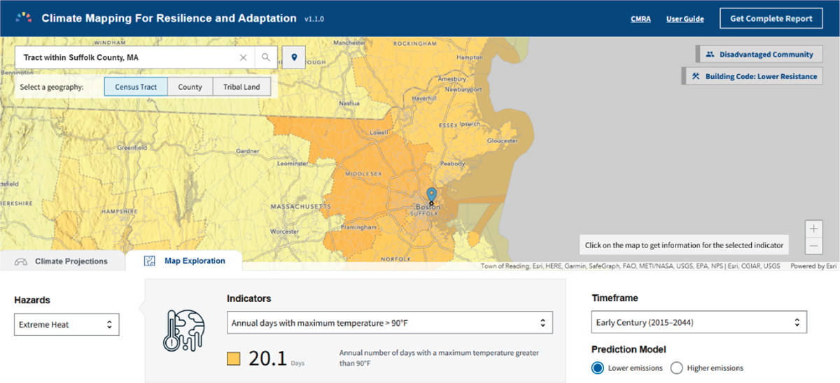
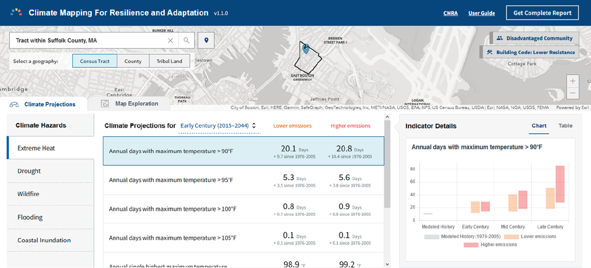
The CMRA tool shows current and future climate hazard information for five types of climate-related hazards across the United States: extreme heat, drought, wildfire, flooding, and coastal inundation. The Climate Projections tab shows hazards and associated indicators calculated for a selected area of interest projected for three time periods through the end of the century. In Figure 4.1, projections for extreme heat are displayed as “Annual days with maximum temperature” greater than temperature thresholds ranging from 90 to 105 degrees Fahrenheit, as well as maximum temperatures. Depending on the climate hazard, raw units include the number of days above or below specific temperature thresholds, the number of days above or below specific precipitation thresholds, average annual precipitation, and the percent of coastal areas subject to inundation.
Although some tools rely on raw data values, the primary mode of information display for most tools is one in which the indicator has been processed into a form that facilitates comparison or aggregation, either cumulatively across all indicators or within domains or subsets of indicators (e.g., health, environment, climate).
Percentiles
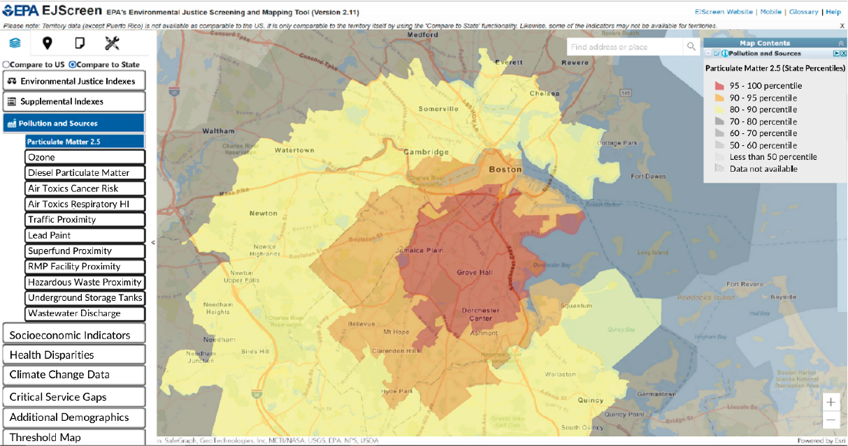
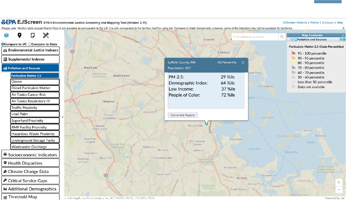
Most of the tools that identify EJ communities or communicate social and environmental burdens convert indicators into percentile scores. Percentile scores present indicator information for a given geographic area (i.e., census-block group, census tract) relative to all other geographic areas within the country or within a state. For example, EJScreen displays environmental, socioeconomic, and health indicators as percentiles for each census-block group relative to all other census-block groups across the country, or relative to all other block groups within its respective state (depending upon user choice). The upper panel of Figure 4.2 shows percentile scores from EJScreen for particulate matter (PM2.5) relative to the state of Massachusetts. Census-block groups in red, within the Grove Hall neighborhood of the City of Boston, exhibit levels of PM2.5 that are within the 95th to 100th state percentile range. This means that the pollutant levels in those block groups are higher than at least 95 percent of all other block groups in Massachusetts. However, when compared to the nation, the same location falls in the 29th national percentile (seen in the lower panel of Figure 4.2). This means that its PM2.5 levels are higher than 29 percent of all other block groups but lower than 70 percent of all other block groups within the country.
Although most of the tools evaluated use percentiles, EJScreen is one of the few that presents percentile scores of individual indicators as the primary value for display. Most tools reviewed use percentiles as an intermediate step in the construction of more complex indicators of cumulative impacts or risk, or the percentile scores are of composite indicator values. For example, in its process of computing cumulative impact scores, CalEnviroScreen first determines percentiles for each of its 21 indicators. Each indicator is assigned to one of four component groupings (i.e., Exposures, Environmental Effects, Sensitive Populations, and Socioeconomic Factors). The indicator percentiles are averaged within their respective component groupings. These component groupings
are themselves organized into one of two larger categories: Pollution Burden (Exposures and Environmental Effects) and Population Characteristics (Sensitive Populations and Socioeconomic Factors).
The Population Characteristics category score is the average of the Sensitive Population grouping score and Socioeconomic Factors grouping score. The Pollution Burden Score is computed similarly, except that the Environmental Effects grouping score is weighted half as much as the Exposures grouping score.10 The averaged scores for the Pollution Burden and Population Characteristics categories are then scaled such that both have maximum values of 10, and the final CalEnviroScreen cumulative impact score is computed by multiplying the scaled Pollution Burden and Population Characteristics category scores. The result is values ranging from 0 to 100 for every census tract in the state, a cumulative impact score. The CalEnviroScreen tool presents these computed cumulative impact scores in its map. Users can see the original percentiles for each of the indicators after clicking on a given census tract. Other composite indicator tools reviewed here that also use percentiles as intermediate calculations include the CDC/ATSDR EJI, DOE EJMT, DOT ETCE, and New Jersey EJMAP tools.
Ratings
Some tools use ratings (sometimes referred to as “rankings”) to display indicators (or constructed indexes), often based on an underlying score or percentile. Ratings indicate a simple ordinal display of relative position, usually “low” to “high.” Unlike percentiles, ratings do not easily allow for quantitative assessment of the distance between rating positions or the ratings’ relative frequency. Ratings are also more qualitative because they require an explicit decision by the developer about how to distinguish between the different ratings.
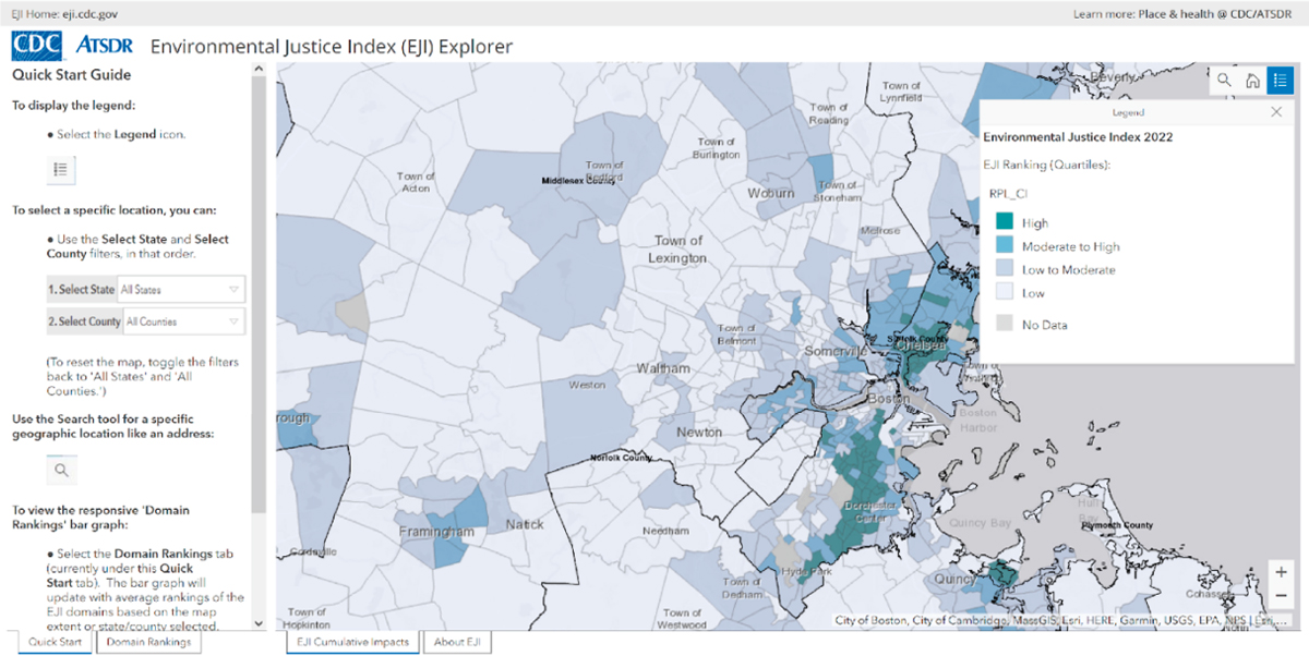
The CDC/ATSDR’s EJI Explorer displays EJI scores as both percentiles and labeled ratings (see Figure 4.3). The latter are based on quartiles, although the quartile method of partition would not be apparent unless the user consulted the technical documentation:
- High: 75th to 100th percentile
- Moderate to High: 50th to 75th percentile
- Low to Moderate: 25th to 50th percentile
- Low: 0th to 25th percentile
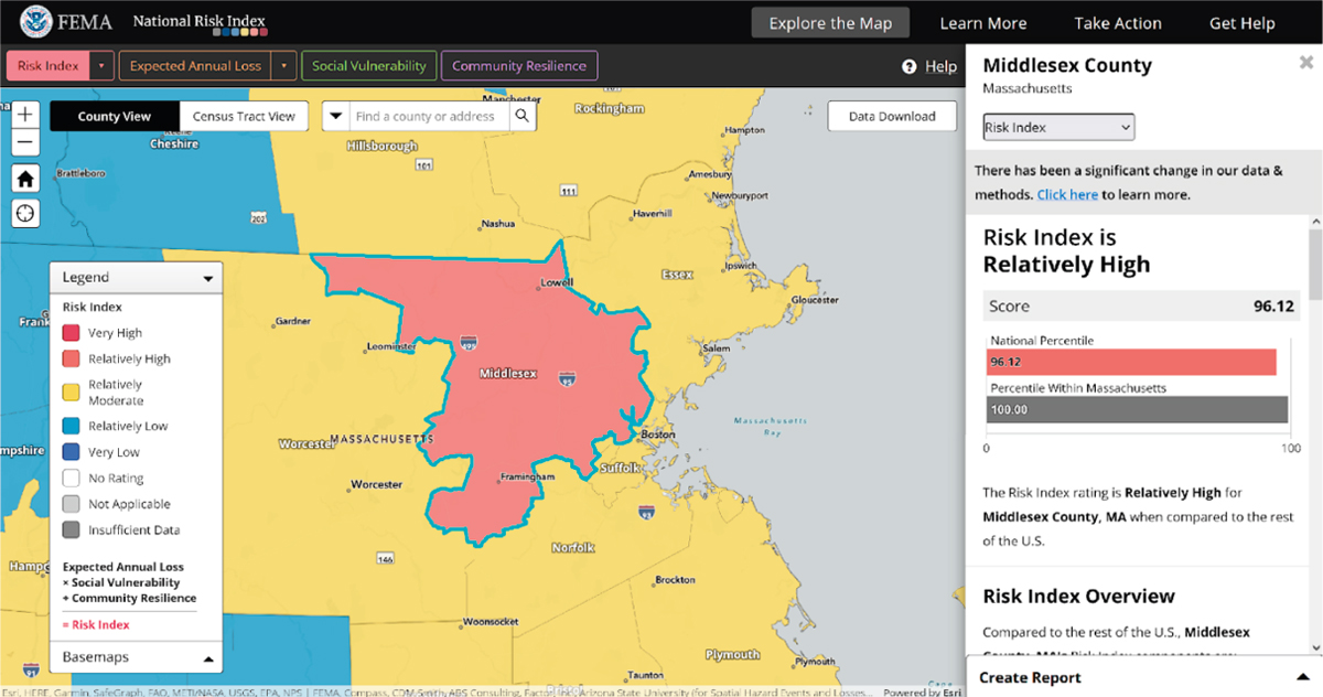
FEMA’s NRI also uses ratings to identify U.S. communities at greatest risk for 18 natural hazards (Figure 4.4). Three different types of results are provided for risk and their components:
___________________
10The rationale for weighting Environmental Effects half as much as Exposures is based on the argument that while Environmental Effects represent the presence of pollutants within a community, they do not necessarily equate to direct exposure to those pollutants. Exposure indicators are therefore assumed to represent a higher order of burden. See CalEnviroScreen 4.0 Report (August et al., 2021).
- Values (in dollars)—for risk and expected annual loss (representing the community’s average economic loss from natural hazards each year). Social vulnerability and community resilience values are index values for the community from the source data.
- Scores (percentiles)—the national percentile ranking of the community’s component value compared to all other communities at the same county or census-tract level.
- Ratings—one of five qualitative categories describing the community’s component value in comparison to all other communities at the same level. Rating categories range from “Very Low” to “Very High.”
Social vulnerability and community resilience ratings have specific numerical boundaries, divided into quintiles based on national percentiles:
- Very High: 80th to 100th percentiles
- Relatively High: 60th to 80th percentiles
- Relatively Moderate: 40th to 60th percentiles
- Relatively Low: 20th to 40th percentiles
- Very Low: 0th to 20th percentiles
CUMULATIVE IMPACTS
Measuring cumulative impacts is an important consideration in determining those communities that are most significantly disadvantaged or burdened by multiple stressors. As mentioned in Chapter 2, this involves three major factors:
- Magnitude of a given stressor: Those communities that have a higher level of the given stressor or indicator or exceed a threshold for that stressor by a greater amount are designated as “more” burdened.
- Presence of multiple stressors: Those communities facing a greater number of stressors are more burdened than communities with fewer stressors.
- Interactions across stressors: The level (or presence) of one stressor in a community can increase the burden imposed on that community by another stressor.
All the tools described in Table 4.1 incorporate one or more of these dimensions of cumulative impacts in some way, although some are more comprehensive than others. Many (but not all) use an aggregation approach to measuring cumulative impacts. As discussed in Chapter 2, aggregation can be either additive or multiplicative, combine demographic or environmental data only or together, and adopt different weights for indicators. In addition, consistent with the varying purposes of the tools, some tools incorporate some measure of cumulative impacts in providing information about the extent to which a community is burdened, while others use it in the binary designation of a community as disadvantaged. This section presents a summary of how the
three dimensions of cumulative impacts are measured by some of the tools that were reviewed.
Magnitude of a Given Stressor
Data reported in raw form or as percentiles, rankings/ratings, or continuous indexes provide information about the magnitude of a given stressor, allowing for considerable variation across communities in the measured level of burden. In contrast, data reported simply based on exceeding a threshold (e.g., a binary variable such “above” or “below”) only crudely represent magnitude without distinguishing among different levels in the “above” or “below” categories. Thus, a community that is only slightly above the threshold is viewed as being identical to one that is far above the threshold, and vice versa. In practice, most tools report both continuous values and identify communities that exceed specific thresholds.
For example, the CDC/ATSDR SVI ranks each county and tract on 16 social factors and groups them into four themes: (1) Socioeconomic, (2) Housing Composition and Disability, (3) Minority Status and Language, and (4) Housing and Transportation. Counties in the top 10 percent (i.e., at the 90th percentile of values) are flagged to indicate high vulnerability (CDC/ATSDR, 2022). Similarly, the CDC/ATSDR EJI Explorer uses percentiles to rank each census tract across the country on 36 environmental, social, and health factors and groups them into three overarching modules and 10 different domains. Domains or individual indicators that meet or exceed the 75th percentile are flagged as having a “high prevalence of a chronic condition test” (CDC/ATSDR, 2023).
Multiple Stressors
The cumulative impacts arising from the presence of multiple stressors can be measured through various methods (see Chapters 2 and 3). For example, some tools simply count the presence or number of stressors, typically based on threshold data and the number of thresholds exceeded. Other tools use an additive approach that calculates the sum of indicators across various stressors, typically based on normalized continuous data of some sort, such as percentiles, to allow for comparability in the summation. They thus incorporate more variation in stressor intensity into the measure of cumulative impacts (rather than simply presence vs. absence). In addition, in calculating a summation, the individual components can be weighted equally (as is most often done) or unequally. Multiplicative approaches also involve consideration of multiple stressors but more directly allow for interaction effects of the type described above. (See further discussion below.)
The tools reviewed provided multiple examples of these approaches. For example, the score for the Health Vulnerability Module of the CDC/ATSDR EJI is calculated by summing the number of indicator “flags” for a given census tract, where a flag indicates that the tract is in the top tertile (33.33 percent) of all census tracts. This is equivalent to counting the number of flags. The New Jersey EJMT also uses a count approach. It determines the cumulative burden for a given community based on the number of
stressors deemed “adverse” in that community, where the adverse designation is based on whether the stressor is above the 50th percentile.
Several tools use an additive approach for multiple stressors. For example, DOE’s EJMT calculates percentiles for each of 36 burden indicators and then sums the percentiles (with equal weights) to generate an aggregate score reflecting cumulative burden. This aggregate score is then used in the determination of whether a census tract is designated as disadvantaged.
The CDC/ATSDR’s EJI calculates a module score for its Environmental Burden module and its Social Vulnerability module by summing (with equal weights) the percentile ranks for each of the indicators within the module. These module scores are ranked and then added together (along with the rankings for the Health Vulnerability Module), again using equal weights, to create an overall EJI score. The DOT’s ETCE calculates percentile ranks for each component, which are then summed (with equal weights) and converted to a percentile ranking that is used to determine the final disadvantage score for each tract. Where components reflect multiple stressors, they are also based on a summation of normalized indicators for those stressors. The State of California’s CalEnviroScreen tool creates its “Exposure” and “Environmental Effects” components by averaging the percentiles for individual indicators within those components, with equal weights. However, when the Exposure and Environmental Effects components are combined, they are summed with unequal weights. In this summation, the Environmental Effects component receives only half the weight of the Exposure component. As a final example, CDC/ATSDR’s SVI computes percentile rankings for each of 16 social factors, which are then grouped into four themes. For each of the four themes, percentiles for the variables within each theme are summed. The summed percentiles for each theme are then ordered to determine theme-specific percentile rankings. Overall tract rankings are computed by summing the sums for each theme, ordering the tracts, and then calculating overall percentile rankings.
Interactions Across Stressors
Capturing the interactions across stressors is possible by different methods. Stressors interact when the burden imposed by one stressor depends on the presence or level of another stressor. Two possible approaches to modeling the interaction of stressors are an intersection approach and a multiplicative approach. Under the intersection approach, a given stressor is deemed to create a burden for a community only if a second stressor is also present. Thus, under this approach, cumulative impact is not measured by a single composite indicator but is instead measured by meeting thresholds for both stressors. For example, to be designated as disadvantaged, a community would have to meet a threshold for both income and an environmental indicator (or possibly a composite index for that burden category). In contrast, the multiplicative approach allows for interaction based on continuous variation in the levels of two or more stressors (rather than simply their presence or absence). For most of the tools reviewed, the only interactions captured are those between environmental stressors and socioeconomic stressors (rather than between two environmental stressors). Tools that do not consider interactions typically
simply include socioeconomic stressors as additional stressors along with, for example, environmental, health, and climate change stressors.
Examples of tools using an intersection approach for interactions across stressors include the_Department of Energy’s (DOE’s) EJMT, which designates a census tract as disadvantaged if its cumulative impact index (discussed earlier) is in the top 20 percent for the state and at least 30 percent of the households qualify as low income. Similarly, the MA-DPH-EJT classifies census-block groups as Vulnerable Health EJ communities if they meet at least one EJ criterion and at least one health indicator criterion.
Several tools use a multiplicative approach for interactions across stressors. For example, although the EJScreen tool does not incorporate cumulative impacts across multiple environmental stressors (since it does not calculate overall cumulative scores), it does incorporate interaction between individual environmental stressors and a demographic index (or supplemental demographic index) through a multiplicative formula. Two communities with a similar percentile for a given environmental indicator will have different EJ indexes for that indicator if they have different demographic indexes. CalEnviroScreen calculates an overall score for each community by multiplying the combined Exposures/Environmental Effects measure (see above) by a mean percentile for socioeconomic factors and sensitive population indicators. Communities with similar combined Exposures/Environmental Effects measures will have different overall scores if they differ based on socioeconomic or health characteristics. The FEMA NRI, which measures the risk of negative impacts resulting from natural disasters, is derived by multiplying a measure of expected annual loss by a measure of social vulnerability and then dividing it by a measure of community resilience. For any given expected annual loss, the index is higher for communities that are more socially vulnerable and lower for communities that have a greater potential for resilience.
Using Thresholds to Identify Disadvantaged Communities
Many of the tools evaluated use threshold criteria to identify disadvantaged or EJ communities. In this approach, the designation of a qualifying area is based on one or more numerical thresholds. Thresholds can be applied either to individual indicators or to composite indicators. These thresholds may be based on statute, regulation, or the result of some deliberative process of the tool developers. For example, consistent with California law SB 535,11 CalEPA uses CalEnviroScreen to identify disadvantaged communities as those in the 75th percentile or higher of cumulative impact scores. Similarly, the U.S. DOT ETCE displays continuous “Overall Disadvantage Component Scores” and separate percentile rankings for each individual indicator within a component. It categorizes a census tract as disadvantaged if the overall index score places it in the 65th percentile of all U.S. census tracts. The 65th percentile cutoff was selected to be consistent with CEJST’s low-income indicator.12
___________________
11California’s law SB 535: https://oehha.ca.gov/calenviroscreen/sb535 (accessed November 5, 2023).
12See https://experience.arcgis.com/experience/0920984aa80a4362b8778d779b090723/page/Understanding-the-Data/ (accessed November 5, 2023).
As another example, DOE’s EJMT—Disadvantaged Communities Reporter identifies a community as disadvantaged if it is in a census tract that is at or above the 80th percentile of the cumulative sum of the tool’s 36 burden indicators and has at least 30 percent of households classified as low income (i.e., at or below 200 percent of the federal poverty level and/or are considered low-income households as defined by the Department of Housing and Urban Development).13
At the state level, consistent with New Jersey’s Environmental Justice Law, N.J.S.A. 13:1D-157,14 New Jersey’s EJMAP identifies Overburdened Communities (OBCs) as census-block groups in which (1) at least 35 percent of households qualify as low-income households (at or below twice the poverty threshold as determined by the U.S. Census Bureau); (2) at least 40 percent of the residents identify as minority or as members of a state-recognized Tribal community; or (3) at least 40 percent of the households have limited English proficiency. OBCs above the median (50th percentile) for a Combined Stressor Total (CST), which is based on 26 environmental or public health stressors, are designated as “subject to adverse cumulative stressors.”15
OVERVIEW OF THE CLIMATE AND ECONOMIC JUSTICE SCREENING TOOL (CEJST)
This chapter has summarized the features of some existing EJ tools and how they may vary, illustrating the range of approaches taken in constructing EJ mapping tools. For comparison, this section provides a brief overview of key features of CEQ’s CEJST, focusing on the burden categories, indicators, and the limited consideration of cumulative impacts. Subsequent chapters provide additional detail and discussion regarding CEJST.
CEJST includes eight burden categories and incorporates 30 indicators for measuring those burdens.16 The eight categories are climate change, energy, health, housing, legacy pollution, transportation, water and wastewater, and workforce development. A community is designated as disadvantaged by CEJST if it is in a census tract that is (1) at or above the 90th percentile for one or more of the indicators and (2) meets a socioeconomic burden threshold.17 For seven of the eight burden categories, that threshold is defined as being at or above the 65th percentile for low income (i.e., percent of households at or below 200 percent of the federal poverty level). However, for the workforce development category, the socioeconomic burden threshold is met if the percentage of people age 25 years or older whose high school education is less than a high school diploma exceeds 10 percent.
___________________
13See https://energyjustice.egs.anl.gov/ (accessed November 5, 2023)
14See New Jersey’s Environmental Justice Law, https://pub.njleg.state.nj.us/Bills/2020/AL20/92_.PDF (accessed February 14, 2024).
15See https://experience.arcgis.com/experience/548632a2351b41b8a0443cfc3a9f4ef6 (accessed November 5, 2023).
16See Chapter 5 for more information on the burden categories and a table with their respective indicators.
17In addition, a census tract that is completely surrounded by disadvantaged communities and is at or above the 50th percentile for low income is also considered disadvantaged.
As already noted, most of the tools described in this chapter incorporate cumulative impacts in some way, although the extent and methods used vary across tools. Because CEJST designates a community as disadvantaged primarily on the presence or absence of at least one environmental or economic stressor (indicator) coupled with an associated socioeconomic indicator, it does not truly capture cumulative impacts. Its use of thresholds for each indicator effectively incorporates only the magnitude of stressors by distinguishing between a stressor being “high” (above the threshold) and “low” (below the threshold). There is no further differentiation based on the magnitude of a stressor. In addition, because CEJST only requires that one of the burden indicators exceed its threshold, it does not account for multiple environmental stressors (i.e., the fact that some communities are burdened with more stressors than others). The data files accompanying CEJST include information about multiple stressors as a form of cumulative impacts by reporting a count variable that measures the number of indicator thresholds that are exceeded in that community. This type of count information is used by several other tools (see earlier discussion). However, CEJST does not use this information in the designation of a community as disadvantaged. A community that exceeds only one threshold has the same designation as a community that exceeds many thresholds.
The only way in which CEJST captures some dimension of cumulative impacts is by designating a community as disadvantaged only if the census tract meets both a burden criterion (exceeding the 90th percentile for at least one burden indicator) and a socioeconomic criterion (based on income for seven of the eight burden categories and on high school attainment for the eighth category of workforce development). In this sense, it uses an intersection approach to incorporate the interaction between environmental/health/climate change stressors and socioeconomic stressors, recognizing that certain stressors impose a greater burden when coupled with socioeconomic stressors. Several of the tools reviewed also incorporate this type of interaction in some way, through either an intersection approach or a multiplicative approach. CEJST does not incorporate the possible interaction between burden categories; for example, the fact that a transportation stressor such as elevated PM2.5 levels may impose a greater burden on a community that is also facing a health stressor such as high incidence of asthma. (Of course, it is also possible that the first stressor is contributing to the existence of the second stressor, so the two are not independent.) Most of the other tools described in this chapter do not incorporate interactions within the environment/health/climate change stressors. However, they do incorporate distinctions across communities based on the number of stressors (beyond socioeconomic stressors) they face.
CHAPTER HIGHLIGHTS
As of the writing of this report, 35 different EJ tools have been released, half of which have been released since 2021. This chapter surveys literature that has reviewed EJ tools and provided more detailed descriptions of a subset of these tools. Several of the reviews found that definitions of community and disadvantage are often inappropriate and not reflective of community self-determinations or lived experiences; that indicators and measures of burden incorporated into tools are often incomplete or out
of date; that consideration of race and ethnicity is warranted; that the ways in which multiple burdens interact (cumulative impacts) are important; and that community input and engagement are vital to a relevant tool. The conclusions of these reviews are consistent with discussions about community disadvantage, the incomplete nature of many indicators, the need to address racism, and community engagement found in Chapters 2 and 3 of this report, as well as with committee member expertise and discussions with community members during the committee’s open-session discussions.
In addition, the committee’s review of tools shows that tools differ along a number of dimensions. Tool outputs vary by the intended use of the tool. Most tools present results as rankings (e.g., percentile comparison with other communities). Other tools may present results using ratings (e.g., “low” to “high”), a binary format (e.g., “above” or “below” some threshold), or rankings (e.g., percentile comparison with other communities). Results presented relative to some threshold (e.g., binary or threshold) represent some amount of subjective decision making in the determination of what the thresholds or rating levels should be. Binary results do not provide information about magnitude (e.g., how much above or below a threshold). CEJST includes consideration of eight burden categories plus a socioeconomic burden threshold and provides results in a binary format (i.e., disadvantaged or not disadvantaged) with no true accounting for the magnitude of stressors or cumulative impacts.
Subsequent chapters of this report provide more details regarding CEJST. Chapter 5 discusses the selection of indicators and datasets. Chapter 6 reviews indicator integration, and Chapter 7 discusses the validation of tool approaches, measures, and results. CEJST is considered in light of scientific literature and sound practices for indicator construction and EJ tool development to inform recommendations for a future data strategy for EJ tools in Chapter 8.


