Visualization for Public Involvement (2024)
Chapter: 3 State of the Practice
CHAPTER 3
State of the Practice
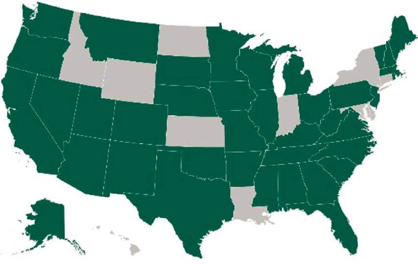
A 10-question online survey was designed to gather information about how state DOTs use visualization for public involvement. The survey, which addressed the types, formats, and implementation used, helped to establish the current state of the practice across the United States. The survey was sent to the 50 state DOTs and the District of Columbia DOT (DDOT). As shown in Exhibit 3-1, responses were received from 39 of the DOTs contacted, a response rate of 76%.
Survey question formats included yes/no, matrix, and multiple-choice (choose one or choose all that apply) answer sets. The specific aspects of visualization for public involvement topics queried included the following:
- Specific methods in use and their frequency of use.
- Project phase.
- Objectives for use.
- How participants access visualization.
- Strategies used to gather participant feedback.
- Agency written policies, procedures, or guidelines on use of visualization.
- Accessibility across media formats.
- Methods to evaluate the effectiveness of communication.
- Who prepares visualizations.
- Barriers encountered that preclude or limit the use of advanced visualization.
Not every DOT answered each question; therefore, statistics shown in this report reflect the percentage of the DOTs answering the question. NOTE: In the equation, n = x, in this chapter’s exhibit captions, x denotes the maximum number of responses to a given question; x is generally equal to 39 (the number of DOTs responding to the survey) but may be less when all 39 DOTs did not respond to a specific question.
Methods and Implementation
The survey explored state DOT use of 13 visualization methods in public involvement. The methods (Exhibit 3-2) are organized from simpler to more complex technology required for development and delivery and were displayed in this order in the survey. Respondents identified additional methods that they consider to be part of their visualization toolbox in an optional “Other” response option, which included web-based and GIS applications.
The survey results and findings are summarized in the following subsections. (The survey instrument is provided as Appendix A, and aggregated survey results are provided as Appendix B.)
Exhibit 3-1. State-of-the-practice survey participant map.
Tool Types and Methods
DOTs are using a combination of visualization methods (Survey Question 1), with plans for using more advanced technologies in the future. Exhibit 3-3 shows the percentage of DOTs using or planning to use each visualization tool or method, as well as those not planned for future use. Nearly all the DOTs use infographics (97% or 36 of 37 respondents), video (94% or 37 of 39 respondents), and conceptual sketches (92% or 36 of 39 respondents). Also heavily used are drone imagery and animated graphics (each at 82% or 31 of 38 respondents), 3D animation/traffic simulation (78% or 29 of 37 respondents), and photo-simulation (74% or 29 of 39 respondents).
Exhibit 3-2. Continuum of visualization method complexity.
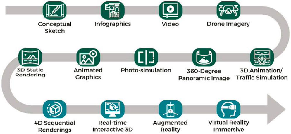
Exhibit 3-3. Results for Survey Question 1 regarding visualization methods currently in use, methods planned for future use, and methods not used nor planned for future use (n = 39).
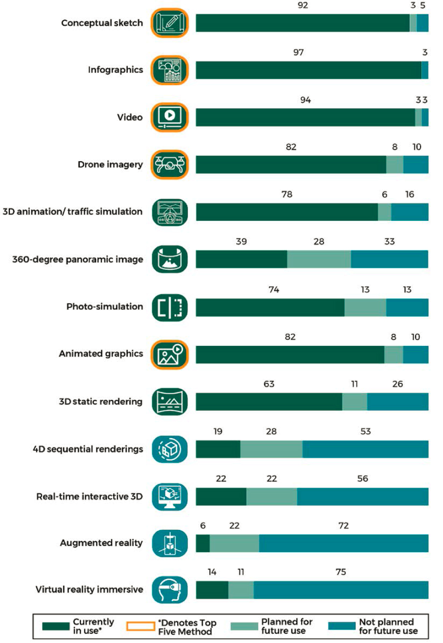
The least-used methods are AR (6% or 2 of 36 respondents), VR immersive (14% or 5 of 36 respondents), four-dimensional (4D) sequential renderings (19% or 7 of 36 respondents), and real-time interactive 3D (22% or 8 of 36 respondents). These are the four most complex methods in the continuum. Although respondents expect some growth in the use of each of these methods, more than half of the DOTs (26, 27, 20, and 19 of 36 respondents, respectively) have no plans to use any of them. However, 28% or 10 of 36 of respondents anticipate significant growth in the use of 360-degree panoramic images. Based on the survey responses, use of 360-degree panoramic images would grow from today’s 39% to 67%, becoming a widespread visualization method.
Implementation Type
The use of visualization with the public is most common in the design phase, closely followed by the environmental review and concept development phases (Question 2). Use of visualization with the public is also common in the planning phase, but less common during the construction and operations/maintenance phases. Almost every visualization method included in the survey is more heavily used during the design phase than in any other phase.
As shown in Exhibit 3-4, conceptual sketches, infographics, video, and drone imagery are the most common visualization methods used across all phases of the project life cycle. The concept development and design phases are the most common phases to have the use of any visualization method. Although only a handful of DOTs report the use of AR with the public, its use is highest in the environmental review phase.
For the planning phase, infographics and conceptual sketches are the most used methods, at 85% (or 33 of 39 respondents) and 82% (or 31 of 38 respondents), respectively. These two methods are also the most used in the concept development and environmental review phases. In the design phase, these two methods are again the most common, with video a close third (80% or 31 of 39 respondents). In construction, the most used method is drone imagery (70% or 26 of 37 respondents). Drone imagery is also the most used method in public involvement for operations and maintenance, at 54% (or 20 of 37 respondents). Finally, the “do not use” column reinforces the finding that the four most complex methods in the continuum are the least used among DOTs (Do Not Use ranged from 71% for “4D sequential renderings” (or 25 of 35 respondents) and “Real-time interactive 3D” (or 28 of 39 respondents) to 89% (or 31 of 35 respondents) for “Virtual reality immersive.”).
Exhibit 3-4. Results for Survey Question 2 regarding visualization methods used by project life cycle phase (n = 38).
| Continuum of Visualization Method Complexity | Planning | Concept Development | Environmental Review | Design | Construction | Operations & Maintenance | Do Not Use |
|---|---|---|---|---|---|---|---|
| Conceptual sketch | 82% | 82% | 86% | 84% | 47% | 18% | 8% |
| Infographic | 85% | 80% | 82% | 82% | 54% | 36% | 5% |
| Video | 59% | 67% | 70% | 80% | 59% | 28% | 8% |
| Drone imagery | 43% | 70% | 62% | 70% | 70% | 54% | 11% |
| 360-degree panoramic image | 14% | 28% | 25% | 25% | 25% | 11% | 57% |
| Photo-simulation | 54% | 68% | 64% | 68% | 30% | 16% | 21% |
| Animated graphics/motion graphics | 44% | 61% | 47% | 75% | 47% | 19% | 11% |
| 3D static rendering | 41% | 52% | 50% | 61% | 36% | 14% | 30% |
| 3D animation/traffic simulation | 30% | 51% | 49% | 73% | 46% | 8% | 16% |
| 4D sequential renderings | 6% | 9% | 14% | 20% | 14% | 3% | 71% |
| Real-time interactive 3D | 6% | 9% | 14% | 20% | 14% | 3% | 71% |
| Augmented reality | 6% | 11% | 20% | 11% | 0% | 0% | 80% |
| Virtual reality immersive | 3% | 6% | 9% | 9% | 3% | 0% | 89% |
Survey Question 2 allowed multiple-choice answer selection, which resulted in a repeat of percentage values in Exhibit 3-4. One DOT did not respond to this question.
Exhibit 3-5 shows the importance of key visualization objectives (Question 3). The visualization objective with the highest overall rating was “to gather public feedback on an initial concept or design,” with a “high importance” rating of 87% (or 34 of 39 respondents). The second highest objective was “to help the public compare and provide feedback on alternatives,” with a “high importance” rating of 82% (or 32 of 39 respondents).
Consistent with the responses to the question about project phases, the visualization objective with the lowest “high importance” rating (53% or 20 of 38 respondents) was “to help the public understand construction process and timeline.” Over 50% of the respondents rated all the visualization objectives as highly important.
Question 3 allowed multiple-choice answer selection, which resulted in a repeat of percentage values in Exhibit 3-5.
Visualizations are implemented during public involvement using all options listed in the survey (Question 4). Exhibit 3-6 shows that almost all respondents cited the use of in-person meetings and websites as methods for the public to view visualizations (95% or 37 of 39 respondents and 97% or 38 of 39 respondents, respectively). Social media (92% or 36 of 39 respondents) and virtual meetings or presentations (90% or 35 of 39 respondents) are also commonly used. One respondent mentioned using quick-response (QR) codes to allow people to access online materials.
The most common strategies used to gather feedback on information provided in visualizations include comment forms (100% or 39 of 39 respondents), formal testimony (90% or 35 of 39 respondents), and verbal discussions with staff (90% or 35 of 39 respondents). Less-used strategies for obtaining feedback on visualizations are real-time polling (26% or 10 of 39 respondents), social media commentary (36% or 14 of 39 respondents), and interactive direct input involving digital/virtual methods (15% or 6 of 39 respondents) (see Exhibit 3-7).
Agencies reported the following additional strategies for gathering feedback under the “Other” answer option:
- Live chat–virtual 3D rooms.
- If an online map tool is used, the comments can be gathered using GIS function.
- Stakeholder and/or council meetings.
- Posting on social media to link respondents to official channels of sharing feedback.
- Focus groups.
- Community events, tabling.
- Email.
Exhibit 3-5. Results for Survey Question 3 regarding the importance of objectives for using visualization for public involvement (n = 39).
| Visualization Objective | High Importance | Moderate Importance | Low Importance |
|---|---|---|---|
| To gather public feedback on an initial concept or design | 87% | 13% | 0% |
| To help the public compare and provide feedback on alternatives | 82% | 15% | 3% |
| To help convey the benefits of a project | 72% | 28% | 0% |
| To build consensus to move forward with a project | 72% | 26% | 3% |
| To get feedback to refine and finalize a design | 69% | 23% | 8% |
| To increase understanding of current transportation or environmental conditions and trends | 67% | 31% | 3% |
| To engage the public in developing alternatives | 67% | 28% | 5% |
| To help the public understand the construction process and timeline | 53% | 34% | 13% |
Exhibit 3-6. Results for Survey Question 4 regarding how participants access/view visualizations during a public involvement process (n = 39).
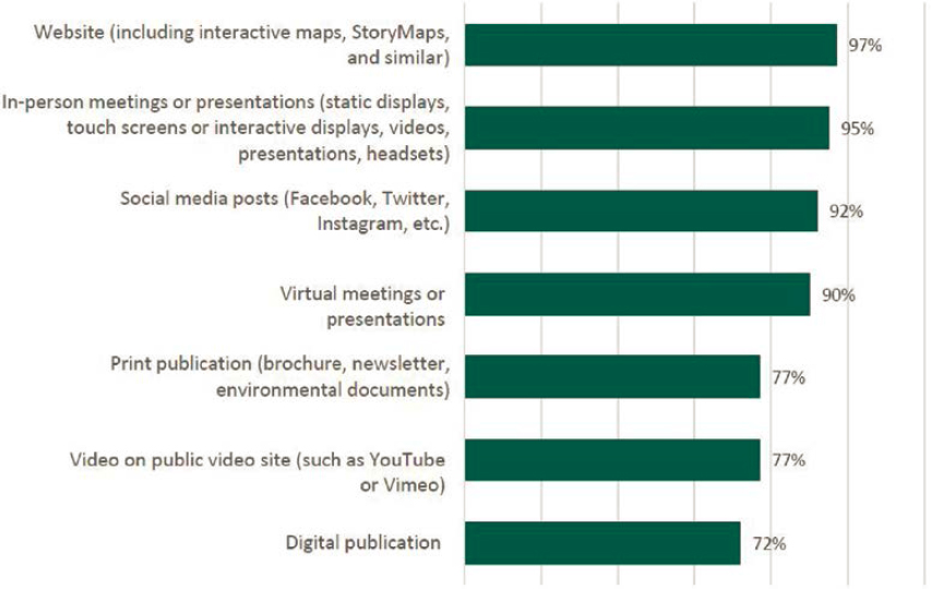
Exhibit 3-7. Results for Survey Question 5 regarding the strategies used to gather feedback on the information provided in visualizations (n = 39).
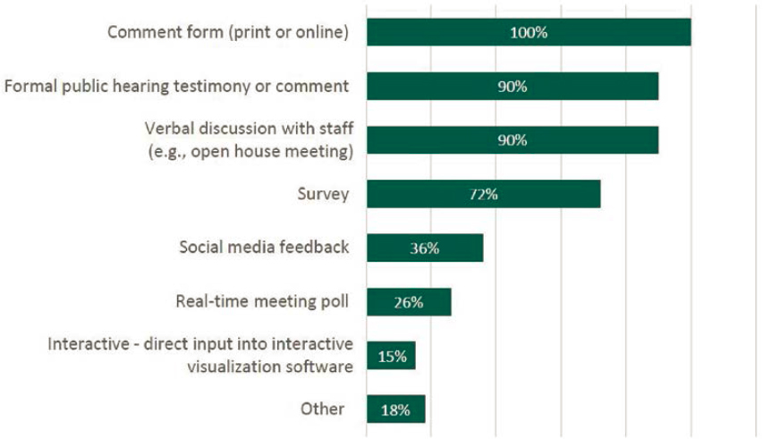
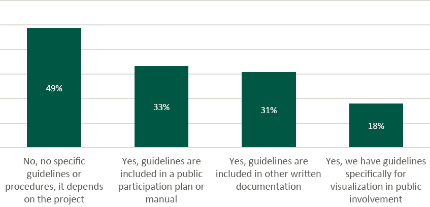
Exhibit 3-8. Results for Survey Question 6 regarding the use of written guidelines on the use of visualization for public involvement (n = 39).
Guidelines and Procedures
Respondents were asked whether their DOTs had specific guidelines for visualization for public involvement (Question 6), or if such guidelines are included in a public participation plan or manual or in other written documentation (Exhibit 3-8). Eighteen percent (7 of 39 respondents) of DOTs have guidelines specifically for visualization for public involvement. A total of 64% have guidelines in a public participation plan or manual (33% or 13 of 39 respondents) or other written documentation (31% or 12 of 39 respondents). However, 49% (19 of 39 respondents) indicated that they have “no specific guidelines or procedures, it depends on the project.”
The survey also asked how DOTs confirm that visualizations are accessible to people with disabilities across all media formats. Responses varied, with 52% performing either “in-house expert review/testing” (34% or 13 of 38 respondents) or “self-check using agency software tools” (18% or 7 of 39 respondents), as shown in Exhibit 3-9. A significant percentage (45%) answered
Exhibit 3-9. Results for Survey Question 7 regarding the methods agencies use to evaluate the effectiveness of visualization in public involvement (n = 39).
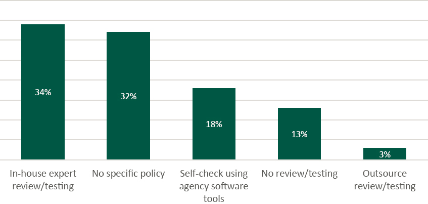
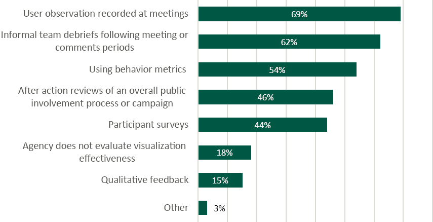
Exhibit 3-10. Results for Survey Question 8 regarding how the effectiveness of visualization for public involvement is evaluated (n = 39).
that they either do not review/test for accessibility of visualizations (13% or 5 of 38 respondents) or do not have any specific policy on the matter (32% or 12 of 38 respondents).
DOTs were asked what methods they used to evaluate the effectiveness of visualization for public involvement. Exhibit 3-10 shows that behavioral, qualitative, and informal processes are most common. Observation during meetings (69% or 27 of 39 respondents) and informal team debriefs (62% or 24 of 39 respondents) were the methods most frequently cited, and 54% (or 21 of 39 respondents) of agencies use behavior metrics (e.g., the number of web page or video views, completed surveys, or social media likes/shares). One respondent mentioned two criteria for gauging effectiveness: an “improved quality of questions” and being “able to reach decisions.”
Challenges and Barriers
Respondents were asked to specify whether all, or most, visualizations for public involvement were prepared in-house, by consultants, or a mix (Question 9) (see Exhibit 3-11). Most (61% or 23 of 38 respondents) responded that they used a mix of in-house and consultant efforts. Approximately a quarter of the DOTs (26% or 10 of 38 respondents) reported having most visualizations developed by consultants. Eight percent (or 3 of 38 respondents) reported managing all materials in-house.
The final survey question (Survey Question 10) asked about barriers to the use of advanced visualization (Exhibit 3-12). The two barriers most frequently cited were cost/funding availability at 47% (or 18 of 38 respondents) and limited staff capability at 39% (or 18 of 38 respondents. These barriers are more fully explored in the DOT interviews described in Chapter 4. The lead time required to produce visualizations was a major barrier for 29% (or 11 of 38 respondents) and a moderate barrier for 43% (or 16 of 37 respondents), for a combined total of 72%.
Most DOTs indicated that difficulty providing equitable access for all stakeholders is either a moderate or minor barrier to the use of advanced tools (for a combined total of 82% or 31 of 38 respondents). Fifty-four percent of the DOTs (or 20 of 37 respondents) indicated that departmental or state policies were not a barrier in adopting these methods.
Exhibit 3-11. Results for Survey Question 9 regarding who typically prepares the visualizations used in agency public involvement (n = 38).
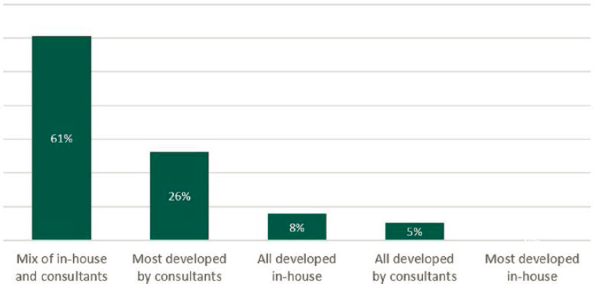
Exhibit 3-12. Results for Survey Question 10 regarding barriers that preclude or limit use of advanced visualizations (n = 39).
| Major Barrier | Moderate Barrier | Minor Barrier | No Barrier | |
| Cost/funding availability | 47% | 26% | 26% | 0% |
| Staff technical capabilities | 39% | 39% | 18% | 2% |
| Lead time required to produce | 29% | 43% | 27% | 0% |
| Difficulty meeting ADA/Section 508 accessibility requirements | 13% | 28% | 37% | 21% |
| Departmental or state policies that limit ability to use these tools | 11% | 14% | 21% | 54% |
| Stakeholder internet access limitations (service or bandwidth) | 8% | 43% | 35% | 13% |
| Difficulty providing equitable access to visualization for all stakeholders | 10% | 32% | 50% | 8% |


