Leveraging Artificial Intelligence and Big Data to Enhance Safety Analysis: A Guide (2025)
Chapter: 5 Additional AI, ML, and Big Data Applications

CHAPTER 5
Additional AI, ML, and Big Data Applications
Introduction
The case studies described in Chapter 4 laid the groundwork for the research team to conduct additional follow-up studies related to those methodologies and other related AI/ML algorithms and big data analysis. All the cases leveraged Python, a programming language for data analysis and deep learning. In each case, the research team sought opportunities to analyze datasets in innovative ways to increase efficiencies or develop novel findings. The additional applications included applying ML algorithms to identify other roadside inventory assets (e.g., signing), identifying lane markings with LiDAR, counting turning movements from CVD, and more. In total, this chapter describes six studies with processes that practitioners can follow and replicate.
Python Primer
Python was the major programming language the research team adopted and used to program all the tools. This section of the chapter introduces basic installation and package management for a reader to start using Python.
Python is used in the programming community for its simplicity and robust functionality; thus, it is widely used for ML. Pythonʼs libraries, such as Scikit-learn, TensorFlow, and PyTorch allow researchers and practitioners to implement and experiment with complex algorithms. TensorFlow and PyTorch are especially good at preprogrammed functions that support the development of deep learning algorithms; they also provide documentation, developer communities, and ecosystems featuring open-source projects, among others. Pythonʼs other libraries, such as Pandas and NumPy, facilitate the manipulation and analysis of large datasets, while libraries like Matplotlib and Seaborn provide visualization tools to represent the data. This toolkit can simplify the technical workload and facilitate the advancement of innovative technical solutions.
Given its open-source nature and dependencies between packages, Python requires package management. Among many alternatives, Anaconda is a distribution widely used in data science, ML, and scientific computing. It provides (1) package management to handle libraries that may require complex installation procedures; (2) a collection of over 1,500 prepackaged core data science modules that come with the installation; (3) environment management that keeps projects with different dependencies separate from each other, which can be useful when working on multiple projects or when different projects require different versions of the same packages; (4) graphical installation that simplifies the process, especially on Windows, where setting up Python for data analysis can otherwise involve multiple steps; (5) community and enterprise support that works not only for individual use but also enterprise use cases, allowing for collaboration and scaling across a large organization; and (6) tools beyond the basic libraries to enhance
productivity, like Spyder (an integrated development environment for Python that is similar to RStudio) and Jupyter Notebook (an interactive computing environment that supports live code, equations, visualizations, and narrative text).
Figures 21 through 28 and the numbered list in this section provide a step-by-step installation guide for Anaconda and Python on Windows. Because Anaconda is platform-agnostic (i.e., works well across all major platforms, including Windows, macOS, and Linux), installation on other platforms is similar.
- Check the version of your operating system.
- Select Start > Settings > System > About and check your operating system version as well as system type. Figure 21 shows that the computer has a 64-bit Windows 10 operating system.
- Check which Anaconda version should be used.
- Go to https://docs.anaconda.com/free/anaconda/install/old-os/ to see if an archived version of Anaconda is needed.
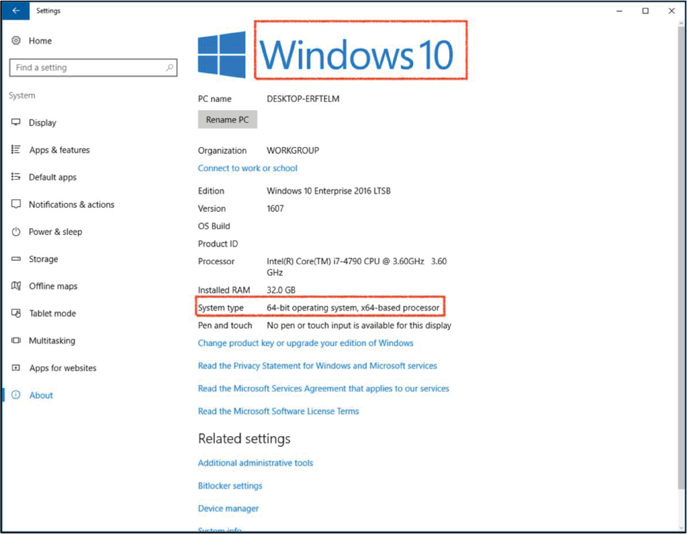
Long Description.
The screenshot showcases the settings page in a system running on Windows 10. The left side of the Home page lists options such as display, apps and features, default apps, notifications and actions, power and sleep, storage, offline maps, tablet mode, multitasking, apps for websites, and about. The About option is selected. The result page is titled Windows 10 and highlighted. The page shows the PC name, organization, edition, version, O S build, product I D, processor, installed RAM, system type, and pen and touch. The system type: 64-bit operating system, x64-based processor is highlighted. Another option titled Related Settings is shown at the bottom of the page.
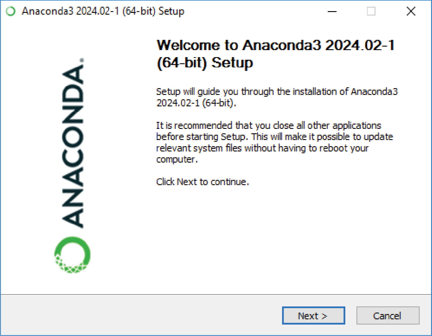
Long Description.
The screenshot is titled 'Anaconda3 2024.02-1 (64-bit) setup.' The dialogue box shows the logo of Anaconda and reads the following text: Welcome to Anaconda3 2024.02-1 (64-bit) setup. Setup will guide you through the installation of Anaconda3 2024.02-1 (64-bit). It is recommended that you close all other applications before starting Setup. This will make it possible to update relevant system files without having to reboot your computer. Click Next to continue. The end of the dialogue box shows two options, Next and Cancel.
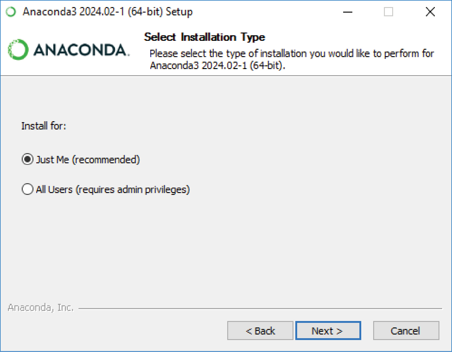
Long Description.
The screenshot is titled 'Anaconda3 2024.02-1 (64-bit) setup.' The dialogue box begins with the logo of Anaconda and reads the following text: Select Installation Type. Please select the type of installation you would like to perform for Anaconda3 2024.02-1 (64-bit). Install for: Just Me (recommended) option is selected. The other option, All Users (requires admin privileges), is not selected. The end of the dialogue box shows three options of Back, Next, and Cancel.

Long Description.
The screenshot is titled 'Anaconda3 2024.02-1 (64-bit) setup.' The dialogue box begins with the logo of Anaconda and reads the following text: Installation Complete. Setup was completed successfully. A completed bar in green followed by codings is shown. The end of the dialogue box shows three options of Back, Next, and Cancel where the Back and Cancel options are inaccessible.

Long Description.
The screenshot is titled 'Anaconda3 2024.02-1 (64-bit) setup.' The dialogue box begins with the logo of Anaconda and reads the following text: Anaconda3 2024.02-1 (64-bit). Code with Anaconda in the Cloud. Everything you love about Anaconda is now available from the cloud with Anaconda's fully loaded Jupyter notebook. No setup is required. Get started for free. Cide in the cloud with Anaconda Notebooks. The end of the dialogue box shows three options, Back, Next, and Cancel where the Back option is inaccessible.
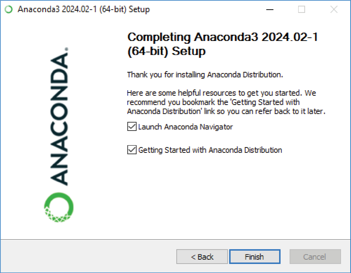
Long Description.
The screenshot is titled 'Anaconda3 2024.02-1 (64-bit) setup.' The dialogue box begins with the logo of Anaconda and reads the following text: Completing Anaconda3 2024.02-1 (64-bit) setup. Thank you for installing Anaconda Distribution. Here are some helpful resources to get you started. We recommend you bookmark the 'Getting Started with Anaconda Distribution' link so you can refer back to it later. Launch Anaconda Navigator and Getting started with Anaconda Distribution. Both options are selected. The end of the dialogue box shows three options Back, Finish, and Cancel where the Cancel option is inaccessible.
- Choose the installer. There are two most used Anaconda installer options: (1) Miniconda, which installs the basic packages and expects the user to install most of their own Python packages and requires 400 megabytes (MB) of disk space; (2) Anaconda Distribution, which will install the graphical user interface (GUI) application as well as the additional tools previously described and requires 3GB disk space to download and install. For Windows users, Windows 8.1 or newer is required for Python 3.9, and Windows Vista or newer is required for Python 3.8. More information is available at https://conda.io/projects/conda/en/latest/user-guide/install/index.html.
- Verify installation (optional).
- Double-click the .exe file and follow the series of instructions on the screen (as shown in Figure 27) and Anaconda Prompt (see Figure 28). Anaconda Navigator is an easy-to-use GUI application, while Anaconda Prompt is a terminal where one can type and execute code.
- Test the installation.
- In Anaconda Navigator, choose Environments from the left panel; all the installed environments will be displayed. In the screenshot shown in Figure 29, two are installed: base (root), which is the default environment installed with the software, and safety, which was installed by the research team. The list on the right shows all packages installed inside the corresponding environments.
- Environment and package information can also be verified in Anaconda Prompt, as shown in Figure 30. Typing conda env list and hitting enter will print all available environments. Executing conda list will print all installed packages in the current environment. All information should agree with the results shown in Anaconda Navigator.
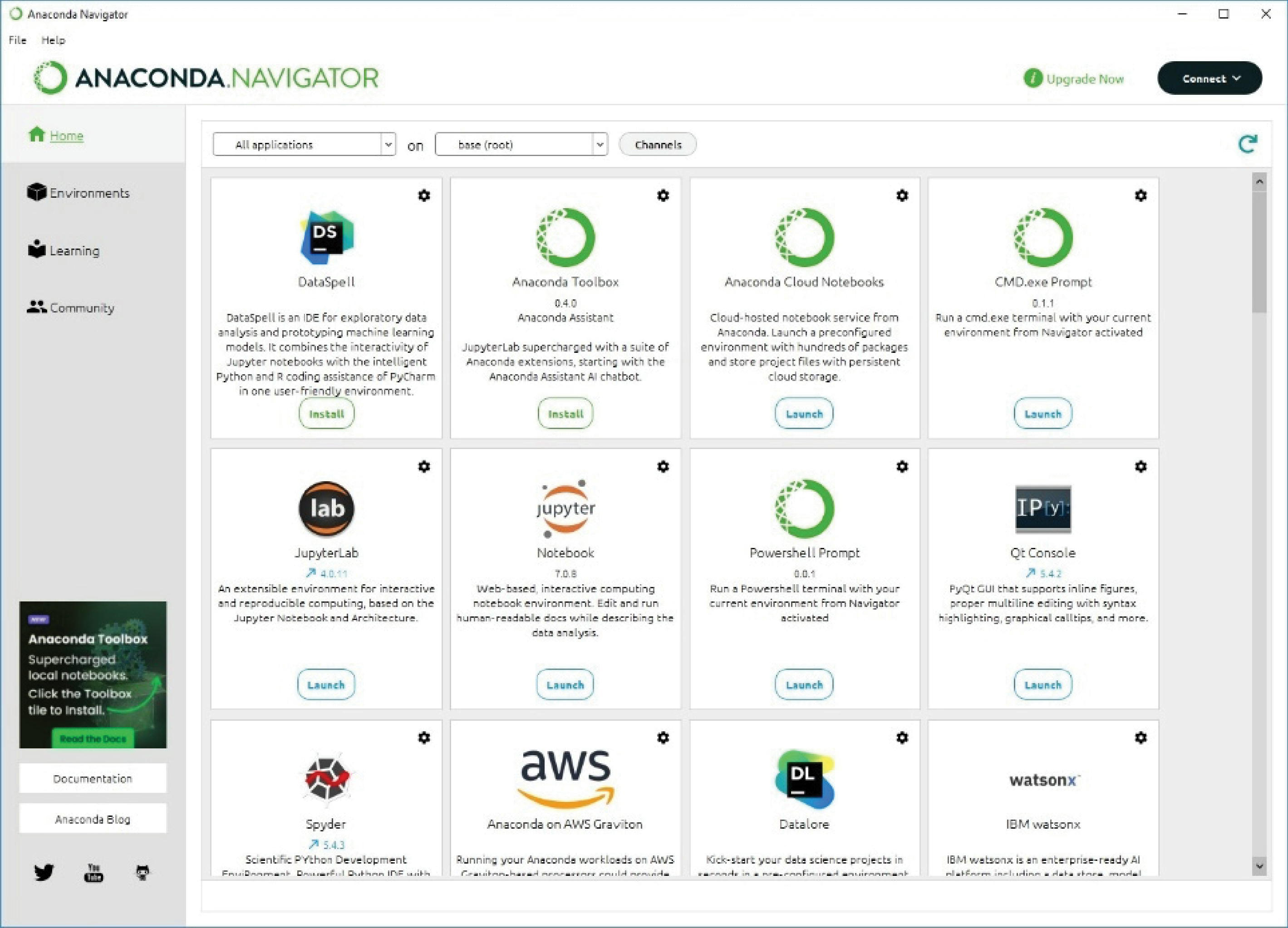
Long Description.
The screenshot is titled 'Anaconda Navigator' and begins with a ribbon of options of file, help, upgrade now, and connect. The left side of the page lists options of Home, Environments, Learning, and Community. The end of this section shows the social pages such as Twitter, YouTube, and GitHub. The Home option is selected which showcases 12 different software. They are Dataspell, Anaconda Toolbox, Anaconda Cloud Notebooks, CMD.exe.Prompt, JupyterLab, Jupyter Notebook, Powershell Prompt, Qt Console, Spyder, Anaconda on AWS Graviton, Datalore, and IBM Watson x.

- Manage environments and packages.
- Environments can be created, as many as the user likes. Each of them will host a separate set of packages, and the versions of these packages can be tailored.
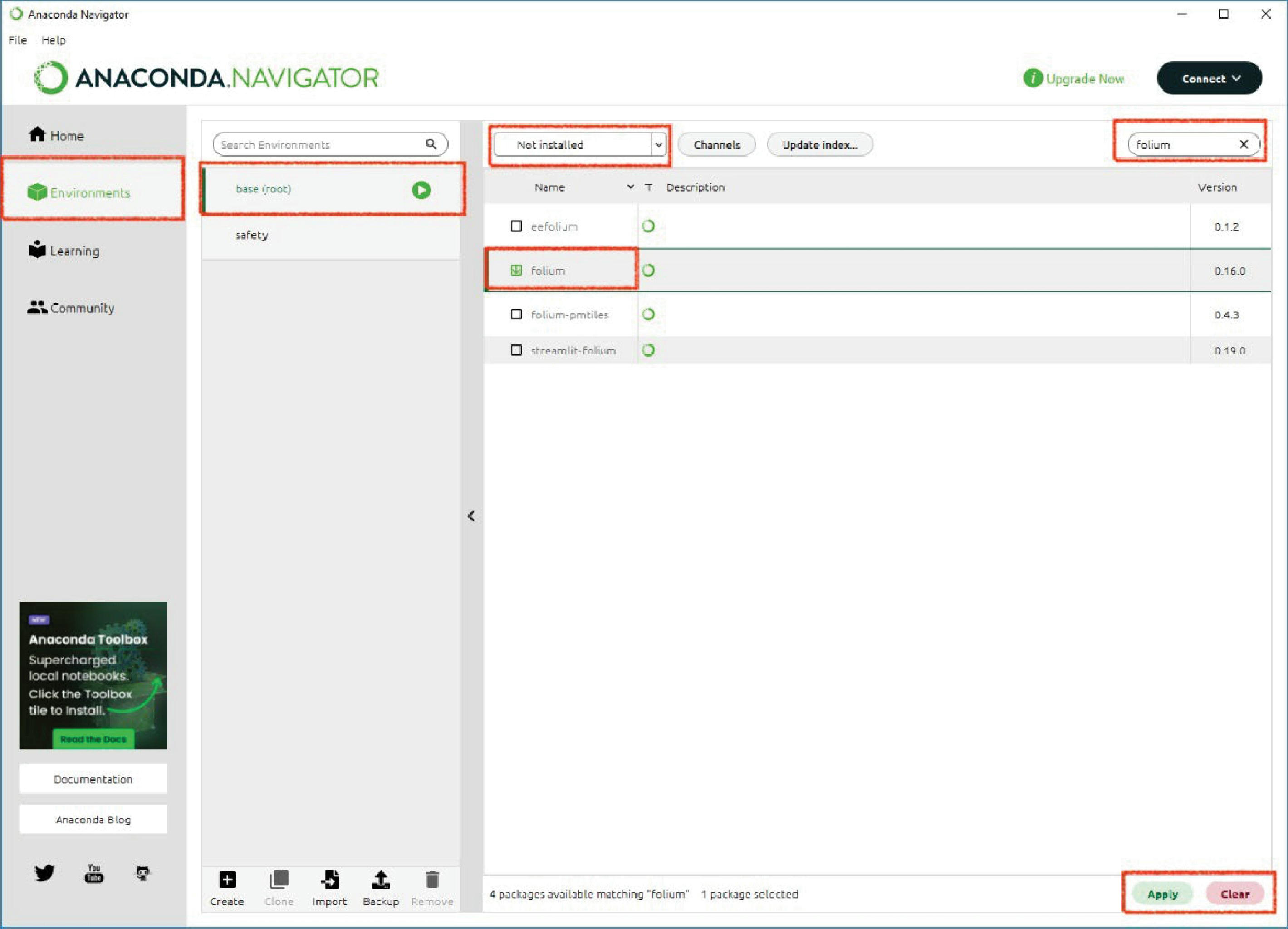
- In the Anaconda Navigator, to create a new environment (Figure 31), go to the Anaconda Navigator -> Environments -> Create; then name the new environment and select the appropriate Python version. To install a new package (Figure 32) to the selected environment, first check if itʼs installed already by typing in the package name and selecting “Installed” in the drop-down list. If no item is showing up, it means the package has not been installed. Then select “Not installed” in the dropdown list. If the package name is valid, relevant items will appear. Select the correct one and click “Apply” to finish the installation. Removing environments and packages is also straightforward: find and click the remove buttons.
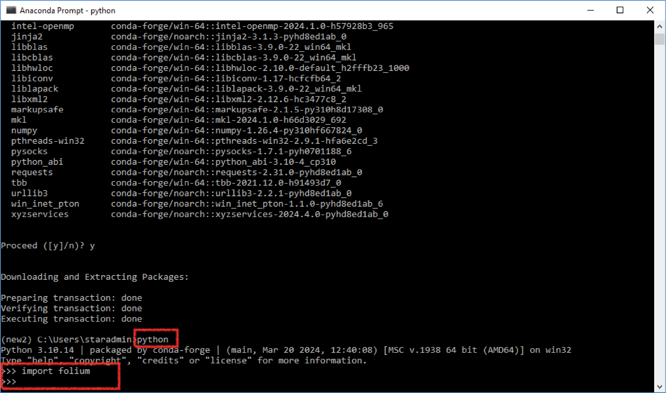
- Compared to the Navigator GUI, it is faster to perform the same tasks in Anaconda Prompt. To create a new environment (Figure 33), type conda create -n <name> <python = desired version>. Now the environment is installed but may not be activated. To activate it and deactivate it after use, type conda activate <name> and conda deactivate, respectively. To install a package in the environment (Figure 34), it is recommended to follow this format: conda install -c conda-forge <name of package>. The parameter -c conda-forge will force the program to search the package in a channel called conda-forge, which is a community-led collection of packages for the Conda package manager. This offers a broader array of software than the default Anaconda channel. It is maintained by contributors who manage and update packages quickly, ensuring wide compatibility across multiple platforms. Packages on this channel are also very reliable. Once the package is installed, a quick way to test the installation is to start a Python session (Figure 35) in this terminal by typing python. In the session, import the package as import <package name>. If no error is printed, the installation was successful, and the package is callable. For a complete list of conda commands like conda create and conda install, go to the Anaconda website (https://docs.conda.io/projects/conda/en/latest/commands/index.html).
Classified Vehicle Volume Using Loop Detector Data
Background and Goal
Classified vehicle volume is an important traffic operational input for transportation agencies. First, large vehicles such as trucks and buses have different operating characteristics compared to passenger cars, including slower acceleration, inferior braking, and larger turning radii. Adjusting traffic flow parameters for these vehicles is an essential step in optimizing roadway capacity and enhancing safety. Second, the impact of vehicles on pavement deterioration varies significantly with vehicle type, primarily due to differences in axle configurations and total weight. Accurate vehicle classification data allow for more precise estimation of pavement wear, leading to more cost-effective pavement design and maintenance strategies. Third, understanding the composition of traffic flow, including the proportion of heavy vehicles, is crucial for long-term transportation planning and infrastructure development. It influences decisions on roadway design, bridge structures, and investment in alternative transportation modes.
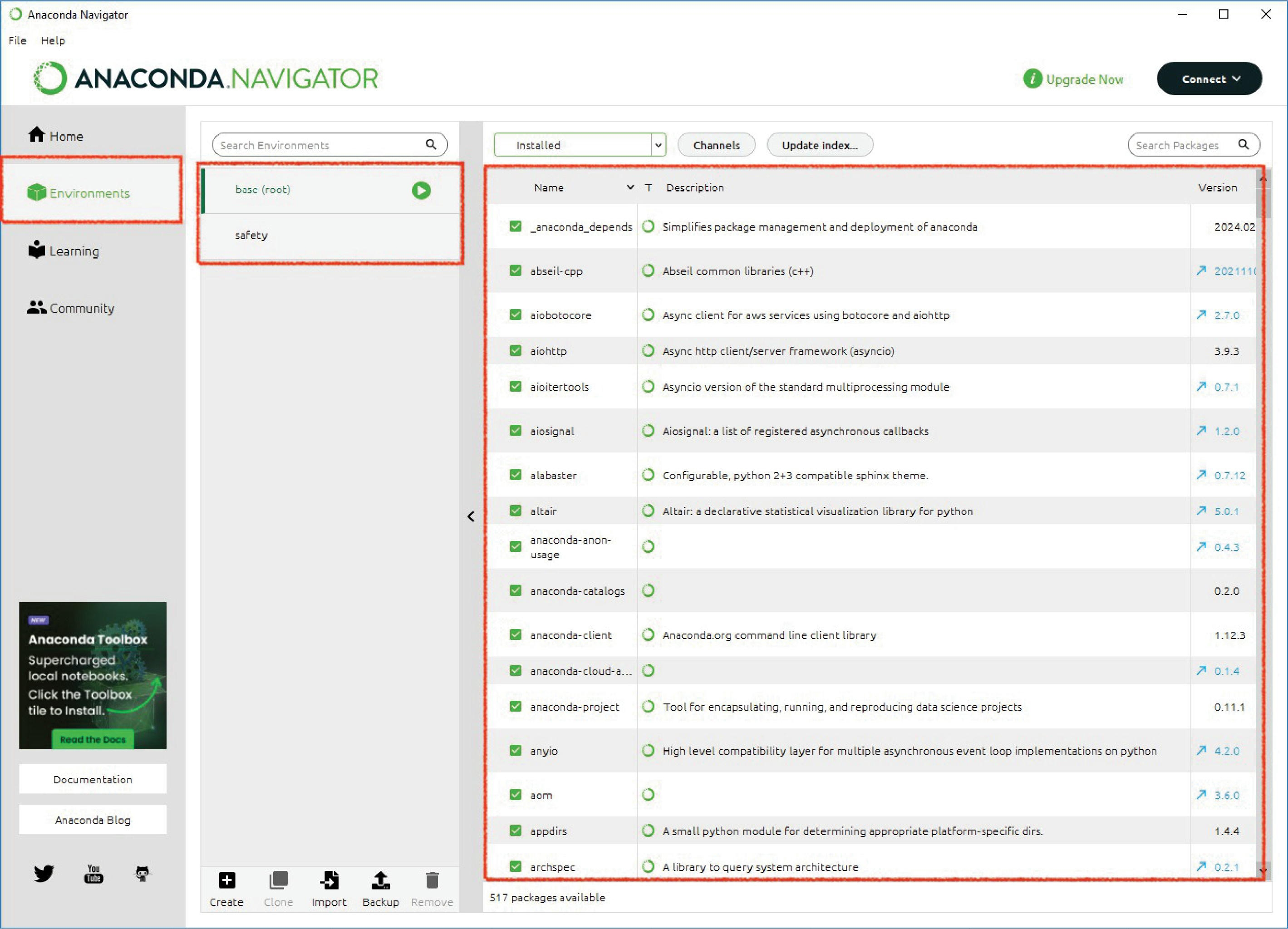
Long Description.
The screenshot is titled 'Anaconda Navigator' and begins with a ribbon of options of file, help, upgrade now, and connect. The page consists of three sections. The left side of the page housing the first section lists options of Home, Environments, Learning, and Community. The end of this section shows the social pages such as Twitter, YouTube, and GitHub. The Environment option is selected which showcases a search bar for searching environments in the second section. Base (root) and safety options are listed below the search bar. The end of this section shows five options create, clone, import, backup, and remove. The base (root) option is selected and showcases 17 installed software in the third section. Apart from installed software, channels and update index options are shown.
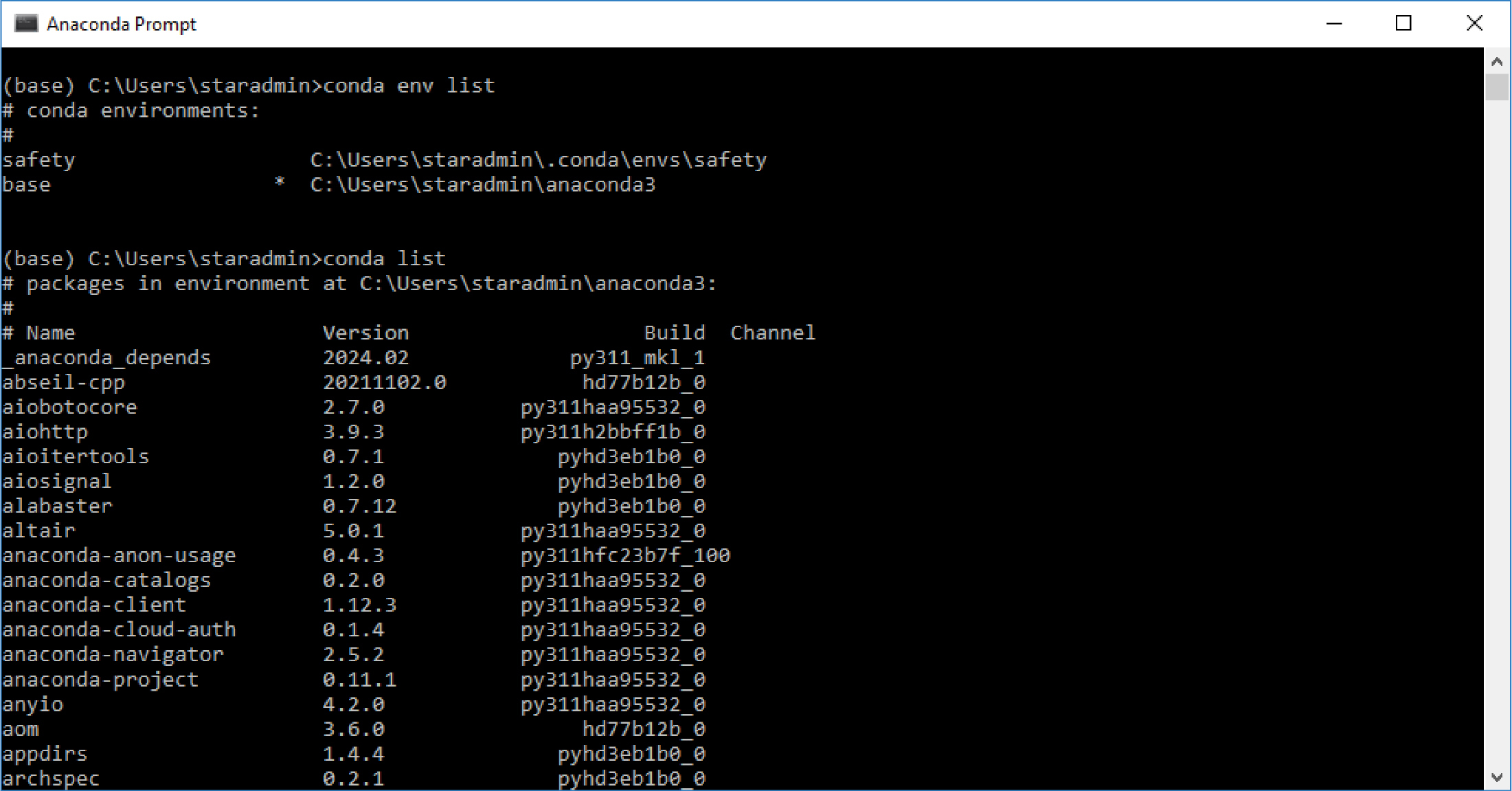
Long Description.
The screenshot is titled 'Anaconda Prompt' and shows a list of codes. The codin reads the following: (base) C:\Users\staradmin>conda env list # conda environments: # safety C:\Users\staradmin\.conda\envs\safety base * C:\Users\staradmin\anaconda3 (base) C:\Users\staradmin>conda list # packages in environment at C:\Users\staradmin\anaconda3: # # Name Version Build Channel _anaconda_depends 2024.02 py311_mkl_1 abseil-cpp 20211102.0 hd77b12b_0 aiobotocore 2.7.0 py311haa95532_0 aiohttp 3.9.3 py311h2bbff1b_0 aioitertools 0.7.1 pyhd3eb1b0_0 aiosignal 1.2.0 pyhd3eb1b0_0 alabaster 0.7.12 pyhd3eb1b0_0 altair 5.0.1 py311haa95532_0 anaconda-anon-usage 0.4.3 py311hfc23b7f_100 anaconda-catalogs 0.2.0 py311haa95532_0 anaconda-client 1.12.3 py311haa95532_0 anaconda-cloud-auth 0.1.4 py311haa95532_0 anaconda-navigator 2.5.2 py311haa95532_0 anaconda-project 0.11.1 py311haa95532_0 anyio 4.2.0 py311haa95532_0 aom 3.6.0 hd77b12b_0 appdirs 1.4.4 pyhd3eb1b0_0 archspec 0.2.1 pyhd3eb1b0_0
Loop detectors are widely adopted solutions due to their cost-effectiveness compared with alternatives. For example, weigh-in-motion (WIM) and other classification stations can be difficult and costly to maintain due to their complexities, thus, there may be a limited number of stations unable to cover the full highway system (Coifman 2009). Mounted traffic cameras are similarly limited. Dual-loop detectors work by utilizing two closely spaced inductive loop sensors embedded in the pavement of a roadway. These loops detect the presence of vehicles based on the disturbance of electromagnetic fields caused by the metal in the vehicle. They help classify vehicles based on four steps: vehicle detection, speed measurement, vehicle length measurement, and length-based classification. When a vehicle passes over the first loop, it causes a disturbance in the electromagnetic field. As the vehicle continues, it passes over the second loop, causing another disturbance. This event marks the completion of the vehicleʼs passage over the dual-loop system. Then, the system measures the time it took for the vehicle to travel from the first loop to the second loop and calculates the speed by dividing the known distance between the two loops by the elapsed travel time. Based on the estimated speed and occupancy time on each loop, the system calculates the vehicleʼs length. The length can be determined by considering the vehicleʼs speed and the time interval between the activation of the first loop and the deactivation of the second loop. Finally, based on the estimates, vehicle lengths are categorized following predefined length ranges.
Contrasted with dual-loop detectors, single-loop detectors can measure vehicle count and lane occupancy but cannot measure vehicle lengths. Thus, they are unable to provide classified vehicle volumes. However, single-loop detectors are ubiquitously available on highway networks and promise to be an inexpensive alternative for distributing classification coverage through existing count stations and traffic operations detectors. Therefore, using single-loop measurements to estimate classified vehicle volumes is of practical significance. The goal of this tool is to demonstrate how AI/ML can be used to model classified vehicle volume with single-loop detector data. In other words, this tool seeks to enable an extension to these existing detector stations. By extending classification to the relatively high density of real-time traffic monitoring stations in urban areas, these urban traffic management systems could better monitor freight traffic within metropolitan areas, as shown in Figure 36.
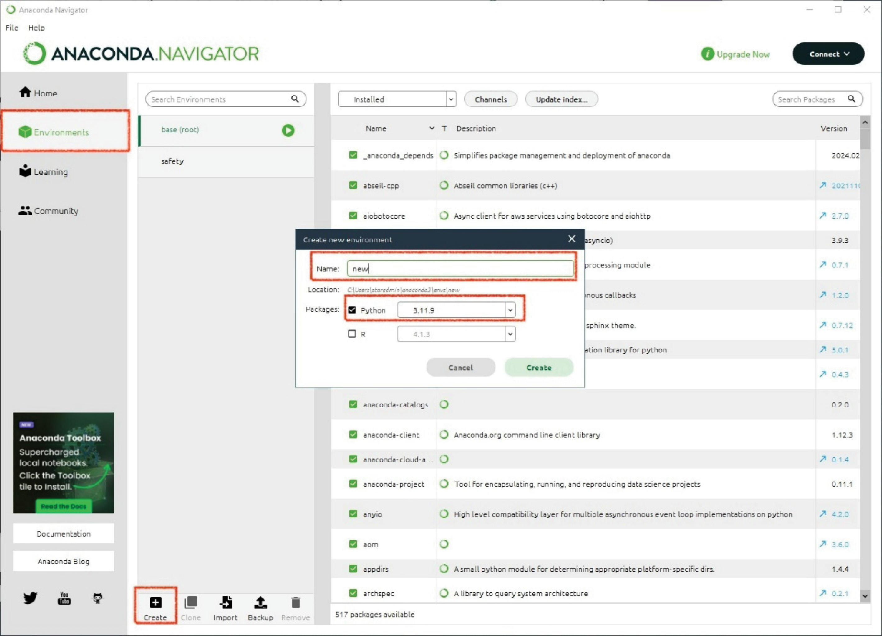
Long Description.
The screenshot is titled 'Anaconda Navigator' and begins with a ribbon of options of file, help, upgrade now, and connect. The page consists of three sections. The left side of the page housing the first section lists options of Home, Environments, Learning, and Community. The end of this section shows the social pages such as Twitter, YouTube, and GitHub. The Environment option is selected and highlighted which showcases a search bar for searching environments in the second section. Base (root) and safety options are listed below the search bar. The end of this section shows five options create (highlighted), clone, import, backup, and remove. The base (root) option is selected and showcases 17 installed software in the third section. Apart from installed software, channels and update index options are shown. A dialogue box titled 'Create new environment' is shown. The box lists the name, location, and packages where the name and package options are highlighted.
Long Description.
The screenshot is titled 'Anaconda Navigator' and begins with a ribbon of options of file, help, upgrade now, and connect. The page consists of three sections. The left side of the page housing the first section lists options of Home, Environments, Learning, and Community. The end of this section shows the social pages such as Twitter, YouTube, and GitHub. The Environment option is selected and highlighted which showcases a search bar for searching environments in the second section. Base (root) and safety options are listed below the search bar. The base (root) option is highlighted. The end of this section shows five options create, clone, import, backup, and remove. The base (root) option is selected and showcases 4 uninstalled software in the third section. The uninstalled option is highlighted. The Find option reads 'Folium.' Out of the four uninstalled software, the folium package is highlighted.

Long Description.
The screenshot is titled 'conda create -n new2 python=23.10.' The screenshot shows the following coding: (base) C:\Users\staradmin>conda create -n new2 python=3.10 Channels: - conda-forge - defaults Platform: win-64 Collecting package metadata (repodata.json): done Solving environment: done ## Package Plan ## environment location: C:\Users\staradmin\anaconda3\envs\new2 added / updated specs: - python=3.10 The following NEW packages will be INSTALLED: bzip2 conda-forge/win-64::bzip2-1.0.8-hcfcfb64_5 ca-certificates conda-forge/win-64::ca-certificates-2024.2.2-h56e8100_0 libffi conda-forge/win-64::libffi-3.4.4-h877e710_0 libsqlite conda-forge/win-64::libsqlite-3.45.3-hcfcfb64_0 libzlib conda-forge/win-64::libzlib-1.2.13-hcfcfb64_5 openssl conda-forge/win-64::openssl-3.0.13-hcfcfb64_1 pip conda-forge/noarch::pip-24.0-pyhd8ed1ab_0 python conda-forge/win-64::python-3.10.13-h4de0772_0_cpython setuptools conda-forge/noarch::setuptools-69.5.1-pyhd8ed1ab_0 tk conda-forge/win-64::tk-8.6.13-h5226925_1 tzdata conda-forge/noarch::tzdata-2024a-h0c530f3_0 ucrt conda-forge/win-64::ucrt-10.0.22621.0-h57928b3_0 vc conda-forge/win-64::vc-14.3-hcf57466_18 vc14_runtime conda-forge/win-64::vc14_runtime-14.38.33130-h82b7239_18 vs2015_runtime conda-forge/win-64::vs2015_runtime-14.38.33130-hcb4865c_18 wheel conda-forge/noarch::wheel-0.43.0-pyhd8ed1ab_1 xz conda-forge/win-64::xz-5.2.6-hd8d14728_0 Proceed ([y]/n)? The conda create -n new2 python-3.10 is highlighted.
Data
Loop detector data in Table 4 was retrieved from Digital Roadway Visualization and Evaluation Network (DRIVE Net) (http://drivenet.uwstarlab.org/), which was developed by the University of Washingtonʼs Smart Transportation Applications and Research (STAR) Lab. It ingests over 50 million lines of loop-detector data each day from the WSDOT sensing system deployed over Puget Sound area freeways since 2007. Data from two stations were selected from 2023.
Pipeline
In the WSDOT dual-loop detection system, vehicles are classified into four categories based on their lengths. In Table 5, Bin 1 represents vehicles shorter than 20 ft, Bin 2 includes vehicles from 20 ft to 42 ft long, Bin 3 vehicle lengths range from 42 ft to 72 ft, and Bin 4 contains vehicles longer than 72 ft and shorter than 115 ft. These classifications are implemented at loop detector stations, and the data retrieved from the online portal includes the classified vehicle volume. Depending on the readerʼs system configuration, the data downloadable from online portals could be aggregated every 20 seconds, 30 seconds, or 5 minutes.

Long Description.
The screenshot is titled 'Anaconda prompt - conda install-c conda-forge folium.' The screenshot shows the following coding: (base) C:\Users\staradmin>conda activate new2 (new2) C:\Users\staradmin>conda install -c conda-forge folium. The 'conda activate new2' in row 1 and 'onda install -c conda-forge folium' in row 2 are highlighted. This is followed by the coding: Channels: - conda-forge - defaults Platform: win-64 Collecting package metadata (repodata.json): done Solving environment: done ## Package Plan ## environment location: C:\Users\staradmin\anaconda3\envs\new2 added / updated specs: The next section shows the following packages that will be downloaded and lists around 22 packages and their build. The end of the screenshot shows two new packages that will be installed.
Note that loop data could be processed for quality control purposes, e.g., missing data imputation for speed records. However, they still need to be preprocessed for the purpose of this research. One typical outlier for classified vehicle volume is negative values for several or all bins. This could be due to sensor malfunction or the corresponding speed, occupancy, and volume records have been imputed by previous quality control steps.
After the data is properly preprocessed, the user starts scoping the AI/ML model and its training based on data availability and existing knowledge. The first thing to consider is what features to include. Because loop detector data may be available every 20 seconds, 30 seconds, or 5 minutes, the corresponding model will have different predictive capabilities. Temporal and spatial correlation are also factors to consider if the agency is interested in knowing how classified volumes are correlated across time and with nearby stations. To model these additional features, more complex structures of the neural network need to be adopted, e.g., recurrent neural networks and graph neural networks.
Long Description.
The screenshot is titled Anaconda Prompt - python and shows 20 rows of ruby coding such as intel-open m p, jinja2, libblas, lib c blas, lib f f i, lib g fortran5, lib icon v, lib l a pack, lib s q lite, lib z lib, markupsafe, m k l, numpy, p threads-win32, pysocks, python_abi, requests, t b b, u r l lib3, win_inet_p ton, and x y z services. This leads to the following code of Proceed ([y]/n)? y Downloading and Extracting Packages: Preparing transaction: done Verifying transaction: done Executing transaction: done (new2) C:\Users\staradmin>python Python 3.10.14 | packaged by conda-forge | (main, Mar 20 2024, 12:40:08) [MSC v.1938 64 bit (AMD64)] on win32 Type "help", "copyright", "credits" or "license" for more information. >>> import folium >>>
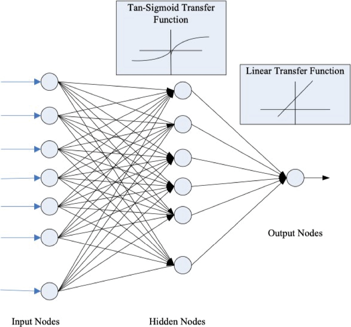
In this report, the research team demonstrated a basic neural network that ingests features from the single-loop detector and predicts the classified vehicle volume at the same time steps. This means that the presented model does not account for any temporal or spatial relationships. As shown in Figure 37, the number of input elements corresponds to the number of features available from the loop detector data. Here are some examples to illustrate:
- If the loop detector data is reported every 5 minutes, and the available features are speed, volume, and occupancy, there will be three input elements.
- If the data is reported every 30 seconds and the user wants to use speed, volume, and occupancy data from the last five minutes, the number of input elements will be 3 ∗ (60/30) ∗ 5 = 30.
- If the data is reported every 20 seconds and the user wants to use speed, volume, and occupancy data from the last 5 minutes, the number of input elements will also be 3 ∗ (60/20) ∗ 5 = 45.
- If the data is reported every 30 seconds and the user wants to use speed, volume, and occupancy data from the last 3 minutes, the number of input elements will be 3 ∗ 2 ∗ 3 = 18.
The optimal number of hidden nodes in the neural network will be determined through trial and error or based on existing knowledge of the problem. The final configuration is the number of output neurons, which depends on how the vehicle volumes are modeled:
- If the vehicle volumes in the four bins are modeled separately, there will be one output neuron.
- If the volumes are modeled together but given different weights when calculating errors, there will be four output neurons.
Before training the neural network, a train-test split is conducted to ensure that the model is evaluated on unseen data.
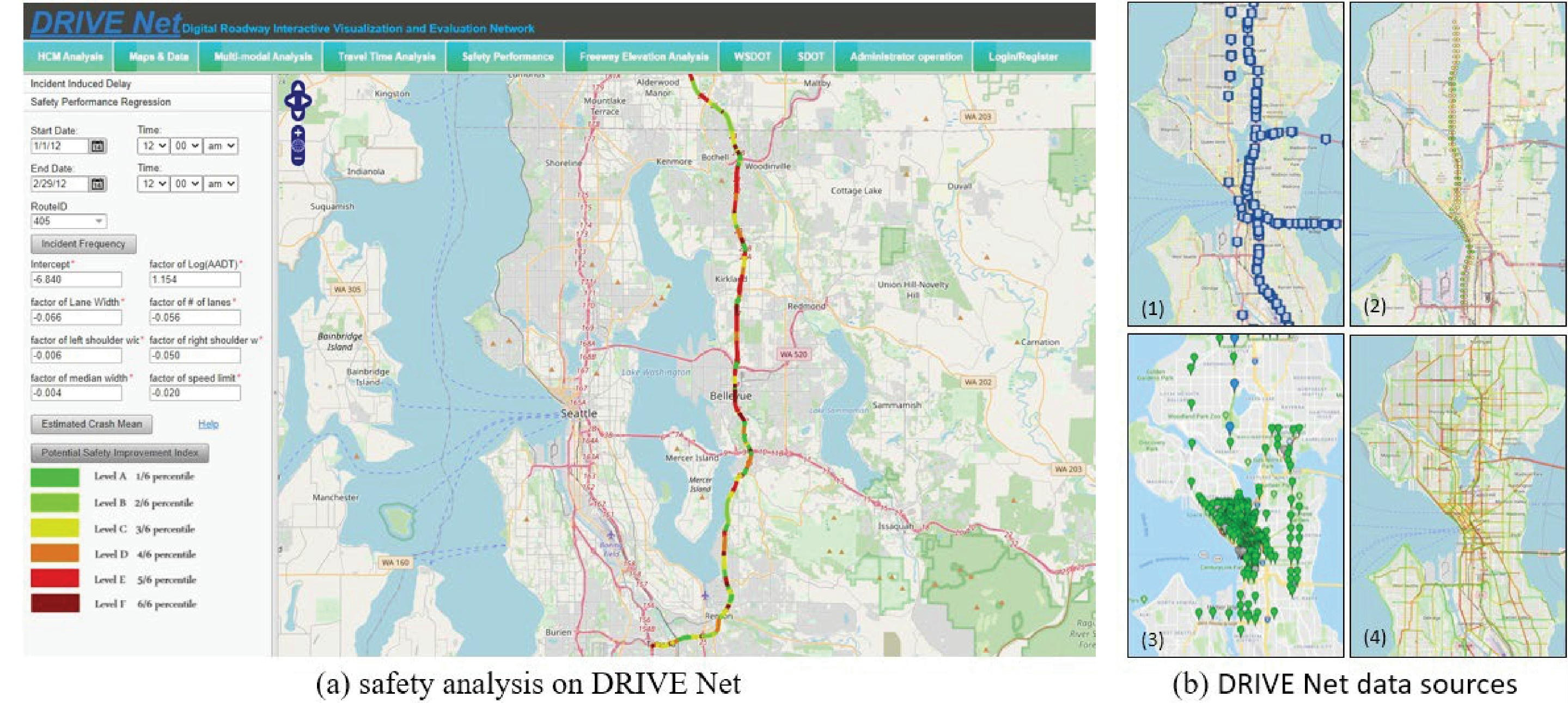
Source: DRIVE Net (http://drivenet.uwstarlab.org/ retrieved April 2024)
Long Description.
Part A, Safety analysis on DRIVE Net: The screenshot is titled DRIVE Net Digital Roadway Interactive Visualization and Evaluation Network. It begins with a tab of 10 options such as HCM analysis, maps and data, multi-model analysis, travel time analysis, safety performance, freeway elevation analysis, WSDOT, SDOT, administrator operation, and log-in or registers. The left side of the screenshot lists incident-induced delay and safety performance regression followed by several numerical data. The right side of the screenshot shows a map with a network of lines marked in different colors. Part B, DRIVE Net data sources: This shows four maps of the same location where the same network is represented by different markings. In map 1, the network is marked in blue. In map 2, the network is marked in lines of yellow and red. In map 3, the locations are marked by location pins in green. In map 4, the network is marked by lines of yellow and red with several branches.
Station code |
Location |
Lane No. (from right)* |
Dual-loop code |
Single-loop code |
|---|---|---|---|---|
005es17458 |
NB I-5 & NE 145th St. |
1 |
_MN__T1 |
_MN__1 |
005es18449 |
SB I-5 & 156th St. SW |
1 |
_MS__T1 |
_MS__1 |
|
Data source: DRIVE Net (http://drivenet.uwstarlab.org/ retrieved April 10, 2024) * Lane 2 was not included because classified vehicle volume was not reported for the selected year. |
||||
Class |
Range of Length |
Vehicle Type |
|---|---|---|
Bin 1 |
Less than 20 ft |
Cars, pickups, and short single-unit trucks |
Bin 2 |
From 20 ft to 42 ft |
Cars and trucks pulling trailers and long single-unit trucks |
Bin 3 |
From 42 ft to 72 ft |
Combination trucks |
Bin 4 |
From 72 ft to 115 ft |
Multi-trailer trucks |
Long Description.
The illustration shows seven circles representing Input nodes. They lead to six circles labeled Hidden nodes. Each circle from the Input Node leads to a circle in the Hidden node. The Tan-Sigmoid Transfer function is marked in this step. The third step shows arrows from the six circles leading to a circle marked Output nodes. The Linear Transfer Function is marked in this step.
Results
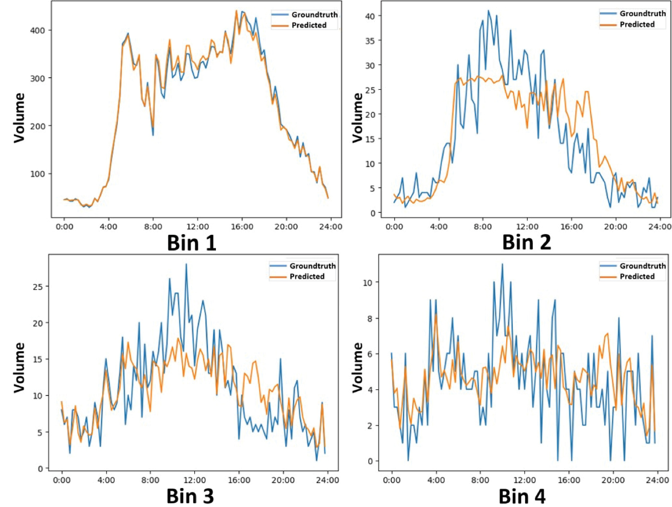
Classified vehicle volumes vary per lane and site. In addition, volumes in Bins 2 to 4 at the two chosen sites have significant variation over time. Therefore, different models are trained for each bin, lane, and site combination, such as those shown in Table 6.
The model performs better for Bin 1ʼs volume (see Figures 38 and 39).
Timestamp |
Speed |
Volume |
Occupancy |
Bin 1 |
Bin 2 |
Bin 3 |
Bin 4 |
|---|---|---|---|---|---|---|---|
2023-01-01 00:00:00 |
60.0 |
25 |
2.2 |
25 |
1 |
1 |
0 |
2023-01-01 00:05:00 |
60.0 |
22 |
1.8 |
22 |
0 |
0 |
0 |
2023-01-01 00:10:00 |
60.0 |
17 |
1.4 |
20 |
0 |
0 |
0 |
2023-01-01 00:15:00 |
60.0 |
33 |
2.6 |
30 |
0 |
0 |
0 |
2023-01-01 00:20:00 |
60.0 |
47 |
3.6 |
47 |
0 |
0 |
0 |

Notes: Groundtruth: observed or actual values; Predicted: predicted values.
Long Description.
In all four graphs, the horizontal axes show bin timings of 1, 2, 3, and 1 respectively from 0:00 to 24:00 in increments of 4 hours. The vertical axes for graphs 1 to 3 show volume from 0 to 300 in increments of 50. The vertical axis for graph 4 shows volume from negative 1 to 7 in increments of 1. Each graph consists of two lines representing truth and pred. The data given in the graphs are as follows: Graph 1, Bin1: The truth line begins at (0:00, 20) and ends at (24:00, 30). The pred line begins at (0:00, 20) and ends at (24:00, 30). Graph 2, Bin2: The truth line begins at (0:00, 1) and ends at (24:00, 0). The pred line begins at (0:00, 1) and ends at (24:00, 1.5). Graph 3, Bin3: The truth line begins at (0:00, 1.5) and ends at (24:00, 2). The pred line begins at (0:00, 1.5) and ends at (24:00, 1.8). Graph 4, Bin1: The truth line begins at (0:00, 1) and ends at (24:00, 1). The pred line begins at (0:00, 0) and ends at (24:00, 1.1). Note that the coordinate values are approximate.
Notes: Groundtruth: observed or actual values; Predicted: predicted values.
Long Description.
In all four graphs, the horizontal axes show bin timings of 1, 2, 3, and 1 respectively from 0:00 to 24:00 in increments of 4 hours. In graph 1, the vertical axis shows volume from 0 to 400 in increments of 100. In graph 2, the vertical axis shows volume from 0 to 40 in increments of 5. In graph 3, the vertical axis shows volume from 0 to 25 in increments of 5. In graph 4, the vertical axis shows volume from 0 to 10 in increments of 2. Each graph consists of two lines representing truth and pred. The data given in the graphs are as follows: Graph 1, Bin1: The truth line begins at (0:00, 35) and ends at (24:00, 40). The pred line begins at (0:00, 35) and ends at (24:00, 40). Graph 2, Bin2: The truth line begins at (0:00, 1) and ends at (24:00, 3). The pred line begins at (0:00, 4.5) and ends at (24:00, 2.5). Graph 3, Bin3: The truth line begins at (0:00, 9.8) and ends at (24:00, 2.5). The pred line begins at (0:00, 9.9) and ends at (24:00, 2.8). Graph 4, Bin1: The truth line begins at (0:00, 6) and ends at (24:00, 1.2). The pred line begins at (0:00, 5.9) and ends at (24:00, 1.9). Note that the coordinate values are approximate.
Using the Tool
This tool is implemented in Python and does not require GPU computing resources. Therefore, it can run on any computer with Python and several packages properly set up (e.g., PyTorch, Pandas, Scikit-learn, Statsmodels, OpenCV, Flask). The tool is used by calling python loop.py in terminal, where all preprocessing, data wrangling, and modeling are included. Figure 40 shows the command used to run the terminal, though additional visualizations are needed to effectively illustrate the results.

Long Description.
The screenshot is titled loop - .z s h - 87x8. The coding reads, (base) -- She ¬ % conda activate loop. (loop) sh u loop % python loop.py --site 005es17450 --direction N --lane 1.
Discussion
As previously stated, there are several factors to consider for the modelʼs transferability. Congested conditions can be singled out and studied separately, whereas the model for this study considered data covering an entire year, with predominantly low to moderate truck volume. The preprocessing steps include basic quality control steps, but do not have other data sources to validate the aggregate dual-loop detector measurements. In other studies, researchers use traffic cameras to further validate classified volumes. Optimal neural network structures can vary per bin, lane, site, and even time frame, because this model is based on data rather than physics. This could be an issue that limits the modelʼs transferability. In other words, agencies should understand their operational data and then decide how many models to build for which sites.
Turning Movement Counts Using CVD
Background and Goal
TMC quantifies the movement of vehicles through an intersection at a given time. These data are essential for traffic analysis and the planning of road infrastructure improvements. These counts help users understand traffic flow patterns at intersections, which is crucial for signal timing, intersection design, and road safety.
There are multiple ways to collect TMC data at intersections, each offering unique insights into traffic flow and behavior. Traditionally, this data is collected by manual counting, where individuals stationed at intersections record vehicular movements. This method, while straightforward, demands significant human resources and is prone to human errors. Because manual counting is very laborious and costly, the scope is extremely limited, and it is impossible to provide coverage at scale either spatially or temporally. For example, manual data collection is often limited to a day or two per year, and to particular times of day (e.g., peak hours only). With technological advancements, video analysis emerged as a promising alternative. Video analysis involves the mounted traffic cameras capturing continuous footage of traffic movements and the subsequent analysis to extract vehicle counts and movement directions. The advancement of video analysis enables the transition from manual review to sophisticated automated systems that leverage CV algorithms to identify and classify different types of vehicles and their turning movements (Ali et al. 2023, and Howlader et al. 2024). This automation not only enhances accuracy but also allows for extended monitoring periods without the need for constant human oversight. Another notable method involves the use of pneumatic tubes, which, although more commonly associated with straight-through traffic volume counts, can be arranged to deduce turning movements. These tubes, when driven over, register the passage of vehicles. By strategically placing them across different lanes, it is possible to infer turning movements based on the sequence and timing of activations. Another emerging method to collect TMC data leverages Bluetooth and Wi-Fi signals of mobile devices. By detecting signals from devices within vehicles as they move through intersections, it is possible to trace paths and determine turning movements. This method captures data over larger areas but may involve the identification of individual devices and raise privacy concerns. To achieve accurate TMC estimates, sensors would need to be installed near intersections to capture signals.
Compared to these data collection methods that are limited in scale and require sensor installation, GPS data from smartphones or connected vehicles are becoming increasingly more promising. By aggregating anonymized location data from users as they navigate through intersections, detailed patterns of movement can be discerned. This approach is particularly valuable for large-scale studies, offering insights across extensive networks with minimal physical infrastructure requirements. The challenge with this data source is the limitation of the penetration rate of devices, i.e., the percentage of the population recorded in the dataset, contrasted with traffic cameras that record all road users.
The goal of this section is to explore and validate principled pipelines applied to connected vehicle GPS data for TMC data at intersections. The differences between CVD and smartphone GPS data will also be briefly discussed.
Data
There are many reasons to use CVD data over smartphone GPS data. CVD is completely vehicle-based and thus can theoretically upload all telematic attributes captured by onboard sensors, including braking/acceleration, occupancy, signal, windshield wiper use, speed, and heading. Many of these features can directly serve safety research and very likely have never been made available at scale before. CVD data is almost always of higher quality because vehicle-based sensors are much more resistant to disturbances that may have confused smartphones. CVD shows a clear start and stop from the vehiclesʼ ignition status, thus, there is no need to infer the home and/or work location of the owners. This better preserves their privacy because there is no device/vehicle identifier, only trip IDs. Because of its privacy-preserving nature, CVD can be theoretically obtained at lower prices, although many other factors also affect the market. There are two aspects in which CVD data are not superior to smartphone GPS data. The first issue with CVD is that it contains only vehicle-based trips and thus no VRUs. While this is not a technical problem, CVD alone depicts only part of the picture of mobility. It leaves out pedestrians and other VRUs, which were more prevalent during the pandemic. This increased the interest of agencies and researchers in the movement of VRUs. The second issue with CVD is the potential data bias of newer vehicle models and passenger vehicles, because only new vehicle models can transmit data and are considered “connected.” There is little understanding of the brands and user populations the CVD represents.
In this analysis, the research team obtained CVD from a national vendor. The dataset contains trajectory points sampled every 3 seconds in an urban environment. The spatial accuracy is good, and the localization error is generally within 10 ft. This example investigates 1,321 trajectories that passed through the intersection, as shown in Figure 41, where the trajectory points are colored by speed: the brighter the color, the faster the spot speed.

Long Description.
The illustration shows an intersection that is plus-shaped. The plus-shaped structure is marked by multiple plots in purple and green. A few plots are extended towards the streets next to the intersecting roads.
Method A: Geofencing
The intuition behind this method is to set up virtual boundaries, i.e., geofences, as “detectors” on the approaches entering and exiting the intersection to identify trajectories that follow predefined patterns. For example, to detect NB-R movements, two virtual detectors are needed: one on the east approach (E-detect) and one on the south approach (S-detect) of the intersection. If a trajectory enters the S-detect first and then the E-detect, this trajectory is very likely a NB-R movement, while the edge case could be that the vehicle did not use the intersection. This edge case corresponds to Figure 42 (left), where the trajectory uses both the S-detect and E-detect but uses an alley rather than the intersection; this alley goes around a hotel, located at the southeastern corner of this intersection. A similar idea can be applied to detecting straight movements. In Figure 42 (right), SB-T and NB-T movements are identified by setting up the N- and S-detect.
The locations and sizes of the virtual detectors are set up by users. If GPS data are collected with high fidelity at the study location, dispersion of trajectory points will be limited, and the points of one driving direction will not interfere with those in the opposite direction. In this case, a smaller-sized virtual detector can be used to identify specific movements. However, if there is a risk that GPS trajectory points are mixed up occasionally with those in the opposite driving direction (for instance, in the example shown in Figure 42b) smaller virtual detectors will introduce false positives, and it is advisable to use larger detectors to identify pairs of movements, such as WB-L and SB-R. It is not difficult to tell WB-L and SB-R apart by checking their headings afterwards. It is generally recommended that a virtual detectorʼs size account for the operating speed of the corresponding approaches. In this example, the speed limit of the westbound approach is 35 mph. Considering the CVD sampling rate is every 3 seconds on average, the width of E-detect should be set as (35 + 7) mph ∗ 3s = 184.8 ft. The additional 7 mph is added based on Institute of Transportation Engineers recommendations to account for realistic operating speeds.
The other sensitivity is rooted at the edge case mentioned earlier. The intersection presented in this example is complex, with many bypass opportunities. A fast-food restaurant is at the southwest corner, which has a parking lot and drive-through lanes; a hotel is at the southeast corner,

(a) WB-L and SB-R movements
(b) SB-T and NB-T movements.
Long Description.
The first illustration shows an intersection of two roads forming a plus symbol. The plotted markings are from the road on the south towards the east. The plots in the south are marked S-detector while the plots in the east are marked E-detector. The second illustration shows an intersection of two roads forming a plus symbol. The plotted markings are from the road on the south towards the north. The plots in the south are marked S-detector while the plots in the north are marked N-detector. The plots form two parallel lines along the vertical road.
with an alley allowing for a shortcut between S-detect and E-detect; another fast-food restaurant is at the northeast corner, allowing for shortcuts between E-detect and N-detect. The pipeline only filters or selects by the start and end points of trajectories and does not consider the paths in the middle. This risks false positives and misclassifications. For example, as discussed in the next method, there are cases when drivers make the wrong maneuver at the intersection and need to take multiple additional turns to reach the destination. A trajectory including NB-T + U-turn + SB-L can be classified as NB-R.
To apply this method, the tool needs the userʼs intersection location as well as the latitude/longitude coordinates of the detectors. Intersection location is used for preliminary filtering of GPS data that appears close enough to the intersection, while the coordinates of the detectors will define the geofences. After providing these parameters, data will be wrangled to identify the trajectories that appear exactly once in each of the two detectors, and the filtered trajectories will further be split based on vehicle heading. A full flowchart is presented below in Figure 43.
Method B: Open-Source Tool
OSRM is a high-performance routing engine designed to provide the shortest paths in a road network. It is open-source and free, making it a popular choice among developers and businesses that need to incorporate routing functionalities into their applications or services. OSRM operates on data from the OSM project, which is a collaborative project that aims to create a free editable map of the world. The routing engine is optimized for speed and can handle large datasets efficiently, making it suitable for real-time applications. It supports several routing services, including point-to-point shortest path calculations, route optimization for multiple waypoints (trip service), and nearest neighbor searches. A flowchart of the OSRM tool is shown in Figure 44.
One of the key features of OSRM is its map matching API, which aligns GPS points to the road network in the most probable way. This is particularly useful for applications that track vehicle movements or for any scenario where GPS data is collected outside of the controlled conditions of laboratory tests. The map matching API takes noisy GPS traces and snaps them onto the road network using a Hidden Markov Model. The result is a clean path that closely follows the actual road layout, even if the original GPS data has significant noise or inaccuracies. This API is invaluable for applications requiring high-quality route tracking, historical route analysis, or improving the accuracy of real-time vehicle tracking systems. It enables more precise and reliable data analysis by ensuring the route information matches the real road network as closely as possible.
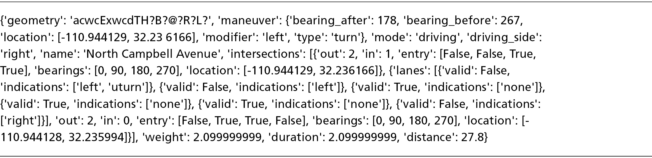
The value of this method is that it considers the full path and the trajectory points contained, eliminating many misclassifications and false positives, as in the geofencing method. The OSRM API receives calls that follow predefined formats. Coordinates in latitude and longitude pairs are passed in as parameters, delimited by semicolons, with several parameters. The returned result includes success codes, mapped trace points, and corresponding matchings. One example step in the response illustrated in Figure 46a shows the complexity of the returned message. Out of all keywords, a left turn is highlighted in red. This demonstrates that the algorithm is sufficiently confident that the trajectory contains a left turn. Similarly, to detect right turns, keywords such as ‘type’: ‘turn’ are sought. An additional check involves looking for any uncommon names indicating alleys and bypasses. For example, in our case, the major arterials are E Speedway Blvd and N Campbell Ave. Any other street names that do not correspond to any forms of the arterial names are indicators of bypasses.
The major issues with this method are three-fold. First, unlike the geofencing method, which looks for bounded trace points and then finds their corresponding trajectories, this map matching method processes trajectory by trajectory. This means not only do traces need to be singled out from the data lake, they also need to be sorted in chronological order and passed linearly to the server.
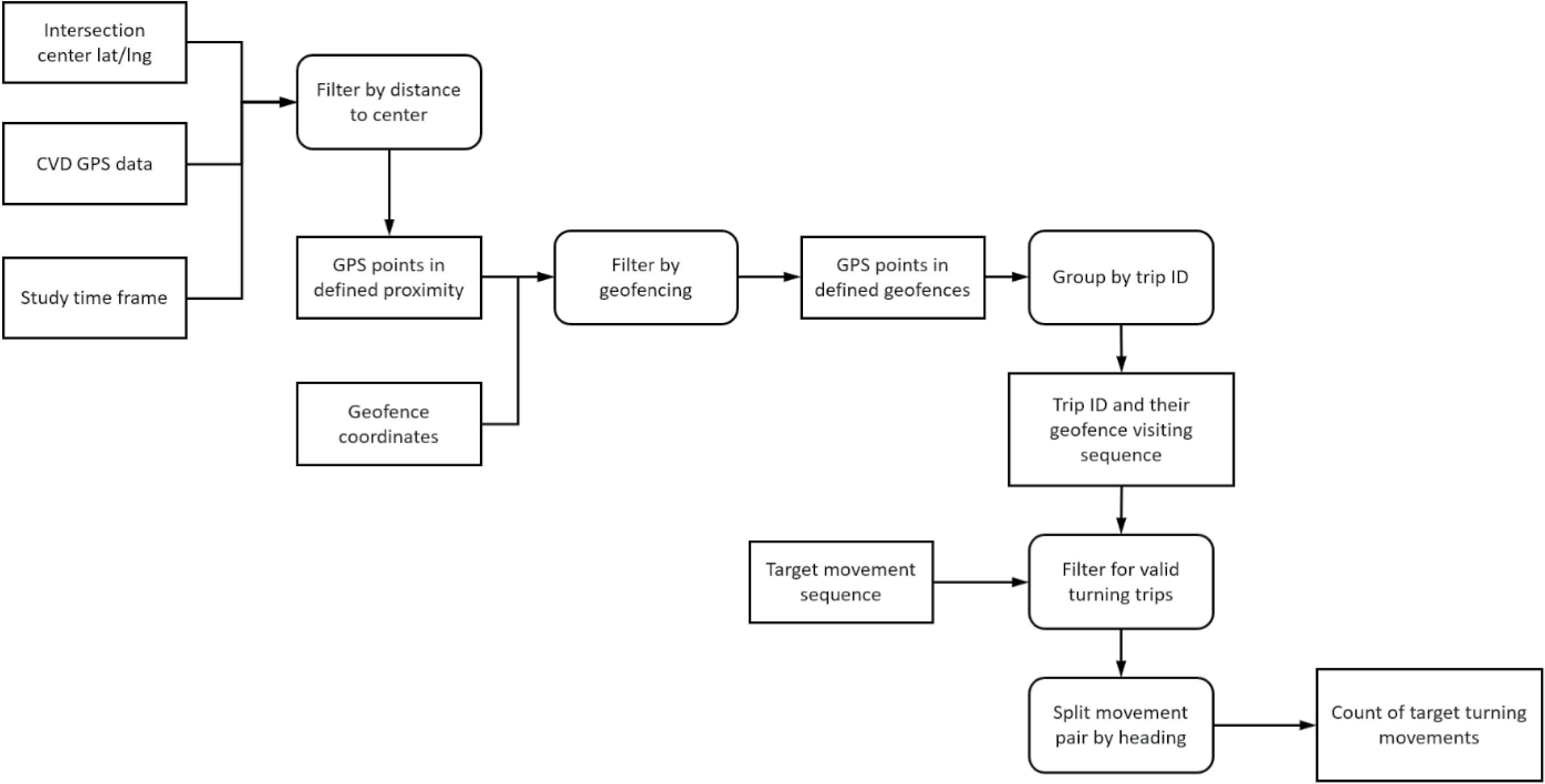
Long Description.
The flowchart begins with three steps, Intersection center lat or lng, CVDGPS data, and Study time frame. They together lead to Filter by distance to the center. This leads to GPS points in defined proximity. This leads to Filter by geofencing with the help of geofence coordinates. The filter leads to a series of events, GPS points in defined geofences, group by trip i d, Trip i d, and their geofencing visiting sequence, Filter for valid turning trips with the help of Target movement sequence, Split movement pair by heading, and the final step of Count of target turning movement.
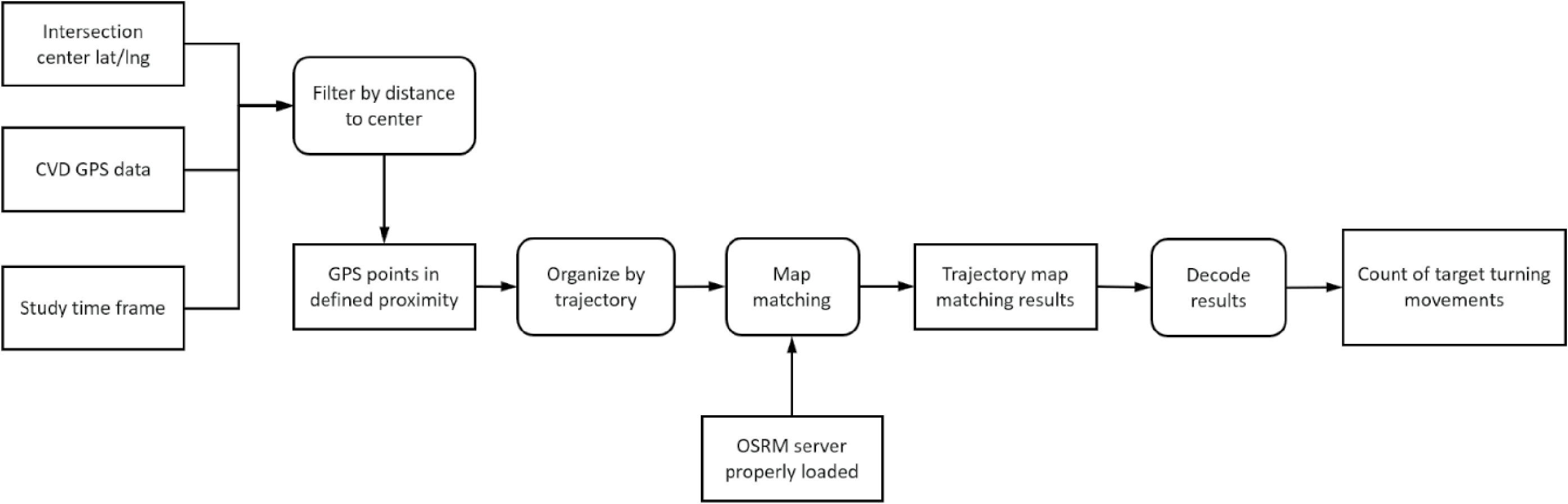
Long Description.
The flowchart begins with three steps, Intersection center lat or lng, CVDGPS data, and Study time frame. They together lead to Filter by distance to the center. This leads to GPS points in defined proximity. This leads to a series of events, Organize by trajectory, Map matching with the help of OSRM server properly loaded, Trajectory map matching results, Decode results, and the final step of Count of target turning movements.
When the dataset is huge, this would require significant computational resources. Second, the OSRM map matching API can be confused by edge cases like those discussed in the geofencing method. In Figure 47, the API returned a complex result for the NB-T + U-turn + SB-L edge case, creating significant fake cruising. In general, this is due to the penalty that OSRM adds for a U-turn, resulting in low confidence/probability for options that include a U-turn. Third, a dedicated OSRM server is desirable for large-scale data processing. While there is a free OSRM server hosted by the OSRM project/organization, the usage per IP address per day or size of request is limited. A dedicated OSRM server allows the user to load a focused map for specific purposes. However, running such a server requires dedicated engineering efforts to manage traffic.
To illustrate the level of detail provided by the OSRM API, the JSON data in Figure 45 represent a sample response for a routing query. These data include comprehensive information about the route, such as the geometry, specific maneuvers, travel mode, and intersection details. Such detailed outputs enable precise analysis and tracking of vehicle movements.

Long Description.
The first illustration shows an intersection of two roads forming a plus symbol. An outline shows a pathway from the south to the east using the longest route. The second illustration shows an intersection of two roads forming a plus symbol. An outline shows a pathway from the south to the east using the shortest route.

Long Description.
The first illustration shows an intersection of two roads forming a plus symbol. An outline shows a pathway from the south to the east via the south, forming one of the longest routes. The second illustration shows an intersection of two roads forming a plus symbol. An outline shows a pathway from the south to the east via the west, forming a slightly longer route.
Method C: Data-Driven
The third method is more data-driven, yet still needs amendments previously discussed. The workflow is presented in Saldivar-Carranza et al. (2021). The main idea is to remove outliers by comparing the headings of entering and exiting points with a predefined range. If the headings of the entering and exiting points meet the constraints, then the trajectory is accepted, as shown in Figures 48 and 49.
It is worth pointing out that this method does not scale well. The most critical issue is how to accurately specify the acceptable range of heading angles. Compared to geofencing, which only requires drawing rectangles for virtual detectors, the data-driven method requires carefully measuring the heading angles. The other issue with this method is that a full trajectory is potentially needed; otherwise, the results may suffer from false negatives. Consider the example in Figure 48b, where even though the entering and exiting heading angles do not fall into the predefined ranges, it is possible that the trajectory enters the main approach and then makes a left turn before leaving for the access road. In other words, just one pair of entering and exiting points is not sufficient to tell if the trajectory has used the intersection, and potentially, bearing angles of all trace points need to be calculated. Following this requirement, all trace points of all potential trajectories using the intersection need to be processed once.
Discussion
Three methods were presented for estimating TMC at user-specified intersections, each with unique strengths and challenges. However, the most important issue is that it encompasses merely a fraction of the complete traffic scenario. This is because not all vehicles on the road are equipped with the technology to share data about their speed, location, and other operational metrics. As a result, the insights derived from CVD, while valuable, do not provide a full picture of the
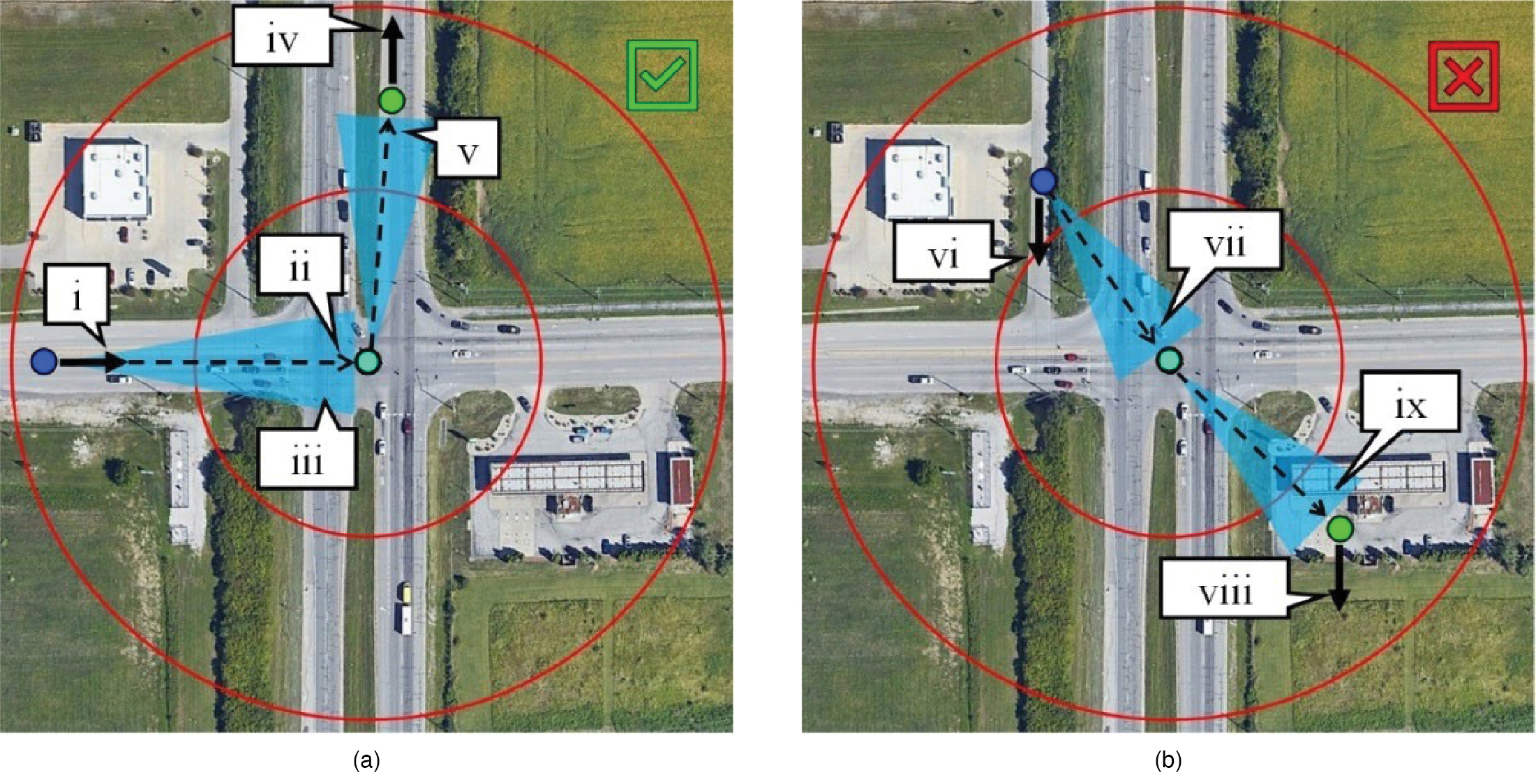
Long Description.
Both photos show an intersection of two roads, forming a plus symbol. Photo 1: A point in the west road is marked 1. A point at the center of the intersection is marked 2. A point marked between 1 and 2, and very close to 2 is marked 3. A point in the northern road is 4. A point right in front of 4 is marked 5. Photo 2: A point at a distance in the northwest direction of 2 is marked 6. A point in the northwest direction of 2 and very close to 2 is marked 7. A point in the southwestern part of the intersection is marked 8. A point right before 8 is marked 9.
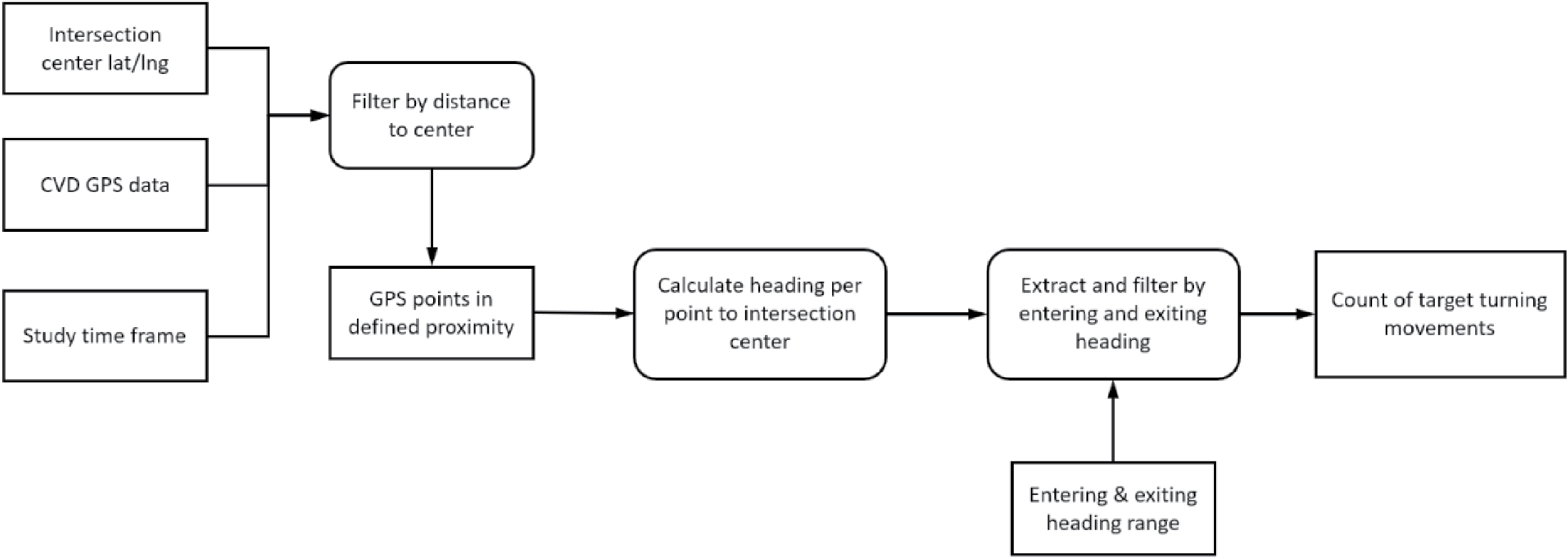
Long Description.
The flowchart begins with three steps, Intersection center lat or lng, CVDGPS data, and Study time frame. They together lead to Filter by distance to the center. This leads to GPS points in defined proximity. This leads to a series of events, Calculate heading per point intersection center, extract and filter by entering and exiting heading with the help of Entering and exiting heading range, and the final step of Count of target turning movement.
traffic at intersections. Because CVD data typically only contain passenger cars, the diversity of vehicles, including those that are older, not connected, or of other classes, means that any analysis based on data from connected vehicles alone must be considered within the context of its limitations. Consequently, for a comprehensive understanding of traffic flows and patterns, additional sources of data and analytical methods need to be integrated.
Lane Markings and Width Using LiDAR Data
Background and Goal
Point cloud data, produced by LiDAR sensors, represent a novel data source in the transportation sector. LiDAR, a remote sensing technology, captures detailed information about the surroundings by measuring variable distances to objects within its range. It has gained traction in the automotive industry, particularly to enhance autonomous and semi-autonomous vehiclesʼ navigational systems. LiDAR sensors use light in the form of a pulsed laser to measure distances to various objects, creating detailed digital 3D representations of the environment. In transportation, point cloud data is utilized across several applications. Driver-assistance features, such as lane keeping and adaptive cruise control, depend on the analysis of this data. This analysis enables vehicles to stay within their lanes by accurately identifying lane markings and other road indicators. Moreover, LiDAR assists adaptive cruise control by continuously measuring the distance to vehicles ahead, allowing for speed adjustments to maintain a safe following distance. For autonomous vehicles, the data derived from LiDAR is crucial for safe navigation, as it aids in recognizing and circumventing obstacles, other vehicles, and pedestrians or cyclists. Additionally, point cloud data analysis contributes to pedestrian and cyclist safety at crosswalks by detecting road users and minimizing crash risks. Beyond these uses, infrastructure management and inspection showcase LiDARʼs versatility and importance in advancing transportation safety and efficiency.
Research on road lane detection using LiDAR data is an advanced area of study focused on improving autonomous and assisted driving technologies. In the context of road lane detection, this technology is pivotal for accurately identifying lane boundaries, understanding the geometry of road surfaces, and detecting obstacles within or around the lanes. Traditionally, camera-based systems have been extensively used for this purpose, relying on CV techniques to interpret road markings and geometries. However, such systems are significantly affected by lighting conditions, weather, and occlusions, which have led to the exploration of alternative technologies that can provide more robust and reliable data. The advent of autonomous vehicles and ADAS has necessitated the development of highly accurate and reliable methods for understanding and interacting with the road environment. One of the critical components of these systems is road lane detection, which is pivotal for lane keeping, adaptive cruise control, and navigation.
The use of LiDAR data for road lane detection involves complex data processing and interpretation algorithms. LiDAR sensors can capture detailed topographical information, including the presence of road markings, curbs, barriers, and other vehicles, providing a comprehensive view of the road. This data, when processed, can yield precise information about lane boundaries, road width, and the orientation of the lanes in relation to the vehicle. The integration of LiDAR technology in road lane detection systems represents a significant leap forward in the development of autonomous driving technologies. It not only enhances the safety and reliability of lane detection but also contributes to the overall situational awareness of the vehicle by providing accurate and real-time data about the surrounding environment.
Data
The primary source of data for this tool is point cloud data, collected by LiDAR sensors mounted on vehicles traversing specific corridors. This studyʼs data were obtained from two sources: the Minnesota Department of Transportation (MnDOT) and City of Bellevue, WA.
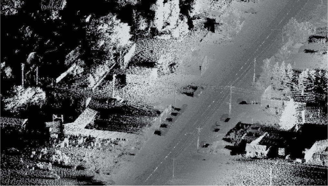
Long Description.
The view shows a long road with white vertical markings on it. On either side of the road are a few houses, electricity posts, trees, and pathways.
The MnDOT data originates from a segment of Minnesota State Highway 210 (TH 210), stretching from Hewitt to Staples, approximately 15 miles in length. This dataset was captured using an Optech Maverick vehicle-mounted (terrestrial) LiDAR sensor and includes the coordinates (x, y, z) and intensity values for each point. However, it lacks RGB color assignments, meaning no color data is available. The data is stored in the laz format, a compressed variant of the las file. A representation of this data, based on intensity values, is shown in Figure 50. Conversely, the data from Bellevue, while similar to that from MnDOT, includes RGB values for each point, thereby providing color information. This dataset was collected by TomTom, and a portion was made available to the research team as a sample. Figure 51 presents a sample of the Bellevue data.
LiDAR sensors can generate high-resolution point clouds that provide a detailed representation of the surrounding environment and physical objects. This precision is highly crucial for applications like autonomous driving systems. The 3D representation of the environment is another advantage of point clouds, which makes them an ideal choice for navigation systems, as well as terrain understanding and obstacle detection. One advantage of point clouds compared to images from cameras is their operation in various conditions, such as low-light conditions. This addresses a lot of important issues with camera-based detection systems. There are also some disadvantages and challenges regarding LiDAR sensors and point clouds. One significant challenge with LiDAR technology is its cost. High-quality LiDAR sensors are expensive, and generating real-time data using these sensors increases the cost of transportation systems that rely on this technology. The other main challenge is the high volume of generated data. LiDAR sensors generate vast amounts of data, which are challenging to process and analyze. The need for powerful computing resources
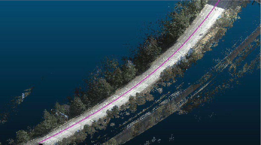
Long Description.
The view shows a slightly curved road with a purple mark along its center. On either side of the road are thick trees. The road appears to be located on an island, with a waterbody surrounding the trees.
and sophisticated software to analyze the data results in more complexity and higher costs. The other challenge is the poor performance of LiDAR sensors in specific circumstances, such as adverse weather conditions, including heavy rain, fog, and snow. The main reason for this issue is the scattering of laser beams and the poor quality of the generated data in these conditions.
This study faced several limitations related to the data. Firstly, the vast size of the collected data posed significant challenges for the analysis process. The data collected for each mile, in the las format, can exceed 10 GB, making the tool development steps both time-consuming and challenging. Secondly, the limited availability of data complicated the development of ML tools, which require labeled data for the training process.
Pipeline
In this section, the data analysis process and how lane width is determined from point clouds are examined. The analysis encompasses several key steps: preprocessing, which includes noise removal, normalization, and downsampling; road surface segmentation; intensity thresholding; lane clustering; fitting polylines to the clusters; and measuring the lane width. Each of these steps will be elaborated upon in later paragraphs.
One primary challenge in analyzing point clouds is managing noise, which can stem from various factors, including sensor inaccuracies, environmental conditions, moving objects, and the reflective characteristics of scanned surfaces. Noise can significantly impact subsequent processing tasks such as object detection, segmentation, and classification in point cloud data. Therefore, it is crucial to eliminate noise from the data. The initial step in noise removal involves conducting a statistical analysis, which entails calculating the mean distance of each point from its neighbors within a predetermined radius. Points that significantly deviate from this average distance in relation to their neighbors can be considered outliers. The k-nearest neighbor (KNN) approach is employed to define each pointʼs neighborhood, utilizing the KNN algorithm to identify the ‘k’ nearest neighbors of each point based on Euclidean distance. This algorithm also examines the density of neighbors, variations in surface normals among neighboring points, and the relative distance of a point to its neighbors in comparison to the overall average distances within the point cloud. Choosing a suitable ‘k’ value is crucial, as a small ‘k’ may lead to the inadvertent removal of valid data points (over-filtering), whereas a large ‘k’ may not effectively eliminate noise. The optimal ‘k’ value typically depends on the point cloudʼs density and the extent of noise present in the data.
In the preprocessing phase, the next step involves calculating the normal vectors of the point cloud. Normal vectors are pivotal in a variety of 3D processing tasks because they convey the orientation of the surface at each point within the point cloud, aiding in the comprehension of the surface geometry underneath. This information is vital for tasks such as surface reconstruction, segmentation, and object recognition. To compute the normal vectors, a neighborhood analysis must first be conducted. In this analysis, for every point in the point cloud, the algorithm identifies a surrounding neighborhood of points. This neighborhood can be delineated by a fixed radius (radius-based search) or a fixed number of the nearest neighbors. The choice of neighborhood size is crucial in the KNN method. Larger neighborhoods yield smoother, more average normals, but smaller neighborhoods capture finer surface details. The ‘k’ value is generally selected based on the density of the point cloud. In a radius-based search, points within a certain radius from the target point are deemed its neighbors, allowing adaptation to varying point densities, but potentially leading to a highly variable number of points in each neighborhood. The next step is local surface fitting, which involves approximating the local surface around each point. Typically, this is achieved by fitting a plane to the points within the neighborhood, which requires solving a least-squares problem to identify the optimal plane that
minimizes the distance from the points to the plane. The normal vector to this fitted plane is then calculated, based on the principle that the normal vector is perpendicular to the plane. This can be derived from the equation of the plane. Finally, it is essential to ensure consistency among the approximate normal planes.
Downsampling is another crucial step in the preprocessing of point clouds. The downsampling factor is established to lessen the computational burden by reducing the number of points that need to be analyzed while retaining the essential structure and shape of the data. This reduction can be achieved in two primary ways: by skipping a set number of points according to the downsampling factor or by grouping points within a certain neighborhood and replacing them with a single representative point, which typically involves averaging their positions. The selection of an appropriate downsampling factor is critical, as higher values could lead to the loss of significant features, complicating the analysis of the point cloud data. The choice of this factor hinges on several considerations, including the quality of the LiDAR-generated data, the density of the point cloud, and the specific objectives of the analysis. It is a delicate balance; too much downsampling may obscure vital details, while too little may not reduce the computational load sufficiently.
Segmentation is a critical and beneficial step following the preprocessing of the point cloud in the analysis process. Typically, there are two main types of segmentation. The first involves segmenting a point cloud based on Euclidean distance, wherein the point cloud is divided into multiple segments. Each segment is composed of points closer to one another than a predefined distance threshold. This method helps identify clusters or groups of points that are spatially proximate, facilitating the isolation of distinct objects or features within the point cloud. The second type of segmentation focuses on differentiating the ground from the rest of the data. This process is crucial for identifying and segmenting the ground plane in a point cloud obtained from LiDAR sensors. It employs advanced algorithms to distinguish ground points from non-ground points, effectively separating the terrestrial surface from other elements such as buildings, vegetation, and vehicles. For ground segmentation, the research teamʼs tool utilizes the Cloth Simulation Filter (CSF), a method introduced by Zhang et al. (2016). In this innovative approach, the LiDAR point cloud is inverted, and a virtual rigid cloth is simulated to drape over the inverted surface. The interactions between the cloth nodes and the corresponding LiDAR points are analyzed to determine the positions of the cloth nodes, which helps to approximate the ground surface. Subsequently, ground points are extracted from the LiDAR point cloud by comparing the original LiDAR points with the simulated ground surface created by the cloth nodes. The effectiveness of this algorithm on the research teamʼs data is depicted in Figure 52, which illustrates the segmented ground surface and demonstrates the CSF methodʼs ability to accurately identify ground points within the point cloud.
The next phase involves isolating lane markings from the point cloud by leveraging the intensity values intrinsic to each point in the point cloud data. These intensity values mirror the reflective properties of various surfaces. Lane markings, due to their higher reflectivity to laser beams, exhibit stronger intensity values in point cloud data compared to road surface points. In the research teamʼs dataset, the intensity values of points corresponding to lane markings are significantly higher than those of the road surface. For instance, lane marking points have intensity values exceeding 70, whereas road surface points typically register values below 20. To isolate lane marking points, the research team employed intensity thresholding, which involves setting a threshold value to differentiate between lane markings and other surfaces based on intensity. This threshold must be carefully selected to strike a balance; it should be high enough to exclude points unrelated to lane markings, yet low enough to ensure all relevant lane marking points are included. This careful calibration is crucial to accurately extract lane markings from the point cloud without omitting important data or incorporating extraneous points.
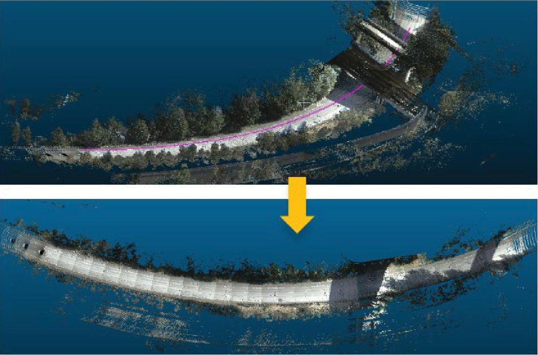
Long Description.
The first photo shows a slightly curved road with a purple mark along its center. On either side of the road are thick trees. The road appears to be located on an island, with a waterbody surrounding the trees. The road ends towards the right. The second photo shows a thin long curved road that covers the entire region and is marked by an arrow.
Following the intensity thresholding to filter the points, the next step is to cluster the lane points. The research team employed an ML technique known as density-based spatial clustering of applications with noise (DBSCAN). DBSCAN is adept at clustering points that are closely packed together and identifying points in low-density areas as outliers. The algorithm operates based on two parameters: ε (eps) and MinPts. The ε parameter defines the neighborhood radius around a point, and MinPts specifies the minimum number of points required to constitute a dense region. Typically, the process begins with preprocessing the image to accentuate the lane markings, which may include converting the image to grayscale, applying filters to mitigate noise, and utilizing edge detection methods like the Canny edge detector to pinpoint potential lane marking edges. The preprocessed image is then used to extract features, such as the positions of edge pixels, which serve as input points for DBSCAN. Applying DBSCAN to these features with appropriately chosen ε and MinPts values allows for the clustering of edge points. Lane markings, being linear and closely spaced, are effectively clustered by DBSCAN, which distinguishes them from outliers or noise. Core points, defined as points within ε distance of at least MinPts other points, form the nucleus of a cluster. Border points, although within ε distance of core points, do not have MinPts within their vicinity and are included in the cluster of the closest core point. Points not meeting these criteria are labeled as noise. Each resulting cluster corresponds to a lane marking. However, the success of lane marking identification and distance measurement using DBSCAN is contingent upon various factors, including the quality of the input data, the preprocessing steps undertaken, and the selected DBSCAN parameters (ε and MinPts). DBSCAN may encounter difficulties with lane markings of varying density, such as faded markings, or in environments with substantial noise, like shadows or the presence of other vehicles.
Following the clustering of lane marking points with DBSCAN, there are multiple clusters, each indicative of a lane marking. The subsequent phase involves fitting a line to the points within each cluster. For this purpose, the research team employed linear regression to establish a straight line that best corresponded to each cluster of lane marking points, resulting in a line equation for each lane marking. The precision of these fitted lines or curves is of paramount importance. Inaccurate fits can result in erroneous estimations of centerlines and distances between lanes. It is essential to ensure that the linear regression model accurately captures the trend of the lane marking points within each cluster to avoid such discrepancies. The process of applying DBSCAN to the intensity-filtered points from the research teamʼs dataset and subsequently fitting lines to the identified clusters is visually depicted in Figure 53. This step is critical for the subsequent calculation of lane widths and distances, underscoring the importance of precision in the fitting process to ensure the reliability of the analysis.

Long Description.
All four illustrations show a three-dimensional view of a graph with x, y, and z axes. The first graph shows five lines extending from the x-axis to the y-axis while crossing the z-axis. Lines 1, 2, 4, and 5 have dense plots while line 3 has fewer plots. Graph 2 shows five lines extending from the z-axis and increases with the graph. Lines 1, 2, 4, and 5 have dense plots while line 3 has fewer plots. Graph 3 shows four lines extending similar to Graph 1. Lines lines 1, 4, and 5 have dense plots while line 2 has fewer plots. Graph 4 shows five lines extending similar to graph 2. Lines 1, 2, 4, and 5 have dense plots while line 3 has fewer plots.
Using the Tool
This tool is implemented in Python and does not require GPU computing resources. Therefore, it can run on any computer with Python properly set up. To better visualize the point clouds, the research team used Cloud Compare software, which is a professional tool for preprocessing and postprocessing of point clouds. This software is open-source and available online. While the research team used CloudCompare, many other similar tools are available, such as PDAL (Point Data Abstraction Library), MeshLab, and LAStools.
Procedures for the Analysis Tools
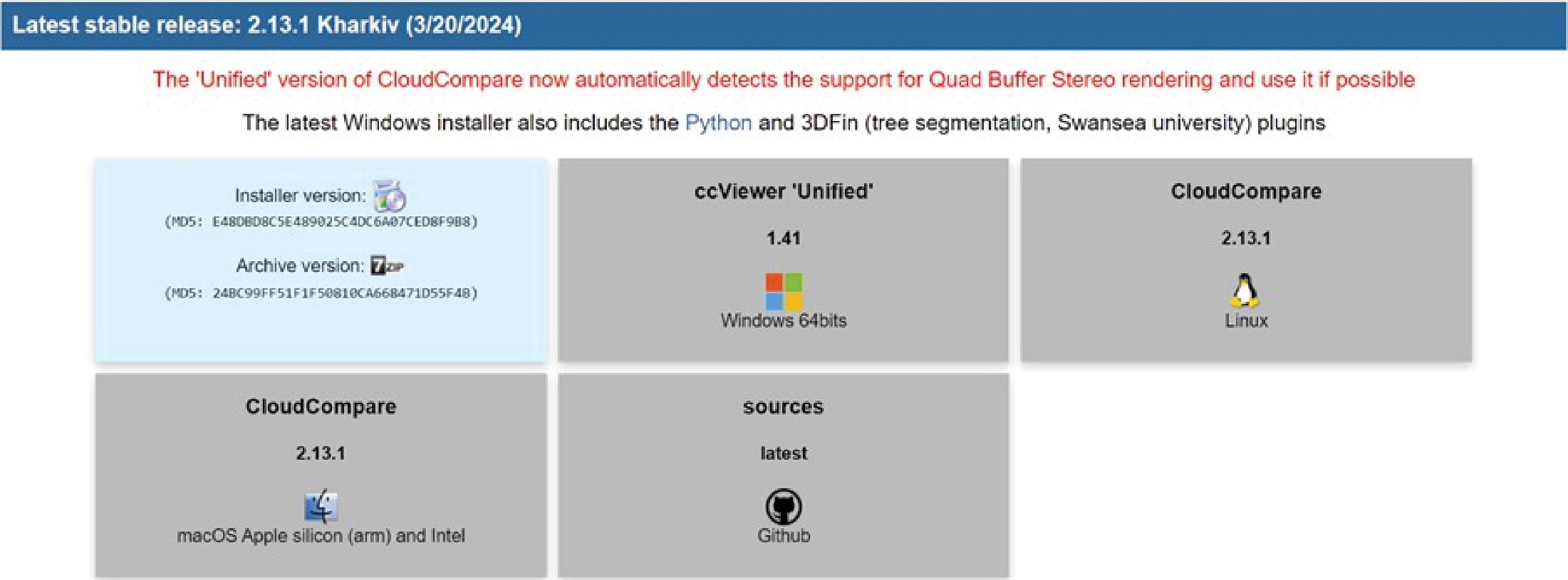
In this section, the analysis tools required for processing LiDAR point cloud data and how to work with the tool developed for this project will be discussed. A step-by-step guide to process the point cloud data using CloudCompare software follows. The procedure for running the code of the developed tool to extract information such as the number of lanes and lane width is outlined. This open-source software is specifically designed for managing point clouds and offers numerous features that enhance visualization beyond what the Python environment typically provides. The version of CloudCompare compatible with a system can be directly downloaded from its official website (https://cloudcompare-org.danielgm.net/release/), as shown in Figure 54. CloudCompare supports Windows, Mac, and Linux operating systems.
CloudCompare can read various point cloud file formats. In this project, the point clouds were in laz and las formats. These formats are essentially the same; laz is simply a compressed version of las and can be easily converted back using several tools, including the saving tools in CloudCompare. However, this software also allows for the direct reading of laz files. To read LiDAR point cloud data in CloudCompare, users should follow these steps:
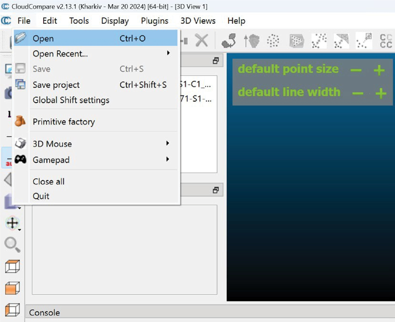
- Select “File” from the toolbar ribbon at the top of the software,
- Choose “Open” (Figure 55),
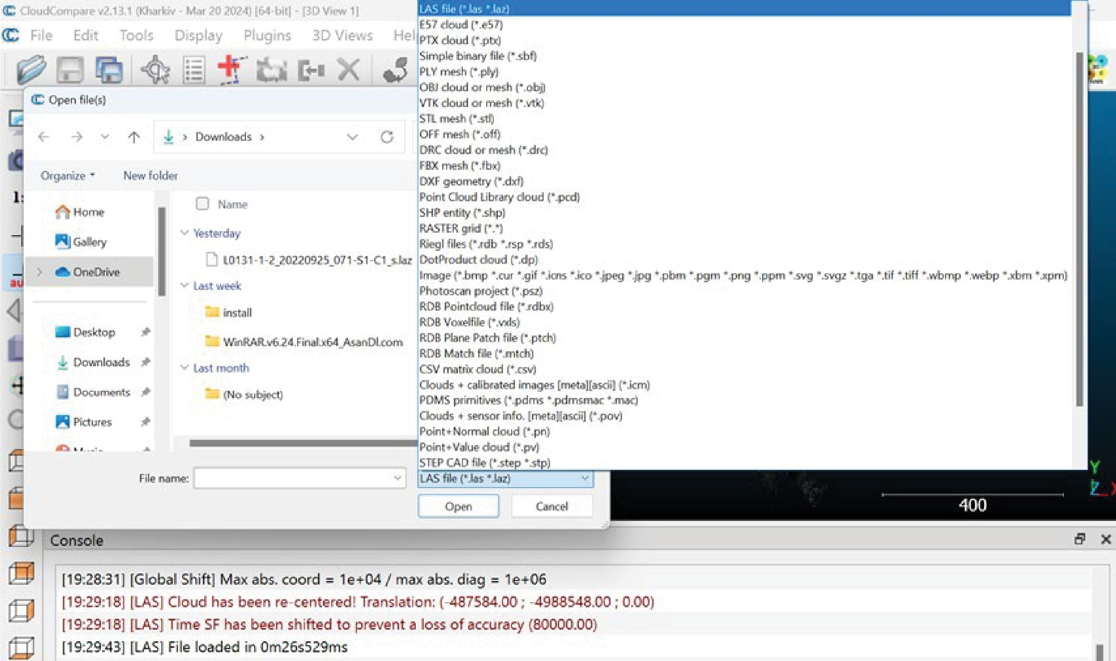
- Select the desired point cloud file format, such as .laz or .las (Figure 56),
- Navigate to the location of the point cloud file on your system, and
- Click “Open” (Figure 57).
The point cloud will then be visualized within the softwareʼs environment. Opening the file may take time, depending on the systemʼs specifications. It is important to note that the size of
Long Description.
The screenshot is titled Latest stable release: 2.13.1 Kharkiv (3/20/2024). The text in the screenshot reads, The 'Unified' version of CloudCompare now automatically detects the support for Quad Buffer Stereo rendering and uses it if possible. The latest Windows installer also includes the Python and 3DF in (tree segmentation, Swansea university) plugins.' Below the text, five packages of the Installer version, ccViewer 'Unified', CouldCompare Linux, CouldCompare mac O S Apple silicon (arm) and intel, and Sources are given.
Long Description.
The screenshot is titled 'CloudCompare v2.13.1 (Kharkiv - Mar 20, 2024( [64-bit] - [3D View 1]. The first row or ribbon shows options for File, edit, tools, display, plugins, 3D views, and help. A list of options shows open (Ctrl + O) which is selected. Other options of open recent, save, save project, global shift settings, primitive factory, 3D mouse, gamepad, close all, and quit are listed.
Long Description.
The screenshot is titled 'CloudCompare v2.13.1 (Kharkiv - Mar 20, 2024( [64-bit] - [3D View 1]. The first row or ribbon shows options for File, edit, tools, display, plugins, 3D views, and help. A new dialogue box titled 'Open file(s)' shows the Downloads folder in the File Manager option. The file manager shows home, gallery, OneDrive, desktop, downloads, documents, pictures, etc. The file format in this Downloads dialogue box lists around 30 various formats. The file format of the L A S file ("Jas" Jaz) is selected.
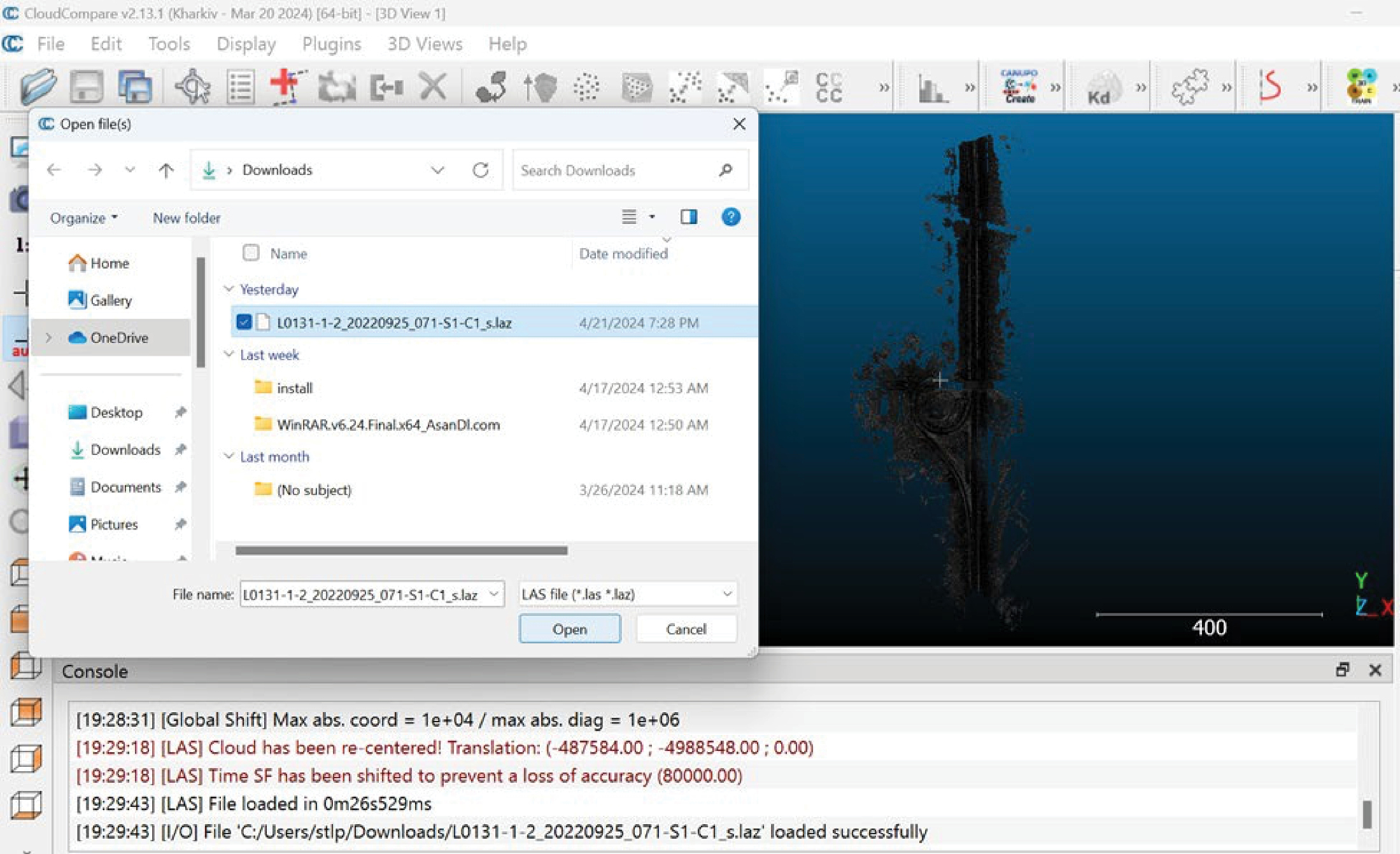
Long Description.
The screenshot is titled 'CloudCompare v2.13.1 (Kharkiv - Mar 20, 2024( [64-bit] - [3D View 1]. The first row or ribbon shows options for File, edit, tools, display, plugins, 3D views, and help. A new dialogue box titled 'Open file(s)' shows the Downloads folder in the File Manager option. The file manager shows home, gallery, OneDrive, desktop, downloads, documents, pictures, etc. The OneDive option is selected. The downloads page shows a file named L0131-1-2-20220925_071-S1-C1_s.laz which is selected.
point cloud files can be substantial. For example, in this project, the laz files from MnDOTʼs LiDAR point cloud were about 200 MB, which increased to approximately 1 GB upon conversion to las. Therefore, some delay should be expected depending on the file format and size.
After importing the point cloud file into the software, the visualized point cloud will appear in the softwareʼs environment. Different sections of the point cloud can be zoomed in and out using the scroll wheel on a mouse. Additionally, the point cloud can be rotated by clicking and holding the left mouse button on the desired section and moving the mouse. To navigate to different sections, press the right mouse button and move the mouse. For enhanced visualization, assign colors to the points within the software by following these steps:
- Select the point cloud from the “DB Tree” toolbox on the left side of the screen by clicking on the point cloud file (Figure 58).
- Once the point cloud file is selected, the “Properties” toolbox will appear on the screen.
- Depending on the LiDAR sensor used for data collection, the point cloud may or may not have RGB values for each point.

Long Description.
The screenshot is titled 'CloudCompare v2.13.1 (Kharkiv - Mar 20, 2024( [64-bit] - [3D View 1]. The first row or ribbon shows options for File, edit, tools, display, plugins, 3D views, and help. The next row and the left vertical bar showcase various icons and options. The auto-adding option is selected. This showcases a box titled D B tree which lists a folder named L0131-1-2-20220925_071-S1-C1. The subfolder with the OneDrive symbol is named L0131-1-2-20220925_071-S1-... is selected. The right side of the screenshot shows a diagonal patch-like structure which is outlined by a outlined by a three-dimensional rectangle.
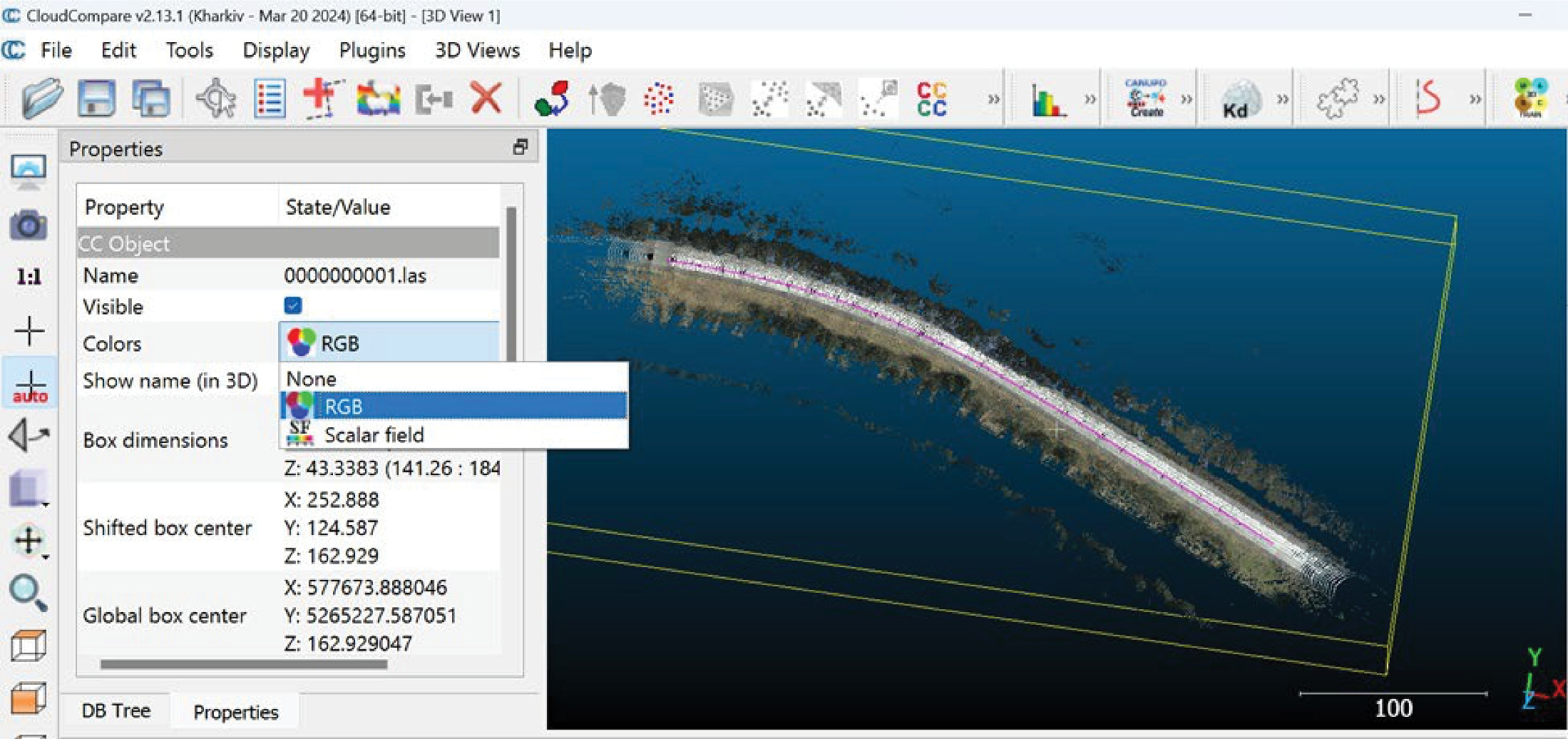
Long Description.
The screenshot is titled 'CloudCompare v2.13.1 (Kharkiv - Mar 20, 2024( [64-bit] - [3D View 1]. The first row or ribbon shows options for File, edit, tools, display, plugins, 3D views, and help. The next row and the left vertical bar showcase various icons and options. The auto-adding option is selected. This showcases a box titled Properties which lists the following data: CC object (selected), name, visible, colors, show name (in 3D), box dimensions, shifted box center, and global box center. The right side of the screenshot shows a slightly bent strip which is outlined by a three-dimensional rectangle.

Long Description.
The screenshot is titled 'CloudCompare v2.13.1 (Kharkiv - Mar 20, 2024( [64-bit] - [3D View 1]. The first row or ribbon shows options for File, edit, tools, display, plugins, 3D views, and help. The next row and the left vertical bar showcase various icons and options. The auto-adding option is selected. This showcases a box titled Properties which lists the following data: L0131-1-2-20220925_071-S1-C_s..., selected, and scalar field. The option of a scalar field is selected out of nine other options. The right side of the screenshot shows a horizontal patchy structure which is outlined by a 3D rectangle.
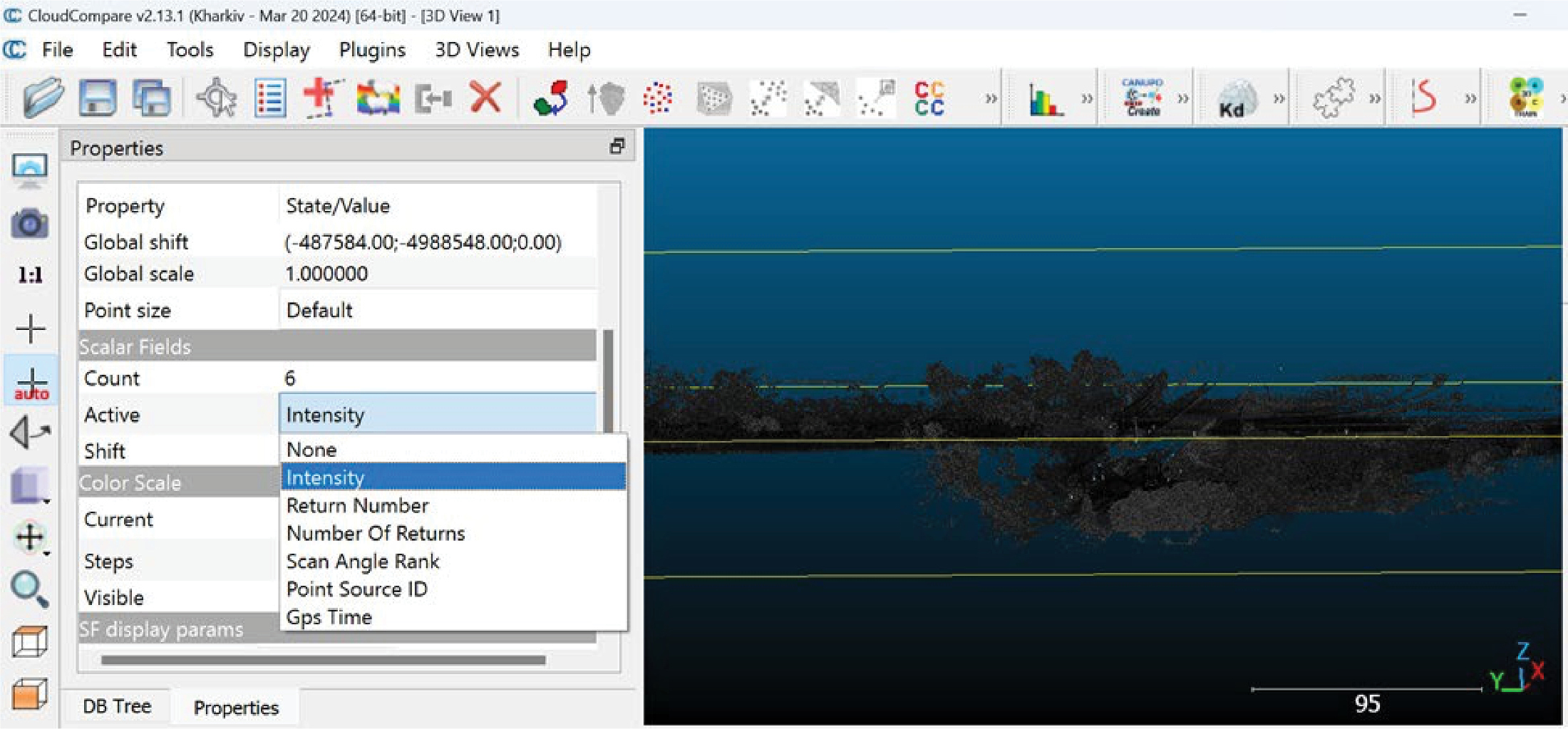
Long Description.
The screenshot is titled 'CloudCompare v2.13.1 (Kharkiv - Mar 20, 2024( [64-bit] - [3D View 1]. The first row or ribbon shows options for File, edit, tools, display, plugins, 3D views, and help. The next row and the left vertical bar showcase various icons and options. The auto-adding option is selected. This showcases a box titled Properties which lists the following data: Global shift, global scale, point size, count, active, shift, current, steps, and visible. In the Active option, out of six other options, 'Intensity' is selected. The right side of the screenshot shows a horizontal patchy structure which is outlined by a 3D rectangle.
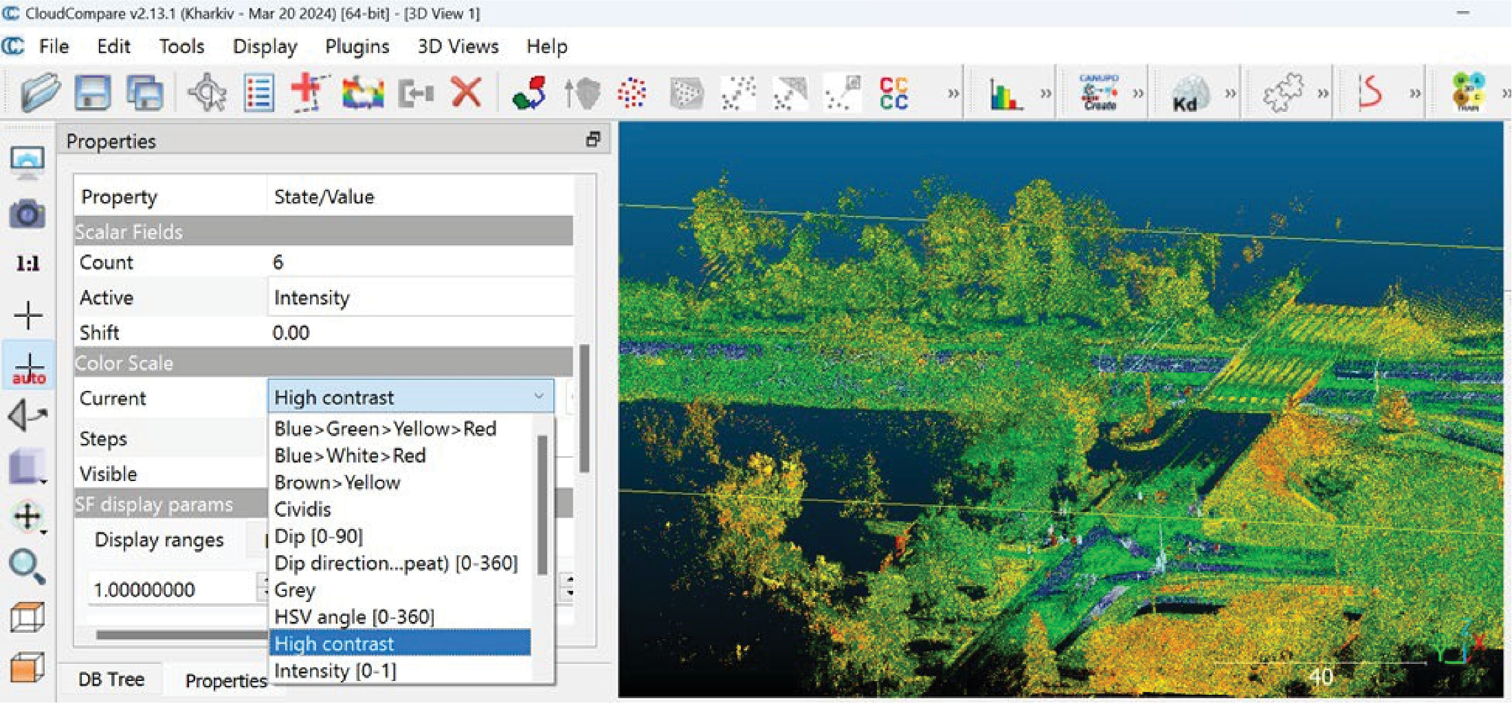
Long Description.
The screenshot is titled 'CloudCompare v2.13.1 (Kharkiv - Mar 20, 2024( [64-bit] - [3D View 1]. The first row or ribbon shows options for File, edit, tools, display, plugins, 3D views, and help. The next row and the left vertical bar showcase various icons and options. The auto-adding option is selected. This showcases a box titled Properties which lists the following data: Count, active, shift, current, steps, visible, and display ranges. In the Current option, out of nine other options, 'High contrast' is selected. The right side of the screenshot shows a three-dimensional structure of what resembles a machinery part in gradients of green, yellow, and hues of orange and blue.
For more precise visualization, adjust the saturation filter in the “SF display params” section of the “Properties” toolbox. Move the triangle pointers on the “Display ranges” slider to set the desired range of saturation (Figure 63).
CloudCompare extracts point attributes for analysis and is useful for working with point clouds. Each point possesses distinct attributes that are crucial for analysis purposes. These attributes can be viewed using the point picking tool, located in the toolbox ribbon at the top of the screen (Figure 64). Upon selecting this tool, a new toolbox appears, offering several options:
- Select one point and display its information. This option involves picking any point on the cloud and viewing its details on the screen, including coordinates and intensity values (Figures 65 and 66).
- Select two points and display segment information: This tool involves selecting two points and receiving detailed segment information, such as the distance and differences in the X, Y, and Z coordinates (Figures 67 and 68).
The tool the research team developed is user-friendly and processes LiDAR point cloud data to determine the number of lanes and their width on a specific section of roadway. To utilize this tool, ensure the required libraries have been installed: laspy, CSF, and sklearn. The default file path for the LiDAR data is set to ‘file_path = “C:/Users/Mehrdad/Documents/Sample.las”’. This path should be updated to reflect the location of the userʼs data file. Similarly, update the input file path in the code at line 23 to ‘inFile = laspy.read(r‘C:/Users/Mehrdad/Documents/Sample.las’)’. The algorithm first isolates the ground from the initial point cloud data. The user can also retain or modify the default output file name, which is specified in line 37 as ‘outFile.write(r“GroundonlySample.las”)’. Ultimately, the tool visualizes the entire point cloud in 3D and outputs the number and width of each lane detected.
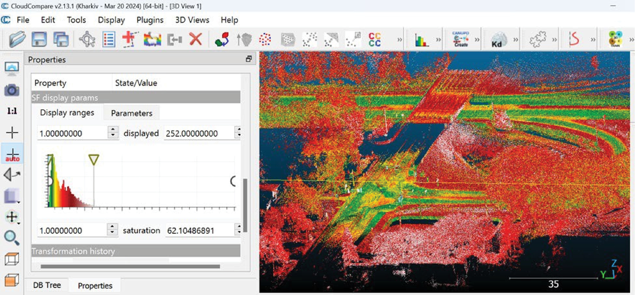
Long Description.
The screenshot is titled 'CloudCompare v2.13.1 (Kharkiv - Mar 20, 2024( [64-bit] - [3D View 1]. The first row or ribbon shows options for File, edit, tools, display, plugins, 3D views, and help. The next row and the left vertical bar showcase various icons and options. The auto-adding option is selected. This showcases a box titled Properties which lists the following data: SF display params: Display ranges of 1.00000000. Displayed 252.00000000. A gradient graph with declining trends is shown. The right side of the screenshot shows a 3D structure of what resembles a machinery part in gradients of predominantly red, green, yellow, and hues of orange on a blue background.
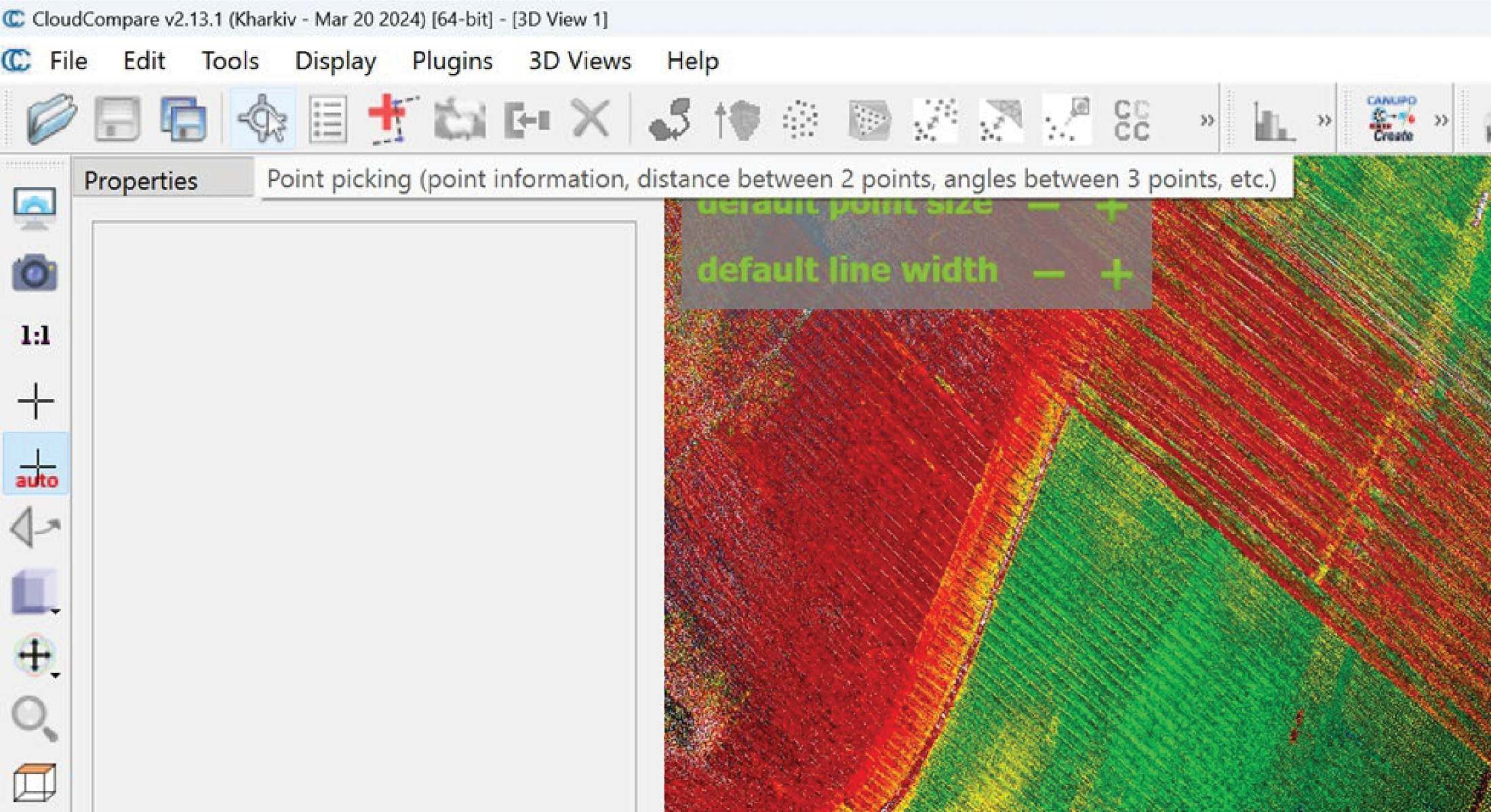
Long Description.
The screenshot is titled 'CloudCompare v2.13.1 (Kharkiv - Mar 20, 2024( [64-bit] - [3D View 1]. The first row or ribbon shows options for File, edit, tools, display, plugins, 3D views, and help. The next row and the left vertical bar showcase various icons and options. The Point picking option in the second row is selected. The left section of the screenshot showcasing the Properties is blank. The right section shows an irregular pattern drawn by diagonal lines of red and green.
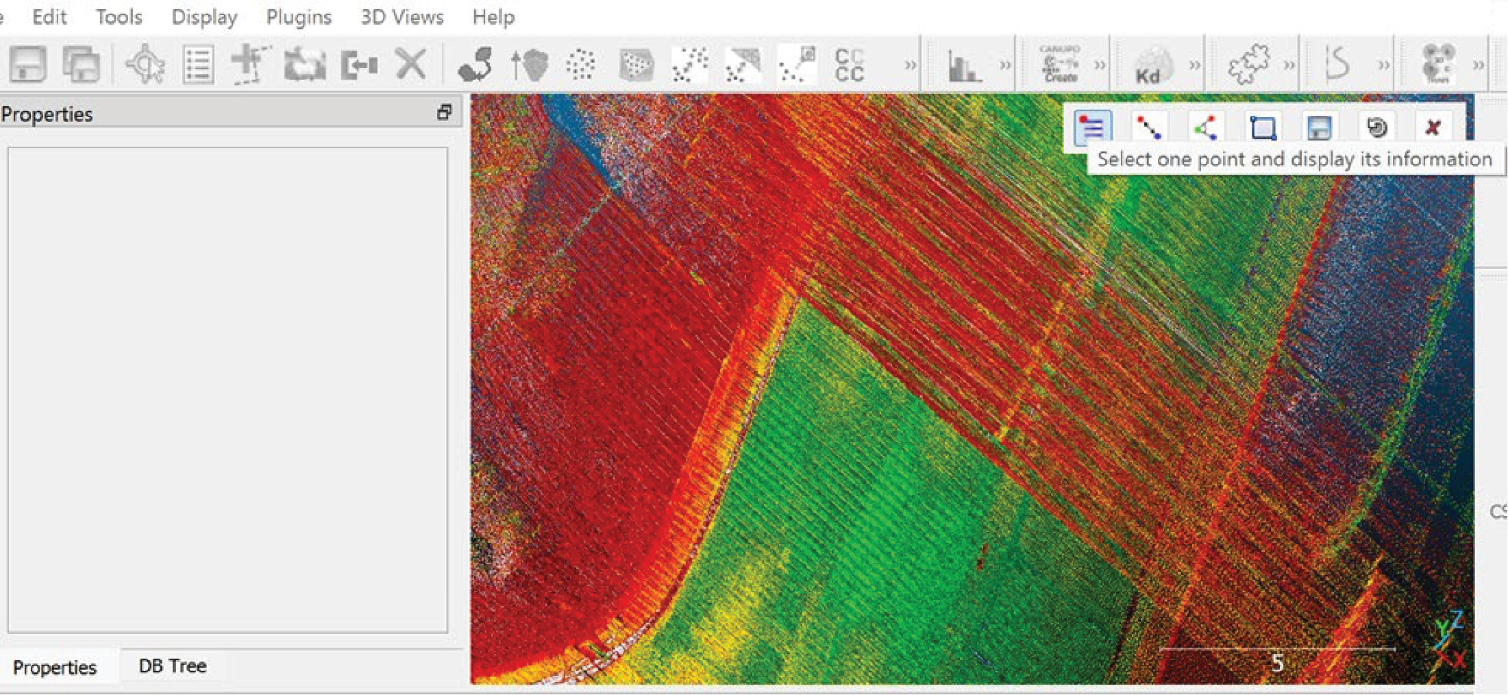
Long Description.
The screenshot begins with inaccessible options of Edit, tools, display, plugins, 3D views, and help. The next row showcases various icons and options. The left section of the screenshot showcasing the Properties is blank. The right section shows an irregular pattern drawn by diagonal lines of red and green. A quick toolbar of seven options is placed on the image.
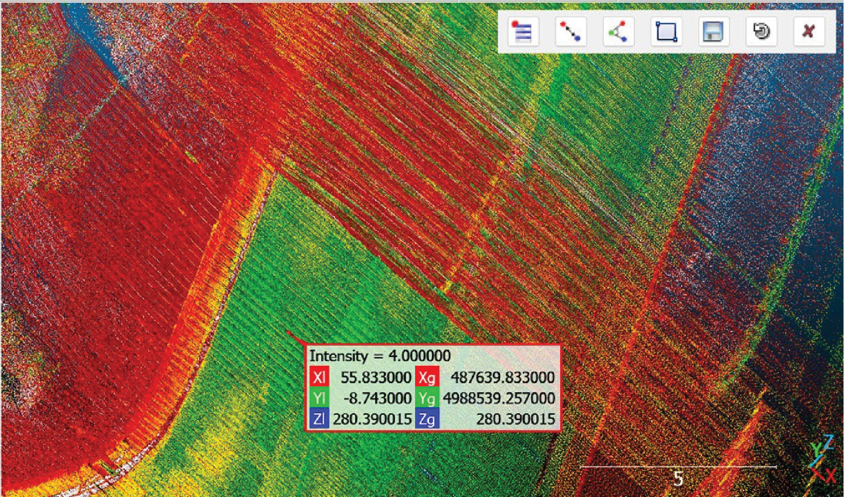
Long Description.
The screenshot shows an irregular pattern drawn which consists of diagonal lines in red, blue, green, and hues of yellow. A quick toolbar of seven options is placed on the image. The intensity is 4.000000; X I: 55.833000; Y I: Minus 8.743000; Z I: 280.390015; X g: 487639.833000; Y g: 4988539.257000; Z g: 280.390015.
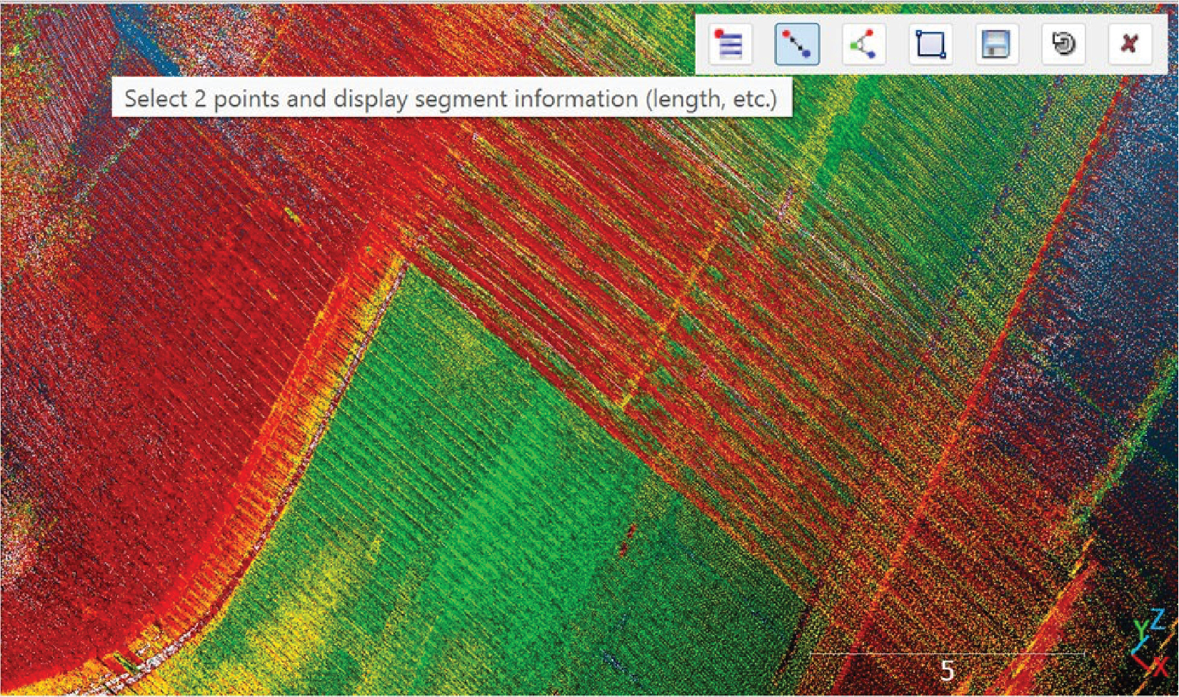
Long Description.
The screenshot shows an irregular pattern drawn which consists of diagonal lines in red, blue, green, and hues of yellow. A quick toolbar of seven options is placed on the image. The second option is selected which reads, 'Select 2 points and display segment information (length, etc.).'

Long Description.
The screenshot shows an irregular pattern drawn which consists of diagonal lines in red, blue, green, and hues of yellow. A quick toolbar of seven options is placed on the image. The intensity is 8.000000; X I: 55.216999; Y I: Minus 29.462999; Z I: 280.720001; X g: 487639.216999; Y g: 4988518.537001; Z g: 280.720001.
Traffic Sign Detection and Recognition Using Road Log Videos
Background and Goals
As economic and technological growth accelerates, vehicles have become essential for daily commutes and travel, greatly facilitating mobility for individuals on the road. However, the increased use of vehicles brings forth substantial challenges in managing traffic safety. Many traffic crashes arise due to human errors, such as improper vehicle operation and distractions while driving, underscoring a significant issue. To address these safety concerns, the introduction of ADAS employs CV and AI to improve road safety. A crucial feature of ADAS is its ability to identify and recognize traffic signs, which allows these systems to effectively interpret road conditions and adhere to legal guidelines. Moreover, the collection and handling of traffic sign data are essential for ITS and smart infrastructure management, necessitating automated methods for gathering traffic sign information efficiently and economically.
Traffic signs are divided into categories such as regulatory, prohibitory, warning, and informational, which help manage traffic flow, inform drivers about road conditions, and offer navigation and caution. The wide variety of traffic signs, each with unique content and shapes, presents a challenge. Traditionally, managing traffic signs involves manual checks by staff for data collection and status evaluation, a labor-intensive and costly procedure given the sheer volume of signs critical for maintaining traffic safety and efficiency. Therefore, creating an automated system for the detection and recognition of traffic sign data is crucial. Such a system would not only aid ADAS but also improve the management and operational efficiency of traffic infrastructure. This project seeks to develop an automated tool for TSR using CV and deep learning techniques.
Pipeline
The research team created an automated system to detect and recognize traffic signs, employing cutting-edge deep learning techniques. This system operates in real time and is organized into two primary phases: TSD and TSR, designed based on existing studies in the field. The TSD phase focuses on identifying and isolating areas of interest within raw video footage or images, initially classifying them into one of four broad categories: regulatory, prohibitory, danger, and informational signs. These identified areas are then processed by the TSR phase, which performs a detailed classification into one of 43 specific traffic signs recognized in Washington State. Integrating datasets from different sources aims to improve the systemʼs effectiveness and adaptability.
TSD Model
After reviewing various backbone models commonly used in CV tasks, the research team opted to enhance and adapt the Faster Regions with Convolutional Neural Networks (R-CNN) Inception V2 model (Ren et al. 2015) for its well-rounded performance in detection accuracy and processing speed. The modelʼs ability to process objects of varying scales simultaneously through different-sized filters stands out, providing a thorough analysis of image contents with faster processing times and reduced memory needs. The architecture of the tailored TSD model is outlined in Figure 69. An incoming image is initially passed through convolutional layers, utilizing the Inception V2 architecture as its backbone to generate feature maps. These maps are then input into the region proposal network, which identifies possible bounding box proposals. The proposed areas are subjected to region of interest pooling, adjusting their sizes for uniformity, before moving to a classifier. This classifier is tasked with determining the object classes and fine-tuning the coordinates of the bounding boxes. Through this procedure, the model efficiently and accurately detects and classifies objects within an image, providing a preliminary categorization.

Source: Adapted from Ren et al. (2015).
Long Description.
The flowchart begins with a 2D image on which conv layers are placed. The cover layers are noted for faster R-CNN inception V2 backbone. The layers lead to feature maps and region proposal networks. The network leads to proposals followed by the classifier. The feature map directly leads to RoI pooling.
TSR Model
Given the complexity of accurately classifying 43 different traffic signs, a task made challenging by the diverse and intricate features identified by the TSD models, the research team introduced a subsequent model focused on TSR to refine the classification process further. This model takes over the regions of interest pinpointed by the TSD model and categorizes them into specific, predefined classes. The categorized results are then archived for further analysis and serve as a database for future inquiries. The aim behind developing the TSR model was to achieve a more detailed and precise classification of the traffic sign images collected, thereby augmenting the initial categorizations made by the TSD model. To accomplish this, the research team developed a sophisticated deep CNN model, the architecture of which is depicted in Figure 70. This advanced model is designed to enhance the granularity and accuracy of TSR.
Using the Tool
An AI machine equipped with two NVIDIA GTX 1080Ti GPUs was adopted to optimize and train the proposed model, leveraging the PyTorch library for building the neural network framework. During testing, it is advised that GPUs be used to accelerate inference; however, they are not required to run this tool. The developed tool is based on MMDetection, and it is recommended that the user go through their instructions to install necessary packages: https://mmdetection.readthedocs.io/en/latest/get_started.html. After proper installation, the code script is executable via the command shown in Figure 71. An example of the developed toolʼs output (note that the traffic signs are detected and classified) is shown in Figure 72.
Discussion
The research team developed an automated pipeline of TSD and TSR for asset establishment and management. The architecture incorporates two stages of data processing: the first stage aims to extract the region of interest from the background, where a relatively high probability of traffic
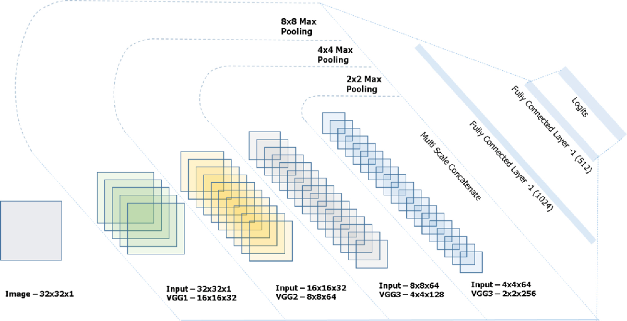
Long Description.
The illustration begins with a two-dimensional structure of a square labeled Image. The model consists of seven segments as follows: Segment 1: An 8 by 8 max pooling where the input is 32 by 32 by 1 and VGG1 is 16 by 16 by 32. Segment 2: A 4 by 4 max pooling where the input is 16 by 1 by 32 and VGG2 is 8 by 8 by 64. Segment 3: A 2 by 2 max pooling where the input is 8 by 8 by 64 and VGG3 is 4 by 4 by 128. Segment 4: Multiscale concatenate where the input is 4 by 4 by 64 and VGG3 is 2 by 2 by 256. The last three segments are Fully connected layer of minus 1 (1024), Fully connected layer of minus 1 (512), and Logits.

Long Description.
The coding given in the screenshot is as follows: (base) ! % python3 ./trafficSign_infer_fromCommand.py --image_path ./520_images.00001M.JPG --output_path ./Output.
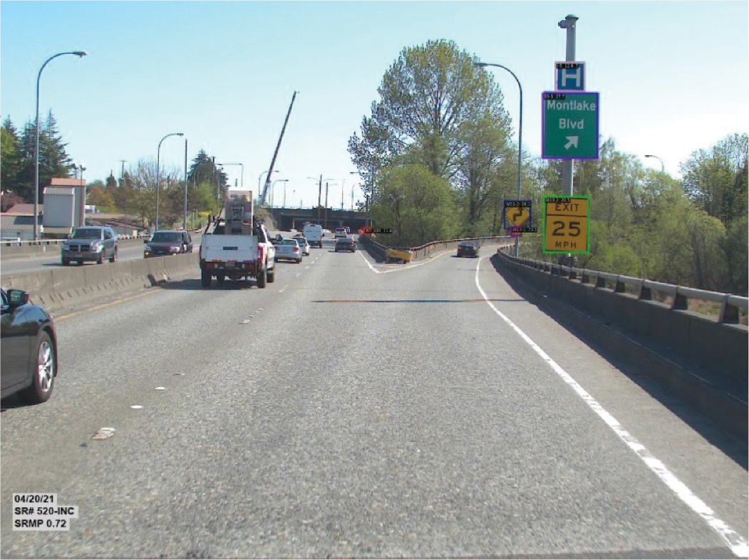
signs resides; the second stage aims to classify signs into a designated number of categories. The proposed model optimizes and trains to achieve comparable accuracy on a collected dataset by keeping this architecture in mind and conducting a comprehensive investigation into state-of-the-art backbone models and well-known public traffic sign datasets. The test results show that the research teamʼs tool has the potential to provide valuable support for a wide scope of transportation tasks, such as road asset management, smart infrastructure implementation, vehicle driving assistance development, and more.
Pedestrian Detection Using Mounted Surveillance Cameras
Background and Goals
Pedestrians play a crucial role in todayʼs transport ecosystems but face significant risks. The most recent National Household Transportation Survey revealed that walking constitutes about 11% of all recorded trips, making it the second most preferred form of transportation. Despite its widespread use, walking in urban and densely populated areas poses considerable dangers to pedestrian well-being. According to the World Health Organization (WHO), pedestrians and bicyclists, together referred to as VRUs, represent half of worldwide fatalities due to road crashes. Moreover, statistics from the Fatality Analysis Reporting System (FARS) indicate a consistent rise in pedestrian death rates in the United States, climbing from 11% in 2002 to 17% in 2020. In 2020 alone, 6,516 pedestrians lost their lives to traffic incidents, averaging one death every 81 minutes. The adoption of new technologies has great potential to minimize severe injury and death on roads. Innovations in sensor and AI technology are pivotal in tackling these safety challenges.
A wide range of research has focused on improving road management, traffic regulation, and traffic monitoring using AI technologies. Cities and agencies are increasingly interested in utilizing existing surveillance infrastructure rather than deploying new sensors, prioritizing cost efficiency. This trend is accelerating the development of intelligent infrastructure, achieving notable progress in recognizing vehicles, roads, traffic patterns, and VRUs based on the surveillance camera feeds. Consequently, the ITS community is focusing more on pedestrian detection technologies, motivated by the goal of enhancing traffic safety for all users. Pedestrian detection technologies within ITS are generally divided into three main categories: detection-based approaches, regression-based approaches, and density estimation techniques.
- Detection-based methods are major techniques for recognizing objects through feature extraction and classification, playing a pivotal role in ITS. Recent advancements have led to the creation of advanced object detection models such as R-CNN, YOLO, and single shot detector (SSD), which have demonstrated exceptional performance in various applications, including traffic control, forecasting, and management. However, applying these detection-based approaches to pedestrian sensing directly presents challenges due to factors such as occlusion, cluttered backgrounds, small object sizes, and motion blur. Contrasted with larger transportation elements like vehicles, VRUs present a unique challenge due to their small size, resulting in fewer pixels and limited distinctive features, making them harder to distinguish from their surroundings.
- Regression-based methods in pedestrian detection leverage the overall characteristics of images, such as their texture and gradient features, for identifying pedestrians. These global characteristics are analyzed using various regression techniques, including linear regression and Gaussian mixture regression, to perceive and detect pedestrians. This approach is particularly adept at navigating the complexities associated with occlusions, small-sized objects, and blurred images. Nonetheless, regression-based methods can face limitations due
- to changes in perspective and the challenge of accurately scaling 2D images, which may lead to inaccuracies such as overestimations in areas of low pedestrian density and underestimations in densely populated areas.
- Density estimation methods have been popularly engaged within the CV community for analyzing pedestrian traffic in densely populated environments. These methods diverge from detection-based and regression-based techniques by employing CNNs to extract sophisticated features and directly estimate crowd sizes using density maps. This approach has found applications in various fields, including public safety, the design of public spaces, and the intelligent monitoring of crowds. Despite their potential, incorporating density estimation methods into transportation contexts faces several obstacles. Ensuring the safety of VRUs goes beyond merely counting or sizing crowds; understanding the precise status and locations of individuals is crucial, a detail that density estimation methods might not always capture effectively. Additionally, VRUs tend to cluster in groups of varying densities within transportation environments. Current density estimation techniques often struggle with these variable densities and nonlinear scale changes, making accurate crowd analysis difficult.
To achieve accurate and reliable pedestrian detection in transportation scenarios to help address safety challenges, the research team proposed an advanced tool incorporating the SARLES algorithm that processes surveillance camera videos of pedestrian crowds frame by frame. This work can assist traffic agencies in sophisticated transportation management, safety issue monitoring, traffic operation, visual data collection, and more.
Data Description
The research team utilized four datasets to train and evaluate the proposed tool across various application settings, including ShanghaiTech, UCF-QNRF, CityStreet, and a custom dataset compiled by the research team. This self-compiled dataset was created through live camera feeds from busy intersections and pedestrian zones in Tokyo, specifically chosen for their ability to represent a wide array of the challenges previously discussed, such as complex backgrounds, varied density distributions, and fluctuations in scale and perspective. The dataset contains 500 annotated images, including 400 training and 100 test images. The rich variety of urban pedestrian scenarios makes the dataset an invaluable resource for refining and validating the toolʼs performance in real-world conditions.
Pipeline
Figure 73 shows the pipeline of the pedestrian detection framework that consists of three major modules: the encoder-decoder module, the density map segmentation and clustering (DMSC) module, and the local patch refinement (LPR) module.
- The encoder-decoder module processes images of pedestrians in traffic scenarios by extracting multi-scale contextual features to create an accurate initial density map. This map is sufficient for fundamental sensing tasks, such as counting the number of people in a crowd. However, it might not provide the detailed information required for more advanced sensing tasks, especially those related to the localization of pedestrians within transportation settings.
- The DMSC module was introduced to refine the initial density map by dividing it into smaller, localized patches based on their density features. This approach is designed to tackle the challenges posed by sudden changes in scale and the wide variety of density distributions typically encountered in transportation environments. In such settings, pedestrians often gather in small, distinct clusters across different areas, leading to non-uniform scale changes and diverse density patterns. By segmenting the initial density map into patches that each
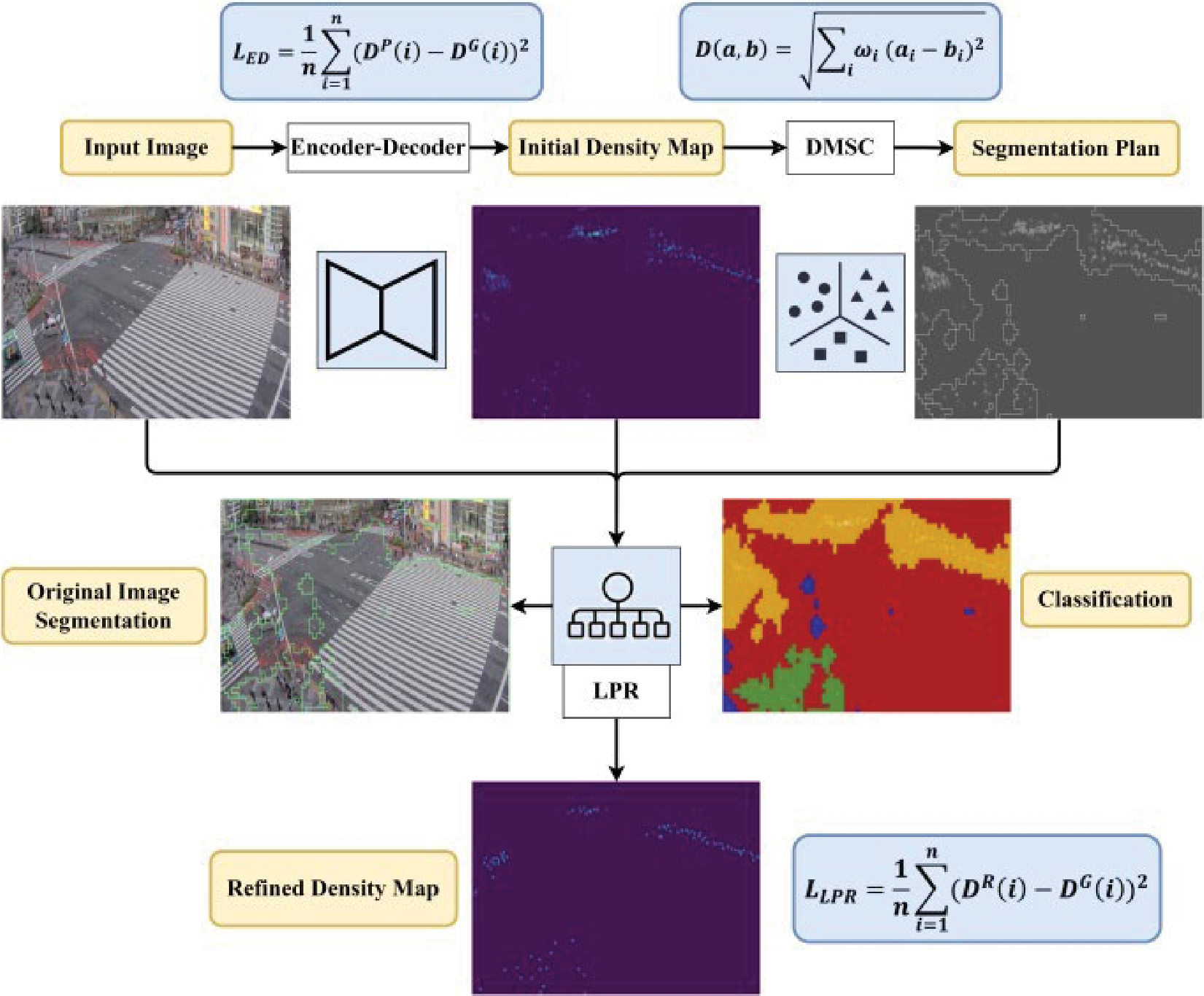
Long Description.
The flowchart begins with an input image and leads to a series of events. They are Encoder-Decoder (L subscript ED equals 1 divided by n end division summation of 1 where i equals 1 end summation (D power P end superscript (i) minus D power G (i)) squared), Initial density map, DMSE (D (a, b) equals square root of Summation subscript i end subscript omega (a subscript i minus b subscript i) squared), and Segmentation plan. The input image, initial density map, and segmentation plan together lead to the Original Image Segmentation and Classification through LPR. LPR leads to a Refined density map where the formula is L subscript LPR equals 1 divided by n end division summation of 1 where i equals 1 end summation (D power R end superscript (i) minus D power G (i)) squared.
- represent a unique density feature, the module ensures consistency within each segment while maintaining the overall density diversity. These segmented patches are then processed through the LPR module, which further fine-tunes the density map. The outcome is a more precise and accurate density map, better suited for detailed pedestrian detection tasks.
- The LPR module employs a CNN model, which includes two fully connected layers, to categorize the local patches into five distinct density levels from high to low. This classification process, combined with the segmentation strategy, provides the necessary input for an ensemble network dedicated to refining the patch density maps. By synthesizing these refined patches, the system can produce an accurate and detailed density map. This enhanced map is instrumental in detecting, sensing, and precisely locating pedestrians within various environments, significantly improving the effectiveness of pedestrian monitoring and safety measures in transportation contexts.
Using the Tool
All images in the study are resized to a uniform resolution of 1080 × 1920 pixels, with labels created to match this size. The optimization and training processes are conducted on an NVIDIA GTX 2080 Ti GPU, leveraging the PyTorch framework to achieve optimal outcomes. This approach ensures that the system is finely tuned to deliver expected performance in pedestrian detection tasks within the specified experimental setup and is outlined below in Figures 74, 75, and 76.
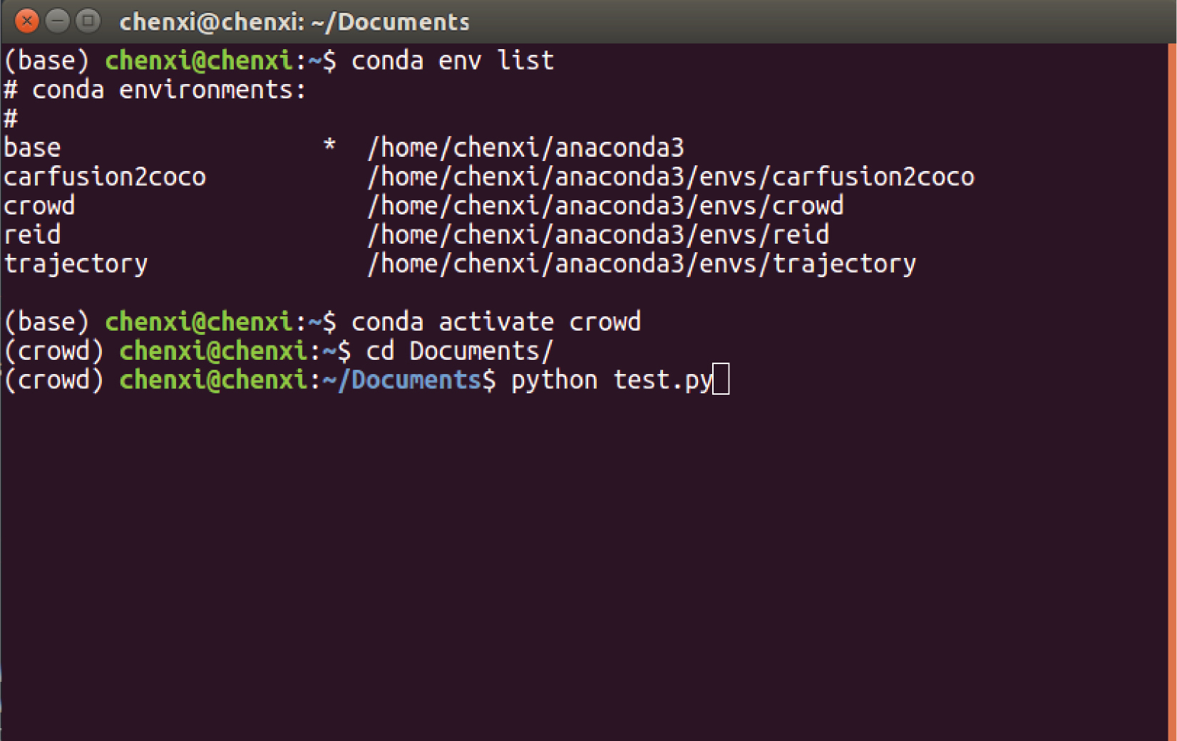
Long Description.
The screenshot is titled 'chenxi@chenxi: ~/Documents.' The coding listed in the screenshot is as follows: (base) chenxi@chenxi:~$ conda env list # conda environments: # base */home/chenxi/anaconda3 carfusion2coco/home/chenxi/anaconda3/envs/carfusion2coco crowd/home/chenxi/anaconda3/envs/crowd reid/home/chenxi/anaconda3/envs/reid trajectory/home/chenxi/anaconda3/envs/trajectory (base) chenxi@chenxi:~$ conda activate crowd (crowd) chenxi@chenxi:~$ cd Documents/(crowd) chenxi@chenxi:~/Documents$ python test.py.
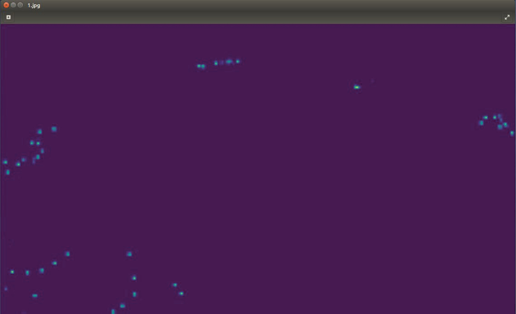
Long Description.
A screenshot titled 1.jpg shows estimated density map of the crowd which consists of a few plots against a dark background.
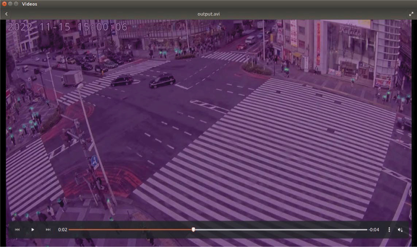
Long Description.
The signal is green and several cars are seen crossing the intersection. The intersection shows huge pedestrian crossing on all sides.
Discussion
This tool is an effective approach for identifying and sensing pedestrians within transportation settings, addressing common obstacles to reliable pedestrian detection in complex surroundings. These challenges include intricate occlusions, complicated backgrounds, variations in scale, heterogeneous distributions, shifts in perspective, and the presence of small objects. By adopting a scale-aware strategy, the method effectively captures features across multiple scales and processes representation information. This enhances its capability to detect and count pedestrians across a variety of distributions and complex scenarios, making it a reliable solution for monitoring pedestrian groups in challenging environments.
Road Surface Condition Detection Using Edge Devices
Background and Goals
Road surface condition detection is a critical aspect of transportation safety and infrastructure management. It involves various technologies and methodologies used to identify and assess the condition of road surfaces, enabling transportation authorities to maintain safe and efficient roadways. The condition of road surfaces directly impacts vehicle safety, ride comfort, and transportation efficiency. Poor road conditions, such as potholes, cracks, and surface wear, can lead to vehicle damage, crashes, and increased travel times. Moreover, adverse weather conditions like ice, snow, and water accumulation further exacerbate these risks. Therefore, timely and accurate detection of road surface conditions is essential for:
- Ensuring road safety by reducing the risk of collisions caused by poor road conditions.
- Prioritizing maintenance and repair activities to extend the lifespan of road infrastructure.
- Enhancing traffic flow and reducing congestion by preventing road closures and delays.
- Informing drivers about current road conditions, enabling them to make safer driving decisions.
Current methodologies and technologies for road surface condition detection include:
- Visual inspection: Traditional road condition assessment often involves manual visual inspections by trained personnel. While straightforward, this method is time-consuming, subjective, and limited in scope.
- Sensor-based systems: Various sensors, such as accelerometers, laser scanners, and ultrasonic sensors, can be mounted on vehicles to detect irregularities in road surfaces as they travel. These systems provide continuous and objective data but can be costly and require sophisticated data analysis.
- Image and video analysis: Advances in CV and ML have enabled the use of cameras to capture and analyze images and videos of road surfaces. Algorithms can detect and classify surface defects, measure their dimensions, and assess their severity.
- Thermal imaging: Infrared cameras can detect temperature variations on the road surface, indicating moisture, ice, or snow. This technology is particularly useful for monitoring road conditions in cold climates.
Methodology
The use of AI and ML algorithms is expected to improve the accuracy and efficiency of road surface condition detection by enabling the analysis of large datasets and the identification of complex patterns. The integration of internet of things (IoT) devices with road infrastructure can provide real-time monitoring and data collection, enhancing the responsiveness of maintenance activities.
The research team identified four key features to classify road surface conditions, comprising two from image data and two from environmental data. The image-based features include the intensity value and the dark channel value. According to the dark channel prior theory, the dark channel value is typically low for most natural objects, including road surfaces, unless the object appears white. However, in conditions with rain or snow, where reflections or white pixels are prevalent, the dark channel value may be higher. Conversely, the intensity value is effective in distinguishing between snowy and non-snowy conditions, as intensity values are elevated in snowy environments. Figures 77 and 78 illustrate the intensity and dark channel histograms of road regions in Washington State, captured by a surveillance camera. These demonstrate the significant difference between the features of roads with and without snow, which can be utilized for classification in the research teamʼs approach. Incorporating temperature and humidity sensors enhances the accuracy and dependability of the classification (Liu et al. 2023).
Environmental Features
Beyond image features, the research team also considers two environmental features: temperature and humidity, as measured by the DHT22 sensor. Temperature serves as an indicator of snowy conditions, while humidity signals rainy conditions. These selected features are straightforward, representative, and create a suitable feature space for effective classification. The feature vector is denoted as [I, K, T, H], where I represents the median intensity, K is the median dark channel value, T denotes the temperature, and H signifies the humidity. COCO SENSOR can categorize the road surface conditions into snowy, icy, wet, and dry using the four features (Liu et al. 2023). Figure 79 shows the image processing results of the road surface conditions detection tool.
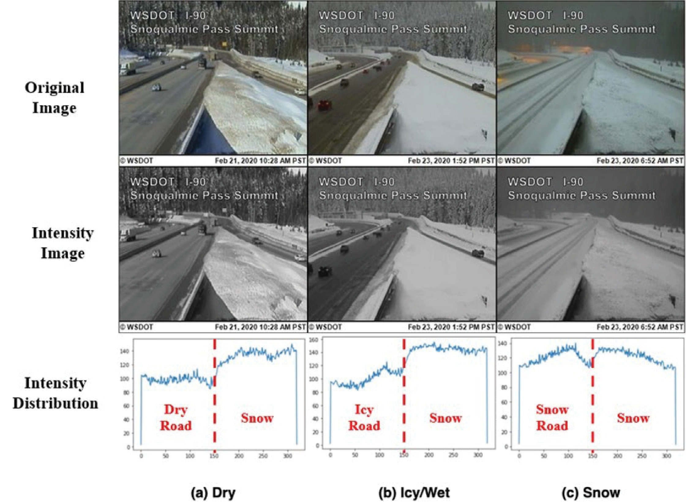
Source: Liu et al (2023).
Long Description.
The first set of three images is marked 'Original image' and labeled WSDOTI-90 Snoqualmie Pass Summit. The images show the same road getting covered with snow as the months progress. The next three images are marked 'Intensity image' and labeled WSDOTI-90 Snoqualmie Pass Summit. The same images in the first set are repeated but the contrast and color grading are slightly different. The second set has a more gray gradient than the first set. The three graphs are marked Intensity distribution. The horizontal axes are unlabeled from 0 to 300 in increments of 50 and the vertical axes are unlabeled from 0 to 140 in increments of 20. Graph A, Dry: A dotted horizontal line is drawn at its center with the Dry road marked on the left and Snow marked on the right. Graph B, Icy or wet: A dotted horizontal line is drawn at its center with Icy road marked on the left and Snow marked on the right. Graph C, Snow: A dotted horizontal line is drawn at its center with Snow Road marked on the left and Snow marked on the right.
Source: Liu et al (2023).
Long Description.
The first set of three images is marked 'Original image' and labeled WSDOTI-90 Snoqualmie Pass Summit. The images show the same road getting covered with snow as the months progress. The next three images are marked 'Dark Channel Image' and labeled WSDOTI-90 Snoqualmie Pass Summit. The same images in the first set are repeated but the second set is heavily pixelated and in complete tones of grey. The three graphs are marked Dark Channel Value. The horizontal axes are unlabeled from 0 to 300 in increments of 50. Graph A, Dry: The vertical axis is unlabeled from 0 to 80 in increments of 10. A dotted horizontal line is drawn at its center with Dry Road marked on the left and Snow marked on the right. Graph B, Icy or wet: The vertical axis is unlabeled from 0 to 100 in increments of 20. A dotted horizontal line is drawn at its center with Icy Road marked on the left and Snow marked on the right. Graph C, Snow: The vertical axis is unlabeled from 0 to 80 in increments of 20. A dotted horizontal line is drawn at its center with Snow Road marked on the left and Snow marked on the right.
Source: Liu et al (2023).
Long Description.
The 20 photos are arranged in a 4 by 5 manner with column headers and row headers. The row headers are Snowy, Icy, Wet, and Dry. The row headers are Original image, Intensity map, Dark channel map, Transmission map, and Environment sensing results. The images show the same view of the same curved road but their appearances differ with each season and type of image processing. The images in dry, original images and dry, environment sensing results are clear. The images in the wet, transmission map, and dry transmission maps are unclear.
Surface Condition |
Dry |
Wet |
Snowy |
Icy |
|---|---|---|---|---|
Dry |
96% |
1% |
1% |
2% |
Wet |
1% |
92% |
4% |
3% |
Snowy |
3% |
0% |
90% |
7% |
Icy |
0% |
5% |
9% |
86% |
Source: Liu et al. (2023). |
||||
Table 7 displays the classification results for road surface conditions. The accuracy levels achieved are 96%, 92%, 90%, and 86% for dry, wet, snowy, and icy road surfaces, respectively. The higher accuracy for dry and wet conditions can be attributed to their prevalence, providing ample data for model training. In contrast, snowy and icy conditions are less common in Washington State (occurring mainly during the winter), leading to limited data availability and a subsequent decrease in accuracy. Additionally, distinguishing between icy and snowy conditions can be challenging during data annotation, potentially confusing the model when differentiating between these states. The overall accuracy reached around 95%, which is still satisfactory and supports the practical implementation of a weather condition warning system (Liu et al. 2023).
Summary
Road surface condition detection is essential for maintaining safe and efficient transportation infrastructure. Advances in technology, including sensors, CV, and ML, have significantly improved the ability to detect and assess road conditions. However, challenges related to data quality, environmental factors, and cost remain. Future developments in AI, IoT, and autonomous vehicles hold promise for further advancements in this field, ultimately contributing to safer and more reliable roadways.