Resilience in Transportation Networks, Volume 2: Network Resilience Toolkit and Techniques (2024)
Chapter: 5 Cascading Effects of Disruptions on Large Statewide Networks
5 Cascading Effects of Disruptions on Large Statewide Networks
5.1 Cascading-Effects Model Documentation – Illinois
Objective
The cascading-effects model in Illinois determines the impact of disruption on freight corridors and trade centers. It identifies the important trade centers and the critical links that provide connection to them. It shows how the failure of identified critical facilities has impacts on access to the trade centers, job access, and the number of residents categorized by income group (total and below the poverty line). Illinois has the highest freight activity of any state. Three tiers of roadway corridors were selected in the region to see each tier’s cascading effects. More information regarding the selection of these tiers will be explained later in this document.
Data Sources
The Illinois Statewide Travel Demand Model (ILSTDM) was used as the primary source for the overall analysis of the test site. The year of analysis was 2017, which is the base year of the model. The data from the travel demand model used includes the following:
- Traffic Analysis Zone (TAZ) boundary – The model includes 4,852 total zones that include 4,366 zones within the state of Illinois, while the remaining zones cover other parts of the U.S.,
- 2017 model network,
- Truck trip tables by four periods, and
- Socioeconomic data – includes population, households, average income by TAZ.
Other data sources include:
- Employment by TAZ – Data from the Longitudinal Employment Household Dynamics (LEHD) dataset provides the number of employees in various industry sectors working in each TAZ.
Software used for the analysis includes TransCAD, ArcGIS, Microsoft Excel, and R.
Procedure
Step 1: Identify trade centers and hinterlands
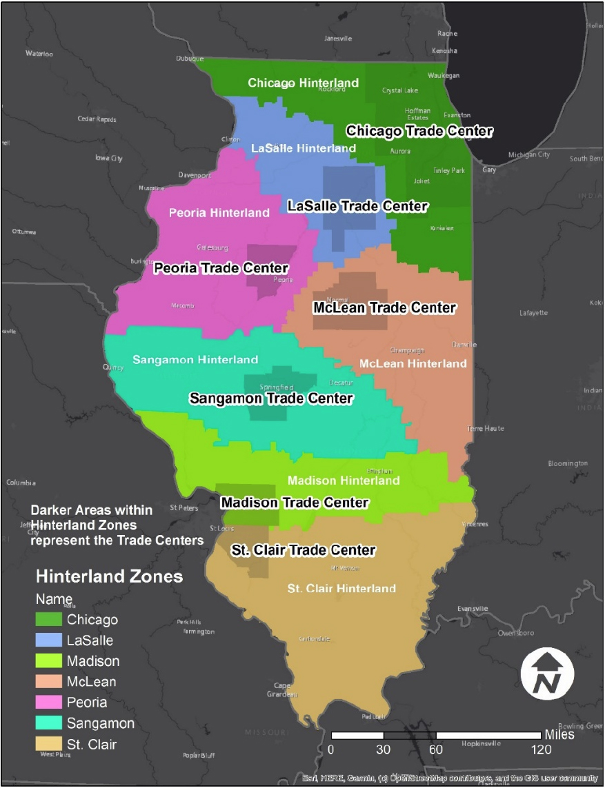
Illinois is divided into seven trade centers and hinterlands to make it easier to interpret what kinds of activities are going on in each trade center as well as its relative hinterland (see Figure 32). Trade centers are major metropolitan centers within the state, where economic activity revolving around freight is occurring. Hinterlands are linked economically to trade centers. For example, the entire region of Chicago is a trade center. The other trade centers were identified by looking at the concentration of population and employment within the state. The following steps were used to identify trade centers:
- Using the TAZ shapefile, calculate the sum of population and employment for each TAZ, and create a thematic map.
- Select areas with a concentration of TAZs that have a high population and employment total.
- Include all zones in a county where high concentration is seen and designate it as a trade center. Six additional trade centers were identified using this process: Lasalle, Madison, McLean, Peoria, Sangamon, and St. Clair.

Step 2: Assign the remaining area of Illinois into the hinterlands of each trade center based on the nearest-neighbor method
- Using the 2017 model network, create distance skims between each origin and destination TAZ.
- For every TAZ in Illinois that has not been assigned to a trade center, calculate the distance to each zone in each trade center. Based on the closest trade center, assign the zone to the hinterland of that trade center. Thus, there are seven hinterland zones associated with the seven trade centers.
Figure 33 highlights the trade centers as well as the hinterlands that surround each trade center. The darker zones are the trade centers that are located within each of the seven hinterlands. The Chicago trade center and hinterland are shown in green, the LaSalle trade center and hinterland are shown in light blue, the Madison trade center and hinterland are shown in lime green, the McLean trade center and hinterland are shown in a peach color, the Peoria trade center and hinterland are shown in pink, the Sangamon trade center and hinterland are shown in turquoise, and the St. Clair trade center and hinterland are shown in light orange. For subsequent maps, please refer to Figure 33 to get a clearer understanding of where trade centers and hinterlands are located.
Step 3: Identify critical links providing connections to trade centers
- Create a daily truck trip table by adding the single-unit (SUT) and multi-unit (MUT) trucks to create daily trips.
- Develop an equivalency file between TAZs and regions that include seven trade centers, seven hinterlands, and external (national) regions.
- Create a subset of the truck trip matrix by including only the trips that occur:
- Between trade centers or
- Between trade centers and externals.
- Create a distance-based assignment script. Assign the new trip table to the highway network.
- Create a thematic map of the link volumes.
- Identify the critical corridors. Based on the volumes, the corridors were categorized into three tiers. One route in each tier was selected:
- Tier 1 – I-55 and IL-66 between McLean and Chicago - They are parallel routes, and both the routes were analyzed together,
- Tier 2 – I-70, east of Madison and St. Clair trade centers, or
- Tier 3 – IL-29 between Peoria and Sangamon.
Tiers are identified by considering the volume of freight trips associated with each link on certain corridors.
Tier 1 is the most truck-traffic heavy (inter-region); Tier 2 (Orange) is a medium-level truck-traffic (inter-region) route that was selected; and Tier 3 (Yellow) is a relatively low-level truck-traffic (inter-region) route that was selected.
Figure 34 highlights link volumes on various roadway segments within Illinois. Five classifications are listed; however, only four are shown, as the 0-200 category range is ubiquitous throughout the map if shown. The I-55 corridor stretching from Chicago to the edge of the Sangamon hinterland is a significant road segment as link volumes are quite high for in-state freight travel.

Step 4: Perform select link on each of the three corridors and determine the impacted zones using the origin and destination trips
- Perform select link for each of the three corridors and develop the O/D matrix of selected trips.
- Export the origin and destination marginals (row sums) for each TAZ.
Step 5: Process the data, analyze the impacts, and develop reports in the form of maps and summaries
Step 5a: For each corridor, allocate the TAZs with trips to the selected corridor into high/low volume and sensitivity categories and create maps.
- The LEHD employment data shapefile is a point shapefile. It was spatially joined to the TAZs and the employment by categories were aggregated to the TAZ level.
- Categorize the employment category into sensitive and non-sensitive using definition in the Table 29 and calculate the sensitive and non-sensitive employment values by TAZ.
- Calculate the average of total origin and total destination truck trips using the output from Step 4.
- Using the zones with select trips, determine the top twenty-five percentile zones based on volume and label them high volume (with remaining as low volume) and determine the top twenty-five percentile zones based on the high sensitivity employment and label them high sensitivity (with remaining as low sensitivity). Develop a map of zones categorized into the four classifications.
Table 29: LEHD Employment by the Sensitivity Level
| Description | Sensitivity Level |
|---|---|
| Number of jobs in NAICS sector 11 (Agriculture, Forestry, Fishing, and Hunting) | Non-Sensitive |
| Number of jobs in NAICS sector 21 (Mining, Quarrying, and Oil, and Gas Extraction) | Non-Sensitive |
| Number of jobs in NAICS sector 22 (Utilities) | Sensitive |
| Number of jobs in NAICS sector 23 (Construction) | Non-Sensitive |
| Number of jobs in NAICS sector 31-33 (Manufacturing) | Non-Sensitive |
| Number of jobs in NAICS sector 42 (Wholesale Trade) | Non-Sensitive |
| Number of jobs in NAICS sector 44-45 (Retail Trade) | Sensitive |
| Number of jobs in NAICS sector 48-49 (Transportation and Warehousing) | Sensitive |
| Number of jobs in NAICS sector 51 (Information) | Non-Sensitive |
| Number of jobs in NAICS sector 52 (Finance and Insurance) | Non-Sensitive |
| Number of jobs in NAICS sector 53 (Real Estate and Rental and Leasing) | Non-Sensitive |
| Number of jobs in NAICS sector 54 (Professional, Scientific, and Technical Services) | Non-Sensitive |
| Number of jobs in NAICS sector 55 (Management of Companies and Enterprises) | Non-Sensitive |
| Number of jobs in NAICS sector 56 (Administrative and Support and Waste Management and Remediation Services) | Sensitive |
| Number of jobs in NAICS sector 61 (Educational Services) | Non-Sensitive |
| Number of jobs in NAICS sector 62 (Health Care and Social Assistance) | Sensitive |
| Number of jobs in NAICS sector 71 (Arts, Entertainment, and Recreation) | Non-Sensitive |
| Number of jobs in NAICS sector 72 (Accommodation and Food Services) | Non-Sensitive |
| Number of jobs in NAICS sector 81 (Other Services [except Public Administration]) | Non-Sensitive |
| Number of jobs in NAICS sector 92 (Public Administration) | Sensitive |
Step 5b: Develop summaries for truck trips, households, and employment by income group for each corridor. A spreadsheet was used to develop input data for graphs, maps, and tables.
- For each corridor, the input data includes the following at the TAZ level:
- Average of origin/destination truck trips,
- Employment from LEHD, and
- Households and income.
- Select-link trips and total trips by TAZ were used to get the share of truck trips.
- The trips were aggregated to the seven trade centers and seven hinterlands. The share of select-link trips among total trips in each region was calculated. Also, the share of select-link trips in each region among the total select-link trips within the state was calculated.
- Sensitive and total employment were aggregated to trade centers and hinterlands. The employment was weighted by the trip share of each TAZ. The shares of weighted vs. non-weighted employment were calculated, as well as the share of statewide employment.
- The poverty threshold income was calculated for each TAZ using Table 30.41
Table 30: Threshold Income by Persons/Household
| Person/HH | Income |
|---|---|
| 1 | $ 41,500 |
| 2 | $ 53,750 |
| 3 | $ 66,000 |
| 4 | $ 78,250 |
- The number of households with low income and total income was calculated. The share of households below poverty was calculated for each corridor.
Validation
It is an important part of this process to take the time to validate the results. This can be done in multiple ways. The first would be to review and validate the data sources prior, during, and after completing the process. Review the data collected and verify that roadway volumes, classifications, TAZ boundaries, and other data appear to be accurate. Be sure to “scrub” or clean any data to remove any apparent anomalies or errors. Additionally, be sure to truth test created or derived data along the to ensure results appear to be within expectations. Finally, review the results of both tabular and geospatial data, identifying and reviewing any anomalies for accuracy.
There are often multiple datasets related to roadway conditions from various sources. Take time to review like datasets and identify potential areas of concern within the modeling links used for this exercise.
In addition to a thorough data review, truth test the results by sharing them with local planners and other experts. Provide them with sufficient mapping and tabular information and ask them to review and apply their local knowledge to determine which results made sense to them and which results seemed to be out of place.
___________________
41“Application Instructions for Illinois Section 8,” ApplySectionEight, n.d., http://www.applysectioneight.com/apply/IL.
Results
Region Maps
Figure Figure 35 highlights the sensitivity per TAZs within Illinois with the Tier 1 Route and its cascading effects shown on the map. On this map and the next two maps, the trend is quite similar. TAZs that are close to the selected roadway segment is most affected by the disruption on the relative tier. For Figure 36, the affected TAZs are situated quite close to the selected route. There are numerous TAZs scattered around Illinois that are also affected by a Tier 1 disruption.
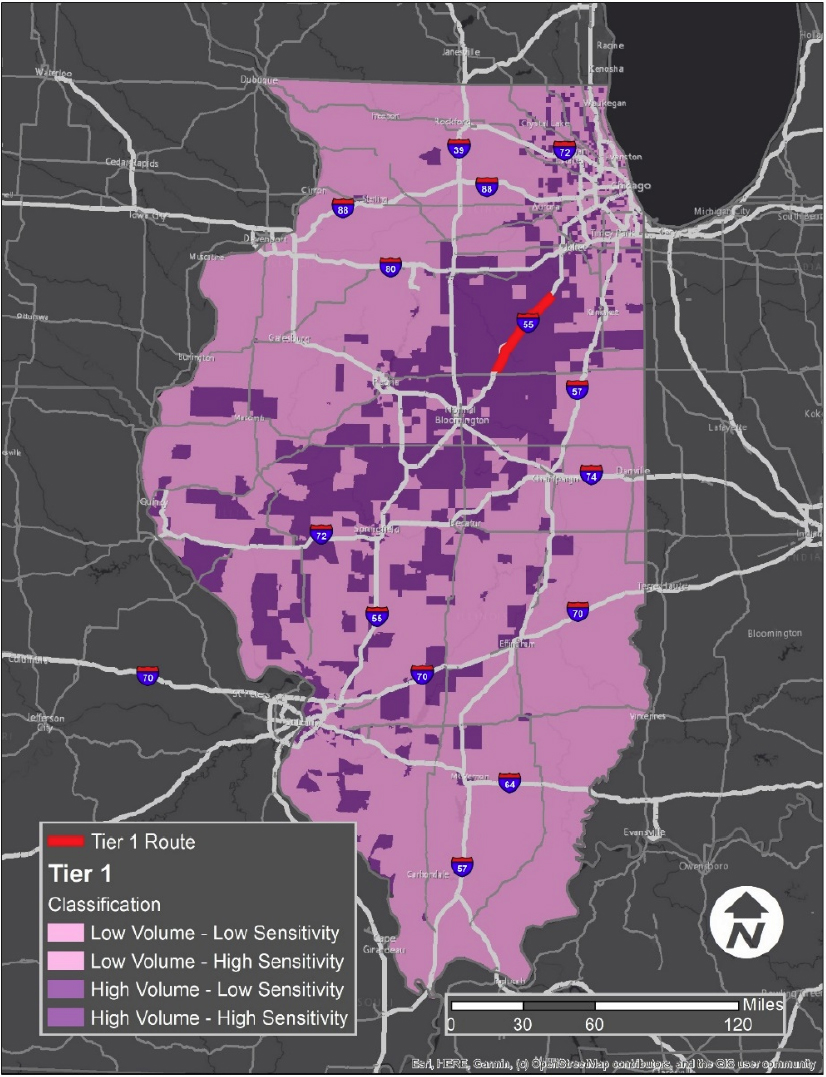
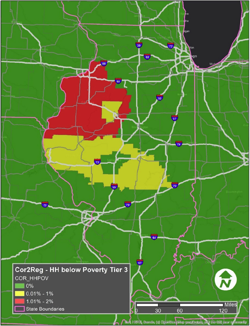
Figure 36 highlights the sensitivity of TAZs impacted by disruptions to Tier 2 routes. TAZs affected by the Tier 2 route disruption are vast. Nearly the entire southern half of Illinois looks to be affected by a Tier 2 route disruption event.
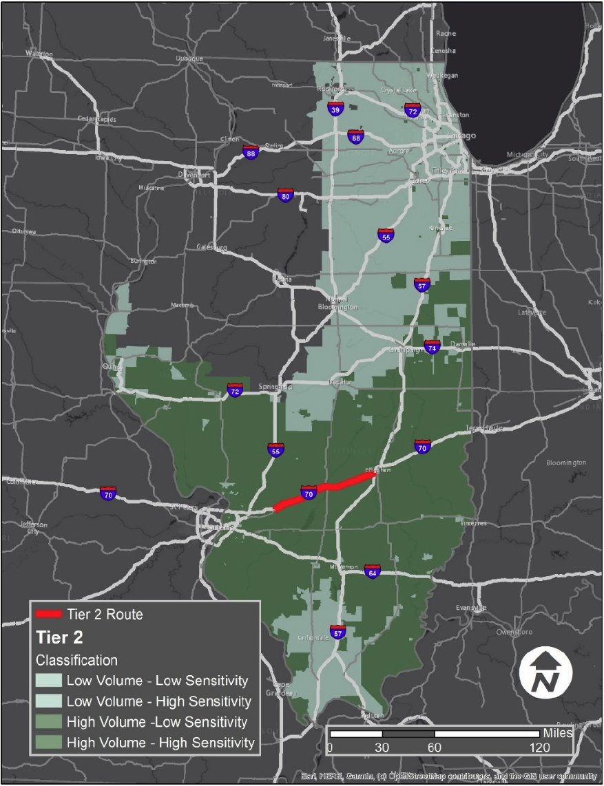
Figure 37 highlights the sensitivity of TAZs within Illinois with the Tier 3 Route and its cascading effects shown on the map. For the Tier 3 route disruption scenario, TAZs that are affected are close to the disrupted route, as well as being quite scattered throughout the entire state of Illinois.

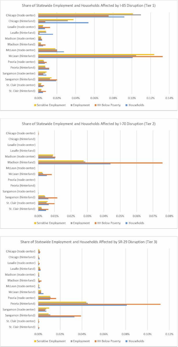
Figure 38 shows impacts of disruptions to key freight corridors (Tier 1, Tier 2 & Tier 3) as the statewide share of households, households living in poverty, employment, and employment in “sensitive” job categories affected in each trade center and hinterland. For example, a disruption to I-55 south of Chicago would have the greatest impact on employment and mobility in the McLean and in St. Clair areas. In McLean alone, the number of households living in poverty affected by a disruption to I-55 represents approximately 12 of every 10,000 households living in poverty statewide.
Figure 39 highlights freight trips out of state that would be affected by a disruption on the I-55 corridor (Tier 1). Regions shown in white boxes on the map highlight which areas of the United States as well as Canada and Mexico, will have affected truck trips. As shown on the map, 156 trips would be affected for trucks traveling to the South-Central area of the United States.
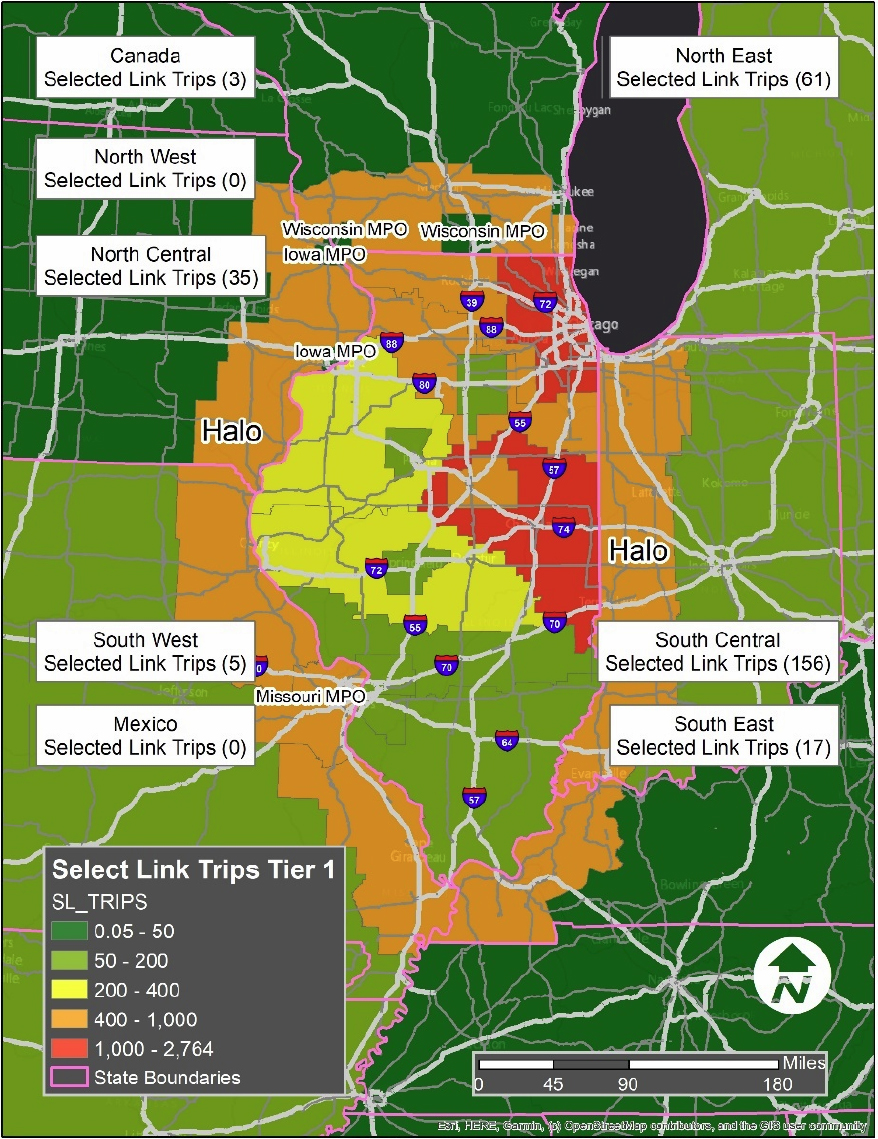
Figure 40 highlights the percentage share of sensitive employment impacted by the corridor to the total sensitive employment in the region. Variable values are weighted by select-link trip shares and divided by the total value of that variable in the region. What can be seen based on these calculations is that a large portion of the eastern region in Illinois has a particularly high employment sensitivity impacted by the Tier 1 corridor disruption.

Figure 41 highlights the percentage share of households below poverty impacted by the corridor disruption to the total households above poverty in the region. Variable values are weighted by select-link trip shares and divided by the total value of that variable in the region. From the calculations, it is shown that there is a high percentage share of households below poverty impacted by a Tier 1 corridor disruption on the eastern side of Illinois. There is also a significant number of households below poverty that are affected in the central and western portions of Illinois.
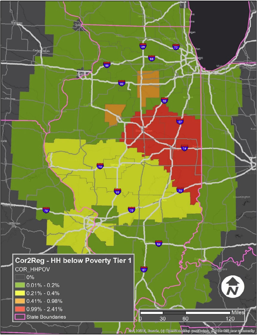
Figure 42 highlights freight trips out of state that would be affected by a disruption on the I-70 corridor (Tier 2). Regions shown in white boxes on the map highlight which areas of the United States as well as Canada and Mexico, will have affected truck trips. The Northeast states in the United States as well as the South-Central states (363 combined truck trips) would be most affected by a Tier 2 disruption.
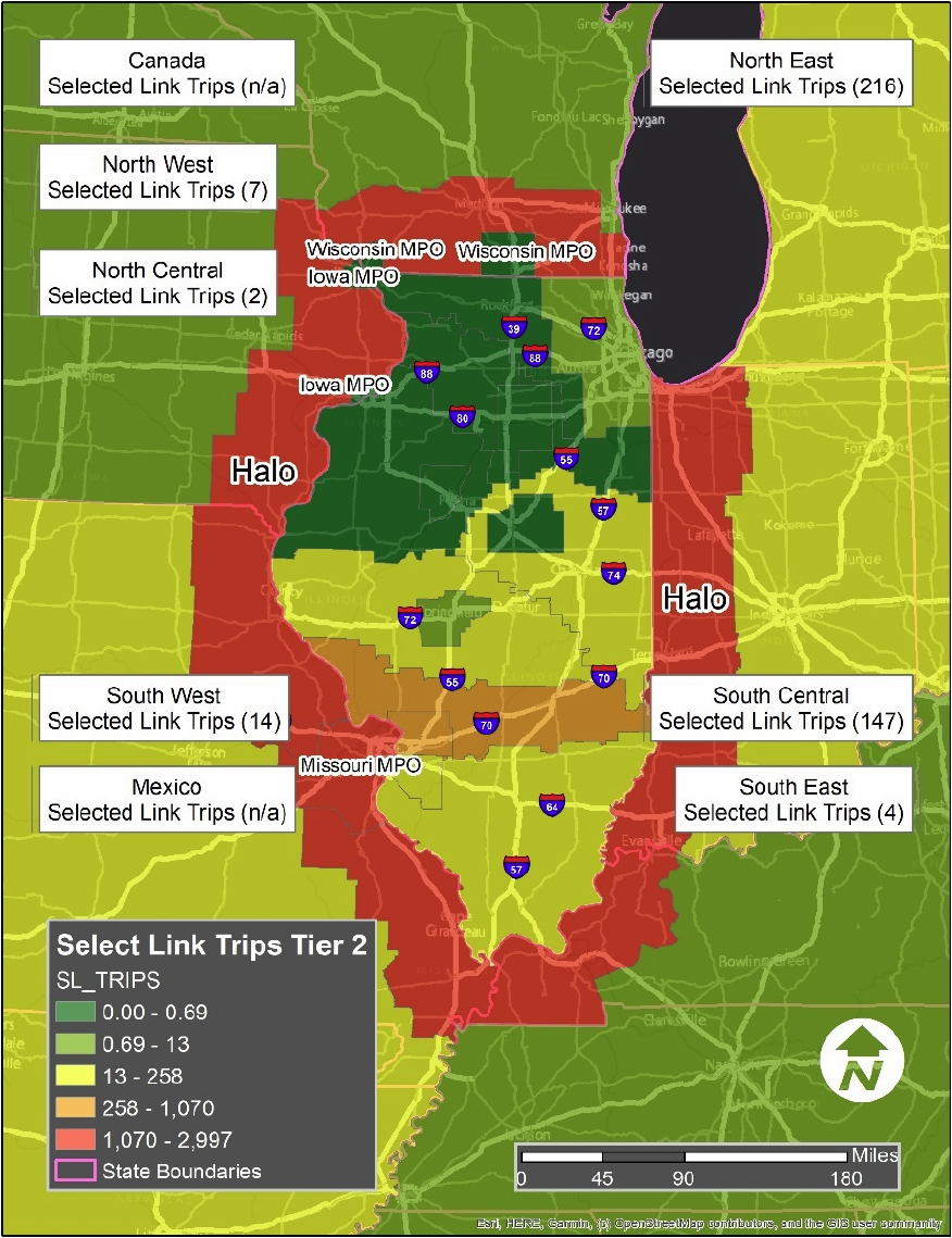
Figure 43 highlights the percentage share of sensitive employment impacted by the corridor to the total sensitive employment in the region. Variable values are weighted by select-link trip shares and divided by the total value of that variable in the region. From this calculation, it can be seen that there is a particularly large region that looks like a red belt that is heavily impacted by a Tier 2 disruption.

Figure 44 highlights the percentage share of households below poverty impacted by the corridor disruption to the total households above poverty in the region. Variable values are weighted by select-link trip shares and divided by the total value of that variable in the region. The red belt appears again with the calculations, and parts of eastern Missouri (St. Louis area) are affected by a Tier 2 disruption scenario.
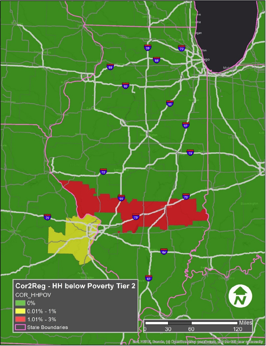
Figure 45 highlights freight trips out of state that would be affected by a disruption on the IL-29 corridor (Tier 3). Regions shown in white boxes on the map highlight which areas of the United States, Canada, and Mexico will have affected truck trips. Particular truck trips to different regions within the United States include North Central and South-Central trips.

Figure 46 highlights the percentage share of sensitive employment impacted by the corridor to the total sensitive employment in the region. Variable values are weighted by select-link trip shares and divided by the total value of that variable in the region. From this calculation, it can be seen that there is a particularly large region located within the northwestern part of Illinois that is affected by a Tier 3 disruption.

Figure 47 highlights the percentage share of households below poverty impacted by the corridor disruption to the total households above poverty in the region. Variable values are weighted by select-link trip shares and divided by the total value of that variable in the region. Based on the calculations, the northwest portion of Illinois seems to have the most impact on households below poverty based on a Tier 3 disruption. Moreover, households within central Illinois seem to be affected as well.
TAZ Maps
Figure 48 shows households below the poverty level in the Tier 1 map along with its cascading effects.
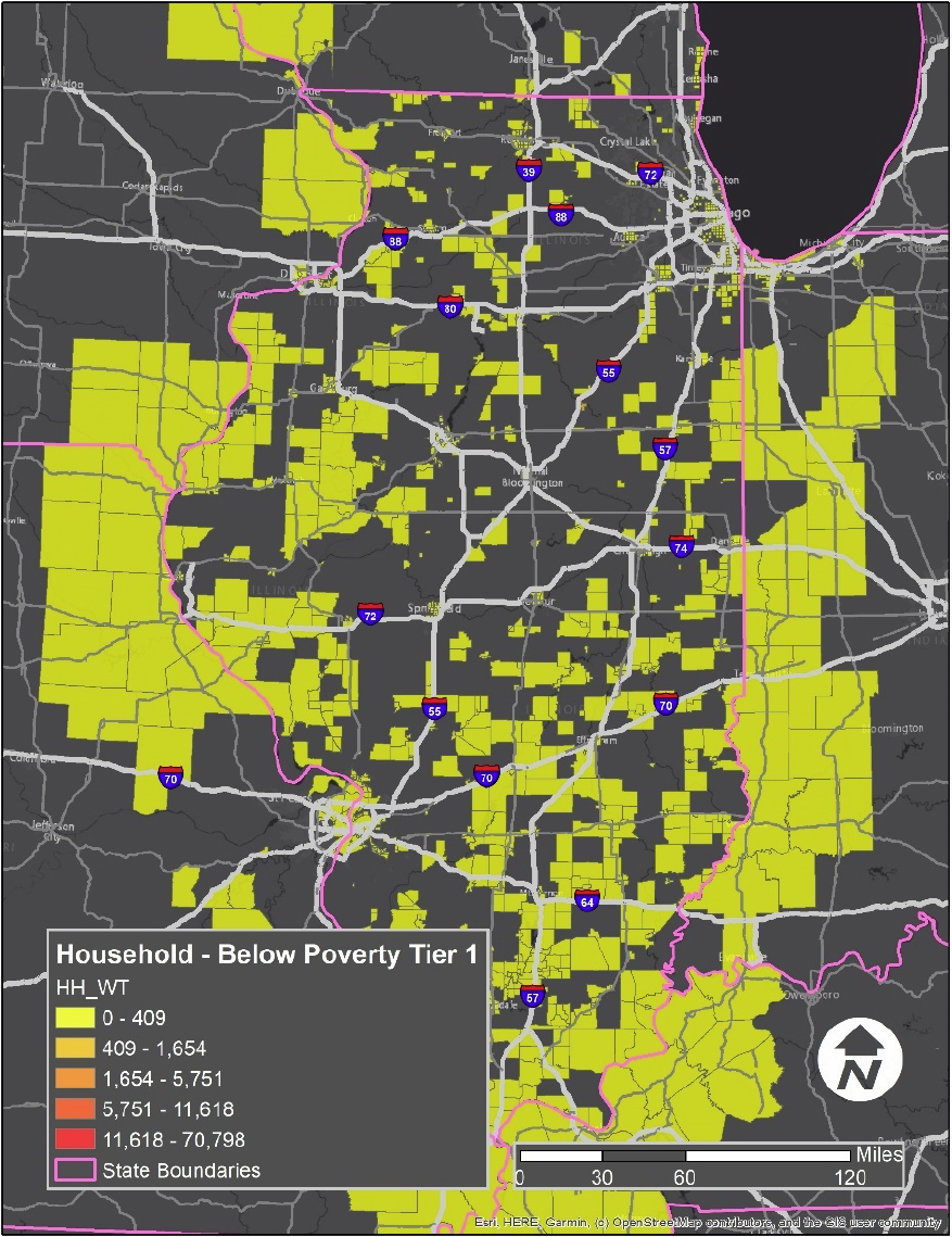
Figure 49 shows households above the poverty level in the Tier 1 map along with its cascading effects.

Figure 50 highlights link trips by zone using the Tier 1 route. Most zones are primarily located right on the border of Illinois. As expected, zones are located close to the selected corridor. Other zones are scattered throughout the state as well as the region.

Figure 51 shows high sensitivity employment (by zone) weighted by share of trips using the corridor. As shown on the map, zones with relatively high sensitivity are located on the Tier 1 route, along with zones being affected in and out of Illinois. Many zones are affected within Missouri.
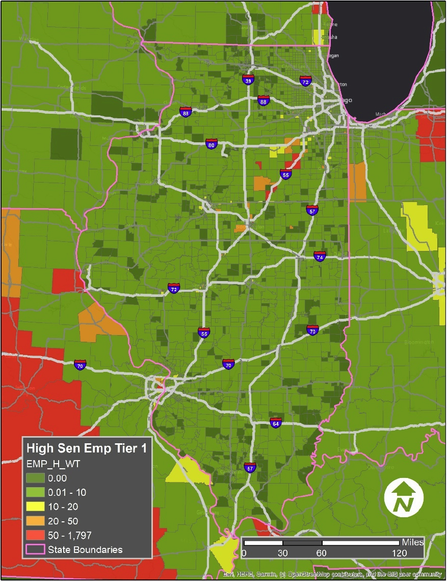
Figure 52 shows households below the poverty level in the Tier 2 map along with its cascading effects.

Figure 53 shows households above the poverty level in the Tier 2 map along with its cascading effects.

Figure 54 highlights link trips by zone using the Tier 2 route. Based on the map, there are not many link trips taking the Tier 2 route. The most significant zones are the ones located in Indiana close to the eastern border of Illinois. There are also a few zones located in the southern portion of Illinois, along with zones in St. Louis, Missouri, near the western border of Illinois.
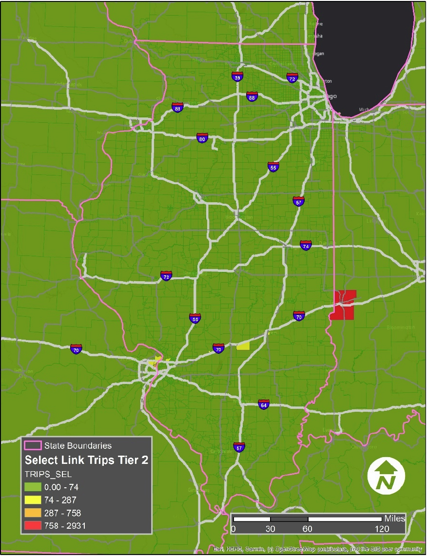
Figure 55 shows high sensitivity employment (by zone) weighted by share of trips using the corridor. The most affected zones are in Indiana, near the eastern border of Illinois, Indianapolis, Indiana, and many zones located within central Missouri. Interestingly, there are essentially no zones within Illinois.
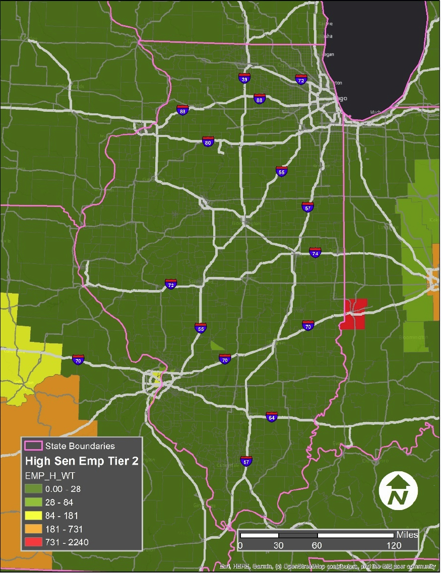
Figure 56 shows households below the poverty level in the Tier 3 map along with its cascading effects.

Figure 57 shows households above the poverty level in the Tier 3 map along with its cascading effects.
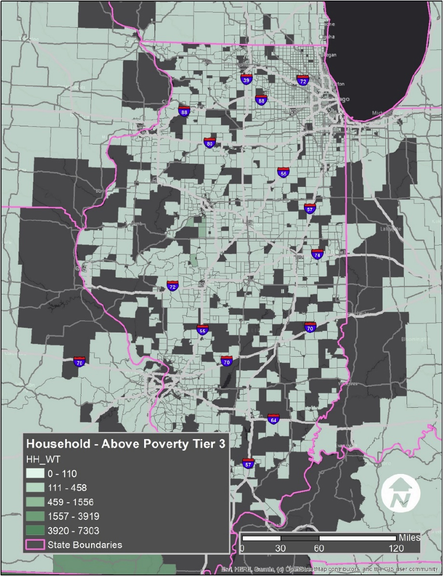
Figure 58 highlights link trips by zone using the Tier 3 route. Based on the map, the highest number of trips using the selected corridor occur close to the selected road segment. Other trips are scattered throughout the region.

Figure 59 shows high sensitivity employment (by zone) weighted by share of trips using the corridor. Most affected zones are located close to the selected corridor. More affected areas outside of Illinois are primarily located in Missouri, as outlined by the orange masses located on the map below.

Conclusion
The methodologies used in this pilot site were successful in highlighting many different cascading effects that may occur using three selected roadway corridors (Tiers 1, 2, and 3). The analysis is sufficient in its findings for the relevant analysis. The sourced data is accurate and provides a clear understanding of cascading impacts for the three routes that were selected.


