Strategies to Improve Reporting of Impaired and Distracted Driving in Motor Vehicle Crashes (2026)
Chapter: Appendix C: Workshop Overview

APPENDIX C
Workshop Overview
As part of the research project, research team members conducted five virtual workshops. The dates, number of registrations, and number of attendees can be viewed in Table C-1, and attendee locations are displayed in Figure C-1. The virtual workshops began with introductions and a review of the issues surrounding the misreporting of impaired and distracted driving. Next, the workshop presented the findings from the survey conducted to examine current statewide and jurisdictional efforts. Following these topics, the workshop went through the text classification method and direct linkage method. Method development, case studies, data needed by agencies, and strengths and limitations were covered.
Throughout the workshop attendees were encouraged to ask questions and discuss their own experiences with misreporting. Examples of feedback received included the following:
- “Thank you, the presentation was very interesting. Definitely a lot of food for thought and things to explore.”
- “Iʼll admit—this was more technical than I expected, but still incredibly fascinating. Thank you for sharing!”
- “This is a great webinar. Very informative.”
- “Thank you!! We are really interested in this research.”
- “A different university working on learning from narratives didnʼt go this direction, and I would have rather [theyʼd] gone in this direction. I like how you approached this from the BTS side. This will be useful for highway safety offices.”
- “Good information. Will reach out to others to see if these methods could be used in our state.”
- “Great information. Our state has used predicted modeling for alcohol-involved but seeing how a model could be used for distracted/inattentive is interesting, because this data field is so hard for us to pin down. Thank you!”
- “I would like to see the slides so I can study them. It was really several workshops in one and I would like to try to use some of the ideas in my work.”
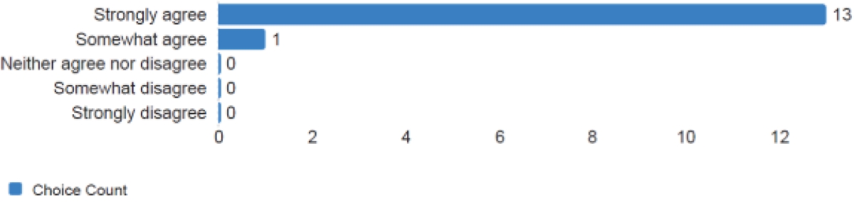
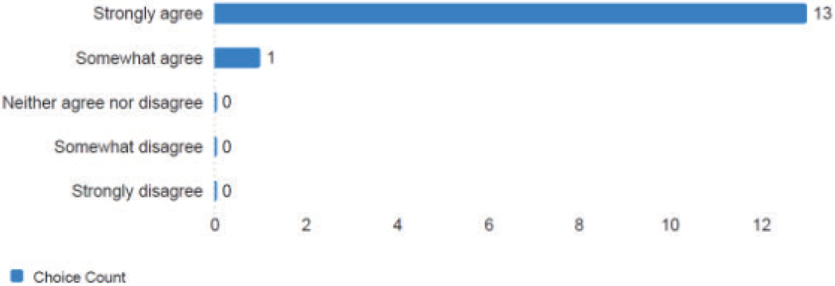
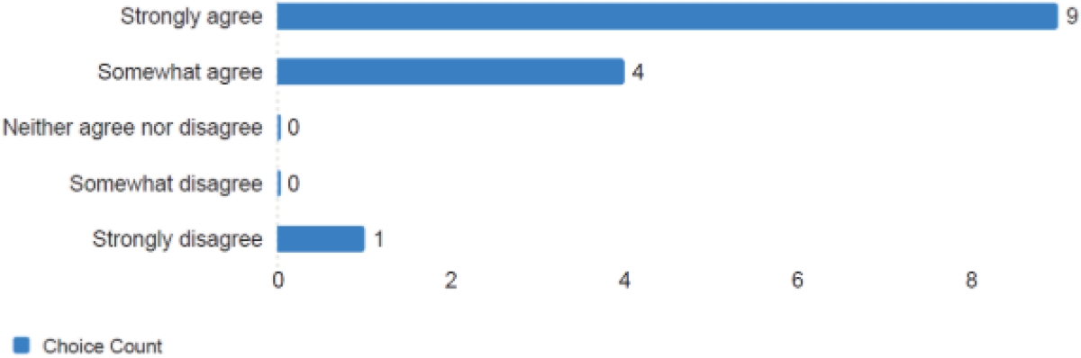
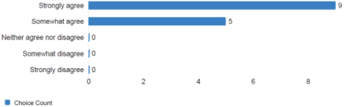
After the workshop concluded, attendees were sent a link to an online evaluation. The results from that evaluation are shown in Figures C-2 through C-9.

Long Description.
The column headers of the table are Workshop Number, Date (2025), Registrations, and Attendees. The data given in the table row-wise are as follows: Row 1: Workshop 1, April 21, 31, 23. Row 2: Workshop 2, April 24, 12, 5. Row 3: Workshop 3, April 29, 16, 8. Row 4: Workshop 4, May 6, 17, 7. Row 5: Workshop 5, May 15, 16, 8.

Long Description.
The map displays the United States and Canada, with certain states and provinces highlighted in a distinct color. The highlighted areas are scattered across both countries.
Long Description.
The horizontal axis represents the choice count, ranging from 0 to 12 in increments of 2. The vertical axis lists response options: Strongly agree, Somewhat agree, Neither agree nor disagree, Somewhat disagree, and Strongly disagree. The chart shows 13 respondents strongly agree, 1 somewhat agrees, and 0 responses for the other categories.
Long Description.
The bar chart is titled ‘The instructor allowed sufficient opportunities for attendees to ask questions, participate in, and interact.’ The horizontal axis represents the choice count, ranging from 0 to 12 in increments of 2. The vertical axis lists response options: Strongly agree, Somewhat agree, Neither agree nor disagree, Somewhat disagree, and Strongly disagree. The chart shows 13 respondents strongly agree, 1 somewhat agrees, and none chose the other options.
Long Description.
The horizontal axis represents choice count, ranging from 0 to 8 in increments of 2. The vertical axis lists response options: Strongly agree, Somewhat agree, Neither agree nor disagree, Somewhat disagree, and Strongly disagree. ‘Strongly agree’ has the highest count at 9, followed by ‘Somewhat agree’ at 4. ‘Neither agree nor disagree’ and ‘Somewhat disagree’ have 0 responses, while ‘Strongly disagree’ has 1 response.

Long Description.
The horizontal axis represents the choice count, ranging from 0 to 10 in increments of 2. Three options are displayed: “Yes” with a count of 11, “No, there was not enough time” with a count of 0, and “No, the class was too long” with a count of 3. The chart visually emphasizes that the majority found the class was not too long.
Long Description.
The horizontal axis represents the choice count, ranging from 0 to 8 in increments of 2. The vertical axis lists response options: ‘Strongly agree’, ‘Somewhat agree’, ‘Neither agree nor disagree’, ‘Somewhat disagree’, and ‘Strongly disagree’. ‘Strongly agree’ has the highest count at 9, followed by ‘Somewhat agree’ with 5. The other categories have a count of 0, indicating no responses.
Long Description.
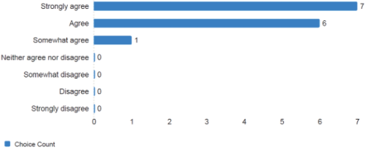
The horizontal axis represents the choice count from 0 to 7 in increments of 1. The vertical axis lists response options: Strongly agree, Agree, Somewhat agree, Neither agree nor disagree, Somewhat disagree, Disagree, and Strongly disagree. Strongly agree has the highest count at 7, followed by Agree at 6, and Somewhat agree at 1. All other categories have a count of 0.
Long Description.
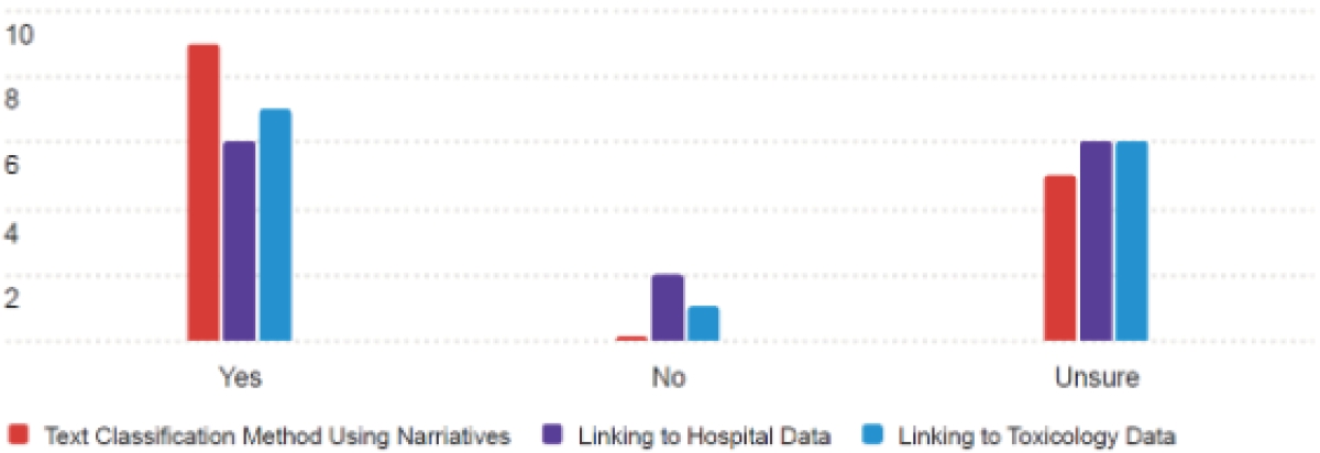
The bar chart illustrates the methods used to estimate misreporting for agencies, categorized into Yes, No, and Unsure. The vertical axis represents the number of responses, ranging from 0 to 10 in increments of 2. The horizontal axis lists the categories: Yes, No, and Unsure. Three methods are compared: Text Classification Method Using Narratives, Linking to Hospital Data, and Linking to Toxicology Data. In the “Yes” category, the Text Classification Method has the highest count, followed by Linking to Toxicology Data and Linking to Hospital Data. The “No” category shows minimal responses, with Linking to Hospital Data slightly higher. In the “Unsure” category, Linking to Hospital Data and Linking to Toxicology Data have equal counts, both higher than the Text Classification Method.

Long Description.
The x-axis represents choice count from 0 to 10 in increments of 2, while the y-axis lists satisfaction levels: extremely satisfied, somewhat satisfied, neither satisfied nor dissatisfied, somewhat dissatisfied, and extremely dissatisfied. 10 participants are extremely satisfied, 3 are somewhat satisfied, and no participants fall into the other categories.


