American Hazardscapes: The Regionalization of Hazards and Disasters (2001)
Chapter: 3 Mapping and the Spatial Analysis of Hazardscapes
CHAPTER 3
Mapping and the Spatial Analysis of Hazardscapes
Michael E. Hodgson and Susan L. Cutter
Maps are a fundamental means of communication. They have been used since prehistoric times to indicate directions to travelers, describe portions of the Earth’s surface, or record boundaries including zones of danger. The collection, mapping, and analysis of geographic information are essential elements in understanding how we live with, respond to, and mitigate against hazards. We begin this chapter with a primer on the fundamental concepts in mapping—scale, resolution of geographic data, and characteristics of spatial databases. We then provide a brief history of mapping generally, and hazards mapping specifically. The chapter concludes with a discussion on the role of technological advances in influencing the mapping and the spatial analysis of societal response to hazards.
INFORMATIONAL NEEDS AND INPUTS
The data we use in hazards assessment and response have two fundamental characteristics: a time (or temporal) dimension and a geographic (or spatial) dimension. The requirements for each may be quite different, depending on the application. For example, the data needed for post-event emergency response (rescue and relief) are quite
different from the information we need for longer-term recovery and mitigation efforts. Similarly, the geographic extent of our data varies depending on the nature of the event.
Temporal Considerations
In hazards applications, we are concerned with when the data were collected, the time interval required for the collection, the lag time between when the data were collected and when we can use them, and finally, how frequently new data are collected. For example, censuses of population and housing at the block level are extremely important for modeling population at risk from future flooding. Yet, these population surveys are made once every 10 years (frequency). Even after the population census is conducted, it may be 2 years or more before the data are made public (lag time). So, communities often use population projection data (for updates) or simply use “old” data because they cannot afford to collect such extensive demographic data on their own. Clearly, these time-dependent characteristics influence the types of questions we can answer and the ways in which data can be used.
Often, special data collection efforts are required in order to conduct hazards assessments that include the most current information possible. The following provides a good example. The collection of aerial photography for post-disaster emergency response or damage assessment (e.g., after a hurricane) can be scheduled upon demand, such as the day after the event. Because it is a snapshot, the photography represents the landscape on that day (collection date). Damage assessments from aerial photography typically are conducted by comparing post-disaster to pre-event photography. Unfortunately, the last pre-event photography may be quite old (e.g., 5 to 10 years). An example is provided by the pre- and postdamage assessments from Hurricane Andrew. The State of Florida was fortunate to have recent (within 1 year) pre-disaster imagery (Figure 3-1a, b), which made pre- and post-event comparisons easier. The updating of flood insurance rate maps (FIRMs) provides another example of the temporal dimension in hazards mapping, where the time interval and frequency of revisions may pose pre-impact planning problems especially for rapidly urbanizing areas. In some places, FIRMs may be more than 10 years old and may not reflect or may inadequately represent the recent growth and development in that community.

FIGURE 3-1 Mobile home park in Homestead, Florida (a) before and (b) after Hurricane Andrew in 1992. Source: Photography scanned by M. E. Hodgson from a pre-event photo from NAPP USGS, and post-event photography flown by Continental Aerial Surveys.
Spatial Scale, Resolution, and Extent
Just as geographic data have temporal dimensions associated with their collection or analysis, they also have spatial characteristics. One of the first decisions a cartographer makes is to determine how much of the Earth’s surface is to be represented on the map. This is known as map scale; it is the relationship between the length of a feature on a map and the length of the actual feature on the Earth. Small-scale maps (such as a map of the world) cover a large proportion of the Earth’s surface, but offer very little detail about it other than broad generalizations about patterns. Larger-scale maps are just the opposite—they portray a smaller area but with greater detail. An example would be a city road map. Large-scale and small-scale maps each have their own purpose and use in hazards. We would not presume to navigate the city with a wall map of the world, nor would we want to use the wall map to tell us how to get to the Federal Emergency Management Agency (FEMA) headquarters in Washington, D.C. Thus, knowledge of scale is an important determinant of what type of geographic data should be collected and the ultimate purpose of the map.
All geographic data should include a description of the spatial characteristics—observation unit (or spatial resolution), collection/reporting unit, and spatial extent. Scientists from different disciplines often incorrectly use the term “spatial scale” to refer collectively to one or more of
these characteristics. For example, suppose we wanted to predict the geographic distribution of anticipated damage associated with a future hurricane for all major metropolitan areas in the United States. To do this, we would construct a building loss-wind speed functional statistical relationship based on a sample of individual homes in a coastal area. Next, we would forecast the spatial distribution of total future losses, using building characteristics within census tracts. At what scale are we operating? It might be most appropriate to say that the damage-wind speed estimate is at the individual building scale (our observational unit) but the forecast of future losses is at the census tract scale (our collection/ reporting unit). Even though the spatial extent of our study was nationwide (at least all metropolitan areas in the country), it would be inappropriate to say we had conducted a national-scale study. As this example illustrates, the use of the term spatial scale is often so contextual and audience-specific that it is confusing to others when we say our study is at such-and-such a spatial scale. Despite this confusion, spatial scale is still an important parameter in geographic data collection and data storage.
Selection of appropriate spatial characteristics is critical for hazards and vulnerability assessments (Been 1995, Cutter et al. 1996). It is arguably one of the primary reasons why different relationships are observed between risk variables in diverse analyses. Research in nonhazards fields, for example, has documented that the correlation between variables (e.g., percentage minority population and mean family income) varies for the same spatial extent as the size of the observational unit changes (Clark and Avery 1976). In general, the correlation between variables increases as the size of the sampling unit increases (moving from block groups to counties, counties to states, sampling plots to ecosystems). In geographic terms, this is called the modified areal unit problem or, more commonly, the “ecological fallacy” (Cutter et al. 1996).
So, what is the appropriate spatial resolution of analysis for hazards and vulnerability assessments and hazards mapping? The immediate response is that it depends on the purpose of the assessment or map and the availability of data. Ideally, we would want to achieve a balance between the best resolution possible (the greatest level of detail, such as the smallest census unit for geo-referenced population data), our understanding of the processes involved (based on individuals or groups), and our ability to process the data. From a hazards standpoint, the appropriate resolution of analysis must be commensurate with the ability to de-
lineate the risk or hazard studied. For example, it makes no sense to use county- or census-tract-level data for estimating the characteristics (e.g., race, income) of the population at risk around a noxious facility—if the risk zone is only one-quarter mile. The spatial differences between the small, one-quarter-mile radius area at risk and the larger census tracts (or much larger counties) is too great. This example is analogous to estimating the kinds of fish along the Toledo shoreline based on the varieties and densities of fish in all of Lake Erie.
Fundamental population characteristics (e.g., age and race) are published in the Decennial Census at the block level; more detailed characteristics are available only at block-group and larger census units. Thus, some hazard impact analyses may be conducted at block-level scales (potential value of the housing stock) whereas others may be limited by the available data and only focus on census tracts or counties (social vulnerability based on personal income). Furthermore, consider the ominous task of analyzing the U.S. population at risk from some hazard at the block level. Processing the spatial data for over seven million blocks (the number of blocks in the 1990 Decennial Census) would put severe burdens on most computers even if the models were simplified.
Graphical Representations
Maps are used to depict the spatial relationships of objects. There are many different types of maps, but the most common are classified as thematic maps because they concentrate on the spatial variability of one phenomenon, such as rainfall or tornado touchdowns. There are a number of specific cartographic representations that provide us with additional information about the phenomena we are mapping (Figure 3-2).
Choropleth maps (the most commonly used in hazards research) show the relative magnitude of the variable using different shadings or colors. In this way, a reader can easily determine those areas that have more rainfall (or tornadoes) by simply looking at the darkly shaded areas on the map (see Chapter 6). Contour maps are another example. Contour maps represent quantities by lines of equal value (isolines) and thus illustrate gradients between the phenomena being mapped. We are most familiar with them for depicting elevation changes on topographic maps, but isoline maps also are used to display regions of high and low pressure on weather maps.
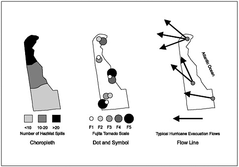
FIGURE 3-2 Different cartographic representations of hazards data.
Dot maps show the location and distribution of specific events, such as tornadoes. A variant on the dot map is the symbol map, which uses different sizes or shapes to indicate a quantity at a specific location. For example, different-size circles could be used to illustrate the different intensities of tornadoes based on the Fujita Scale. Hazards information is also represented by line maps, which illustrate actual or potential movement or flows. The volume of hazardous waste transported from one location to another, for example, could be depicted using such a map. Similarly, the number of evacuees leaving specific coastal towns could be represented that way. Finally, animated maps can be used to graphically illustrate changes in phenomena over time, such as the population of the United States, the growth of a city, or the likely storm surge from an impending hurricane (Collins 1998).
IMPROVEMENTS IN DATA COVERAGE AND ACCURACY
During the past 25 years, our knowledge about risk, hazards, and vulnerability has improved. Over the same time period, we have seen major advances in techniques for collecting hazards data with increased
accuracy. Better data result in improved hazard and vulnerability assessments.
Monitoring and Surveillance
The greatest advances in technology have been in the areas of monitoring and surveillance of hazards. The mid-1970s saw the implementation of real-time detection of seismic events via digital monitoring networks (Stewart 1977). As the 1980s progressed, researchers installed denser networks, trying to increase the global coverage of sampling points. For example, by the mid-1990s, over 46,000 seismometers had been deployed, but in a very uneven spatial pattern (Wysession 1996). Although we can now monitor global seismic activity, there are still some regions about which we know relatively little (seismically) because of the lack of monitoring at the subglobal level.
Another hazard that has been the focus of increased surveillance and monitoring over the past 25 years is severe meteorological storms resulting from extratropical cyclones and convection. The development of WSR-88D Doppler radar has increased forecasters’ ability to predict and track tornadoes, hail, and wind. Further refinements in the technology have enabled forecasters to examine three-dimensional data to look for the distinct “hook” or signature of a forming tornado (see Chapter 2). In addition, Doppler radar has been used to estimate precipitation at given locations in order to predict possible flood hazards (Figure 3-3, see color plate following page 22). Doppler radar systems now are installed in most urban areas (airports) across the country as part of the National Weather Service’s (NWS) modernization program. However, there are many remote areas where Doppler radar still is unavailable.
Perhaps the greatest technological advances in hazards surveillance and monitoring are remote-sensing technologies. In 1960, the National Aeronautics and Space Administration (NASA) launched the first experimental weather satellite, TIROS 1. Because of the success of the polarorbiting TIROS and NIMBUS (1964-1974) programs, National Oceanic and Atmospheric Administration (NOAA) also began the Geostationary Observational Environmental Satellite (GOES) program in 1975. Versions of these satellites continue to operate today, providing scientists with access to near real-time images of the weather around the globe. The ability to view severe storms and hurricanes using more than the visible bands of the electromagnetic spectrum has allowed meteorolo-
gists to examine the tracks and internal characteristics of storms, which was not possible two decades earlier (Lillisand and Kiefer 1994). It has also assisted in the mapping of the impact areas of natural hazards such as lava flows, natural oil seeps, floods, droughts, and dust storms (Abrams et al. 1991, Simpson 2000).
In addition to meteorological hazards, remote sensing has been used to monitor wildfires (Figure 3-4, see color plate following page 22) and air pollution. The U.S. Geological Survey (USGS) and NASA initiated the Earth Resource Technology Satellite (ERTS) program, resulting in the deployment of seven satellites to collect Earth resources information. The first of these, ERTS-1, was launched in 1972 and had a spatial resolution of 79 by 79 meters. LANDSAT 1, (the renamed ERTS satellite) became operational in 1978 and subsequent satellites were launched throughout the next two decades, tracking small-area events with less expense and great efficiency, and providing a potential wealth of data for the hazards community.
Satellite data also have been used to assess post-event damages and thus aid in resource allocation during the hazard recovery process. After Hurricane Andrew, for example, remote-sensing technologies helped to quickly determine the extent of damage for the disaster declaration (Davis 1993). In the aftermath of Hurricane Hugo, remote-sensing data were used to determine the nature and extent of damaged forest resources in coastal South Carolina (Cablk et al. 1994). Previous property damage assessments were restricted to either field reconnaissance, which took weeks or months after the event for ground crews to enter the affected area, or through aerial and digital-frame photography, but satellites could not provide enough detailed information to be helpful. Thus, the spatial and temporal resolution of sensor systems has limited the direct application of remote sensing to hazard studies up to now.
The newest generation of satellites (releasing unclassified data) has spatial resolutions on the order of 1 by 1 meter, enabling even more precise monitoring of hazards (and their impacts) at the local level (Jensen 1996, 2000). For example, Space Imaging Inc.’s IKONOS platform includes multispectral digital-frame cameras that can “sense” infrastructure such as roads and pipelines and even individual homes. This highresolution pre- and post-disaster imagery can provide a valuable source of information during disaster response and recovery (Cowen and Jensen 1998, Jensen and Cowen 1999). In 1999, the TERRA satellite was launched, ushering in a whole new generation of remote-sensing satellites to assist in hazard surveillance (King and Herring 2000). Initially
geared toward monitoring of global climate change indicators, a number of the sensors on the TERRA satellite have tremendous utility for hazard assessments (Table 3-1). The potential of the newer technology is only now beginning to be realized.
Finally, as part of its Map Modernization Plan, FEMA is currently assessing the applicability of remote-sensing techniques in producing National Flood Insurance Rate maps (FEMA 2000b). Specifically, FEMA is experimenting with the use of LIDAR (light airborne detection and ranging) and IFSAR (Interferrometric Synthetic Aperture Radar) sensor systems to generate digital elevation models and digital terrain maps that could be used to project flood-prone areas based on elevation. The experiment is designed to see if the application of this technology can predict the geographic extent of flooding (e.g., 500-year flood event or 100-year flood event) associated with Hurricane Floyd in Tarboro, North Carolina (J. R. Jensen 2001, personal communication).
The spatial and temporal characteristics of data and the subsequent maps produced from them will vary with the needs of the researcher or emergency manager. In mapping individual structures in hazard or risk assessments, the spatial resolution must approach the 1 by 1 meter pixel size or better (Welch 1982, Cowen and Jensen 1998). The rapid assessment of post-disaster damage for emergency response requires a spatial resolution of 0.25 to 1 meter. However, this information must be available to the emergency manager within 1 to 2 days after the event (Cinti 1994, Wagman 1997) to be of greatest use. On the other hand, preimpact planning and mitigation often requires less spatial resolution (less
TABLE 3-1 TERRA Satellite Sensors Used to Monitor Hazards
|
Sensor |
Spatial Resolution |
Attribute |
Targeted Hazard |
|
Aster |
15-90 m |
Can target selected sites or areas |
Floods, wildfires, volcanic eruptions, earthquakes |
|
CERES |
20 km |
Monitors radiation fluxes |
El Niño, La Niña |
|
MOPITT |
22 km |
Monitors trace pollutants and their sources |
Pollution, chemical releases |
|
MISR |
275 m-1.1 km |
Monitors clouds and smoke plumes |
Smoke plumes from industry, volcanic eruptions, etc. |
|
MODIS |
250 m-1 km |
Covers entire planetary surface every 2 days |
Volcanic eruptions, floods, severe storms, drought, wildfires, snow cover |
|
Sources: King and Herring 2000, Jensen 2000. |
|||
detailed information) and a longer time frame (months to years). Both need to be considered when using remotely-sensed data to map hazards.
Data and Improved Collection Accuracy
Historically, the collection of data for hazards mapping began with fieldwork. The seminal work by John Snow on cholera used individual observations of cholera cases—where the victims lived in the city—to find the source of the health threat (Frerich 2000). Fire insurance maps during the 1800s also used field observations to note the location and construction materials of every building in the urbanized area. Even today, the “windshield survey” is the fundamental method for building a spatial database of damaged homes after a hurricane event.
Advances in field survey methods for building spatial databases include the mobility of the observer and improved methods for determining geographic position (Goodchild and Gopal 1992). Largely developed in the 1980s, the Global Positioning System (GPS) provides a very accurate method for determining the geographic position of the observer. Compared to other methods of locating positions, GPS is essentially an all-weather, 24-hour/7-day global system that is relatively cost-free to the user, who needs to purchase only the receiving device. Single-point positions are accurate to within 30 meters with the inexpensive handheld receiver (costing about $100). This new, inexpensive, and accurate method of determining geographic position is used widely in emergency response and in transportation-related hazard studies. Documentation of damage at a specific location from a hazard event has been greatly improved. Field personnel merely have to push one button on the automobile-mounted GPS to locate and record the position of the noted damage. Another example is monitoring the movement of hazardous materials using GPS in a truck, barge, or train.
THE SCIENCE AND ART OF MAPPING
Rapid technological advancements during the twentieth century (photography, aircraft) enabled us to expand not only the coverage of mapped areas of the Earth, but the efficiency with which it was done. We no longer needed to complete field surveys for mapping, but could use fixed-wing aircraft that took photographs (which were then converted into maps). This method had the advantage over field surveys in that larger areas could be covered in more detail, resulting in both time and
labor savings. In February 2000, the ultimate mapping project took place when the Space Shuttle Endeavor mapped 80 percent of the Earth’s surface in 10 days, creating three-dimensional topographic maps with 30-meter resolution (accurate within ± 30 meters of their true location) (Chien 2000).
The science of mapping—cartography—has a long and rich history and tradition. The oldest known map (on a clay tablet) was found in Mesopotamia and is thought to be a city map of landholdings (Robinson et al. 1978). Now, such maps are called cadastral (or tax assessment) maps. Starting with the ancient Greeks and Romans—and later Ptolemy (known as the father of cartography) in ancient Egypt and Phei Hsiu in ancient China—maps were a standard form of communicating geographic information about places. The quality and accuracy of many of these early maps were unchallenged for more than 10 centuries! The art of cartography was lost during the Dark Ages in Europe, but was reintroduced by the Arab cartographer, Idrisi. In addition to the increased curiosity about faraway places, seemingly accurate sailing charts (the forerunner of contemporary nautical charts) appeared, both of which stimulated additional interest in map making.
The rapid advancements in map making during the Renaissance were largely due to the great voyages of discovery and the development of the printing press, which allowed multiple copies of maps to be reproduced. Modern cartography dates to the seventeenth century with the use of a Cartesian grid system to more accurately position and orient the map. National surveys, especially in France and England, delineated not only their territory, but also the physical and human features within it ushering in what we now know as topographic mapping. Thematic mapping (maps of specialized subjects such as climate, weather, population density, landforms, and even hazards) became the norm during the nineteenth century when the process of lithography made those maps easier and less expensive to duplicate, and thus more widely distributed than ever before.
The development of the computer has enhanced cartography more than any other single technological advancement during the twentieth century. The integration of geographic information along with environmental and socioeconomic data has resulted in the development of the Geographic Information System (GIS), the dominant force in today’s mapping of hazards and their impacts.
Hazards Cartography
It might be argued that the work of John Snow, a physician in London, England, was the earliest example of applying cartographic approaches to hazards—in that case epidemiology (Monmonier 1997, Timmreck 1998, Frerich 2000). Snow recorded cholera observations in the mid-1840s and then created spatial and temporal distributions of the infections and deaths in a small area of London. By comparing the distribution of cholera cases to water supplies, he was able to suggest hypotheses about the origin (i.e., the water supply), transmission, and control of the disease. After mapping and analyzing the spread of cholera, he finally removed the pump handle from the contaminated water source on Broad Street to control future cholera outbreaks (Frerich 2000).
The development of weather maps was another early example of the use of cartography to convey hazards information. First suggested in 1816 by a German physicist, Heinrich Brandes, daily weather maps did not routinely appear until the 1860s in Europe and almost a decade later in the United States (Monmonier 1999). Another early example of hazards cartography was the mapping of urban structures for fire insurance purposes. Fire insurance maps date from the late eighteenth century, with the earliest known map (of Charleston, South Carolina) produced in 1790. The dominant company producing such maps, the Sanborn Company, began creating fire insurance maps in 1870. Field research detailing each structure’s position, construction type, and purpose was used to make each Sanborn map. These fire insurance maps were completed for most urban areas in the United States and updated periodically until the mid-1900s. Although Sanborn maps are no longer produced, the Sanborn Company still exists and sells copies of the older maps. Today, the primary use of the now-dated Sanborn maps is for researching prior use of sites to determine whether any hazardous materials storage or manufacturing was present at any time in the past. Some states require the use of historic materials such as fire insurance maps in design studies and local zoning approvals for redeveloping industrial sites in urban areas, called “brownfields development.”
The systematic “mapping” of human occupance of hazardous areas began with Gilbert White and his students at the University of Chicago during the 1960s and 1970s. Aimed at understanding human responses to extreme natural events, a significant portion of the comparative research both within the United States and internationally involved the
estimation and delineation of the human habitation of areas subject to extreme natural events (White 1974, Burton et al. 1993). These field observations linked the increasing level of losses to a number of factors, including increasing human excursions into risky areas. A comparison of the disproportionate effect of pollution on various social groups using a sample of American metropolitan areas was another early cartographic view of risks and hazards (Berry 1977).
Perhaps the most widely known hazard maps are those done by FEMA’s Flood Hazard Mapping Program. Begun in 1968 under the auspices of the National Flood Insurance Program (NFIP), floodplain maps (and the subsequent FIRMs) have been completed for more than 20,000 communities nationwide (Platt 1999). Over 100,000 map panels (approximately the size and scale of the USGS 71/2-ft quadrangle) were originally produced in this program (Figure 3-5). The original intent of these maps was for lenders, property owners, and real estate agents to determine if properties generally were located in areas of high probability of future flooding (designated 100-year and 500-year floodplains).
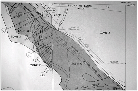
FIGURE 3-5 Example of a FIRM showing the locations of the 100-year (A zones in dark gray) and 500-year (X zones in light gray) flood zones. Source: FEMA.
Moving from Manual to Automated Hazards Cartography
The creation of maps by manual methods has long passed. Even the use of strictly automated cartographic applications for hazards work has been replaced by the use of GIS. The unique capabilities of GIS to combine other geographic information distributions for analysis with the specific hazard (e.g., disease, fire) and then to simply map the spatial distributions have made it the technology of choice. Thus, one seldom discusses cartographic processes today without GIS.
There are many examples of the use of GIS to produce hazard maps. Goldman (1991) produced an atlas of toxins and health that mapped the distribution of industrial toxins, pollution, and health indicators by county for the entire United States. Aptly titled—The Truth About Where You Live—this atlas provides a striking picture of hazard zones throughout the country. FEMA’s (1997a) multihazard assessment is another example, illustrating the geographic variability in individual hazard occurrences throughout the country. More recently, an atlas of environmental risks and hazards has been produced for South Carolina (on CD-ROM), illustrating the geographic patterns of hazards and their consequences by county within the state (Cutter et al. 1999). The natural hazards map of North America produced by the National Geographic Society (Parfit 1998, Tucker 1998) provides a generalized depiction of the primary hazards affecting the continent. Despite the necessary level of generalization, the map provides extensive coverage of historic hazard events at this scale. These are but a few of the many examples of hazard mapping that are occurring today.
SPATIAL ANALYSIS AND THE GIS
Spatial analysis is a term used to describe a set of tools that examine patterns in the distribution of human activity or environmental processes or both as well as movement across the Earth’s surface. There are many tools for conducting spatial analyses: statistics, mathematical models, cartography, and GIS. Two are particularly important for hazards: the GIS and its refined cousin—the spatial decision support system (SDSS). Both provide the foundation for mapping, analyzing, and predicting hazards and impacts. Evolution of the GIS has had a profound impact on hazards research and application, especially in studying hazards in a spatial context.
GIS
The development of remote sensing, the creation of commercial GIS software, and the proliferation of digital geographic databases were key to the widespread use of GIS. The initial development of computers was limited to federal agencies or a few universities during the 1950s and 1960s. Beginning in the late 1970s, and particularly in the early 1980s with the creation of relatively powerful yet inexpensive personal computers, GIS software was developed and marketed by private industries. Leaders in GIS software development (e.g., ESRI, Intergraph, ERDAS, and MapInfo) are improving the applications to all aspects of emergency management, from preparedness to response to recovery (Dangermond 1991, Johnson 1992, Newsome and Mitrani 1993, Beroggi and Wallace 1995, Marcello 1995, Carrara and Guzzetti 1996, Radke et al. 2000).
Today, the GIS is defined as a computer-based method for collecting, storing, managing, analyzing, and displaying geographic information. Geographic information (locational and attribute data) is collected with a GIS by either using a GPS receiver or conventional survey methods in the field or by conversion of remotely sensed imagery or existing maps into digital form. Alternative methods for acquiring digital geographic information include data purchases from private companies or data acquisition from state or local agencies. Also, geographic data can be obtained at minimal or no cost through federal agencies, such as the USGS, NASA, or NOAA.
Modern GISs contain a rich set of tools for analyzing geographic information. Fundamentally, a GIS allows diverse sets of geographic data to be put together in overlays so that the relationships between the different data “layers” can be analyzed. An example of a simple overlay application would be to use a digital map of residential houses and a digital map of the 100-year flood zones to determine the homes within the flood zone. By summing the value of structures within this high-risk area, an estimate of economic vulnerability could be made (Figure 3-6). The biophysical nature of the hazard (e.g., flood, wind, or ground failure) can be modeled by GIS applications as well (Carrara et al. 1991, Zack and Minnich 1991, Chou 1992, Mejia-Navarro and Wohl 1994). The geographic distribution of such hazard probabilities and/or magnitudes (potential ground motion with earthquakes) is then overlain on the distribution of human settlement patterns. Fundamental work with earthquake hazards was begun in this area by the Association of Bay Area Governments and has been extended to the entire United States at the
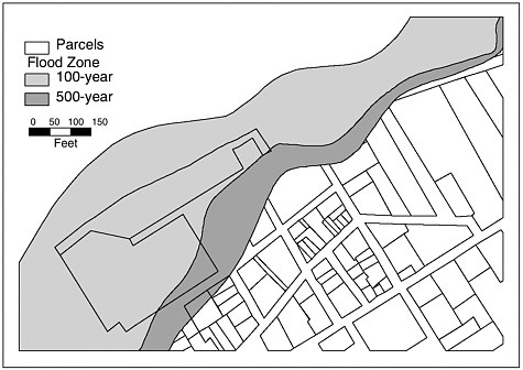
FIGURE 3-6 Intersection of flood zones and land parcels in Snow Hill, Maryland.
census-tract- and zip code-level scales of analysis with FEMA’s loss estimation tool, HAZUS (see Chapter 2).
The GIS also has been used to assess hazardous waste transport and management (Estes et al. 1987, Stewart et al. 1993, Brainard et al. 1996). On the social side, the GIS has been used to identify environmental injustice based on toxic risks (Chakraborty and Armstrong 1997, Cutter et al. 2001) and in evacuation planning (Cova and Church 1997). The use of GIS analysis is not limited to aggregate data, such as census units, nor is it limited to published sources of information. Palm and Hodgson (1992a, b), for example, combined survey research and GIS methodologies to study individual and aggregate attitudes and behavior toward seismic risks.
SDSS
An SDSS is designed to address a specific problem for which numerous criteria are used to determine the selected course of action or policy alternative. Information included in the system guides the users or stakeholders through the process of implementing different scenarios. Thus,
the SDSS supports decision makers by producing several alternative outcomes (such as variable siting patterns) based on different criteria and weights (or levels of importance) for the criteria. A good example of an SDSS for planning is the USEPA’s LandView III. That system is used in evaluating inequitable patterns of hazardous facility siting (USEPA 2000e). It contains geographic background data (roads, streams, etc., from the Census TIGER/Line database), jurisdictional boundaries, USEPA databases on toxic substances and releases, and demographic data from the U.S. Decennial Census. Although the system allows the creation of maps and other cartographic products, another use of the system is to estimate the number and characteristics of people within a specific radius of a hazard site.
The SDSS has been used in emergency management for a number of years and has great potential for sustainable mitigation of hazards (Mileti 1999). With improved computer capabilities, the potential integration of disparate information is now possible. Decision support systems can aid in the allocation of resources, in developing scenario-based training exercises, and most importantly, in disaster management and incident control. For some applications, the development of GIS software has reached such a level of maturity that it is increasingly integrated into emergency management and response. The digital atlas of Central America in the aftermath of Hurricane Mitch by the USGS Center for Integration of Natural Disaster Information (CINDI) is one example (USGS 1999). These data, provided in map form and in GIS digital layers, served as a crucial resource for establishing critical needs and subsequent resource allocation for short-term relief efforts.
Unfortunately, the full functionality of a GIS is still limited to experienced users in each application field, be it floodplain management, water quality modeling, or seismic mapping. Less sophisticated users rely on pre-configured “GIS-based” packages, such as HAZUS, which have extremely limited decision-making options imbedded within them. Consider the following scenario: In a potentially hazardous situation such as an approaching wildfire or residences near a hazardous materials spill, it would be more desirable to systematically notify residents within the specific wildfire path or zone of danger via telephone rather than by a more “generic” and nontargeted approach such as a siren. This is already being done with a reverse Emergency-911 (E-911) system, where the GIS is used to identify risk areas and then notifications are issued. Such notification systems are already in use, for example, along Colorado’s Front Range for wildfires.
A more sophisticated use is illustrated by the following example: In a hazardous material spill, an SDSS would need data on the location of the chemical spill, type of chemical, and release amount. Using a mathematical dispersal model, a digital topographic map, and existing meteorological conditions, a prediction of the dispersal pattern would then be modeled. The map of dispersion would be overlain on a map of residences to determine specific families at risk. The database of homes in the risk zone would be linked to a digital telephone directory and all homes would be automatically telephoned with a pre-recorded message. This entire process would take only a few minutes and involve an integration of data collection, GIS analysis, air diffusion modeling, and reverse E-911 phoning.
There are other GIS-based decision support systems used in public policy decision making (see Chapter 2), but the widespread implementation of SDSS is still not under way within the hazards community. It currently takes a specialist to manipulate this expert system, which provides an important impediment to its widespread use at this time.
DISTRIBUTING GEOGRAPHIC INFORMATION
There are many ways in which geographic information is distributed. Conventional methods include paper maps or digital databases. With new advances in technology, wireless communications and the Internet will become the most important ways to communicate hazards data in the future.
Wireless
Wireless communications will enhance hazards management in the future. For example, GPS technology has permitted the accurate determination of geographic positions (longitude and latitude) since the late 1980s, but its rapid declassification and commercialization opened opportunities for increased use in hazards management. Consider how this technology is now used to remotely monitor a hazardous materials shipment. The driver of the truck knows where the truck is at any point in time, but how does the command center know its location? The most widely used method of tracking trucks in the United States is with the Qualcomm OmniTRACS system, a type of automatic vehicle locator, which predates even the GPS. Although the positioning capability of the OmniTRACS was only about 300 meters, this level of accuracy was suf-

FIGURE 3-7 Wireless tracking of hazardous materials trucks. Typical location of Qualcomm transmitter on an 18-wheeler. The unit is the white dome located on top of the cab wind shell. Photograph by M. E. Hodgson.
ficient for interstate truck tracking. The key feature in the OmniTRACS is a transmitter/receiver based on a geostationary satellite (Figure 3-7). This system automatically polls the location of the moving truck (or any vehicle) every 15 minutes and the location is transmitted from the truck to a command center via the satellite. The OmniTRACS is the one employed by the U.S. Department of Energy for real-time tracking of their hazardous shipments. With the enhanced GPS capacity, this tracking system can be used to pinpoint transportation accidents involving the vehicle to within 100 meters (or 30 meters using a GPS) and thus enhances local response capability through better information on location, amount, and nature of the material spilled.
A more common wireless infrastructure, developed during the past 20 years, is the cellular telephone network. The combined analog and digital cellular network allows a more rapid rate of transmission (as compared to OmniTRACS). There is also a move toward incorporating GIS and GPS devices into cellphones in the near future. Unfortunately, even with the cellular telephone network today (over 75,000 cellular sites in
the United States alone), geographic coverage of the United States is not complete. The dissemination of data over cellular networks is possible within most urban areas and major transportation arteries. Although cellular communication provides a much higher bandwidth than OmniTRACS, and thus faster transmission of data, it is not nearly as fast as through conventional landlines. Thus, hazards researchers and responders in the field may find it more useful to request specific data to be transferred directly to a laptop computer or, more commonly, a personal digital assistant.
Internet
The Internet has truly revolutionized the dissemination of information and knowledge and made it more accessible to everyone. More and more data are migrating to the Internet from both researchers and governmental agencies, and are becoming available with just a click of the mouse. In many ways, this has democratized information and enabled stakeholders to become more informed if they so desire. It has allowed local communities to become more knowledgeable about their own environmental vulnerabilities. However, there is just as much “junk” on the Internet as with printed information, and so, users must exercise caution when utilizing some of the information for hazards analysis and management.
Every day brings new advances in Internet applications and it is often difficult to keep up with favorite Web sites. Within the past few years, however, a number of important innovations have occurred, including the mapping of hazards on the Internet. Some of these are interactive, that is, you create or customize your own maps, whereas others are more static products. A number of these are discussed below.
USGS (www.usgs.gov)
The USGS hazards program includes earthquakes, volcanoes, floods, landslides, coastal storms, wildfires, and disease outbreaks in wildlife populations. In addition to fact sheets on each of these hazards and their management, the USGS also is involved in monitoring, predicting, forecasting, and mapping natural hazard events. For example, the geographic distribution of hazardous regions mapped for the contiguous United States is provided for earthquakes, volcanic hazards, landslide areas,
major flooding, hurricane activity, and tornado activity in addition to a composite map of all of them.
Streamflow conditions are mapped daily for the entire United States (http://water.usgs.gov/dwc), providing real-time information on potential flooding and drought conditions. Links are also provided to drought monitoring and river conditions maintained by NOAA, the U.S. Department of Agriculture, the National Drought Mitigation Center, and the National Weather Service (NWS).
Another important mapping project by the USGS is the national seismic hazard mapping project prepared under the National Earthquake Hazards Reduction Program (NEHRP). These probabilistic maps are available digitally, as GIS coverages, and in hard-copy form (http://geohazards.cr.usgs.gov/eq/html/genmap.shtml). Covering the entire United States and for selected seismically active regions (California/Ne-vada, Alaska, Hawaii, central/eastern United States), these ground motion maps include peak ground acceleration. In addition to static maps, customized inquiries using zip codes or latitude and longitude can determine ground motion hazard values for specific locations for 10, 5, and 2 percent probabilities of exceedence in the next 50 years. These probabilities correspond to ground motions with return periods of 500, 1,000, and 2,500 years, respectively.
A variant of these static maps is a near-real-time map of earthquake intensities. In 1997, Southern California developed the TriNet, a digital seismic network that produces real-time “shakemaps” that include the location of the earthquake and the severity of ground-motion shaking (FEMA/NIST/NSF/USGS 1999). Information on monitoring-station coverage and events is available on the Internet (http://www.trinet.org) as are community-based felt-intensity maps (http://pasadena.wr.usgs.gov/ciim.html).
FEMA/ESRI On-line Hazard Maps (www.esri.com/hazards/index.html)
Through the Project Impact program, FEMA and Environmental Systems Research Institute, Inc. (ESRI) have developed an interactive multihazard mapping program. The interactive nature of the mapping is a significant improvement on existing Internet mapping applications. Although limited to historical occurrences of selected hazards (earthquakes, hail, hurricanes, tornadoes, windstorms) as well as recent floods
TABLE 3-2 Hazards Spatial Information Available On-line from the USEPA
|
Data/System |
Update Frequency |
|
Permit compliance |
Monthly |
|
Toxic Release Inventory |
Monthly |
|
Resource Conservation Recovery and Information System (RCRIS) |
Monthly |
|
Biennial Reporting System (BRS) |
Every 2 years |
|
Hazardous air pollutants (AIRS Facility Subsystem) |
Monthly |
|
CERCLIS (Superfund) |
Monthly |
|
Safe Drinking Water Information System (SDWIS) |
Quarterly |
|
Grant information and control |
Biweekly |
|
Risk management plans |
Nightly |
|
Facility information |
Nightly |
and earthquakes, the Web site permits a user to develop customized maps for local areas (based on zip code, city, or congressional district) for selected hazards. In this way, local residents can easily see the historic patterns of hazards and risks in their community.
USEPA Envirofacts Maps on Demand (www.epa.gov/enviro/html/mod/index.html)
In many ways, the USEPA has been one of the leading innovators in interative Web-based hazards mapping. The current EnviroMapper application has three different geographic levels (national, state, and county) and covers most of USEPA’s spatial databases (Table 3-2). Hazardous waste sites and toxic releases are the primary hazards available for querying. Given the changing nature of reporting, most of the data used in Envirofacts are updated frequently.
Scorecard (www.scorecard.org)
Scorecard is another interactive mapping and information dissemination vehicle for hazards information. Developed and maintained by Environmental Defense, Scorecard provides easily accessible information on environmental hazards information (pollution, toxics) to local communities. Users can create their own toxic profiles of the community by
zip code or searching national maps by state and county. Hazard topics include land contamination, hazardous air pollutants, chemical releases from manufacturing facilities, animal waste from factory farms, and environmental priority setting. The information presented in Scorecard is based on USEPA data. However, Scorecard is intentionally designed to facilitate public use and to communicate the risks and hazards in order to empower communities to reduce risks in their local area.
A WORD OF CAUTION ABOUT HAZARDS MAPPING
Like other technological advances, it should be remembered that a GIS is only a tool and, as such, is only as good as the data that were entered into it. In fact, a GIS can distort true relationships and is just as prone to bias as other data-based systems. This distortion is a function of the subjectivity in the data selection and input as well as the quality of the data themselves. For example, we cannot always quantify factors (such as indirect economic damages) that might be important in hazards management and thus these would be excluded. Often, a GIS is based on available data, not what are the best data. A further distortion occurs as a consequence of moving among map scales and between different projections. This introduces a type of spatial error into a GIS.
It is impossible to represent all geographic information on a map, and so, out of necessity, some of the data are generalized or simplified. All maps (including those created using a GIS) are generalizations of the real world, and as the scale increases, more detail can be included. For example, the lines that are placed on FIRMs to delineate floodplain boundaries or flood zones are themselves generalizations. They represent the best science at the time of their construction on the nature of potential flooding in an area, but should not be construed as “absolute” truth, since we can lie just as easily with maps as we can with statistics (Monmonier 1991).
Map generalization, scale, and the initial data used to create the maps (hard copy or digital) are important to remember when interpreting maps. Although a map can convey useful information and illustrate geographic patterns, we must be aware that what we are viewing is a representation of reality that may not be equally shared by everyone. Since a map (hard copy or digital version) is an abstraction of reality, it reflects its creator’s view of the real world, which is subsequently affected by the person’s education, race, gender, or professional occupa-
tion. All of these factors influence our perceptions of risk and therefore how we ultimately make decisions about the management of hazards.
GIS and hazard research approaches have, at least in the past 40 years, coevolved. The early approaches to studying hazards with a GIS were often limited by the complexity of the subject matter, slow computers, and cumbersome software. The possibilities for modeling physical and social processes with a GIS are increasing. Because of such capabilities, it is increasingly unlikely that future hazard studies will be conducted without a GIS. The limitations we face today and in the future are, in large part, conceptual rather than technical, and are strongly con-strained by the quality of hazard and loss data, the topic of the next chapter.