American Hazardscapes: The Regionalization of Hazards and Disasters (2001)
Chapter: 6 Which Are the Most Hazardous States?
CHAPTER 6
Which Are the Most Hazardous States?
Deborah S. K. Thomas and Jerry T. Mitchell
Hazard events and losses clearly vary geographically. For instance, the Gulf and Atlantic coasts of the United States are much more prone to tropical storms whereas the Pacific Coast is more seismically active than any region in the country. The juxtaposition of where people live and work and hazard-prone areas increases the potential for loss of life and property damage. It is equally important to understand the geographic patterns of hazard events as well as the spatial distribution of human occupance of hazardous areas. In this way we can begin to assess where the risk and vulnerability are greatest and why.
This chapter examines regional patterns of hazard events and losses for the nation. The data sets utilized in this chapter are the same as those described previously. Consequently, the same limitations apply to the interpretation of the spatial patterns as the temporal trends (Chapter 5). Specifically, all damage categories are assigned a dollar amount based on the lowest value of the range given, and thus are extremely conservative estimates. Further, all damages are adjusted to 1999 U.S. dollars, in tables as well as maps unless otherwise stated. The maps use the natural-break method for classifying data, resulting in five categories ranging from low to high. This chapter begins by
presenting cumulative damage and casualty statistics by state, followed by a discussion of the geographic distribution of losses from individual hazards. It concludes with a regional summary of damaging events.
GEOGRAPHIC SCALE AND LOSS INFORMATION
Geographic scale is a limiting factor for almost all of the databases utilized. Meaningful loss data often are lacking at the local level, and attributing the loss data to a specific geographic unit, such as a county or community, is not always possible. For example, the Storm Prediction Center collects very detailed tornado event information that includes location, path, deaths, injuries, and a damage category. However, a single tornado event may have affected more than one political jurisdiction, complicating the assignment of losses to specific counties. On the other hand, if one were interested in very detailed information about a single tornado event, these data are quite useful. This scale limitation is true of most of the event-based data sets, including earthquakes, hurricanes, and meteorological events listed in the National Weather Service’s (NWS) Storm Data and Unusual Weather Phenomena. Finally, some of the hazards data are not even collected or reported below the state level. Historic losses associated with hazardous materials transportation spills are an example of this type of geographic limitation in the data during our study period.
LOSSES FROM ALL HAZARD TYPES
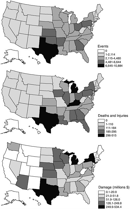
Of the nearly 9,000 deaths caused by hazard events in the United States, most occurred in Texas, the Southeast, and the eastern Great Lakes regions (Figure 6-1a). The Northwest, New England, and the upper Great Plains experienced significantly fewer fatalities. Texas alone accounted for 10 percent of all deaths, or more than five times the national fatality average and nearly twice the next highest state (Table 6-1). California and Colorado also stand out in the geographic distribution of hazard fatalities. Although not the only state with many fatalities from hazard events, Colorado’s high ranking is attributed to the Big Thompson flood of 1976, when at least 139 people were killed. Deaths in California were caused predominately by three hazards: earthquakes, flooding, and winter-related storm events. The Loma Prieta and Northridge earthquakes account for over 25 percent of fatalities for the state during this time period. In Texas, the fatalities were attributed to a broad
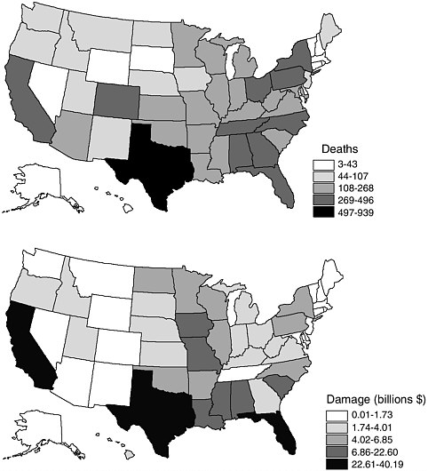
FIGURE 6-1 Geographic patterns of loss from all hazards, 1975-1998: (a) number of deaths, and (b) damages (in 1999 dollars).
range of hazards—hurricanes, floods, and tornadoes. Hazardous material spills and lightning caused nearly 70 percent of the listed fatalities in Florida. Florida also leads the country in the number of lightning deaths by a factor of two.
The geographic distribution of damages from all hazard types shows a slightly different pattern than the fatality maps (Figure 6-1b). The central portion of the United States bordering the Mississippi River incurred substantial amounts of damage, as did the Gulf Coast states, the
TABLE 6-1 Top 10 State Death Totals from All Hazards, 1975-1998
State | Deaths |
Texas | 938 |
Florida | 495 |
Alabama | 440 |
California | 415 |
New York | 410 |
Tennessee | 367 |
Pennsylvania | 347 |
Georgia | 333 |
Colorado | 294 |
North Carolina | 291 |
National average | 180.0 |
Carolinas, Florida, and California. California lives up to its reputation as the “disaster state”; not only does it rank fourth in number of deaths caused by hazards, it also endured the largest total losses at over $40 billion (Table 6-2). In California’s case, a majority of the damages were from earthquakes and flooding. The losses in Texas stemmed from hurricanes, droughts, floods, and tornadoes, which together caused over $20 billion in damages. Not surprisingly, given Hurricane Andrew’s ranking as one of the nation’s most damaging natural disasters to date, the majority of damages in Florida resulted from hurricanes, although floods and tornadoes contributed over $1 billion themselves.
TABLE 6-2 Top 10 State Damage Totals from All Hazards, 1975-1998
State | Damages (billions, adjusted to U.S. $1999) |
California | 40.1 |
Florida | 33.0 |
Texas | 22.0 |
Iowa | 15.6 |
Louisiana | 12.4 |
Mississippi | 12.2 |
South Carolina | 12.1 |
Alabama | 11.7 |
Missouri | 11.4 |
North Dakota | 6.8 |
National average | 6.0 |
SPATIAL VARIATION IN HAZARD EVENTS AND LOSSES
Using these aggregate numbers, Texas may be viewed as the “fatality state” and California the “disaster state.” When individual hazards are examined over the past 24 years, a very different geography of hazards emerges. The spatial variation in events, injuries and deaths, and damage totals highlight the differences between catastrophic events and everyday occurrences of hazards—both of which contribute to America’s hazardscape. For the ranking of the top five states for hazard events, deaths, and economic damages for each individual hazard see Appendix B.
Floods
Very few places are completely protected from flooding. In fact, every state had at least four deaths from this hazard and a minimum of $10 million in property and crop loss during our study period. Most flood-related deaths were concentrated in the southern tier of the United States extending up through the Midwest and into New York and Pennsylvania (Figure 6-2a). Pennsylvania’s place at number 2 is a direct consequence of flooding in Johnstown that killed over 75 people in 1977. Interestingly, this was not the first experience with serious flooding by this community. Flooding in 1889 in Johnstown holds the record as the second-deadliest disaster in U.S. history when over 2,200 people died (FEMA 1997a). Colorado is in the top five states as a direct consequence of the 1976 Big Thompson flood that killed more than 139 people, an event that focused national attention on the threat of flash floods (Gruntfest 1996).
Large dollar damages are concentrated in four states: three that border the Mississippi River (Iowa, Missouri, and Louisiana) and Texas (Figure 6-2b). Texas tops the charts for both flooding deaths and damages. Of the 42 events listed as causing more than a billion dollars in damages between 1980 and 1998, 4 were Texas floods (NCDC 2000). These include flooding in southeast Texas in fall 1998, Dallas in May 1995, the Harris County flood in October 1994, and the May 1990 floods in north central and east Texas. The great Mississippi River flood events of 1993 and 1995 are clearly evident on the map of flood damages especially Iowa and Missouri. States throughout the central portion of the United States were severely impacted, causing in excess of $20 billion according to some estimates (Changnon 1996). This 500-year flood event raised serious questions about the prudence of strict river control
FIGURE 6-2 Trends in losses from flooding, 1975-1998: (a) number of deaths, and (b) damages (in 1999 dollars).
practices that officials have routinely implemented to protect people and property from flooding in the region (IFMRC 1994). However, flooding along the Mississippi and its tributaries is very much a part of the region’s cultural and economic history (Barry 1997, Changnon 1998).
Flooding has also plagued the northern Great Plains where the Red River has repeatedly overflowed its channel (IJC 2000). The impacts were so widely felt in Grand Forks, North Dakota, and in East Grand Forks,
Minnesota, after the 1997 flooding, that the Federal Emergency Management Agency (FEMA) and the North Dakota Division of Emergency Management started the mass distribution of Recovery Times in April as a resource for the those in the community (FEMA 1997b). Flooding is also a perennial problem in California, where rains combine with snowmelt from the mountains to cause severe winter and spring floods. Among the most notable of these were the 1997 floods involving the Sacramento, Mokelumne, San Joaquin, and Tuolumne rivers in California’s Central Valley.
Tornadoes
Although the areal extent of damage from this hazard is limited when compared to other events such as hurricanes, the damage within these small areas is often catastrophic. Most places within the United States are susceptible to tornadic activity, but some areas have greater exposure than others. States in the south-central region (Kansas, Oklahoma, and Texas, in particular) have the highest annual average of tornadoes (Figure 6-3a), leading to the regional moniker of “Tornado Alley.” This concentrated pattern of tornadoes is a result of atmospheric instability caused by the collision of colder northern air masses with warm, moist air from the Gulf of Mexico, especially during late spring and early summer. Florida also ranks near the top in overall tornado events.
Tornadoes are the leading cause of all injuries resulting from natural hazards. There is a slight regional shift in the spatial pattern of death, injuries, and damage away from the event core in the south-central Great Plains to the southeast (Figures 6-3b and 6-3c). In other words, although Tornado Alley clearly has the most tornado events, these areas do not necessarily receive the greatest level of damage or casualties (deaths and injuries). The rankings of top states (Appendix B) reinforce this point, particularly where deaths are concerned. This may be a result of different housing types, greater population concentrations, time of day, or even lack of warning systems in the southeastern region.
Economic damages are concentrated in the Great Plains and southern states as well (Figure 6-3c). Texas ranks first for both deaths and damage from tornadoes, with almost twice as many as the next closest ranking state. The Red River tornado outbreak of April 10, 1979, illustrates just how devastating Texas tornado history has been. A single tornado, at times 1.5 miles wide, ripped through Archer, Wichita, and Clay counties, killing more than 50 people, injuring almost 2,000, and
causing around $400 million in property damage (NCDC 1979, Bomar 1995). Along with its location in an area susceptible to severe thunderstorms in the spring and summer, the sheer size of the state when compared to others is a factor in mapping these patterns.
Hail
Although no place is immune from hailstorms, the Great Plains experience the greatest number of annual occurrences. In fact, when mapped, hail has a more concentrated geographic pattern compared to most other hazards (Figure 6-4a). The spatial distribution of loss is equally concentrated (Figures 6-4b and 6-4c). Of the more than 100,000 hail events during the 24-year study period, only about 2 percent resulted in damages greater than $50,000. However, when intense hail events do occur, automobiles and crops in particular show the signs of damage. The top states for hail damages are concentrated in the Great Plains region. Similar to the pattern of tornadoes, Texas is number 1 for events as well as damages from hail, again partly due to climate, location, and its sheer size. Of all the hazards reported in this chapter, except wildfire (which is grossly underestimated), hail caused the fewest number of deaths (15) during our study period.
Thunderstorm Wind
As with hail and tornadoes, thunderstorm wind events are closely linked to severe thunderstorms. Admittedly, downslope winds, squall lines, tornadoes, and tropical storms can all produce damaging winds. Tornadoes and hurricanes were treated separately, partly because of their unique characteristics and partially because wind events are defined in Storm Data as thunderstorm winds near or in excess of 50 knots. As a result, regions more prone to thunderstorms also will experience a greater number of thunderstorm wind events. Wind events occur more frequently in the eastern half of the United States (Figure 6-5a).
The pattern of casualties highlights the southern tier of states as well as those along the Great Lakes (Figure 6-5b). The West and New England have very few thunderstorm wind casualties. As was the case with hail and tornadoes, Texas had the largest number of wind events, deaths, and damages. New York and Michigan both ranked high for deaths and damages (Figure 6-5c), mostly attributed to two specific thunderstorm events. In 1991, thunderstorms moved through the Michigan counties of
Washtenaw, Ann Arbor, and St. Clair, causing over $20 million in damages and leaving more than 100,000 people without electricity (NCDC 1991). Eastern New York experienced one of the most intense and severe thunderstorm outbreaks of the century in May 1995 when 900,000 acres of forestland and 125,000 acres of commercial timber were damaged and over 200,000 people were left without electricity (NCDC 1995). Only a few days before, this same storm system destroyed 100 miles of phone and power lines in Michigan.
Because of the similar initiating conditions—collision of air masses producing severe thunderstorms, it is often difficult to differentiate and therefore classify tornado, hail, and thunderstorm events. For example, a tornado may be accompanied or preceded by hail. Is this listed as a hail event or a tornado? Similarly, microbursts may create substantial damage, yet unless there is other confirming evidence (tornado spotter, Doppler radar signal), it would be listed as a wind event. Needless to say, there are ambiguities in the exactness of the data used to map these meteorological hazards, and so, caution should be exercised in interpreting the findings.
Lightning
Of all natural hazards, lightning is one of the most ubiquitous and deadly hazards. Over 20 million cloud-to-ground flashes are detected every year in the continental United States (NOAA 2000b). According to our estimates, lightning ranks second after flooding in fatalities during the 24-year period, the majority of these in Florida. On the basis of a longer time frame (35-year record), others suggest that lightning is the leading cause of death from all natural hazards, even surpassing flooding (Curran et al. 1997). According to Curran et al., over 70 percent of deaths occur in the summer months in the late afternoon, where more than 80 percent of the fatalities are males. The seasonality and time of day are not surprising, given that thunderstorms often develop in the late afternoon and people are outdoors in warmer weather. Golf and other similar sporting events along with outdoor occupations put a large number of people at risk. The reasons for the disparate numbers for men and women are not easily explained and may be reflective of behavioral differences in activities between these two groups, including a predilection toward risk taking. Demographic differences such as age (young/old), gender (male/female), or race (Black/White) are rarely recorded in most hazards databases. The database on lightning fatalities is the only haz-
ards database that we found that systematically records gender, for example.
The geographic distribution of casualties is concentrated in the Great Lakes region, the South, and the southern Great Plains (Figure 6-6a). The spatial pattern of damage is different with distinct clusters in the northwest, south-central, southeast, and Great Lakes states (Figure 6-6b). Oregon appears high as a result of lightning-caused wildfires, where losses were attributed to this hazard rather than wildfire. Overall damage estimates from lightning are low compared to other hazards. Even though the direct economic losses appear low from our data, the Na-
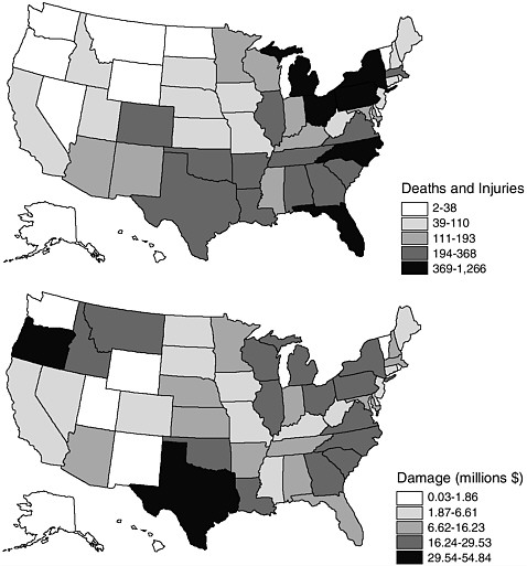
FIGURE 6-6 Trends in losses from lightning, 1975-1998: (a) deaths and injuries, and (b) damages (in 1999 dollars).
tional Lightning Safety Institute (NLSI 2000) suggests that, in reality, damages from lightning are much higher. It causes substantial damage when forest fires are started, houses are burned, airplanes are struck, and when power outages and surges ruin electronics. For example, the damages associated with the western fires in the summer of 2000 (caused by lightning) exceeded $1 billion.
Wildfires
Wildfires are a natural part of ecosystems, and human land use has increased the impacts of wildfires on society. Not all wildfires are caused by natural sources (e.g., lightning strikes). Most fires are caused by people, yet the average acreage burned is higher for those started by lightning (NIFC 2000). The urban-rural interface poses a particular challenge to wildfire management. As people move into areas that infringe on natural ecosystems or where building (or certain building materials) may not be appropriate because of the fire potential, danger to people and property increases. The Oakland, California, fires in 1991 catapulted the state to the top ranking for wildfire damage during our study period. This singular event revealed just how volatile that interface can be when climate and weather conditions are right; approximately 25 people died and nearly $1 billion in property was lost in this event. In 1993, fires in Malibu, California, caused over $500 million in losses (Figure 6-7). Most of the exclusive homes that burned were insured, and so, this particular disaster was somewhat unique because those individuals primarily impacted were a very select set of people who could absorb the cost of the property damage (Davis 1998).
Damage from wildfires is concentrated in the western region of the United States (Figure 6-8). A generally dry climate in this part of the country creates ideal fire conditions. Florida also experienced several severe wildfires during the study period. In 1998, for example, over 2,000 wildfires burned almost 500,000 acres, causing millions of dollars in damage (NIFC 2000). The ever-expanding urban fringe in this state along with drought conditions produced extensive damage potential, widespread burned areas, and poor air quality during the fires.
In terms of loss of life, few deaths were reported in the data used here. However, Mangan (1999) reports that 33 people died while fighting wildfires during the 1990-1998 period alone, and many more were injured. Because of the limitations in the data, our figures represent a significant underestimate of loss from this particular hazard.
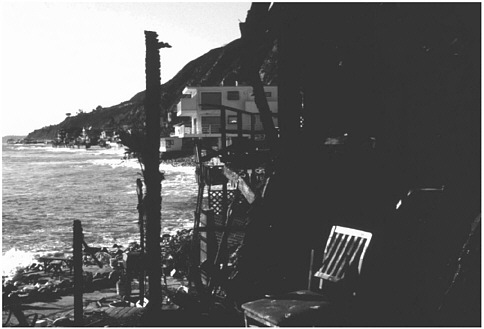
FIGURE 6-7 Wildfire damage to homes in Malibu, California. Source: Photograph taken by Sally Cutter.
Extreme Heat
Even though not reflected entirely in the fatality statistics derived from Storm Data, exposure to severe heat is one of the deadliest of all natural disasters in the United States, killing between 150 and 1,700
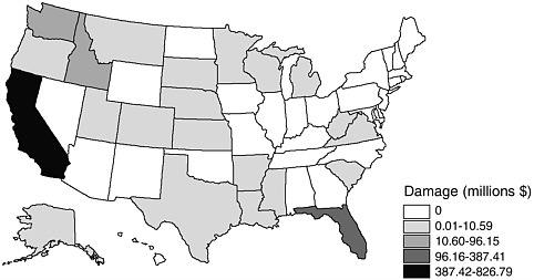
FIGURE 6-8 Wildfire damages, 1975-1998 (in 1999 dollars). Damage (millions $)
people each year (CDC 1995). In fact, one event in 1980 in Chicago caused 1,700 fatalities. Heat waves in 1983, 1988, and 1995 resulted in 1,500 deaths (NOAA 1995). These estimates suggest that exposure to extreme heat potentially kills more people than hurricanes, floods, tornadoes, and lightning combined, even though the databases we utilized do not indicate this.
A majority of deaths and injuries from extreme heat occurred in the East generally and in a few southern states, and extended up through the upper Midwest specifically (Figure 6-9a). Note that the Southwest and
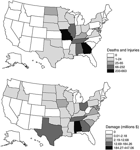
FIGURE 6-9 Trends in losses from severe heat events, 1975-1998: (a) deaths and injuries, and (b) damages (in 1999 dollars).
California have very few injuries and deaths from extreme heat, despite their warm climates. Texas ranks among the top five states for economic damages, experiencing over $100 million in losses from 1975 through 1998, but Alabama tops the list (Appendix B). Damages from extreme heat tend to be concentrated in the South and the Midwest as well and primarily reflect agricultural losses (crops and farm animals) (Figure 6-9b).
Drought
Although not precisely the same hazards, drought and extreme heat are intertwined and often misclassified. The difference between an event being recorded as heat rather than drought simply is attributed to the way states classify climate hazards when reporting to Storm Data. Drought by itself is an unlikely candidate for directly causing human fatalities as long as there is a supply of drinking water and food. In fact, within Storm Data, few deaths are attributed to drought. Both drought and extreme heat, however, display a similar geographic pattern of economic loss (Figures 6-9b and 6-10). Drought losses are mostly confined to the eastern Great Plains states, the South, and the Southeast. Iowa has the most extensive (in dollar amounts) damage totals, with over $3 billion during the study period.
The dollar losses associated with drought are underestimated in Storm Data and thus in our data as well because of its long-term impacts
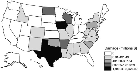
FIGURE 6-10 Drought damages, 1975-1998 (in 1999 dollars).
and difficulty in measurement. Other data sources provide greater loss estimates for this hazard. For example, of the 42 billion-dollar weather disasters during our study period (1975-1998) six were droughts. According to the National Climatic Data Center, these six events caused more than $74 billion in damages and 15,000 fatalities (NCDC 2000). Drought is the leading hazard in terms of total losses and in the most losses attributed to a single event, the 1988-1989 Midwest drought tallied almost $40 billion. With climate becoming more variable, long-term drought may be the most significant hazard facing this country in the future.
Extreme Cold and Severe Winter Storms
Memories of waking up to a white-covered ground and listening to the endless list of school cancellations in anticipation of hearing one’s school name called are vivid for many people, but, what happens when parents cannot get to work, either because roads are actually too dangerous or because they must take care of their children? Severe winter storms and extreme cold have the potential to disrupt vast numbers of people’s lives, often unexpectedly. For example, a major storm blanketed most of the East Coast in 1996—effectively closing federal government offices in Washington, D.C., for 2 days.
As the map of winter storm damage shows, nearly all portions of the United States except Hawaii have some loss experience with snowstorms, ice storms, or blizzards (Figure 6-11a and Figure 6-11b). Deaths are concentrated in New York, which has three times as many fatalities as the next highest state, California. With the exception of New York, winter storm deaths were more likely to occur in states that have slightly warmer climates than that of the Northeast. Perhaps somewhat unexpectedly, the two top-ranking states for winter storm damage are located in the Deep South (Alabama and Mississippi) with over $5 billion in losses each for the 24-year study period.
Damage and casualties from extreme cold were much less widespread, geographically, than winter storms (Figure 6-12a and Figure 6-12b). The Carolinas and Louisiana had around 90 deaths related to extreme cold, perhaps because people in these states are not as acclimatized to the cold or the houses are not well insulated against cold temperatures. The homeless, poor, and indigent also are more susceptible to the effects of cold weather, further increasing their vulnerability to this hazard. Pennsylvania ranks high as well perhaps due to urban poor popu-
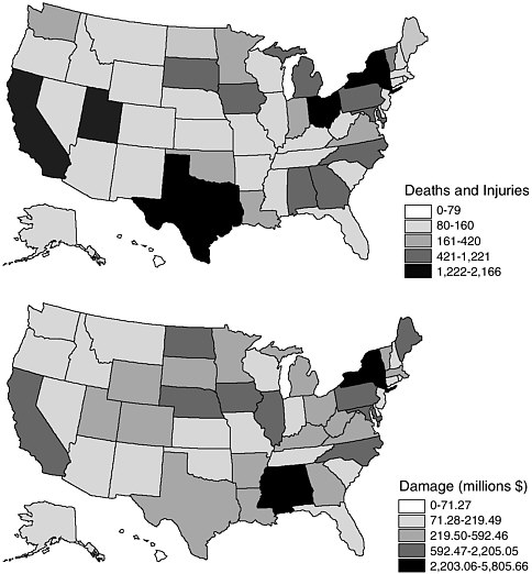
FIGURE 6-11 Winter hazards, 1975-1998, based on events causing more than $50,000 in damages: (a) deaths and injuries, and (b) total damages (in 1999 dollars).
lations who cannot afford high heating bills during the cold season. The greatest amount of economic damage from extreme cold events occurred in Florida and California, primarily from freezes affecting agriculture. Although significantly underestimated in dollar amounts (when using Storm Data), Florida’s citrus crops are extremely vulnerable to freezes.
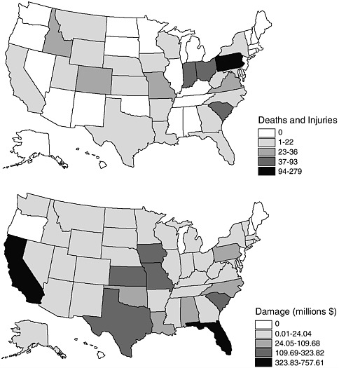
FIGURE 6-12 Extreme cold events, 1975-1998: (a) deaths and injuries, and (b) damages (in 1999 dollars).
Two different freeze events in 1983 and 1985 caused over $3 billion in damage, for example (NCDC 2000).
Hurricanes and Tropical Storms
The Atlantic and Gulf coasts of the United States experience hurricanes more frequently than the western United States except Hawaii. During the 1975-1998 time period, 72 tropical storms or hurricanes crossed eastern or Gulf Coast states, while 10 Pacific Ocean hurricanes
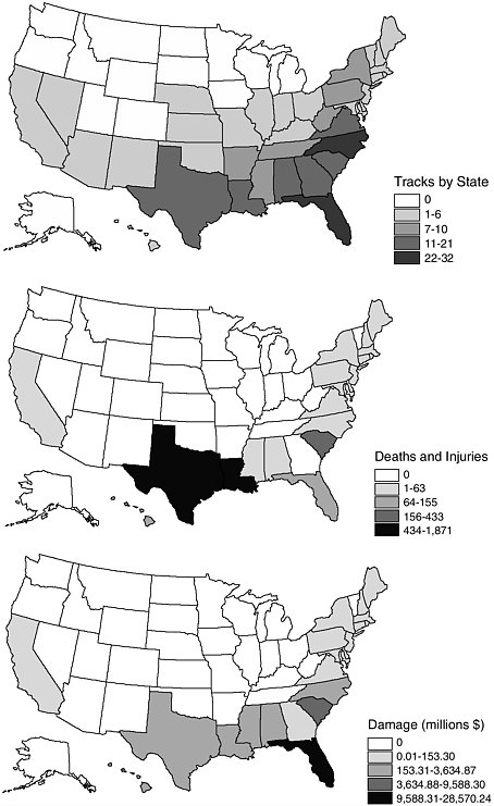
made landfall in the United States (4 in Hawaii). The storms were not always hurricane strength when they made landfall; they may have weakened to tropical storms or even tropical depressions. Still, 75 of these storms still had enough power to cause injuries and/or damages. The differential impact on the U.S. East Coast clearly reflects the relative position of the East Coast to hurricanes originating in the Atlantic Ocean and traveling west. The number of storm tracks crossing the land area of each state provides a good indication of the relative risk for each state. As might be expected, Florida leads the nation in hurricane experience (defined as the number of times a hurricane or tropical storm has crossed over its state border), followed by North Carolina, South Carolina, Georgia, and Texas (Figure 6-13a). Each of these states has a long history of hurricanes and tropical storms (Barnes 1995, 1998).
The high-risk Atlantic and Gulf coasts are also more prone to loss of life, injuries, and property damage from hurricanes and tropical storms (Figures 6-13b and 6-13c). Florida again tops the list for fatalities, followed by Texas, with 36 and 30 deaths, respectively. According to our data, Florida incurred more than $29 billion in total losses during this time period as a consequence of the tropical storm and hurricane hazard.
A single event has the potential to skew the data and this is clearly reflected in the rankings of hurricane damages. For instance, Hawaii ranks seventh in terms of property damage, even though it ranked much lower for total number of events and deaths. The high rank on damages is a consequence of Hurricane Iniki in 1992, which caused over $1.8 billion in damages. The same is true of other individual hurricane events, notably Andrew (Florida in 1992), Hugo (South Carolina in 1989), and Frederic (Alabama/Mississippi in 1979). Devastating events have not been confined to the southern and southeastern United States. Hurricane Agnes, for example, caused over $2 billion in damage throughout the Northeast in 1972. Note that there is often inconsistency between data sources on the number of fatalities and damages attributed to hurricanes and tropical storms. Again, we must caution that our data represent the most conservative estimates, and thus potentially underestimate the economic losses due to hurricanes and tropical storms.
Earthquakes
The majority of earthquakes (90 percent) occur along the boundaries of tectonic plates (Coch 1995), hence the understood relationship between seismic activity and earthquake hazards in the western United
States. Intraplate seismic activity within the United States is also a concern, however, with historic events occurring near Boston, Charleston (South Carolina), Memphis (Tennessee) and New York City. Whether due to compressional or extensional stress, the resulting crustal break for any of these events releases energy as seismic waves, devastating many building types and infrastructure. Because the quality and quantity of materials and construction varies over time and geographically, so does the amount of damage incurred.
From 1975 through 1998, the Council of National Seismic System’s earthquake catalog reveals that the majority of earthquake events (epicenters) occurred in the seismically active areas of the western United States, although there were a number that did affect eastern states (Figure 6-14). The more vulnerable eastern states include those in the vicinity of the New Madrid fault zone (Arkansas, Illinois, Kentucky, Missouri, and Tennessee) and several northern/New England states (New Hampshire, New York, Maine, and Pennsylvania). Tennessee clearly stands out in the Southeast. With nearly 700,000 epicenters, California leads the nation as the most seismically active. Nevada, the next highest, had less than 4 percent of California’s total.
Following a geographic pattern similar to that for overall earthquake events, the majority of deaths, injuries, or property damage also occurred in the western United States again with a concentration in California (Appendix B). Several eastern states also experienced significant losses.
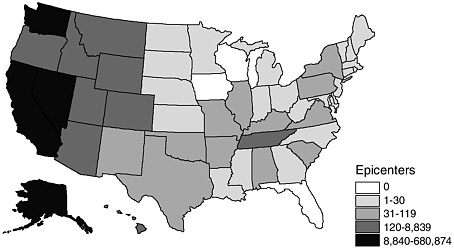
FIGURE 6-14 Earthquake epicenters by state, 1975-1998.
For example, Kentucky had over $1 million (unadjusted) property damage from a 5.1 magnitude (Richter scale) earthquake on July 27, 1980.
Loma Prieta in 1989 and Northridge in 1994 together account for approximately 95 percent of all earthquake damage during the 1975-1998 time period, thus securing California’s top ranking for earthquake hazards. Note also that there are serious discrepancies in loss estimates for the Northridge earthquake based on the data source used. Still, losses associated with earthquakes in the United States are not necessarily restricted to “the Big One.” A large-magnitude event can occur in a location with few people and thus inflict little loss. A smaller-magnitude event, however, can cause considerable loss if it occurs near a densely populated area. For instance, the Whittier Narrows earthquake was recorded at only a 5.9 Richter magnitude, yet caused over $350 million in damage. Although infrequent, larger events with an epicenter in close proximity to vulnerable populations increase the risk from earthquake hazards and have the potential to produce large damages and significant loss of life.
Volcanoes
Headline-grabbing because of their impressive and explosive releases of energy and heat, volcanoes pose a threat to lives and property from a number of types of hazards—lava flows, lahars, pyroclastic debris, and super-heated and poisonous gases. Earthquakes and tsunamis also may accompany volcanic activity. Nearly all volcanoes occur at the margins of tectonic plates, especially where one plate is subducting another. Other activity occurs within plates where a few “hot spots” (e.g., Hawaii) puncture the plates and send magma to the surface. Forming the eastern edge of the Pacific “Ring of Fire,” Washington, Oregon, California, and Alaska are at the greatest risk from volcanic hazards. Other potentially threatened areas in the United States include parts of the Southwest (Arizona, New Mexico) and the Yellowstone area (Montana, Wyoming) (Figure 6-15).
We have very little collective experience with volcanic hazards except in Hawaii. Because the volcanic hazard is so localized and infrequent, there is no national database on deaths, injuries, or damages. Instead, we have case-study data from past events mentioned in the previous chapter (e.g., Mt. St. Helens, Mt. Redoubt, Kilauea). However, as shown in Appendix B, the potential for catastrophic damage and loss of life is significant from this hazard. Since many of the Pacific Coast volca-
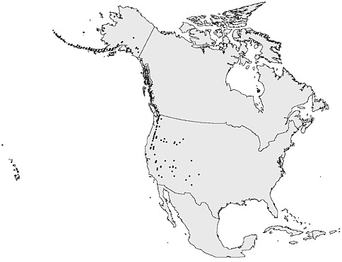
FIGURE 6-15 Distribution of volcanoes and volcanic hazards in North America.
noes are located in relatively rural areas and protected as national parks, human and economic losses have been somewhat minimized up to now, especially due to the lack of recent eruptions.
Hazardous Material Spills
Typically, the severity and impact of a hazard event is determined by characteristics such as the event’s magnitude or intensity. Further, the nature of the hazard usually is described in terms of loss of life and property, as most of the previous discussion illustrates. The interaction of society, its technology, and natural systems gives rise to technological hazards. Acute events such as nuclear or industrial accidents and oil or hazardous material spills are noteworthy events, as are the more chronic types of technological hazards such as chemical contamination or pollution. Determining the severity of most technological hazards is much more problematic than for many natural hazards, given the unforeseen future consequences (especially human health considerations) that may
result from inadvertent exposure. However, we can consider the possibility of exposure as representing a potential risk.
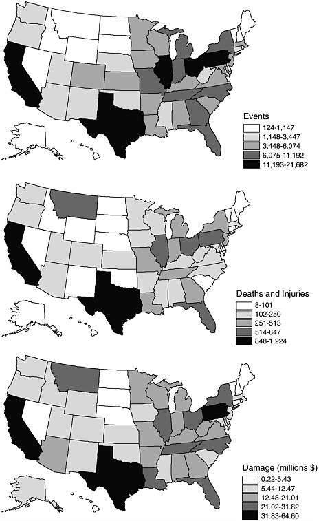
Transportation accidents (highway, rail, air, and water) involving hazardous materials are one of the few technological hazards for which event, death, and damage estimates are collected (Cutter and Ji 1997). Not all incidents result in a hazardous material spill, but the events do represent a likely risk of exposure to toxic chemicals. Although all states have experienced accidents involving hazardous materials, there is a noticeable concentration of events in the eastern half of the United States, especially in the Great Lakes states (Figure 6-16a). Texas and California also ranked among the top five states in terms of accident frequency. The pattern of damages is fairly similar to the distribution of events, except that it is more widespread across the entire United States. Casualties are concentrated in California, Florida, Texas, Montana, and several Great Lakes states (Figure 6-16b). Florida leads the nation in fatalities from hazardous material spills by a factor of two, although, as mentioned in Chapter 5, we believe the Florida source data may have some errors. Damages are concentrated in the eastern half of the nation (Figure 6-16c), although California leads the nation in total dollar damages with $65 million, closely followed by Texas ($63 million). Montana appears in the top five for economic damages because of the 1996 rail spill along Interstate 90 that injured 792 people.
Nuclear Power Plants
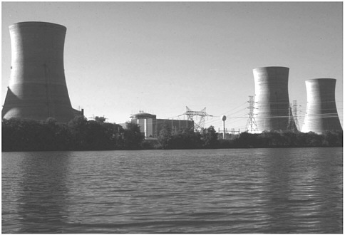
Major nuclear accidents in the United States have occurred in both military and commercial sectors. Fermi, Browns Ferry, and Three Mile Island are commercial facilities that experienced accidents during our study period (Cutter 1993). Given the sensitivity of military installations and difficulty in data acquisition, our focus is only on commercial nuclear power plants. Currently, there are 107 operating commercial nuclear power plant units in 32 states (Figure 6-17), which represent 14 percent of the nation’s existing electrical generating capacity (EIA 1998). Although the number of nuclear power plants is small in comparison to the other 10,421 U.S. power plants (coal, petroleum, hydroelectric, geothermal, solar, and wind), many suggest that the hazard potential is significantly greater.
There have only been a few nuclear power plant accidents in this country, the most notable being the 1979 Three Mile Island incident (Figure 6-18) (Sills et al. 1982, Goldsteen and Schorr 1991). Since the
number of events is relatively small compared to the operating years of these facilities, a different indicator of the potential hazard is required. The U.S. Nuclear Regulatory Commission (USNRC) provides an assessment of the operation of nuclear power plants in this country in their annual performance review known as the Systematic Assessment of Licensee Performance (SALP) reports (USNRC 1996, 1999). The SALP reports utilized here cover 71 facilities (some facilities have more than one operating reactor) in 32 states between 1988 and 1998. Most of these monitored facilities are located in the northeastern portion of the United States with the exception of Florida and South Carolina. In each report, the facilities were graded and given a score of superior (1), good (2), or acceptable (3) in each of four performance categories (operations, maintenance, engineering, and plant support).
For this discussion, an average score for each category was calculated over the reporting years from the SALP score for each facility. The means were then summed to produce a final score for each state. For example, Alabama (with three facilities) had an average SALP score of 1.28 (Operations), 1.75 (Maintenance), 1.75 (Engineering), and 1.29 (Plant Support) for a final state score of 6.08. These scores do not represent events, but rather the potential for an event based on a performance rating. Higher scores reflect lower safety performance.
There is no real geographic pattern to the rankings (Figure 6-19) although New York and Washington have the worst performance records. Washington has only one operating facility (operated by Siemens
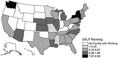
FIGURE 6-19 Average rankings of nuclear power plant performance by state, based on SALP ratings, 1988-1998.
Power Corporation), yet its ranking reveals a relatively poor performance record and thus a greater hazard potential when compared to other states.
Toxic Releases
Representing one of the many potential technological risks that face communities, the Toxic Release Inventory (TRI) provides an indicator of the relative hazardousness of industrial activity. The TRI covers toxic chemicals that are released into the air, water, or land from industrial sources (Lynn and Kartez 1994). The U.S. Environmental Protection Agency (USEPA) only began collecting these data in 1987, and only from selected facilities and covering a limited number of chemicals. Since 1987, the TRI has increased both the types of industries monitored and the chemicals covered. For example, in 1987, around 300 chemicals were covered in the reporting requirements, but by the mid-1990s, more than 600 were routinely monitored. As a result, monitoring changes in the temporal and spatial patterns of both the number of facilities and the total amount of releases is virtually impossible. The releases from TRI facilities depict both direct and hidden costs of pollution and potential health risks from chronic chemical exposures.
Nationwide, there were over 23,000 facilities reporting to the TRI in 1998. These are concentrated in Great Lakes states, Texas, and California (Figure 6-20a). The concentration in the industrial heartland of the nation is no surprise. When the on-site toxic releases are mapped for the year, a very different geographic pattern is apparent (Figure 6-20b). Nevada and Arizona rank highest in toxic emissions (largely due to mining operations). Toxic emissions due to manufacturing are evenly distributed in the eastern half of the nation, posing a significant level of potential risk to the region. Alaska’s prominence on the map is due to emissions from paper and pulp mills and electric utilities. Note that the distribution of emissions is based simply on millions of pounds released and does not include a measure of the toxicity of the chemicals being put into the air, water, or onto the land, another indicator of the relative risk posed by this hazard.
Relict Hazardous Waste Sites (Superfund)
Sites contaminated by chemical wastes are the remnants of past dumping practices by companies. Often, the health impacts were unknown at the time and little consideration was given to the long-term
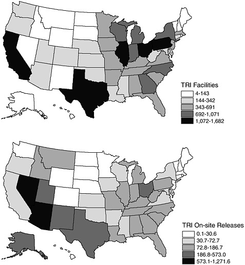
FIGURE 6-20 Toxic Releases, 1998: (a) number of TRI facilities, and (b) releases on site to the air, water, or land in millions of pounds.
environmental consequences. In 1980, Congress passed the Comprehensive Environmental Response, Compensation, and Liability Act (CERCLA, also known as Superfund), which provided the basis for the remediation of these abandoned sites. Not all sites were immediately slated for cleanup, however. Once listed as a potential source of contamination, the site goes through a listing and evaluation process. If the contamination is severe enough and poses imminent danger to human health, it is placed on the National Priority List (NPL) for immediate remediation. The NPL thus represents those sites that have the greatest potential to harm human health and the environment. Part of the
Superfund legislation also authorizes the search for responsible parties in order to recover some of the state and federal costs of cleanup. However, the costs associated with remediation of these abandoned waste sites since 1980 is well into the billions of dollars (Hird 1994).
Not all states bear the same environmental burden when it comes to hosting NPL sites. Of the 1,245 sites currently listed, New Jersey has the most with 113 and North Dakota the least with none. Similar to the patterns observed with other technological hazards, the concentration of NPL sites is in the Northeast, especially New York, Pennsylvania, and New Jersey (Figure 6-21). Florida, Michigan, Texas, California, and Washington also host a substantial number of NPL sites.
REGIONAL ECOLOGY OF DAMAGING EVENTS
This chapter began with a series of maps illustrating the geographic distribution of overall losses for the nation. On one level, these maps reveal which states have the greatest loss of life and property and thus which ones may require some type of intervention to reduce the future impacts of hazards. One of the ways in which the federal government assists counties and states in a time of crisis is to issue disaster declarations under the Stafford Act. In fact, when the number of disaster declarations is mapped by individual state for the 24-year period, the geo-
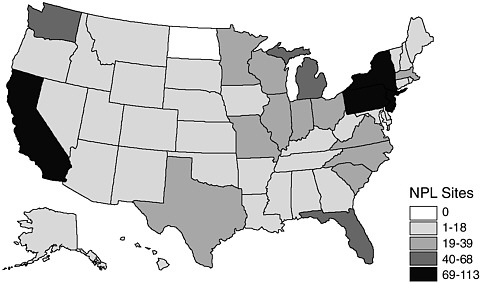
FIGURE 6-21 Number of Superfund NPL sites, 1998.
FIGURE 6-22 Presidential disaster declarations, 1975-1998.
graphic pattern (Figure 6-22) shows some similarities (Gulf Coast states and California) but some interesting differences. Note, for example, that South Carolina had comparatively large total damages during this period (Figure 6-1b), yet received very few disaster declarations (4). Conversely, Washington received a large number of disaster declarations (26) (Figure 6-22), but our damage estimates for the state placed it in the lowest category for loss (Figure 6-1b). California and Texas had the highest number of presidential declarations (42 and 45, respectively), and they also had the highest total dollar amounts in damages. Those states with the least property and crop loss damages due to natural hazards according to our data also had the lowest number of disaster declarations. The Southeast (except South Carolina) and the Gulf Coast states, especially Florida, had a relatively high number of declarations as did New York, Illinois, and Oklahoma.
Although examining the geographic distribution of raw damages and the total number of deaths has some utility, it does not uncover the differential burdens of a state’s disaster experiences. To begin to understand the complexity of loss distribution in the United States, we normalized damage losses by number of people in the state, by area of the state, and by the state Gross Domestic Product (GDP) in 1997. The number of deaths attributed to disasters was also recalculated as a rate per 100,000 people to account for the effect of large populations.
Economic Losses
Loss per capita shows the relative economic burden for each individual residing in the state. In theory, huge losses in heavily populated states become more widely distributed and thus compare favorably to fewer losses in less populated areas. The map of per capita hazard losses (Figure 6-23a) shows a very different pattern from the raw loss totals (Figure 6-1b). California and Texas (heavily populated, with large losses) no longer rank at the top. Instead, North Dakota now has that distinction. Regionally, states in the Mississippi River Valley and Gulf Coast rank quite high. Even with a fairly large population, Florida still ranks ninth; South Carolina and Idaho (with lower populations) also are among the top ten states for per capita damages (Table 6-3).
Another way to examine losses is through some measure of areal density, which takes into account the sheer physical size of the state (Figure 6-23b). The density control enables us to more effectively compare very large states (Texas and California) with very small ones (New Jersey and Connecticut). In this configuration, Florida, Hawaii, and South Carolina get top honors as the most disaster-prone states, with losses exceeding $400,000 per square mile during our study period (Table 6-4). Alaska and the Rocky Mountain states have the lowest damage density—not a surprise given the large size of those states.
Finally, standardizing economic losses by state GDP (1997) provides an indication of a state’s ability to financially recover from disasters (Figure 6-23c). In fact, this map is considerably different not only from the maps of raw damage, but from the per capita map as well. Losses standardized by state GDP also catapults North Dakota to the position of the state most impacted from hazards (Table 6-5). California and Texas slide further down in the rankings due to their large wealth and thus ability to absorb the losses and recover. Poorer states such as South Carolina, Mississippi, Idaho, and Iowa appear to be the most disaster-prone places on this indicator, based on the potential economic impact of all hazards on these states’ economies.
Pattern of Disaster Deaths
Using another indicator of loss—death—the most hazardous places do not necessarily coincide with those states with the most economic damage. In fact, a very different geographic pattern emerges, as shown previously (Figure 6-1a). However, if you normalize the total number of
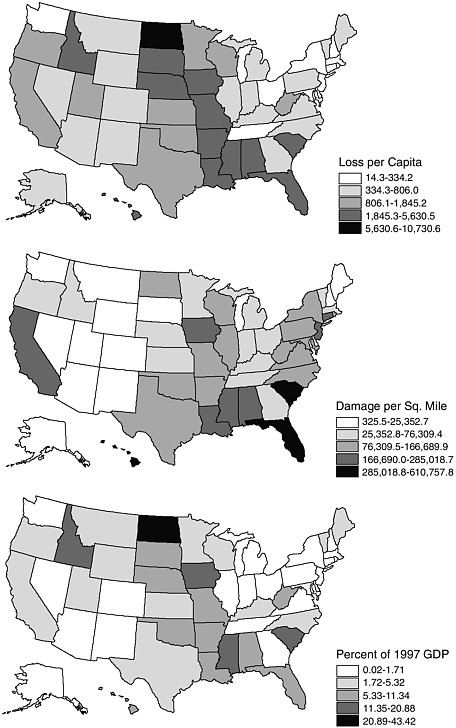
TABLE 6-3 Disaster Losses per Capita, 1975-1998
State | Dollars per Person |
North Dakota | 10,631.53 |
Iowa | 5,610.06 |
Mississippi | 4,727.64 |
Idaho | 3,704.44 |
South Carolina | 3,459.23 |
Louisiana | 2,939.23 |
Alabama | 2,891.75 |
South Dakota | 2,732.97 |
Florida | 2,548.46 |
Hawaii | 2,493.54 |
National average | 1,214.98 |
TABLE 6-4 Top 10 States for Damage, by Density, 1975-1998
State | Dollar Amount of Damages per Square Mile |
Florida | 610,758 |
Hawaii | 430,237 |
South Carolina | 400,755 |
Louisiana | 285,019 |
Iowa | 279,811 |
Mississippi | 259,535 |
California | 257,669 |
Alabama | 230,361 |
Connecticut | 207,680 |
New Jersey | 200,294 |
TABLE 6-5 Property and Crop Losses, as a Proportion of the 1997 State GDP, 1975-1998
State | Losses as a Percentage of State GDP |
North Dakota | 43.42 |
Mississippi | 20.88 |
Iowa | 19.43 |
South Carolina | 12.94 |
Idaho | 12.92 |
Alabama | 11.34 |
Louisiana | 9.99 |
Arkansas | 9.85 |
South Dakota | 9.53 |
Florida | 8.66 |
National average by state | 5.08 |
deaths attributed to all hazards as a rate (in other words number of deaths per 100,000 people) rather than just raw numbers, a very different regional pattern emerges (Figure 6-24). The national fatality rate is 4.4 deaths per 100,000 people. Four states have a high death rate (more than two to three times the national average) from all hazards—Alabama, Arkansas, Colorado, and Wyoming (Table 6-6). Only two of these (Colorado and Alabama) were in the top ten for total number of deaths. With the normalization procedure, we can moderate the influence of population size and determine the relative risk of death for each state. The low fatality rate in California is interesting given the high economic
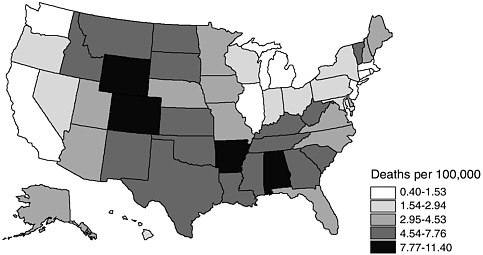
FIGURE 6-24 Hazard deaths per 100,000 people, 1975-1998.
TABLE 6-6 Deaths per 100,000 Attributed to Hazards, 1975-1998
State | Death Rate (deaths per 100,000) |
Arkansas | 11.40 |
Alabama | 10.89 |
Colorado | 8.95 |
Wyoming | 8.82 |
Montana | 7.76 |
Tennessee | 7.52 |
North Dakota | 7.36 |
Mississippi | 7.03 |
West Virginia | 7.03 |
New Mexico | 7.00 |
National average | 4.41 |
damages from hazards. Also, Texas (labeled “the fatality state” earlier on the basis of raw data) drops to eighteenth when population size is considered.
Hazards of Places
As was done in Disasters by Design (Mileti 1999), we calculated a simple composite measure of the relative hazardousness of states, using three indicators—number of hazard events, casualties (deaths and injuries), and losses. The event score reflects the potential risk from hazards for which we have no death or damage estimates, such as toxic releases. The level of risk from other hazards is captured by our casualty and damage estimates. Each indicator was constructed by assigning each state a value based on the percentage of that state’s contribution to the national total, be it events, casualties, or dollar losses. The percentages were then summed for all hazards for each state to derive an average, which was then ranked and mapped. In this way, we can compare and geographically examine the relative hazardousness of individual states and/or regions. As can be seen in Figure 6-25 the most disaster-prone states are Florida, Texas, and California, where number of events, damages, and casualties are extremely high. Florida and California rank high because of a number of large catastrophic events, whereas the pattern for
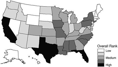
FIGURE 6-25 Hazard proneness by state, based on risk potential and overall losses.
Texas is reflective of the sheer number and diversity of hazardous events during the study period. Note the large number of states in the low category—states that have quite a bit of exposure to hazards, but where the losses (economic and casualties) do not reflect more catastrophic events (Table 6-7).
CONCLUSION
The American hazardscape is a multifaceted quilt of hazard events (and thus exposure), casualties, and economic losses. The common perception of which states are the most hazardous may not always fit the reality of the data. The level of hazardousness and the spatial variability depend on the type of hazard and specific indicators of losses (casualties and economic damages). For example, there is an inconsistent pattern
TABLE 6-7 Overall Hazard Scores
State | Event | Death | Damage | Overall | State | Event | Death | Damage | Overall |
FL | 3.25 | 47.34 | 113.18 | 54.59 | IN | 2.21 | 13.44 | 7.02 | 7.56 |
TX | 3.96 | 88.75 | 61.49 | 51.40 | AZ | 4.73 | 13.68 | 3.80 | 7.40 |
CA | 4.46 | 39.08 | 102.36 | 48.63 | ND | 0.09 | 4.30 | 17.44 | 7.28 |
AL | 2.05 | 40.29 | 32.56 | 24.96 | WV | 0.71 | 11.33 | 5.91 | 5.98 |
SC | 2.83 | 22.59 | 40.56 | 21.99 | OR | 0.68 | 6.98 | 10.21 | 5.95 |
LA | 2.04 | 23.72 | 33.24 | 19.67 | NE | 1.16 | 6.02 | 10.27 | 5.82 |
NY | 4.56 | 37.87 | 12.20 | 18.21 | MD | 1.08 | 11.33 | 3.05 | 5.16 |
MO | 2.00 | 19.52 | 29.35 | 16.96 | ID | 0.57 | 5.18 | 9.59 | 5.11 |
IA | 1.32 | 9.31 | 39.89 | 16.84 | NJ | 4.14 | 6.21 | 3.81 | 4.72 |
MS | 1.00 | 15.76 | 33.73 | 16.83 | UT | 2.54 | 6.79 | 4.80 | 4.71 |
PA | 5.80 | 31.29 | 12.68 | 16.59 | HI | 0.13 | 3.09 | 9.30 | 4.17 |
NC | 2.65 | 29.06 | 14.08 | 15.27 | NM | 1.22 | 9.07 | 1.62 | 3.97 |
GA | 2.24 | 29.90 | 7.34 | 13.16 | WA | 1.72 | 4.85 | 4.06 | 3.55 |
AR | 1.16 | 23.44 | 14.80 | 13.13 | NV | 4.77 | 2.42 | 2.03 | 3.07 |
TN | 2.20 | 32.78 | 4.20 | 13.06 | SD | 0.18 | 3.81 | 4.92 | 2.97 |
IL | 5.25 | 15.33 | 17.16 | 12.58 | MT | 0.70 | 5.51 | 1.56 | 2.59 |
OH | 4.22 | 25.32 | 8.04 | 12.53 | CT | 2.07 | 2.49 | 2.66 | 2.41 |
OK | 0.72 | 18.11 | 14.88 | 11.23 | ME | 0.73 | 4.79 | 1.61 | 2.38 |
CO | 0.62 | 25.99 | 4.42 | 10.34 | MA | 1.55 | 3.67 | 1.64 | 2.29 |
VA | 2.10 | 17.93 | 8.93 | 9.65 | NH | 0.87 | 3.70 | 0.43 | 1.67 |
WI | 2.64 | 12.55 | 13.06 | 9.42 | VT | 0.53 | 3.40 | 0.80 | 1.58 |
KY | 1.18 | 17.36 | 7.13 | 8.56 | WY | 0.16 | 3.53 | 0.94 | 1.54 |
MI | 4.20 | 11.90 | 8.73 | 8.28 | AK | 1.29 | 1.50 | 0.47 | 1.09 |
MN | 1.88 | 11.67 | 11.23 | 8.26 | DE | 0.48 | 1.78 | 0.26 | 0.84 |
KS | 0.98 | 13.88 | 9.79 | 8.22 | RI | 0.41 | 0.65 | 0.36 | 0.47 |
between actual damages experienced by states (1975-1998) and the number of presidential disaster declarations during this same time period. Given the politicized nature of presidential declarations and the need to meet minimal threshold requirements on a disaster-by-disaster basis, this is not surprising. The American hazardscape consists of large singular events for some states (Florida and California), but more often than not, the regional pattern of hazard losses for the nation is composed of frequent, less costly events, that, over time, add up to billions of dollars in direct economic losses and untold numbers of injuries and deaths. You stand a greater chance of dying from a natural hazard event if you live in Arkansas, Alabama, Colorado, or Wyoming than if you live in California, Texas, or Florida. The per capita losses during this period averaged around $1,200 for every person in the nation. North Dakotans experienced per capita losses nine times the national average, the highest in the country. While there is significant federal interest and funding in earthquake research, planning, and mitigation, weather-related disasters are more costly to this nation than seismic ones, with drought posing the most significant problems for the future. However, the catastrophic potential for earthquake losses throughout the nation remains very high.
Since we are a nation obsessed with rankings, we include our contributions to this American pastime, based on our 24-year study period. The most exposed state (based on potential risks from hazards, not actual losses) is Pennsylvania (because of the large amounts of toxic releases, poor nuclear power plant performance, and relict hazardous waste sites). Texas has the largest number of fatalities, yet when computed as a rate (to account for large populations), Arkansas lays claim to the title of “hazard fatality state.” California has experienced the most economic losses (based on 1999 dollars). Yet when we consider both population and the size of the state, California’s supremacy declines. Instead, Florida ranks number 1 for greatest economic losses ($611,000) per square mile, whereas North Dakota claims that honor based on per capita economic losses ($10,600 per person).
Perhaps the most telling statistic is the impact of hazards on a state’s economic well-being (measured as a percentage of its GDP). The state most economically affected by hazards is North Dakota, where total losses during the past 24 years amounted to 43% of its 1997 state GDP.
When all indicators (events, casualties, economic losses) are combined, Florida, Texas, and California are the most hazard-prone states, whereas Rhode Island, Delaware, and Alaska are the least hazard-prone. It is the combination of multiple types of hazards, people living in haz-
ardous locations (coastal areas, floodplains, seismic zones), along with large urban populations that contribute to economic losses and casualties from hazards and thus define the nation’s hazardscape. We must learn the lessons from these historic and geographic trends in hazard events and losses and use this knowledge in developing more sustainable options for vulnerability reduction and hazards mitigation throughout the nation.