Carving Our Destiny: Scientific Research Faces a New Millennium (2001)
Chapter: More Than Mere Coloring: A Dialog Between Philosophy and Neuroscience on the Nature of Spectral Vision
3
More Than Mere Coloring: A Dialog Between Philosophy and Neuroscience on the Nature of Spectral Vision
Kathleen A. Akins
Department of Philosophy, Simon Fraser University, Burnby, British Columbia
INTRODUCTION
In its broadest form, the aim of my research is to bring together two disciplines with a shared intellectual territory—to find out what the combined resources of the neurosciences and philosophy can tell us about the nature of mind and its relation to the world.
In one direction, in bringing neuroscience to philosophy, my goal is to understand what empirical insights the new science can bring to a variety of traditional (and traditionally intransigent) philosophical problems, to the problems of our sensory attachment to the external world, of the self and its relation to the body, of conscious experience, and of mental representation in general. Like most philosophers, I assume that insofar as questions about the mind are empirical questions, the neurosciences will eventually provide empirical answers. This after all is the very purpose of the neurosciences, and as such is not surprising. A far more interesting possibility, however, is that neuroscience may well change the very questions asked, something that could occur in at least two different ways. First, a lesson I take from Quine (1960) is that as philosophers we are unlikely, in advance of the neurosciences, to have divided the problem space correctly, into questions that are amenable to empirical solution and those that are not—“these are the conceptual questions, impervious to the advances of science” and “these are the empirical questions, ripe for sci-
entific explanation/revision.” We should expect that as neuroscience advances it will jog the boundaries between the conceptual and the empirical as currently perceived. Second, following Sellars (1956), I suspect that our own mental events are, in some crucial respects, not unlike the postulated “unobservables ” of scientific theories; at the very least, we do not have unmediated, “transparent” introspective access to our own psychological processes. But if this is so, perhaps in certain crucial respects the categories or classifications assumed by our everyday attributions of psychological events may not capture the mind’s natural ontology. Perhaps the neurosciences will posit categories of neural events that cross cut the categories of common-sense psychology, such that the old questions no longer stand. Change the ontology of the mental, and you may change the shape of the problem space.
What then of the other direction, of the relation of philosophy to neuroscience? First, although the philosophy of neuroscience is as yet mostly uncharted territory, philosophy has a clear contribution to make in understanding the methodology of this essentially new science.
There is, however, another much more ambitious contribution that philosophy can make, one alluded to above in speaking of the “shared intellectual territory” of philosophy and neuroscience, namely, the interpretation of neuroscientific results. That is, I take quite seriously the view that the neurosciences and the philosophy of mind do have a common project, that the traditional philosophical problems about the mind and its relation to the world, are, at bottom, the same questions that animate both disciplines—and hence, that a neuroscientist is no more likely than a philosopher to know, for example, what a mental representation is, for this is (just) one of the common, central questions at issue. Indeed, in light of the reams of neuroscientific data already amassed (think here, for example, of the gigabytes of data from single-cell recordings that electrophysiologists have accumulated), one or two good ideas would go a long way toward meaningful interpretation of that data—and I suspect that several thousand years of philosophical thought about the nature of concepts, mental representation, sensory processing, and the self might well provide a few such insights.
That, in the abstract, is how I think things ought to work. The (million dollar) question is how to establish, concretely, the theoretical connections outlined above. Unlike many researchers, I do not expect that the problems of the mind/brain will be solved in one large leap, tamed, as it were, by The Great Idea. Indeed, I doubt that any of the central questions about the nature of mental representation, the self, or consciousness will each admit of a single solution. In light of this, I have adopted a piecemeal approach in my research: I have set myself a series of (what I hope will be) more tractable problems, each one focusing on a different area of
visual neuroscience, which I hope will help me to untangle the mysteries of the mind/brain.
Below I illustrate this project by choosing one small puzzle, color vision—or what seems like a small problem only until one considers its long philosophical history and the recent explosion of color research in the neurosciences. By appealing to only widely accepted neuroscientific results, I hope to show how one might reinterpret the recent color research in a way that differs from the widely accepted version—and do so in a way that causes our understanding of our experience and phenomenology of color to change.
SPECTRAL VISION
A Puzzle Case
Let me begin by posing a puzzle about color vision and our conscious experience of color—or rather the case of M.S., an achromatopsic patient described by Heywood et al. (1994). To have cerebral achromatopsia is to suffer loss of color vision due to brain injury, a deficit that has been associated with damage to ventral occipital cortex (Damasio et al., 1980; Meadows, 1974). Typically, achromatopsic patients report that “their world looks dull, dirty, faded, gray, washed out, or devoid of color like a black and white TV” (Rizzo et al., 1992), and the standard tests for color perception bear this out—they test at chance or little better. When asked to name color samples, they respond with inappropriate color terms (e.g., in Rizzo et al., 1993, one subject identified a yellow sample as “pink” “because it is a lightish color”); when asked to name the typical colors of certain objects, they respond incorrectly (e.g., the same subject identified a banana as “green” because “it’s a plant (and) most plants are green”). In the Heywood et al. (1994) study, the subject M.S. had bilateral ventral and ventromedial damage to the temporo-occipital regions and was classified as “densely achromatopsic:” He scored at chance on the Farnsworth-Munsell 100-Hue Test (which tests the just noticeable difference between 85 hues in a color circle); he failed to identify any of the concealed figures in the Ishihara pseudo-isochromatic plates (Figure 1); he was unable to discriminate between any two colors matched for brightness; and, like achromatopsics in general, he used color terms incorrectly and reported that the world appeared “gray.”
In the reported experiments, however, M.S. showed certain specific responses to color stimuli. For example, given the stimulus in Figure 2a, a checkerboard of squares with low-luminosity contrast and a randomly placed light red square, M.S. could not pick out the red square. Yet, in Figure 2b, when a highly saturated red square was used, M.S. could pick
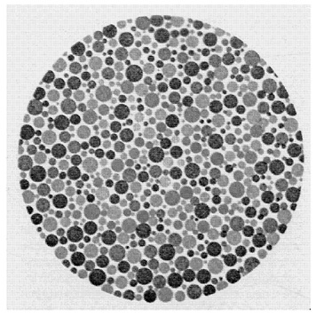
FIGURE 1 An Ishihara pseudo-isochromatic plate.
out “the different one.” In Figure 2c, however, when the luminosity contrast of the background squares was increased, M.S. could no longer detect the saturated square.
At first glance, the explanation for this failure would seem to be the following. What allows M.S. to select the “odd man out” in Figure 2b is that he can see—in addition to luminance contrast—chromatic contrast when the colors are “deep” or saturated. What he cannot distinguish between are the two kinds of contrast, one from the other. Rather, what is signaled is merely “contrast of some type.” Thus in Figure 2c, when there is both high luminance contrast between all of the squares and a high chromatic contrast between the red square and its neighbors, there is nothing to distinguish the red square. Every square contrasts with its neighbors in one way or another.
What makes this case puzzling, however, is that in further experiments the patient was able to detect and identify a colored form against a checkerboard background, whether that form was composed of saturated or unsaturated colored squares and whether the checkerboard background was of high or low luminance contrast. For example, the patient could not detect,
FIGURE 2 Schematic illustration of the stimuli used in Hey wood et al. (1994). A. Low luminance contrast checkerboard with desaturated red square. B. Low luminance contrast checkerboard with highly saturated red square. C. High luminance contrast checkerboard with highly saturated red square. D. High luminance contrast checkerboard with desaturated red square and desaturated green cross.
in Figure 2c, the small, red square but he could detect and trace with a finger the green cross in Figure 2d. He could also detect and identify the red forms in Figure 2d. (This is particularly strange when one recalls that M.S. was not able to detect or identify the concealed figures in the Ishihara plates.) Indeed, M.S. was able to pick out the individual squares that made up each of the forms—squares of exactly the same size and saturation as those that, in isolation, he could not see. To add to the mystery, further experiments showed that M.S. was also able to see (apparent) motion given only chromatic information; and in brightness additivity tests, M.S. responded as would the normal subject, which suggests that, at some level, color opponent processing remained intact.
The above results pose a number of difficult puzzles. For physiological theories of color vision, one puzzle—the one posed by Heywood et al. at the end of their article—seems to be this. With bilateral damage to the cortical “color center” (Heywood et al., 1994), M.S. has no phenomenal experience of color, but he retains some color abilities but not others. What residual chromatic information is available, then, and where is it available in M.S.’s visual system? Why is it that exactly the same color information is available for some tasks but not others (e.g., why can a colored square be seen when it forms part of larger form but not when it is shown by itself?).
For philosophical theories of color, the puzzle is not about M.S. ’s chromatic information per se but about his phenomenological experience: What is it like to be M.S. as he stares at the test stimuli? Here the problem is not merely difficult but it is peculiar. In the color discrimination experiments that used single colored squares against the checkerboard background, it seems plausible that M.S. sees saturated chromatic contrast as luminous contrast or as variations along a “gray scale.” If, say, M.S. sees the saturated red square as a very dark gray or black, then he would be able to pick out the red square against a checkerboard background of low luminosity contrast (i.e., he sees a black square amid a checkerboard of varying shades of gray). This would also explain why, under the condition of high luminosity contrast, the red square became invisible: It would be just one black square among many. Here again, the experiments using colored forms show that this hypothesis could not be right, at least in general. M.S. is able to pick out (flawlessly) colored forms against a high luminosity contrast checkerboard, so, in some sense, he must be able to see both luminance and chromatic contrast as well as the difference between them. Yet M.S. does not see the colored form as a colored form. In what, then, does the phenomenal difference between luminance and chromaticity consist?
More to the point, what could the difference be given a world that appears in shades of gray, a phenomenal space of one dimension? The problem here is that the common-sense options for describing M.S.’s phe-
nomenology seem entirely inadequate. First, intuitively, we seem faced with only two possibilities:
-
Either M.S. sees in black and white or he sees in color.
We can understand, of course, that a person might have a limited color capacity, that he or she might be unable to discriminate between or categorize all of the hues perceived by the normal (human) observer. The red-green dichromate is an obvious and common example: For M.S., a pale green teacup and a pink one are indistinguishable by means of color. What seems nonsensical, however, is that a person might be able to see the world’s objects “in color” yet at the same time perceive them as devoid of color or “in black and white.” Second, in this case:
-
M.S. sees in black and white.
Or, at least, so it seems. Certainly this is what M.S. claims, and there is no reason to believe that he is insincere or in a state of general confusion. It is still more difficult to understand just how he might be genuinely mistaken about his own experiences. So, prima facie, M.S. sees in black and white. Hence:
-
M.S. does not see in color.
But M.S. must be able to see in color: if he could see only shades of gray, there would be no visual quality that distinguished the colored forms from the background. Thus, the paradox.
Recasting the Problem of Color Vision
When I open my eyes and look at my surroundings, I see the kitchen chair before me painted a uniform “colonial blue,” the worn terra-cotta floor tiles in shades of rust; and, out the window, a dark green fig tree, now lit a brilliant yellow-green by the setting sun. On the common view, that is, to see “in color,” to have human color vision, is just to see various media (the surface of objects, as well as gases, liquids, etc.) as colored; and this, in turn, means that we see each medium as having a particular determinate color or shade, a color which is of some type or category, and a color that is more or less independent of my present perception of it.
Looking at the chair, for example, I see “that exact color,” a particular shade of blue that differs from the blue of the teapot on the table. In this sense of “color,” “the exact color of the kitchen chair, ” it is estimated that we can see over a million colors or, more precisely, that we can make over a million discriminations within the range of chromaticity and lightness that define our phenomenal color space (Boynton, 1990, p. 238). This color phenomenology is said to be organized along three coordinates—hue, saturation, and lightness—or, alternatively, along the three “opponent” dimensions of lightness/darkness, red/green and blue/yellow. Intuitively, some of these colors appear to be “pure” or unitary colors (e.g., a
pure red contains no yellow or blue), whereas others are “binary” hues apparently composed of two different hues (e.g., orange seems to be composed of red and yellow, whereas lime green is predominantly “pure” green with some yellow added).
In addition to seeing some particular color or other, we also categorize the colors. I do not see the chair as merely some determinate color or other, as “that one, there,” but as a particular shade of blue. It is now widely accepted that there are basic color categories that are universally applied regardless of language or culture, although there is some disagreement about just which categories these are. As early as 1878, Hering suggested that there were but four elemental hue sensations —red, green, yellow, and blue—results confirmed by Sternheim and Boynton (1966) and Fuld et al. (1981). By contrast, Berlin and Kay (1969) concluded that there were 11 basic color terms common to (and translatable between) nearly 100 languages—in English these are red, yellow, green, blue, orange, purple, brown, pink, white, gray, and black, and these findings were confirmed in psychophysical experiments by Boynton and Olson (1987). Whatever the actual categories, Figure 3 shows one attempt, the Inter-Society Color Council–National Bureau of Standards (ISCC–NBS) method, to divide our continuous phenomenal space of color into the color categories.
Third, color is seen as an “inherent” property of objects (and other media), a property that objects have more or less independently of our present perceptions of them or, to use the philosophical terminology, for which an “appearance/reality ” distinction holds. For example, looking out at the fig tree in the setting sun, I distinguish the leaves’ present appearance, a luminescent lime, from their true color, matte dark green. I see the contribution of the light source—the warm golden light shining through and reflected from the leaves—as distinct from the color of the leaves themselves. Were I to watch the same scene through yellow-tinted sunglasses, I would distinguish between the true color of the leaves and their yellow appearance. Thus, naively at least, we distinguish between the colors that objects possess, in and of themselves, and the colors that objects often merely appear to have in virtue of external factors such as lighting or of our own subjective states. We see and conceive of colors as they are in themselves.
For the most part, research on human color vision—be that investigation philosophical, psychological, or physiological —has attempted to understand and explain this color phenomenology, our experience of a colored world. It is standard for philosophers and psychologists, for example, to ask about the evolution of human color vision and the historical function of seeing “in color.” What survival advantage did seeing objects (and other media) as colored confer about our species—why do we see

FIGURE 3 Illustration of a section of the ISCC–NBS color name chart in the purple region. The system divides the space into 267 blocks. The system uses the 10 different hue categories of Berlin and Kay, plus an additional one, “olive.” These hue categories are divided through the use of modifiers—“pale,” “light,” “strong,” “dark,” “deep,” “vivid,” “brilliant” as well as the adverb “very” (from Kelly and Judd, 1976).
“in color”? Why do we have the particular color categories that we do—the reds, greens, yellows, and blues? Do our color categories serve to track salient features of our environment? And why does our phenomenal color space have the properties it does: Why does it have three dimensions, why are there “unitary” and “binary” colors, and so on (e.g., Shepard, 1997)? Computer scientists and psychophysicists, on the other hand, ask about which visual processes use color and for what purposes. Does seeing in color help us to locate objects of interest within a scene (e.g., to see the green pen amidst a jumble of office supplies in the desk drawer)? Does noting the color of an object help us to reidentify particulars (e.g, to locate your car among all the others in the parking lot) (e.g., Swain and Ballard, 1991)? Finally, neurophysiologists have asked about
the physical realization of our color experience (e.g., Zeki, 1980). If the purpose of color vision is to produce “the colors,” spectral processing must eventuate in a place where “the colors” are represented and which thereafter provides information about the colors (so encoded) to other visual areas. Thus we can expect to find in visual cortex a neural realization of our phenomenal color space, one that represents each determinate color as a single, determinate location within some color coordinate system, one that will explain the various phenomenal features of our particular color experience (e.g., its apparent three dimensionality and the unitary and binary hues). Exactly how such an area will be organized remains an open question: One need not expect to find the ISCC–NBS color system (“very dark olive”) instantiated at a particular place in the gray matter. But given the phenomenology of color, some coordinate system, which maps onto our phenomenal color space, must exist—or so it has been commonly assumed.
Below, I make a rather odd suggestion about human color vision, namely, that the primary function of color vision is not to see the colors or to see various media as colored—to see, for example, ripe strawberries as red, the unclouded sky as blue, or the sun as bright orange. Rather, my suspicion is that color vision has evolved to encode a certain kind of general information about the retinal image, not color per se but spectral contrast information. Just as the luminance system encodes luminance contrast information for the purpose of discerning objects, properties, and events, the color system encodes spectral contrast information for much the same ends. Of course, we both perceive and conceive of various media as being colored, so spectral information must be used in this way as well. But seeing the colors is not the central function of color vision any more than seeing objects as bright or dark is the central purpose of luminance vision.
To explicate this view, I begin by setting aside the standard research questions above, questions that are driven by our first-person experience of a colored world. What would happen if we asked not about color per se as presented in our ordinary phenomenology—about the evolutionary history, function, and neural realization of color? What if we asked, instead, “What uses might a visual system make of spectral information?” If you think about “the world of light,” that is, it is obvious that light, viewed as a waveform, has two dimensions, wavelength and amplitude. Normally, as researchers in vision, we concentrate on luminance information, on the amount of light independently of wavelength—on vision in a “black and white” world, as it were. Of course, our world is not a black and white world and the “spectral world, ” as such, is an exceedingly complex one in its own right.
Sunlight, as it filters through the atmosphere of earth, undergoes
ozone absorption, molecular and aerosol scattering, plus water and oxygen absorption. When it reaches the ground, sunlight ranges in wavelength from about 300 nm on out past 1500 nm, with its peak intensity between 500 and 600 nm (Hendersen, 1977). Not coincidentally, as Boynton (1990) points out, the range of visible light for humans coincides with the range of greatest sunlight intensity, from 320 nm to around 800 nm, and its spectral sensitivity mimics the intensity curve of terrestrial sunlight, peaking at about 550 nm. Moreover, although we think of sunlight as constant in spectral composition (even though there may be more or less of it), in fact the spectral power distribution (SPD) of sunlight changes markedly throughout the day. This is intuitively obvious when we think of the quality of light at dawn (the “cool” hues), at midday (glaring “white”), and at dusk (the warm red-yellow hues). The SPD of sunlight is also dramatically affected by one’s position relative to the Sun. Figure 4 shows, for example, the difference in SPDs reflected from an object facing toward and away from the Sun. All things being equal, a yellow banana facing away from the Sun ought to appear green, given the shift in SPD toward the short or blue end of the spectrum (Walraven et al., 1990).
The real complexity of the “spectral world,” however, begins with the interaction of light with various media —the fact that light sources, in all their initial complexity, are absorbed, refracted, and reflected by a vast range of media and surfaces —and, as a result, the spectral composition and directionality of the light are altered in an indefinite number of ways. Take for example the media of air and water. Sunlight shining through a clear sky is scattered by the small particles of the atmosphere, a process that effects the short “blue” wavelengths selectively (hence the blue of the sky) but that leaves the overall directionality of the sunlight largely unchanged. On cloudy days, all wavelengths are scattered by the suspended water particles, yielding a diffuse illumination from all parts of the sky, and thus a reduction in the shadows of objects. In contrast, when sunlight shines on water, white light glints from the surface: Initially, some light in all wavelengths is reflected, a phenomenon known as specular reflectance. Most of the sunlight, however, enters the water and is absorbed by it: The deeper the water, the greater its absorption. Which wavelengths are absorbed, however, depends on the type of suspended organic particles in the water. For example, clear water with little organic matter will most easily absorb red and violet light, leaving only the intermediate “blue” wavelengths, whereas in marshes and swamps, the little light that is not absorbed by decomposing plants, tannins, lignins, and yellow-green plankton is in the red-orange region of the spectrum—hence the shimmering blue of the Mediterranean and the dark red-brown appearance of a swamp. Of course, water molecules (and the suspended particles in
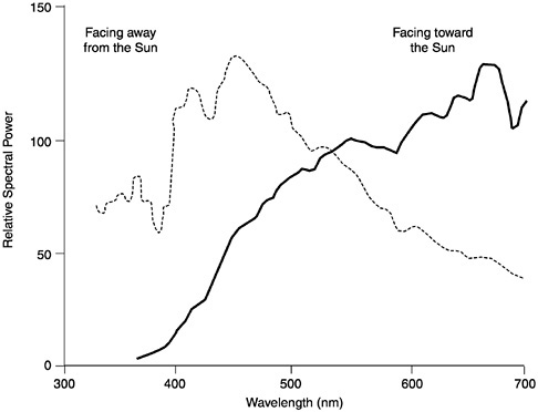
FIGURE 4 The relative SPDs of the light reflected from a single piece of white paper. The leftmost curve illustrates the SPD of the paper when illuminated by the “blue” light of morning, with the surface facing away from the Sun (at 30 degrees solar altitude); the rightmost curve illustrates the SPD of the same paper, illuminated with the “red” light of evening and with the surface facing toward the Sun (at 8 degrees solar altitude) (from Walraven et al., 1990)
water) also scatter light waves, so the medium of transport is itself “colored” (Levine and MacNichol, 1979; Munz and MacFarland, 1977).
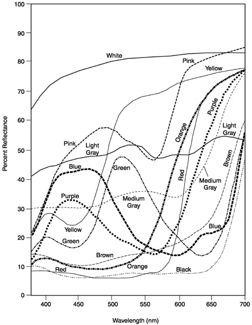
Add to this the opaque and transparent objects of the world. Take, for example, the simplest case, pieces of uniformly dyed, matte construction paper (Figure 5). Looking at these spectral reflectance curves, it seems safe to say that our access to the spectral world, as human color observers, gives us very little insight into the spectral complexity of even a “uniform” surface color: Orange construction paper does not reflect one wavelength but rather its “spectral reflectance profile” is a continuous function across the range of visible light. Note that spectral reflectance curves give the percentage of light reflected at each wavelength (in the visible range), a measure that is constant across illuminations. But shine, say, a “red” light
or a “blue” light on these same paper samples and the absolute values of the light reflected will vary enormously. In most natural settings, of course, objects are not illuminated by diffuse white light nor are they uniformly pigmented. So the “shape” of the light reflected from a natural object is both complex and ever changing.
Finally, objects do not sit in isolation, one from the other. When, for example, one walks in the woods, light is both filtered through and reflected from the canopy of leaves overhead and the bushes around, shifting the SPD of the ambient light significantly toward the medium wavelength “green” part of the spectrum. (Think here of photographs taken inside a tent—say, a green tent—and the spectral shift becomes more intuitive.) Moreover, when two objects sit side by side, light reflected from one will be cast upon the other, such that each object acts, in effect, as a local filter for the light source. A blue teapot sitting on a white table gives the table a blue tinge; the terra-cotta red floor casts red light on the blue kitchen chairs. Despite the pervasive nature and significant effects of the interreflection (by one estimate, in a natural scene, fully 15 percent of an object’s reflected light is contributed by its nearby objects) (Funt and Cardei, 2000), it is not one that we are able to see in ordinary color vision. Indeed, most of the above facts are “hidden” from us by our visual system.
The spectral world, then, is a complex one, and it is in this world that all vision—human vision included—evolved. The general evolutionary “question” posed to each and every developing visual system, then, was not “what use could a visual system make of color?” Rather, the “question” posed was “what use could a visual system make of spectral information?” What could a visual system do with wavelength, as opposed to luminance?
Two Principles of Luminance Vision
In answering this question, I believe that there are two widely accepted general principles of luminance vision that might be equally applicable to spectral vision—two principles that can help us understand “color” vision in ourselves and other species as well.
Perhaps the most basic principle of vision is simply this: The proximal stimulus of all vision is luminance contrast, not light per se or absolute luminance. To “see” anything at all, be it only the detection of a large looming shadow, there must be contrast in the light stimulus. To put this another way, if one wants to see what is in a picture, a black object against a black background will not prove very informative. What one needs is a dark figure against a light background—or, conversely, a light figure against a dark background. What is essential to vision are not the absolute levels of
light per se, but luminance contrast in the image, be it positive or negative. Thus, the most important of visual information is where and how much contrast exists in the image.
The second most basic principle is as follows: The more simple the behavioral repertoire of the organism, the more specific the information encoded by the initial sensory processes; the more complicated the behavioral repertoire of the creature, the more general the information encoded (Lennie et al., 1990). To see what this principle involves, begin with the frog’s four classes of retinal ganglion cells (Lettvin et al., 1959) (ganglion cells are the “output” cells from the retina). One kind of cell is sensitive to borders between light and dark areas, another to moving edges, another to reductions in overall illumination, and the last to small dark moving convex edges. The information processed by each ganglion cell of the frog is considered “specific” because of the discrepancy between the complex properties of the image that fall on the frog’s retina and the limited number of those properties to which the ganglion cells react (i.e., because of the loss of information due to neural filtering). For example, sit a frog in front of the Mona Lisa, and the image falling on its retinae will form a complex pattern of spectral and luminance contrasts—the same pattern that the image would fall on your retinae if you were looking at the Mona Lisa. But because the ganglion cells of the frog respond to only four distinct patterns of illumination, there will be little ganglion response—probably only the “border detectors” will fire, responding to the frame of the picture. In this way, the frog’s ganglion cells miss or serve to filter out most of the properties of the proximal stimulus, the complex image. (This is also why frogs make lousy art critics.)
For the frog, of course, such highly filtered information is behaviorally appropriate. As Lettvin et al. (1959) first claimed, in the natural environment of the frog, these light patterns on the frog’s retina are usually caused by particular kinds of events in the world: dimming illumination over a substantial portion of the retina is caused by the movement of a largish opaque object, an object that is often a predator; small convex moving edges are usually caused by flying insects; borders between light and dark areas are usually caused by the borders of objects; and moving edges are usually caused by moving objects (or the frog’s own movement). Thus, one finds a more or less direct wiring from these classes of cells to pathways that control the frog’s behavior in relevant ways: The ganglion cells that react to looming shadows stimulate evasive behavior; those that are sensitive to small dark moving spots cause tongue-swiping behavior and so on.
In a mammalian or primate visual system, the initial encoding of the retinal image must subserve an indefinite number of complex behaviors. As Homo sapiens, we can walk through a tangled forest floor, thread a
needle, recognize an acquaintance in a concert crowd, pick green peas, park a car, dodge (or catch) a speeding missile, secure a squirming baby into a pair of overalls, read fine newsprint, or swat a passing fly. Such diversity of behavior is produced by equally diverse computational tasks, and these in turn have diverse informational requirements. However information about the retinal image is encoded, as much information as possible about the image itself must be retained (not for us, mere edge detection for the Mona Lisa).
What then is the most general form of visual encoding? Return once again to the first principle of vision. If the proximal stimulus of vision is luminance contrast, then what primate vision must encode is where and how much luminance contrast exists in the retinal image, hence the spatially opponent center-surround organization of retinal cells in all vertebrates that encode fine-grained contrast information about the retinal image. Each center-surround cell “watches” a particular circular area of visual space, an area that is divided by the cell ’s response into a “center” (a smaller circular area in the middle) and a “surround” (the outer concentric region). Here there are two basic classes of cells, “ON” and “OFF.” When a bright light is shone in the center region of an ON-center cell, it fires in response to the illumination; when light is shone on the surround, such a cell is inhibited or prevented from responding. An “OFF-center” cell has just the opposite response (i.e., it is excited by light in its surround but inhibited by light in the center region). Thus the response of a center-surround cell corresponds to either positive or negative luminance contrast between the center and the surround regions within a particular area of visual space (its “visual field”). In primates, the ON and OFF cells form two separate systems, from the retina to primary visual cortex, that are anatomically and physically distinct (Schiller, 1982, 1984; Schiller et al., 1986). This separation extends the range of contrast signaling (each cell has to signal only the positive range or the negative range) and makes for a “speedier,” less noisy system (by using an excitatory signal for the transmission of all luminance information).
It seems to me that these same two principles might well apply to what I will call spectral vision, namely, that
-
Given a primate’s large repertoire of complex, visually guided behaviors, the primate visual system requires a general encoding of retinal information.
-
What is encoded at the retina is contrast information—both luminance and spectral contrast information—that is then used, both separately and conjointly, to solve the multiple computational problems of primate vision.
Explaining this will take a good deal of work. As is commonly acknowledged, creatures with one kind of cone (or daylight retinal receptor) are color blind: They are unable to discriminate stimuli on the basis of wavelength alone. Although the receptor reacts to light across a broad spectrum of wavelengths, by increasing or decreasing the intensity of the light stimulus, the receptor’s response can also be increased or decreased (Figure 6). Thus a particular response does not signal the presence of any particular wavelength: Given a single receptor, intensity and wavelength are conflated. Nonetheless, even creatures with only one kind of receptor could make use of spectral information. Indeed, one way to think of retinal receptors, given their preferential response to a small range of wavelengths (e.g., the “red” range), is as a spectral filter. Consider the black and white photo in Figure 7. Here, variations along the gray scale signal the intensity differences in the visual scene. When a color filter is added to the camera lens, however, the luminance values change. For example, when a blue filter (a filter through which blue light is transmitted but
FIGURE 6 A one-pigment system (from Sekuler and Blake, 1990).

FIGURE 7 A black and white photograph taken without any color filters.
which filters out red light) is attached to the camera lens, the apples in the scene become very dark, almost black (Figure 8). Indeed, almost all the fruit in this scene are somewhat darkened, a fact that tells us that most of the fruit reflect a reasonable amount of long wavelength or “red” light. In a natural setting, a spectral filter on a “black and white” (or single-cone system) can be extremely useful in enhancing luminance contrast. For example, if one were a creature whose diet consisted mainly of ripe red fruit set against a background of green leaves, a permanent blue filter of just this sort (i.e., a single retinal receptor insensitive to red light) would prove very useful.
In fact, this visual “strategy” of using a receptor as a filter to enhance luminance contrast is found in many species. For example, Lythgoe (1979) hypothesized that the rods and cones in certain fish have evolved to function as filters that highlight the contours of objects against the background space light. If the photo pigment is “matched” (maximally sensitive) to the spectral range of the background light (i.e., if the filter is matched to the “color” of the water), then a dark object will be highlighted against the brighter background; if the photo pigment is “offset” from the dominant wavelengths of the background light, then a bright object will be outlined against a poorly illuminated background. The skipjack tuna, then, which spots its prey from below (a dark object against a bright surface), has only

FIGURE 8 The same scene as depicted in Figure 7 using a blue filter. Note how dark the red fruits and vegetables appear, whereas the blue colander is now light gray.
one photo pigment that is matched to the background light. The walleye, bluegill, and piranha that inhabit dark, particle-laden (hence, red-shifted) waters are all dichromats (i.e., have two types of cones), with one cone type matched to the near-infrared, a wavelength common to their “black” water habitat during the dusk and dawn hours of feeding (Levine and MacNichol, 1979; Lythgoe, 1979; Munz and MacFarland, 1977).
Apart from spectral filtering, how might spectral information be used? In particular, what widespread benefit might the addition of yet another, differently tuned receptor bring about? In the standard version, what an organism gains through the addition of another receptor type is the ability to do “rough” wavelength comparison (Figure 9). Given a light stimulus of a single wavelength, one can compare the response of receptor 1 with the response of receptor 2 to determine the unique wavelength of the stimulus, a ratio that will remain constant independent of any change in intensity. Unfortunately, adding another cone yields only “rough” wavelength discrimination because any dichromat can be “fooled” by a light of two or more wavelengths: For any given ratio of cone response caused by a single-wavelength light, it is possible to produce that same ratio using a stimulus of two or more wavelengths (Figure 10) Thus, it is not possible for the system to disambiguate the two types of stimuli. By adding more receptors, a system can become capable of more accurate wavelength dis-
FIGURE 9 In a two-pigment system, the responses of receptors 1 and 2 can be compared to determine the unique wavelength of a stimulus (from Sekuler and Blake, 1990).
crimination, but the same principle holds no matter how many different types of cones are added. (A three-cone system can be fooled by a stimulus composed of three lights, a four-cone system can be fooled by a stimulus of four lights, and so on.) Again, according to common wisdom, the number of cones that a color system will have is constrained by the system’s particular need for spatial resolution (the more cones there are, the less the spatial resolution of the system) as well as the constraints imposed by the (natural) spectral environment.
It is an interesting fact, however, that the vast majority of mammals, all of which have sophisticated visual systems, are dichromats. So, in the standard version, what each mammalian species has gained is only very rough wavelength discrimination (i.e., bad color vision). So why, exactly, would that ability have been so uniformly useful? For the version of spectral vision that I put forward here, one can think of two differently tuned

FIGURE 10 In a two-pigment system, the same ratio of response that is produced by a stimulus of a single wavelength (left), can be produced by a stimulus composed of two (or more) different wavelengths (right) (from Sekuler and Blake, 1990).
receptors as creating a means to compare two ranges of wavelengths (of comparing two ends of the spectrum) divided at that point at which both receptors give the same response (Figure 11). Let receptor 1 be given a positive signal and receptor 2 be given a negative one. In this antagonistic relation, a positive cumulative response will signal a proximal stimulus that has wavelengths predominantly in the lower range of the spectrum whereas a negative response will signal a proximal stimulus with wavelengths predominantly in the upper range. What will be signaled in a spectral system, in other words, are “positive” and “negative” ranges of a spectrum, just as in the luminance system, ON and OFF cells signal the positive and negative ranges of luminance.
In very primitive visual systems, we can see this kind of spectral contrast used for primitive motor tasks. Take for example the copepod Daphnia (Menzel, 1979). In blue light, Daphnia become highly active, lean forward, and move steadily at right angles to the angle of illumination; in red light, Daphnia remain upright and move slowly in parallel with the angle of illumination. One hypothesis is that this is related to foraging behavior. In phytoplankton-rich layers of water, where the chlorophyll of the plankton absorbs blue light and hence produces red ambient light, Daphnia slow down to eat; in phytoplankton-poor layers, in which the water is more blue, Daphnia begin to forage. In this way, Daphnia exhibit a typical pattern of wavelength-specific behavior, in which blue and red light produce positive and negative phototaxis, respectively.
In more complex visual systems, spectral contrast, of and by itself without spatial contrast, would not be of much use in discerning distal

FIGURE 11 Here, the two receptors are placed in an antagonistic relation: receptor 1 provides a positive input and receptor 2 provides a negative input. When the combined signal is positive, the wavelengths of the light source will be predominantly from the blue range of wavelengths; when there is a negative response, the wavelengths of the light source will be predominantly from the red range of wavelengths (adapted from Sekuler and Blake, 1990).
objects and their properties. In the primate visual system, this problem seems to be solved by “interweaving” the encoding of luminance and spectral contrast. In our own case, we have three types of daylight receptors —cones with overlapping ranges of response. Each cone responds to a broad range of wavelengths, each with a different peak sensitivity (Figure 12). Thus, they are called the blue, green, and red cones or, more properly, the short (S), medium (M), and long (L) cones, respectively. At the level of retinal ganglion cells, 52 percent of all ganglion cells are color-opponent cells, with the same spatially opponent center-surround organization as luminance cells (which receive input from the same kind of cone). As one can see, the majority of cells are red-green opponent cells—center–surround cells with an L ON-center and an M OFF-surround (L-M
cells) or the reverse arrangement, M ON-center and L OFF-surround (M-L). Blue-yellow cells, S ON and OFF center cells, comprise only 7 percent of all ganglion cells (Malpeli and Schiller, 1978; Zrenner and Gouras, 1981). Exactly what, for example, an L-M ganglion cell signals is an interesting question. Contrary to intuition, it does not signal spectral contrast between the center and the surround per se. It is true that such a cell will respond to red light in the center region and green light in the surround, but it will also respond to, for example, a red light shone only in the center, to a diffuse red light over the entire center-surround area, or to a lone white light in the center. (However, such a cell does respond uniquely to spectral contrast across a moving border, in virtue of the pattern of inhibition and excitation as the border passes first through the surround, then the center, and then the surround again.) So L-M center–surround cells are informationally complex, carrying interwoven information about spectral and luminance contrast.
This view that the color and luminance systems both serve to encode “visual” contrast information makes sense of the kinds of sensitivity control that exist at the retina and early in cortical processing. Start with the

FIGURE 12 Response properties from the S, L, and M cones of the human retina (from Sekuler and Blake, 1990).
luminance system. In luminance processing, the visual system must operate across the very broad range of luminance throughout the day—nearly 10 decades from noon sunlight to starlight (Walraven et al., 1990)—yet a sensory neuron has a maximal firing rate of several hundred spikes per second. The range of stimulation over which the system must respond far exceeds the ability of a sensory neuron to signal fine-grained distinctions. For the most part, when this problem of visual sensitivity is discussed, it is framed as one of brightness constancy. How does the visual system ensure that an object is seen as having the same brightness (lightness) despite changes in luminance, that a piece of white newsprint looks white both outdoors and in? For example, Fiorentini et al. (1990) quote Hering (1878) to illustrate the problem: “without this approximate constancy, a piece of chalk on a cloudy day would manifest the same color as a piece of coal does on a sunny day, and in the course of a single day it would have to assume all possible colors that lie between black and white.” This is true but perhaps not the best way to see the problem. If the visual system responds to contrast as opposed to the absolute luminance values, then the problem posed by variable illumination is not one of object reflectance per se but of contrast sensitivity: The central problem is not whether paper or chalk continues to look white throughout the day but whether one can find the chalk on a white table at high noon or read the black newsprint on white paper in dim light. What is important is the relative luminance of an object and its background (i.e., contrast). Theoretically, that is, a single neuron could respond across the entire range of daily illumination but only at the expense of fine-grained contrast resolution. Each small increase in firing rate would signal a large increase in illumination, and small contrast changes in the image would yield no response. Conversely, if the luminance range of the neuron were narrowly restricted (say, to the noon sun), the neuron would be sensitive to contrast within that range but otherwise “blind.” Somehow, the system must “discount the illuminant” and signal contrast with a constant signal. Note that if a global solution to contrast sensitivity were implemented, then something close to “brightness constancy” would also result.
One can think of the spectral system as facing a very similar problem. Here, the primate visual system must respond to spectral contrast in the face of constant changes in the SPD of sunlight, both throughout the day as the spectral composition of sunlight changes, but also as we move through the environment, turn toward and away from the sun, walk under the shade of trees, and so on. Just as in luminance processing, the problem is not that of color constancy per se, of trying to ensure that a yellow banana looks yellow from dawn to dusk, but of seeing the ripe banana at all, of “segmenting” the ripe banana quickly from its green counterparts. In a species with a very limited behavioral repertoire or for
one that lives in slowly changing and/or predictable “spectral worlds/’ there is an easy way to maintain or even enhance spectral contrast given a change in SPD: Simply change the spectral filters. To return to the fish again, the action spectra of the cones of the Pacific salmon, which migrate between fresh water and the ocean, change seasonally so as to maintain optimal contrast between prey and the different types of water (Munz and MacFarland, 1977; Whitmore and Bowmaker, 1989). For us, however, there is no simple solution of this sort: We are interested in a vast number of differently colored objects, against multiple backgrounds, under conditions of constantly changing SPDs. What, then, ought the visual system to do? On the assumption that there are no spectral biases that span across all these variables, the system’s best global strategy for discerning spectral contrast is to “discount” the predominant wavelength in an image should there be one. All things being equal, viewing the visual scene as if under a white light will not enhance particular contrasts per se, but, for the most part, it will allow us to see whatever spectral contrasts between objects and their backgrounds actually exist. For example, if the object of interest is a bright blue, and the SPD of the illuminant is shifted toward the long wavelength end of the spectrum, toward the “reds,” the blue object’s natural contrast with its red background will be obscured (i.e., very little blue light will be reflected). Under conditions of an uneven SPD, such adaptation produces a rough approximation to color constancy because the spectral biases of the actual illuminant will be discounted. Thus, when one stands with a yellow banana in hand, the banana will look (more or less) yellow whether you are facing toward or away from the sun, given retinal adaptation.
Note that this kind of retinal adaptation does not distinguish between an illuminant with an uneven SPD and what I call “the bordello effect, ” when the objects in the visual scene all have a common hue, say, red. Here, retinal adaptation will normally increase the natural spectral contrast between objects and their backgrounds. If, for example, the visual system is trying to segment red velvet curtains against red-flocked wallpaper, filtering out the common “red” wavelengths may well leave differing residual spectral profiles if, for example, the curtains are a little more orange than the wallpaper. These are precisely the conditions in which color constancy fails. Being able to distinguish the curtains from the wallpaper is more important than seeing the curtains as being the correct shade of red.
To summarize, the initial levels of visual processing (in humans) serve to encode “general” contrast information—information about both luminance and spectral contrast. I suggest that this contrast information is used both conjointly and separately by visual cortex to solve the many problems of vision —the problems of discerning, among other properties,
the position, shape, depth, and motion of objects within the visual scene. Just as the luminance system does not function in order to see brightness and darkness per se, neither does the spectral system function for the sole purpose of seeing the colors. Both the spectral and the luminance systems function to see objects simpliciter. Of course, we do see objects as being brighter or darker, and we do see objects and other media as colored, so doing so must be one of the functions of the luminance and spectral systems, respectively. But what looks from our end, as conscious perceivers, as the raison d’être of human color vision (i.e., seeing the world “in color”) may not be its primary function at all. We see the world in color, in other words, not because the colors have proven so very useful but because spectral contrast information has proven so.
Benefits of a Spectral System
Unfortunately, the above view of the spectral and luminance systems has rarely been considered seriously for one simple reason: For any given visual image, wherever there is spectral information in an image, there is usually luminance information present as well. That is, if one were to take a black and white photo of, say, a patch of strawberry plants, one would find that red berries differ in “brightness” from both the green berries and from the green leaves as well. So even without spectral information, it is possible to spot the strawberries against the leaves and to tell the ripe from the unripe berries. But if it is possible to perform almost all of the requisite visual tasks using luminance information alone, what benefit would adding a spectral system confer? Spectral information would seem redundant.
The short answer to this question is this: “Pure possibility”—the range of computable functions theoretically available to an evolving system—is perhaps the least of the constraints acting upon any visual system as complex as primate vision. In evolution, our visual system has been shaped by many requirements, three of which are as follows.
First, although we are often told how large the human brain is, our brains are not infinite, and relative to the complexity of what they manage to do, perhaps we ought not to think of them as very large at all. In the face of finite resources, “cheap” computational solutions are preferable to those which use significantly greater computational resources. If, by using spectral information, there is a simpler way to solve a visual processing problem, all things being equal, spectral processing might be a preferable method. Going back to the strawberries again, although it is possible to pick strawberries using luminance information alone, doing so would be a significantly noisy process given the paucity of such information. But if the input from “red” cones were used as a spectral filter to increase
the contrast between the ripe strawberries (and only the ripe strawberries) and the background green foliage, noise would be reduced, and the need for costly noise reduction mechanisms would be eliminated. Sometimes spectral information ought to provide an easier means of performing the same task.
Second, the real challenge facing primate vision is not task performance per se, of discerning this or that property of the visual environment, but of real-time processing. To make a visual system that can recognize a flight of stairs is a reasonably complex task. But to make a system that will recognize that flight of steps before you take the fatal step is a far more challenging affair. Real-time visual processing —having a visual system that can guide our movement at a reasonably rapid pace—is one of the great design hurdles which evolution has had to overcome. Hence, any system that can provide a faster solution to a visual processing problem has enormous utility.
Finally, primates are soft and squishy creatures moving about in a relatively dangerous environment. Hence, for us at least, evolution has placed a high premium on the reliability of our perceptual systems. You cannot afford to recognize that flight of stairs only 99 percent of the time, or to misjudge, one time out of a hundred, the distance from one step to another. In this context at least, 99 percent accuracy in a visual system would be exceedingly costly to life and limb. One standard tactic for increasing reliability is to compare “your ” answer with someone else’s—or, in this case, to compare an answer based on luminance information with an answer calculated from spectral information. Given two different sources of information, and potentially two different means of solving a common problem, the reliability of the luminance system could be significantly increased. To put this another way, although, prima facie, computational redundancy might seem like a bad idea for any computational system—a squandering of resources—this is not so when the computational problems are difficult and the cost of failure is high.
In light of the above three constraints, when we examine experimentally the computational processes of primate vision, we should see spectral contrast information used in parallel and complimentary ways to luminance information. Sometimes visual processing will benefit from the independent processing of spectral and luminance information (in order to compare the answers); sometimes it will benefit from a single mechanism that can use both spectral and luminance information (in order to increase the available contrast information); and sometimes task-specific mechanisms, using only spectral or luminance information, will be more appropriate. All of this will depend on the exact task at hand and on the features of the visual scene. More specifically, I expect that spectral information will be utilized when
-
Luminance information is simply missing from the retinal image. As I stated above, in the natural world, isoluminance is a very rare problem: Even the red (ripe) berries and the green (unripe) berries are distinguishable, in principle, on the basis of luminance measures. Nonetheless, crucial luminance contrast information is often lost locally. For example, in the black and white photograph in Figure 13, it is difficult to make out the features of the two figures on the bed because the shadows obscure the crucial borders between the faces and the background bedding. What is surprising about this photo is that it was taken in very bright morning light, conditions under which the normal observer would see the two figures quite easily. (In other words, what the photographer realized was that, with all spectral information expunged, the scene would have a mysterious and “veiled” quality created by the shadowing.)
-
Luminance information is ambiguous between two incompatible answers. For example, in a visual image that contains only luminance information, dark moving spots across a retinal image can be caused either by a moving object (e.g., a leopard moving through the grass) or by moving shadows across a stationary object (as when the wind moves leaves back and forth and dappled light plays across the scene). However, when the leopard moves, his spectral contrast goes with him; when shadows move across a stationary object, there is no accompanying movement of spectral contrast. Thus, the spectral contrast information can disambiguate the scene.
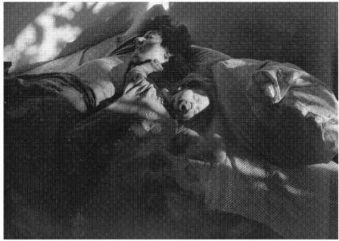
FIGURE 13 In this photograph, which was taken in bright, early morning sun, shadows obscure many of the crucial contours of the two sleeping subjects. Photograph by Gena Hahn.
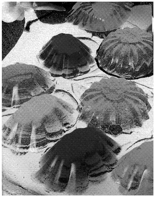
-
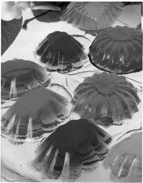
Luminance information is limited or noisy. For example, if you were asked to pick out the blue jellies in the photo in Figure 14, it is certainly possible to do so based on luminance information alone. Given the color photo in Figure 15, however, it is clearly faster and easier (for us) to use spectral information as well. When an object and its neighbors have low luminance contrast but high spectral contrast, a visual search using both spectral and luminance contrast information might be faster and cheaper.
Recent experiments show that, indeed, spectral information contributes to some aspect of virtually all human visual abilities including those that previous research had dubbed “color blind.” The research on motion processing provides a good example here.
In 1978, Ramachandran and Gregory published the results of the first isoluminant motion studies. The tests used two random dot arrays, identical except that in one array a central square-shaped region of dots was shifted horizontally. When superimposed optically, and presented alternately, the display produced the impression of a square oscillating back and forth. Under isoluminant conditions, using a red-green random dot array, however, there was no apparent motion. Later experiments suggested that the color contribution to motion processing was either absent (Livingstone and Hubel, 1984, 1987, 1988; Ramachandran, 1987) or very weak in comparison with that of luminance (Derrington and Badcock, 1985; Mullen, 1985; Mullen and Baker, 1985). Most strikingly, Cavanagh et al. (1984) found that certain isoluminant apparent motion stimuli (a red-green isoluminant grating phase shifted left or right) appeared either stationary or to be moving very slowly.
In the early 1990s, however, Papathomas et al. (1991) asked the following question: even if color is neither necessary nor sufficient for apparent motion perception, might color still not contribute significantly to its processing? In their experiments they disassociated color and luminance cues in an apparent motion display, asking what would happen when (a) the luminance cues were ambiguous but the color stimuli were directional (i.e., were all shifted in a particular direction); (b) when both color and luminance stimuli were directional and coordinated (i.e., shifted in the same direction); and (c) when the color and luminance cues were directional but conflicted (i.e., shifted in opposite directions). As suspected, they found that adding color information resolved ambiguity in an isoluminant display and also enhanced motion perception when
added to a directional isoluminant display. Most interesting, in (c), color was able to “capture” the direction of motion given low luminance: As luminance decreased, there was a point, different for each observer, at which color, not luminance, determined the direction of motion. When luminance information is slight or noisy, the visual system used color information.
Similarly, Mullen and Boulton (1992) investigated Cavanagh et al/s (1984) reports that isoluminant motion displays were perceived as either slowly moving or stationary. They divided the task into three components: the detection of motion, the identification of its direction (i.e., left or right), and the perception of velocity or smooth motion. Mullen and Boulton found that, for isoluminant stimuli, subjects could both detect and identify motion at near-threshold spectral contrast, over a wide range of speeds and grating widths. In fact, for these two tasks, detection and identification, spectral processing proved about on par with luminance processing. The perception of smooth motion, however, was possible only under very specific conditions —for gratings with very high spectral contrast and moving at slow speeds. Thus, at low spectral contrasts, subjects found themselves in the odd position of detecting and identifying the motion yet without the perception of that motion as smooth motion. These findings were both confirmed and refined by Derrington and Henning (1993). In their experiments they found that, for gratings moving at very slow speeds (below 2 Hz), the chromatic system was actually slightly better at motion identification, whereas the luminance system was slightly better at detecting motion in the parafoveal areas.
Based on these results and a variety of psychophysical experiments (Gorea et al., 1993; Thompson, 1982), Hawken et al. (1994) hypothesized that motion processing might have two separate components—mechanisms for fast- and slow-moving stimuli, that might be further subdivided between chromatic and luminance mechanisms. What they looked for in these experiments were distinct response characteristics for each of the four conditions: slow chromatic, slow luminance, fast chromatic, and fast luminance. They asked, for example, how do our visual abilities for slow-moving chromatic stimuli compare to our visual abilities for fast-moving chromatic stimuli? Again, subjects were tested for three motion tasks: motion detection, direction discrimination, and velocity perception. In velocity processing, the results showed the expected divide. At slow speeds, the perception of velocity was highly contrast dependent for both luminance and chromatic processing, whereas at high speeds (greater than 4 Hz) velocity perception, for either luminance or chromatic stimuli, showed very little contrast dependence. There was also a division, at slow speeds, between luminance and chromatic processing: Although both were highly contrast dependent, their contrast gains differed. That
is, as slow velocities increased, it took a far greater increase in contrast to see the chromatic stimuli as moving smoothly than it did to see luminance stimuli moving smoothly, suggesting different mechanisms for luminance and chromatic stimuli. The experiments for motion detection and identification showed similar results (Gegenfurtner and Hawken, 1995): There was a marked difference between fast- and slow-motion processing, as well as a difference between luminance and chromatic processing for slow speeds. Hence, the authors concluded that there were three separate channels for motion processing—two separate channels for slow speeds, one chromatic and one luminance, but only one channel for high speeds, sensitive to both kinds of information. Finally, as a last twist in the story, Cropper and Derrington (1996), using a new masking paradigm, demonstrated that there is a color-specific motion mechanism for analyzing the direction of motion for very fast or brief signals, thereby confirming the most controversial results of Gegenfurtner and Hawkins.
The results from recent experiments on depth perception have followed much the same pattern. For example, Kovacs and Julesz (1992) tested subjects for the perception of depth using random dot stereograms. When polarity-reversed luminance stimuli were used, the subjects were unable to perceive depth in the stereoscopic displays from luminance information alone (i.e., the displaced central square of dots did not appear as raised relative to the background), but could do so when chromatic information was added (i.e., the square “popped out ”). Just as in the Papathomas et al. (1991) experiments on apparent motion, the chromatic information provided the requisite additional “resolving power” in this particular depth perception task. Tyler and Cavanagh (1991) have also reported that a strong percept of stereoscopic motion can be produced by chromatic stimuli alone, and that given the differences in thresholds for luminance and chromatic stimuli, these stereoscopic abilities might well be supported by different neural pathways. In addition, Zimmerman et al. (1995) have reported that depth perception from purely pictorial cues is possible under equiluminant conditions. Taken together, these and other results (Dengler and Nitschke, 1993; Faubert, 1995; Jimenez et al., 1997; Kingdom and Simmons, 1996; Kingdom et al., 1999; Simmons and Kingdom, 1995, 1997; Wanatabe and Cavanagh, 1992) suggest that spectral information is used by many of the mechanisms of depth perception.
In addition, spectral information seems to be used for texture segregation (Gorea and Papathomas, 1991; Pessoa et al., 1996), for maintaining coherence in the perception of moving objects (Cropper et al., 1996; Kooi and De Valois, 1992), and attention capture (Baylis and Driver, 1992; Folk et al., 1994; Motter, 1994; Nagy and Cone, 1996; Nothdurft, 1993; Theeuwes, 1992). The spectral system, it would seem, provides information, in many guises, for a large variety of visual tasks.
Cerebral Achromatopsia Revisited: Philosophical Conclusions
Let us return to the case of M.S., the cerebral achromatopsic patient discussed above. One puzzle presented by his case was a neurophysiological one. As Heywood et al. (1994) described the case, even with bilateral damage to the cortical “color center,” M.S. retains some color abilities but not others. Hence, the concluding question of their paper is: What “ residual” color information is available and where is it available in M.S. ’s visual system?
If something like the above view of color vision is correct, then this way of framing the question may well misconstrue the problem. As suggested above, to assume that there must be a color area is to assume that what we see consciously provides the raison d’être of the spectral system—that the purpose of the color system is to produce “the colors.” Thus, spectral processing must eventuate in a place where the colors are represented and that, thereafter, provides information about the colors (so encoded) to other visual areas. But if this were true, M.S/s behavior seems truly mysterious. After all, M.S. can pick out a large red square under circumstances in which he cannot pick out a small red square; he can also pick out a large red cross on a random luminance checkerboard, but he cannot pick out the large red numbers in Ishihara pseudo-isochromatic plates. If M.S/s representation of our phenomenal color space is selectively damaged, then why are his perceptions of, say, all red figures not selectively annihilated? Why is red available on some occasions but not on others (and the same, mutatis mutandi, for the other colors)?
On the view of color vision I gave above, seeing objects simpliciter is the evolutionary raison d’être of the spectral system, not seeing objects as colored; thus its primary function is to supply spectral contrast information for motion identification, pattern analysis, depth perception, texture discrimination, and the like. Looking at things in this way has the following theoretical consequences.
First, although bilateral cortical damage to temporo-occipital cortex has surely caused M.S. to loose numerous spectral capacities, most notably the ability to consciously discriminate and categorize hue, the abilities he retains are not the “residual” abilities of a damaged “color center” at all. Rather, when the spectral system is damaged, certain spectral mechanisms will either be damaged or lose their spectral (as opposed to color) input. Experimentally, one would expect a patient to show a wide variety of spectral deficits just as M.S. does. On the one hand, for visual tasks that are impossible without spectral contrast information, the patient ought to be able to perform some of these tasks but not others. For example, M.S. could see apparent motion in an experimental display (a task that requires signed spectral contrast) but could not do color matching. Here the pre-
cise nature of the task and, hence, of the stimuli will be of prime importance. For example, perhaps the salient difference between the concealed numerals in the Ishihara plates and the large forms (squares and crosses) on the luminance checkerboards is that the squares and crosses have continuous color borders, whereas the numbers are composed of individual spots. To see the numbers, the system must first see the dots composing the numerals as sharing a common property, be that property “greeness” or merely “positive spectral contrast,” and then recognize that set of dots as having the shape of a numeral. Intuitively at least, this task would seem more difficult than whatever is involved in discerning continuous borders, a task that need not require “signed” contrast information at all. On the other hand, for visual tasks that do not by their very nature require spectral information such as the tasks of ordinary depth perception and motion detection, one might still see a number of deficits. Where spectral information is normally used to aid luminance processing, one might see reduced or slowed performance; under conditions of high noise or ambiguous luminance information, one might see a complete loss of function.
Second, there need not be a “color area” in the standard sense at all, a physiological area of the brain which serves to map the phenomenal space of color (Zeki, 1980, 1990), the coordinates of which determine the nature of our color phenomenology. If the function of both luminance and spectral vision is the same, then the possibility of such a color area is about as prima facie plausible as the existence of a “brightness” center. (Imagine here an entirely color-blind people who assumed that, because they see objects of varying brightness, that the luminance system must eventuate in a place where luminance is encoded on a “gray scale” and which then supplies this “gray scale” information to the “residual” functions of motion processing, etc.) To put this another way, one possibility not foreseen by Heywood et al. is that phenomenal color might ride on the coattails of other spectral processes, not the other way around. Perhaps whenever the visual system ascribes an “inherent” color to an object, the “colonial blue” of the kitchen chairs, it computes its answer “on the fly” using the spectral information already encoded for some other visual purpose. That is, perhaps the dimensions of phenomenal color space reflect the informational requirements—the spectral “packaging”—of these other visual tasks. This is certainly possible.
Finally, on the view of color that I am suggesting, determining the spectral reflectance profile of an object, its “inherent” determinate color, is but one specific task that the visual system performs with spectral information. One has to wonder just when and why the visual system would compute (something akin to) the spectral reflectance curve of an object given the difficulty of such a computation (Akins and Hahn, 2000).
Is it really the case, as our phenomenology leads us to believe, that each and every object is assigned a determinate spectral reflectance curve? Or do we merely see each object as having a determinate color, a color that could be roughly approximated were the visual system to turn its attention toward the task? Perhaps the visual system does not compute, as a matter of course, the spectral reflectance of each object within the visual field. Maybe it computes only rough color categories (e.g., “very bright red”) or perhaps it makes do with only the spectral information already discerned for other spectral processes (e.g., “highly saturated color” or “positive spectral contrast”). That is, what we see on a given occasion might be a matter of how spectral information has been processed given that particular visual scene. Just as there may not be a “color area ” that represents each determinate color, there may not be anywhere a representation of a determinate color each time an object is seen. This too is a possibility.
The second puzzle raised was a philosophical one about the nature of M.S.’s experience: What is it like to be M.S.? What is the nature of his visual experience? There are a number of philosophical lessons about color experience, both normal and pathological, to be gleaned, but here I will mention only two. First, one way out of the paradox presented above is to consider the possibility that there is some middle ground between seeing “in color” and seeing “in black and white.” Objectively, of course, there either are or are not objects in the world with uneven spectral reflectance curves, like those of the colored construction paper in Figure 5; there either are or are not the sort of broadband sources of illumination that are necessary for color perception. None of this is in dispute. Rather, if seeing the chair as colonial blue is not the result of a “colonial blue” representation in the color center—if our ordinary perceptions of color are underwritten by any number of distinct spectral processes—then various aspects of our color phenomenology may be dissociable from each other. Theoretically, it ought to be possible to experience some spectral processes in the absence of others. Yet take away one or two “strands” of spectral processing —strands that need not map onto the dimensions of color we consciously recognize as aspects of color, such as lightness, hue, and saturation —and the resulting experience may not seem much like a color experience at all. Perhaps in the case of M.S. some but not all of the spectral processes that normally support our color phenomenology are absent. M.S. may not see the cross as any determinate color at all (“forest green”); he may not even see it as being in a certain color category (“green”) at all. Nonetheless, M.S. may have some spectral information about the cross, some information that would contribute to a normal conscious perception of the cross as forest green. What he experiences in the daily run of things is some part (or parts) of our ordinary (nonpathological) color experience.
The problem is that M.S. does not recognize his present experience as such: He has no conscious access to that spectral information as some aspect of object color—hence his uninformative descriptions of the world as “dull,” “washed out” or “gray.”
Second, and more generally, this theory of color suggests that we, as normal subjects, may not be in the best position to determine the nature of our own color phenomenology. If, as I have just suggested, (a) we do not perceive the determinate color of each object as a matter of course, but only see each object as having some determinate color or other; or (b) if our color perceptions of what seems to be a single determinate color, “the very color of the kitchen chair, colonial blue,” are the result of a number of dissociable processes; then (c) we too may fail to understand our own phenomenology. We may think we see each and every object with a determinate color; we may think that each color experience, or color “qualium,” is a phenomenologically unified experience of a particular hue, “that every blue.” But we may not see what we think we see. Just as M.S. may not be the best person to describe his own visual experience—or at least not without the help of a detailed theory of spectral processing that will allow him to conceptualize his conscious experiences of the world—we too may come to revise our understanding of our own experiences of a colored world.
REFERENCES
Akins, K., and M. Hahn. 2000. The peculiarity of color. In Color: Vancouver Studies in Cognitive Science, Vol. 9., S. Davis, ed. Oxford: Oxford University Press.
Baylis, G., and J. Driver. 1992. Visual parsing and response competition: The effect of grouping factors. Perception and Psychophysics 51(2):145–162.
Berlin, B., and P. Kay. 1969. Basic Color Terms: Their Universality and Evolution. Berkeley: University of California Press.
Boynton, R. M. 1990. Human color perception. Pp. 211–253 in Science of Vision, K. N. Leibovic, ed. New York: Springer-Verlag.
Boynton, R., and C. Olson. 1987. Locating basic color terms in the OSA space. Color Research Applications 12:94–105.
Burkhardt, D. 1989. UV vision: a bird’s eye view of feathers. Journal of Comparative Physiology 164:787–96.
Cavanagh, P., C. Tyler, and O. Favreau. 1984. Perceived velocity of moving chromatic gratings. Journal of the Optical Society of America 1:893–899.
Cropper, S., and A. Derrington. 1996. Rapid colour-specific detection of motion in human vision. Nature 379(6560):72–74.
Cropper, S., K. Mullen, and D. Badcock. 1996. Motion coherence across different chromatic axes. Vision Research 36(16):2475–2488.
Damasio, A., T. Yamada, H. Damasio, J. Corbett, and J. McKee. 1980. Central achromatopsia: behavioural, anatomic, and physiologic aspects. Neurology 30:1064–1071.
Dengler, M., and W. Nitschke. 1993. Color stereopsis: A model for depth reversals based on border contrast. Perception and Psychophysics 53(2):150–156.
Derrington, A., and D. R. Babcock. 1985 The low level motion system has both chromatic and luminance inputs. Vision Research 25(12):1879–1884.
Derrington, A., and G. Henning. 1993. Detecting and discriminating the direction of motion of isoluminant inputs. Vision Research 33:799–811.
Faubert, J. 1995. Colour indiced stereopsis in images with achromatic information and only one other colour. Vision Research 35(22):3161–3167.
Fiorentini, A., G. Baumgartner, S. Magnussen, P. Schiller, and J. Thomas. 1990. The perception of brightness and darkness. In Visual Perception, J. Spillman and J. Werner, eds. San Diego, Calif.: Academic Press.
Folk, C., R. Remington, and J. Wright. 1994. Structure of attentional control: Contingent attentional capture by apparent motion, abrupt onset, and color. Journal of Experimental Psychology: Human Perception and Performance 20 (2):317–329.
Fuld, K., B. Wooten, and J. Whalen. 1981. The elemental hues of short-wave and extraspectral lights. Perception and Psychophysics 29:317–322.
Funt, B., and V. Cardei. 2000. Computational uses of colour. In Color: Vancouver Studies in Cognitive Science, Vol. 9., S. Davis, ed. Oxford: Oxford University Press.
Gegenfurtner, K., and M. Hawker. 1995. Temporal and chromatic properties of motion mechanisms. Vision Research 35(11):1547–1563.
Gorea, A., and T. Papathomas. 1991. Texture segregation by chromatic and achromatic visual pathways: an analogy with motion processing. Journal of the Optical Society of America A 8(2):386–393.
Gorea, A., T. V. Papathomas, and I. Kovacs. 1993. Motion perception with spatiotemporally matched chromatic and achromatic information reveals a “slow” and a “fast” motion system. Vision Research 33(17):2515–2534.
Hawken, M., K. Gegenfurtner, and C. Tang. 1994. Contrast dependence of colour and luminance motion mechanisms in human vision. Nature 367(6460):268–270.
Hendersen, S. 1977. Daylight and Its Spectrum, 2nd ed. Bristol, England: Adam Hilger.
Hering, E. 1878. Zur Lehre von Lichtsinn Wien: Gerald u. Sohne.
Heywood, C., A. Cowey, and F. Newcombe. 1994. On the role of parvocellular (P) and magnocellular (M) pathways in cerebral achromotopsia. Brain 117:245–254.
Jimenez, J., M. Rubino, E. Hita, and L. Jimenez del Barco. 1997. Influence of the luminance and opponent chromatic channels on stereopsis with random-dot stereograms. Vision Research 37(5):591–596.
Kelly, K., and D. Judd. 1976. The ISCC-NBS method of designating colors and a dictionary of colour names. NBS special publication 440. Washington, D.C.: U.S. Department of Commerce.
Kingdom, F., and D. Simmons. 1996. Stereoacuity and colour contrast. Vision Research 36(9):1311–1319.
Kingdom F. A., D. Simmons, and S. Rainville. 1999. On the apparent collapse of stereopsis in random-dot-stereograms at isoluminance. Vision Research 39(12):2127–2141.
Kooi, F., and K. De Valois. 1992. The role of color in the motion system. Vision Research (4):657–668.
Kovacs, I., and B. Julesz. 1992. Depth, motion, and static-flow perception at metaisoluminant color contrast. Proceedings of the National Academy of Sciences of the United States of America 89(21):10,390–10,394.
Lennie, P., C. Trevarthen, D. Van Essen, and H. Wassle. 1990. Parallel processing of visual information. In Visual Perception, J. Spillman and J. Werner, eds. San Diego, Calif.: Academic Press.
Lettvin, J., H. Matturana, W. Pitts, and W. McCulloch. 1959. What the frog’s eye tells the frog’s brain. Proceedings of the Institute of Radio Engineers 47:1940–1951.
Levine, J., and E. MacNichol. 1979. Visual pigments in teleost fishes: Effect of habitat, microhabitat and behavior on visual system evolution. Sensory Processes 3:95–131.
Livingstone, M., and D. Hubel. 1984. Anatomy and physiology of a color system in the primate visual cortex. Journal of Neuroscience 4(1):309–356.
Livingstone, M., and D. Hubel. 1987. Connections between layer 4B of area 17 and the thick cytochrome oxidasestripes of area 18 in the squirrel monkey. Journal of Neuroscience 7(11):3371–3377.
Livingstone, M., and D. Hubel. 1988. Segregation of form, color, movement, and depth: Anatomy, physiology, and perception. Science 240:740–749.
Lythgoe, J. 1979. The Ecology of Vision. Oxford: Oxford University Press.
Malpeli, J., and P. Schiller. 1978. The lack of blue off-center cells in the visual system of the monkey. Brain Research 141:385–389.
Meadows, J. 1974. Disturbed perception of colours associated with localized cerebral lesions. Brain 97:615–632.
Menzel, R. 1979. Spectral sensitivity and color vision in invertebrates. In Handbook of Sensory Physiology, Vol VII/6A: Comparative Physiology and Evolution of Vision in Vertebrates. Berlin: Springer-Verlag.
Motter, B. 1994. Neural correlates of attentive selection for color or luminance in extrastriate area V4. Journal of Neuroscience 14(4):2178–2189.
Mullen, K. 1985. The contrast sensitivity of human color vision to red/green and blue/yellow chromatic gratings. Journal of Physiology 359:381–400.
Mullen, K., and C. Baker. 1985. A motion after affect from an isoluminant stimulus. Vision Research 25:685–688.
Mullen, K., and J. Boulton. 1992. Absence of smooth motion perception in color vision. Vision Research 32(3):483–488.
Munz, F., and F. MacFarland. 1977. Evolutionary adaptations of fishes to the photopic environment. In Handbook of Sensory Physiology, Vol. VII/5: The Visual System of Vertebrates, F. Crescitelli, ed. Berlin: Springer-Verlag.
Nagy, A., and S. Cone. 1996. Asymmetries in simple feature searches for color. Vision Research 36(18):2837–2847.
Nothdurft, H. 1993. The role of features in preattentive vision: Comparison of orientation, motion and color cues. Vision Research 33(14):1937–1958.
Papathomas, T., A. Gorea, and B. Julesz. 1991. Two carriers for motion perception: Color and luminance. Vision Research 31(11):1883–1892.
Pessoa, L., J. Beck, and E. Migolla. 1996. Perceived texture segregation in chromatic element-arrangement patterns: High-intensity interference. Vision Research 36(11):1687–1698.
Quine, W. V. 1960. Word and Object. Cambridge, Mass.: MIT Press.
Ramachandran, V. S. 1987. The interaction between color and motion in human vision. Nature 328(6131):645–647.
Ramachandran, V. S., and R. L. Gregory. 1978. Does colour provide an input to human motion perception? Nature 275(5675):55–56.
Rizzo, M., M. Nawrot, R. Blake, and A. Damasio. 1992. A human visual disorder resembling area V4 dysfunction in the monkey. Neurology 42:1175–1180.
Rizzo, M., V. Smith, J. Porkorny, and A. Damasio. 1993. Color perception profiles in central achromatopsia. Neurology 43:995–1001.
Schiller, P. H. 1982. Central connections on the retinal ON- and OFF-pathways. Nature 297:580–583.
Schiller, P. H. 1984. The connections of the retinal ON- and OFF-pathways on the lateral geniculate nucleus. Vision Research 24:923–932.
Schiller, P., J. Sandell, and J. Maunsell. 1986. Functions of the ON and OFF channels of the visual system. Nature 322:824–825.
Sekuler, R., and R. Blake. 1990. Perception. New York: McGraw-Hill.
Sellars, W. 1956. Empricism and the philosophy of mind. In Minnesota Studies in the Philosophy of Science, Vol. 1, H. Fiegel and M. Scriven eds. Minneapolis: University of Minnesota Press.
Shepard, R. N. 1997. The perceptual organization of colors: an adaptation to regularities of the terrestrial world? In Readings on Color: the Science of Color, Vol. 2, D. Hilbert and A. Bryne, eds. Cambridge, Mass.: MIT Press.
Simmons, D., and F. Kingdom. 1995. Differences between stereopsis with isoluminant and isochromatic stimuli. Journal of the Optical Society of America A 12(10):2094–2104.
Simmons, D., and Kingdom, F. 1997. On the independence of chormatic and achromatic stereopsis mechanisms. Vision Research 37(10):1271–1280.
Solomon, C. 1991. Charmain Solomon’s Thai Cookbook: A Complete Guide to the World’s Most Exciting Cuisine. Rutland, Vt.: Tuttle Press.
Sternheim, C., and R. Boynton. 1966. Uniqueness of perceived hues investigated with a continuous judgemental technique. Journal of Experimental Psychology 72:770–776.
Swain, M., and D. Ballard. 1991. Color indexing. International Journal of Computer Vision 7(1):11–32.
Theeuwees, J. 1992. Perceptual selectivity for color and form. Perception and Psychophysics 51(6):599–606.
Thompson, P. 1982. Perceived rate of movement depends upon contrast. Vision Research 22:377–380.
Tyler, C., and P. Cavanagh. 1991. Purely chromatic perception of motion in depth: Two eyes as sensitive as one. Perception and Psychophysics 49(1):53–61.
Walraven, J, C. Enroth-Cugell, D. Hood, D. MacLeod, and J. Schnapf. 1990. The control of visual sensitivity: Receptoral and postreceptoral processes. In Visual Perception, J. Spillman and J. Werner, eds. San Diego, Calif.: Academic Press.
Watanabe, T., and P. Cavanagh. 1992. Depth capture and transparency of regions bounded by illusory and chromatic contours. Vision Research 32(3):527–532.
Whitmore, A., and J. Bowmaker. 1989. Seasonal variation in cone sensitivity and short-wave absorbing visual pigments in the rudd, Scardinius erythrophthalamus. Journal of Comparative Physiology A 166:103–115.
Zeki, S. 1980. The representation of colours in the cerebral cortex. Nature 284:412–418.
Zeki, S. 1990. A century of cerebral achromatopsia. Brain 113:1721–1777.
Zimmerman, G., G. Legge, and P. Cavanagh. 1995. Pictorial depth cues: A new slant. Journal of the Optical Society of America A 12(1):17–26.
Zrenner, E., and P. Gouras. 1981. Characteristics of the blue sensitive cone mechanism in primate retinal ganglion cells. Vision Research 21:1605–1609.