Human Factors Guidelines for Road Systems: Third Edition (2025)
Chapter: 21 Signing

GENERAL PRINCIPLES FOR SIGN LEGENDS
Introduction
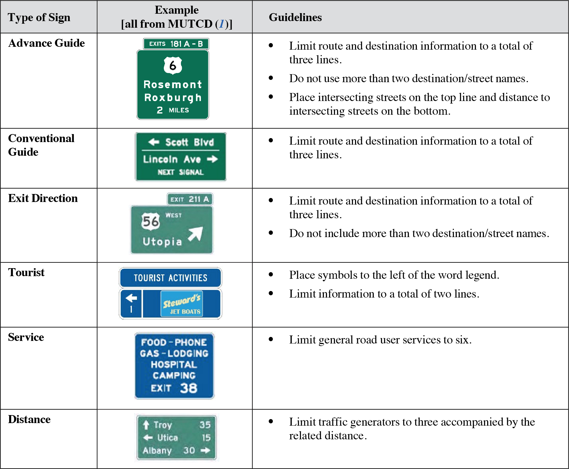
Sign legends refers to the text and/or symbols composing the sign message. Legends that are too long or too complicated can lead to problems in comprehension. In general, the content of a legend on a sign must be kept to a minimum, regardless of letter size, to aid driver comprehension.

Discussion
The relatively small amount of available space on roadway signs suggests the need to make the best use of this space when designing legends. The guidelines on the previous page have been adapted from the MUTCD (1) because of their common focus on legends and because they are provided across various sections/pages within the MUTCD and can be hard to find. In general, they reflect acceptable, best practices for sign legends. The legend for a sign should be selected to maximize information transmission and comprehension, given both the nature of the signʼs message and general roadway environment. Text-based signs are clearly more appropriate than symbolic signs for highly complex messages, such as destination messages or hazards that are more quickly and easily presented via text rather than potentially ambiguous or unfamiliar symbols.
There is a trade-off between the amount of information provided in a sign, the complexity of the sign information, and its overall comprehensibility. Either through the use of more words or through the use of complex graphics, the density of information presented on a sign can be increased, but often at the cost of legibility and/or comprehensibility. New sign designs (or even existing signs being used in a new location or a new way) should always be tested, using a representative group of drivers, to see if they support adequate levels of driver comprehension.
Design Considerations
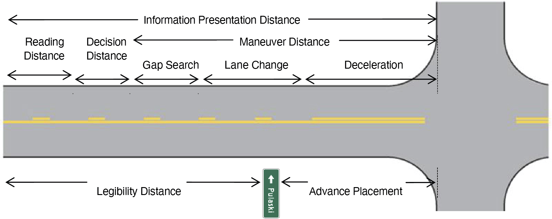
Sign placement and appropriate letter height are determined by a number of factors. A process for determining these values is presented in Chapters 2 and 3 of the Traffic Control Devices Handbook (2) and discussed in more detail in Tutorial 5 in Chapter 27 of the HFG. Appropriate sign placement is determined by the overall information presentation distance, which is the total distance at which the driver needs information about the choice point (e.g., intersection). This distance is the sum of the reading distance, the decision distance, and the maneuver distance. The reading distance is determined by the amount of time that the driver needs to read the signʼs message, depending on the number of words, numbers, and symbols contained in the message. The decision distance is determined by the amount of time needed to make a decision and initiate a maneuver. The decision time necessary depends on the complexity of the maneuver.
The maneuver distance is determined by the time necessary to complete any maneuver required by the choice decision. For a lane change maneuver, this distance is the sum of the gap search, lane change, and deceleration distances. These values are all influenced by the vehicle operating speed—higher speeds allow less time for searching for and comprehending signs. Once the reading, decision, and maneuver distances are summed to find the information presentation distance, the advance placement distance between the sign and the choice point can be subtracted to find the legibility distance, which is the distance at which the sign must be legible. The required letter height can be calculated by referencing the legibility index provided in the MUTCD (30 ft/in.). When the legibility distance is divided by the legibility index, the letter height is obtained.
Long Description.
Line segments are marked above and below the road in the image. Above the road, entire distance of the road up to the intersection is marked by an information presentation distance segment. Below that is the Maneuver Distance segment, which includes gap search, lane change, and deceleration segments below. Prior to these segments are the reading distance and decision distance segments. Below the roadway a legibility distance segment extends to a road sign for Pulaski. After the sign is the advance placement segment.
Cross References
Presentation to Maximize Visibility and Legibility
Key References
1. FHWA. (2023). Manual on Uniform Traffic Control Devices for Streets and Highways. (11th ed.). Washington, DC.
2. Seyfried, R. K. (Ed.). (2013). Traffic Control Devices Handbook. Washington, DC: ITE.
SIGN DESIGN TO IMPROVE LEGIBILITY
Introduction
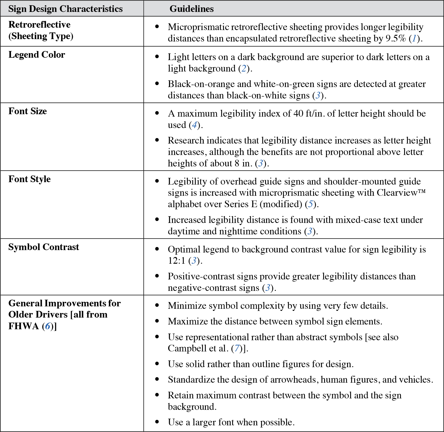
Sign design refers to the design parameters of signs that impact the legibility of text placed on the sign. Sign legibility is greatly affected by specific design characteristics of signs that contribute to driversʼ ability to perceive and understand a signʼs message in order to promote safe driving behaviors. Key design parameters determining the legibility of signs include sign shape, retroreflectivity (sheeting type) and legend color, font size, and font style.

Discussion
The table on the previous page summarizes key design guidelines that can help improve sign legibility and safety. A great number of studies have examined specific properties of roadway signs that affect legibility, and many of the results from these studies are reflected in the MUTCD. A number of the guidelines on the previous page are drawn from Garvey et al. (3), a comprehensive review and synthesis of existing research associated with the use and design of roadway signs.
Design Considerations
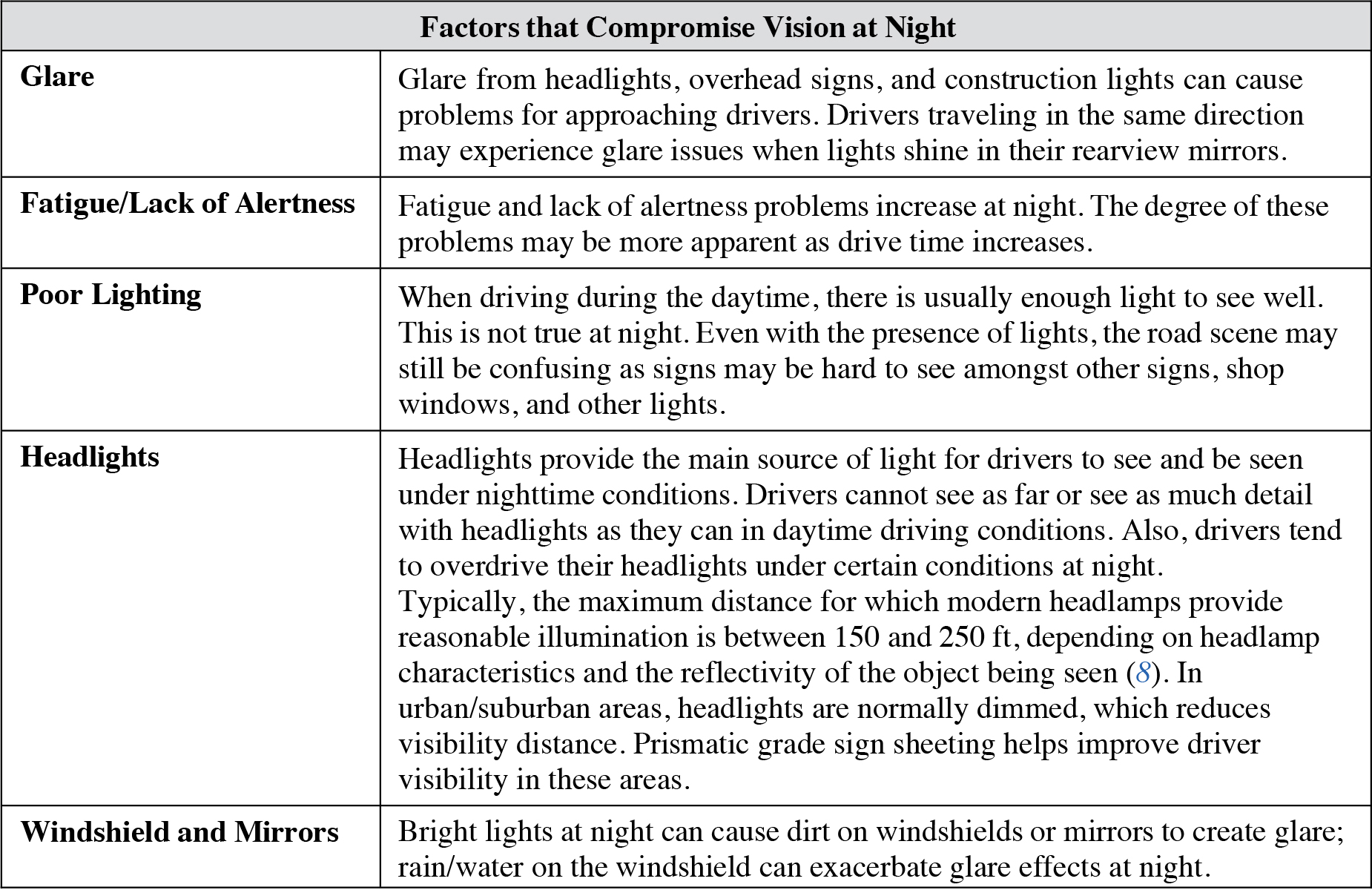
Drivers cannot see as well under nighttime conditions as they can under normal daytime conditions. Additional factors that compromise vision at night, consequently affecting legibility distances, are summarized in the following table.
Long Description.
Glare: Glare from headlights, overhead signs, and construction lights can cause problems for approaching drivers. Drivers traveling in the same direction may experience glare issues when lights shine in their rearview mirrors. Fatigue/Lack of Alertness: Fatigue and lack of alertness problems increase at night. The degree of these problems may be more apparent as drive time increases. Poor Lighting: When driving during the daytime, there is usually enough light to see well. This is not true at night. Even with the presence of lights, the road scene may still be confusing as signs may be hard to see amongst other signs, shop windows, and other lights. Headlights: Headlights provide the main source of light for drivers to see and be seen under nighttime conditions. Drivers cannot see as far or see as much detail with headlights as they can in daytime driving conditions. Also, drivers tend to overdrive their headlights under certain conditions at night. Typically, the maximum distance for which modern headlamps provide reasonable illumination is between 150 and 250 feet, depending on headlamp characteristics and the reflectivity of the object being seen (8). In urban/suburban areas, headlights are normally dimmed, which reduces visibility distance. Prismatic grade sign sheeting helps improve driver visibility in these areas.
Also, arrow-per-lane (APL) signs are often used to point to individual lanes and provide destination information to drivers. Drivers will be aided by clear alignment of signs, destinations, arrows, and driving lanes.
Cross References
Arrow-per-Lane Sign Design to Support Driver Navigation
Key References
1. Carlson, P. J., and Hawkins, G. (2003). Legibility of overhead guide signs with encapsulated versus microprismatic retroreflective sheeting. Transportation Research Record, 1844, 59–66.
2. Sivak, M., and Olson, P. L. (1983). Optimal and Replacement Luminances of Traffic Signs: A Review of Applied Legibility Research. (UMTRI-83-43). Ann Arbor: University of Michigan Transportation Research Institute.
3. Garvey, P. M., Thompson-Kuhn, B., and Pietrucha, M. T. (1996). Sign Visibility: Research and Traffic Safety Overview. Bristol, PA: United States Sign Council.
4. Chrysler, S. T., Carlson, P. J., and Hawkins, H. G. (2002). Nighttime Legibility of Ground-Mounted Traffic Signs as a Function of Font, Color, and Retroreflective Sheeting Type. (FHWA/TX-03/1796-2, TTI: 0-1796). College Station: Texas Transportation Institute.
5. Hawkins, H. G., Jr., Picha, D. L., Wooldridge, M. D., Greene, F. K., and Brinkmeyer, G. (1999). Performance comparison of three freeway guide sign alphabets. Transportation Research Record, 1692, 9–16.
6. FHWA. (1995). Improvements in Symbol Sign Design to Aid Older Drivers. Summary Report. (FHWA-RD-95-129). McLean, VA.
7. Campbell, J. L., Richman, J. B., Carney, C., and Lee, J. D. (2004). In-Vehicle Display Icons and Other Information Elements. Volume I: Guidelines (FHWA-RD-03-065). McLean, VA: FHWA.
8. Schiller, C., Holger, S., Groh, A., Böll, M., and Khanh, T. Q. (2009). HID vs. Tungsten Halogen Headlamps: Driver Preferences and Visibility Distance. (2009-01-0550). Warrendale, PA: Society of Automotive Engineering.
CONSPICUITY OF DIAMOND WARNING SIGNS UNDER NIGHTTIME CONDITIONS
Introduction
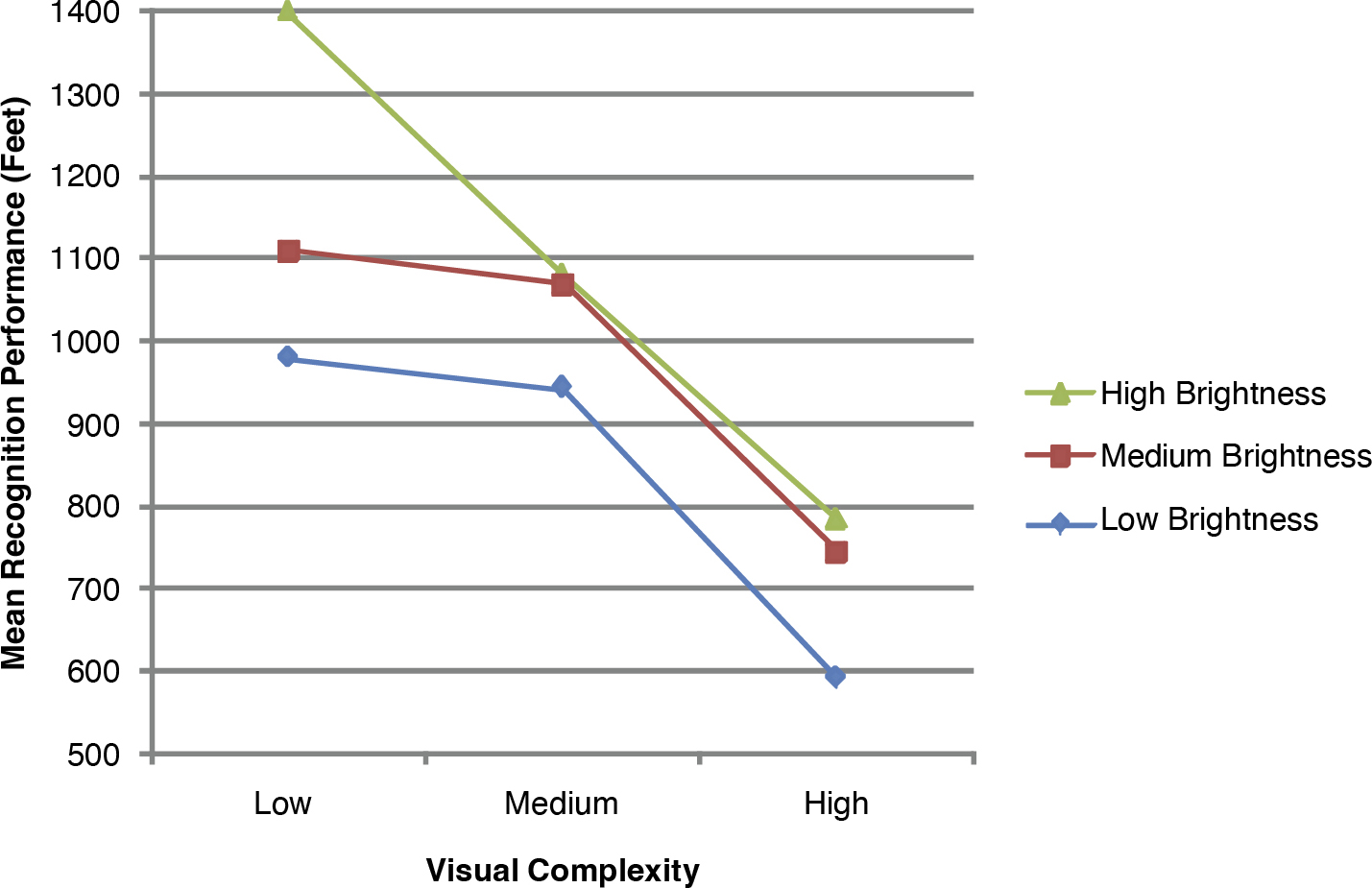
Conspicuity refers to how easy it is to see and locate a visual target. In the context of road signs, it represents how easy it is to distinguish a sign from the surrounding visual environment. Visual conspicuity is particularly important when providing important information because drivers are typically reluctant to spend more than 2 s with their eyes off of the roadway. Consequently, the easier it is for drivers to find a sign, the more time they have to comprehend the sign information. Also, at a more basic level, increasing the conspicuity of a sign will reduce the chance that drivers will miss or be unable to read the sign information altogether. Nighttime visibility is a special problem for sign design, as reduced illuminance (relative to daytime conditions) is associated with reduced target contrast and generally reduced visibility for drivers. Related to traffic control devices in general, the MUTCD (1) provides design considerations that specify that “devices should be designed so that features such as size, shape, color, composition, lighting or retroreflection, and contrast are combined to draw attention to the devices.” As discussed in more detail below, a critical factor in facilitating the driverʼs ability to find and comprehend warning signs at night is to maximize the signʼs visual conspicuity relative to surrounding background elements. The figure below illustrates the relationship between sign recognition by drivers, sign brightness, and the complexity of the signʼs immediate environment.

RECOGNITION PERFORMANCE BY VISUAL COMPLEXITY AND SIGN BRIGHTNESS
Source: Adapted from Mace, King, and Dauber (2).
Long Description.
The graph has lines for high brightness, medium brightness, and low brightness. The vertical axis values range from 500 to 1400 in increments of 100. The horizontal axis is divided into Low, Medium, and High. The three curves show a decreasing trend.
Discussion
Mace et al. (2) describe a study conducted to establish luminance levels for conspicuity of yellow diamond warning signs at night. A key finding of the study was that, while many factors influence the visibility of a road sign, the visual complexity of a scene is most important in determining nighttime sign luminance requirements. Specifically, the complexity of the area immediately surrounding a sign (e.g., other signs, lights, structures, trees, etc.) greatly influences a driverʼs ability to perceive and extract information from a sign.
When sites are assessed or classified on their visual complexity, the following factors are rated:
- The amount of detail visible in the visual scene, quantified as the number of objects or percentage of the scene with visible detail
- The number of bright light sources—streetlights, signs, cars, billboards, store windows, reflection, etc.—located in the scene
- The amount of visible detail contained in the cone (portion on the right-hand side of the roadway where a driver would typically look for road signs) of the scene
- The visual demands associated with the portion of the roadway associated with the sign (i.e., the percentage of the driverʼs time that would be spent looking for driving-relevant information while at that location)
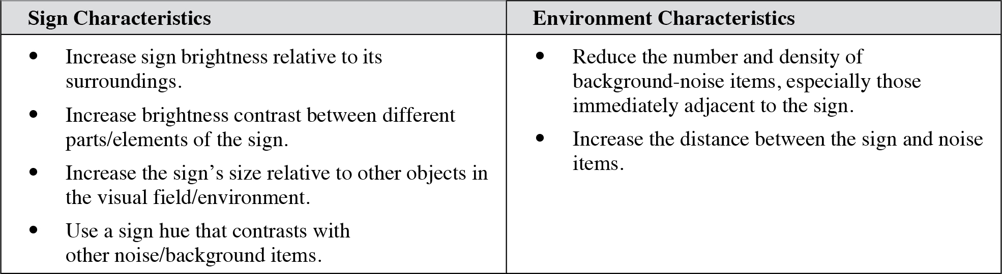
A broader summary of relevant research provided in Mace et al. (2) concluded that the attention-getting value of a target increases as (1) the targetʼs brightness increases, (2) the brightness contrast between the target and its surroundings increases, (3) the brightness contrast between different parts of the target increases, (4) the targetʼs size increases relative to other stimuli in the visual field, (5) the shape of the target contrasts with noise items, (6) the targetʼs hue contrasts with noise, (7) the number of noise elements in the visual field decreases, (8) the overall density of noise items in the visual field decreases, (9) the density of noise items immediately adjacent to the target decreases, (10) the distance between the target and noise increases, (11) the number of irrelevant classes of stimuli in the visual field decreases, and (12) the variability within each irrelevant class of stimuli decreases. Although sign conspicuity is clearly important, compliance with the specifications set by the MUTCD for sign shape and other characteristics is essential.
Design Considerations
A key factor to consider in improving the conspicuity and visibility of highway signs is the importance of individual differences across the driver population. In particular, older drivers have poorer rates of detection and recall of signs than do younger drivers (3), and slower response times (4). Thus, conspicuity and visibility for older drivers should be a key concern in the design and placement of signs.
Another factor in driver reaction to signs is their relevance to the drivers at a particular time and place. A series of studies have demonstrated that the greater the relevance to a particular trip and the greater their need for the information provided by the sign, the more likely that drivers will pay attention to the sign (5).
Cross References
Presentation to Maximize Visibility and Legibility
Key References
1. FHWA. (2023). Manual on Uniform Traffic Control Devices for Streets and Highways. (11th ed.). Washington, DC.
2. Mace, D. J., King, R. B., and Dauber, G. W. (1985). Sign Luminance Requirements for Various Background Complexities (FHWA-RD-85-056). McLean, VA: FHWA.
3. Al-Gadhi, S. A., Naqvi, S. A., and Abdul-Jabbar, A. S. (1994). Driver factors affecting traffic sign detection and recall. Transportation Research Record, 1464, 36–41.
4. Garvey, P. M., and Kuhn, B. T. (2004). Highway sign visibility. In Handbook of Transportation Engineering. (Chapter 11). New York: McGraw-Hill.
5. MacDonald, W. A., and Hoffmann, E. R. (1984). Driversʼ Awareness of Traffic Sign Information. (AIR 382-1). Vermont South, Victoria: Australian Road Research Board.
DRIVER COMPREHENSION OF SIGNS
Introduction
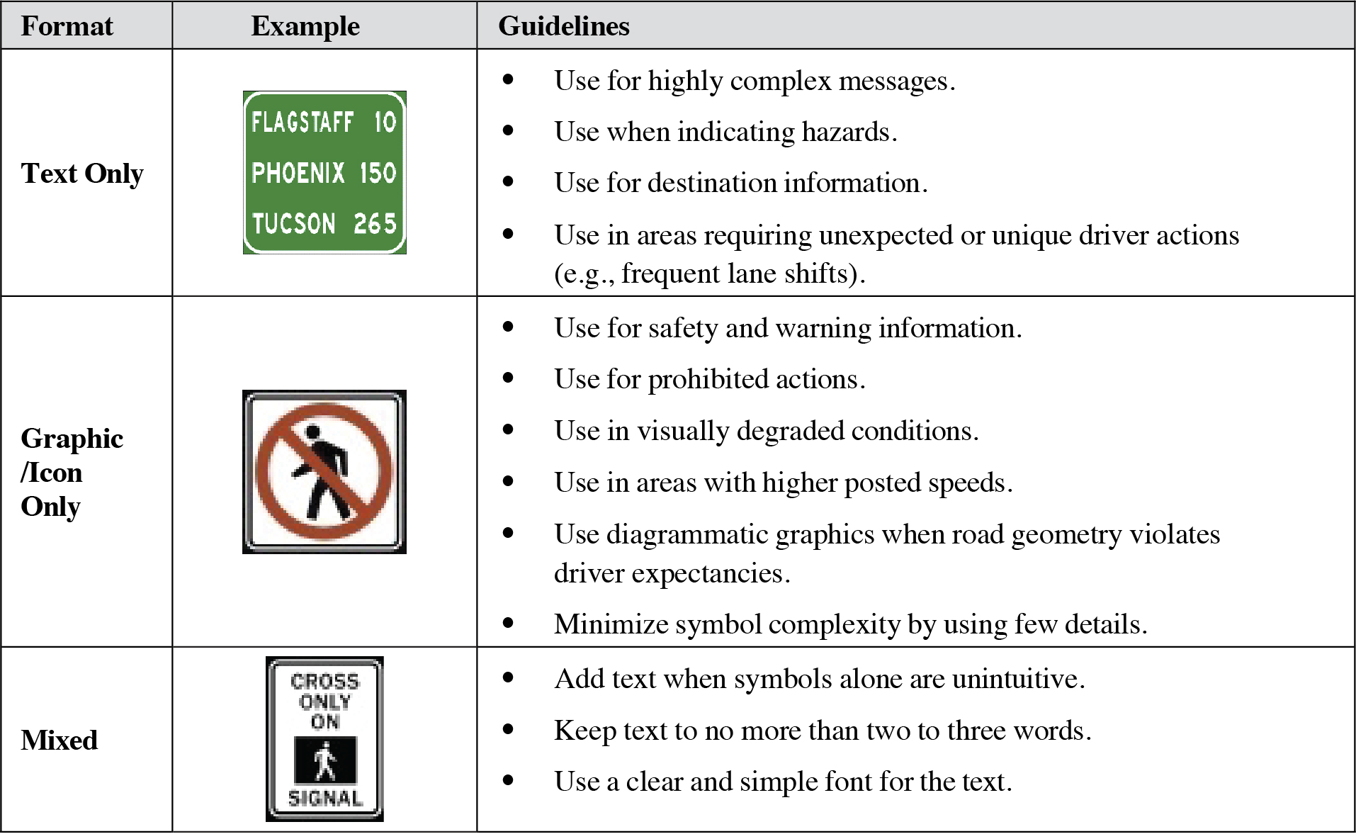
Sign comprehension refers to a driverʼs or road userʼs ability to interpret the meaning of a sign. Signs should be designed and presented so that their message is comprehended and understood by users. As discussed in Campbell, Richman, Carney, and Lee (1), in the context of icons and symbols, there are three stages associated with the comprehension and use of signs: legibility, recognition, and interpretation. Legibility reflects the relationships among the driver, the sign, and the environment; it is essential for the initial perception of the sign and includes parameters such as luminance uniformity, contrast, and size. Recognition reflects whether or not the driver can readily distinguish the sign, especially in the context of other signs and stimuli. Interpretation reflects the relationships among the driver, the sign, and the referent or message associated with the sign; it includes parameters such as whether the driver comprehends the meaning, intent, or purpose of the sign. User comprehension of signs is greatly aided by signs that are consistent with respect to color and shape; in particular, these features of signs (e.g., a red octagon for a stop sign) provide cues to the meaning of signs and support rapid and effective comprehension. This guideline identifies message format recommendations for improving driversʼ comprehension of road signs. As shown below, information can be presented in a text-only, graphic/icon-only, or mixed text–graphic format.

Discussion
The figure below shows the three stages that appear to be associated with comprehension and use of signs: legibility, recognition, and interpretation. As shown below, this sequence of icon comprehension refers to the perceptual and cognitive process by which users interpret the meaning of a sign.
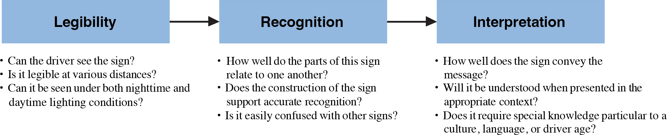
Source: Adapted from Campbell et al. (1).
The format of a sign—i.e., text only, graphic/icon only, or mixed—should be selected to maximize information transmission and comprehension, given the nature of both the signʼs message and the general roadway environment. Text-based signs are clearly more appropriate for highly complex messages, such as destination messages or hazard warnings that are more quickly and easily presented via text. It has long been recognized that well-designed icons are generally recognized more accurately and quickly than text-based signs meant to convey the same message (2) and that icons can be presented in a much more spatially condensed form (3, 4, 5) than can most text-based messages.
Road signs also have a limited amount of space for presenting information and must take advantage of the ability of icons to present more information to the driver than can be presented textually. Research in this domain has shown that icons can be recognized more rapidly and are legible at greater distances than information presented in other formats (6, 7).
Design Considerations
Road users may benefit from having redundant signs for locations or situations that are especially complex to guide and direct behavior. Such benefits should be balanced against the possibility of having too many signs and possibly overloading or confusing users, but if, for example, a critical sign may not be seen, using redundant signs may be helpful. A number of procedures can be used to measure driver comprehension of signs, including SAE J2830, Process for Comprehension Testing of In-Vehicle Icons, an SAE Information Report within the SAE Standards series.
Sign comprehension benefits from a consistent approach to signing with respect to sign locations, colors, and shape. Such consistency helps drivers build expectancies for signs that avoid surprising drivers and increasing comprehension time. Also, road engineers may consider message format based on location and driver demographics. For example, non-native-English speakers can correctly interpret graphic messages without relying on their knowledge of the English language. An increased use of transportation graphic signs in the vicinity of non-native-English-speaking population areas may be appropriate.
Cross References
Presentation to Maximize Visibility and Legibility
Key References
1. Campbell, J. L., Richman, J. B., Carney, C., and Lee, J. D. (2004). In-Vehicle Display Icons and Other Information Elements. Volume I: Guidelines. (FHWA-RD-03-065). McLean, VA: FHWA. Retrieved from http://www.tfhrc.gov/safety/pubs/03065/index.htm.
2. Edworthy, J., and Adams, A. (1996). Warning Design: A Research Prospective. Bristol, PA: Taylor & Francis.
3. Zwaga, H. J., and Boersema, T. (1983). Evaluation of a set of graphic symbols. Applied Ergonomics, 14, 43–54.
4. Rohr, G., and Keppel, E. (1984). Iconic Interfaces: Where to Use and How to Construct Human Factors in Organisational Design and Management. The Netherlands: North-Holland.
5. Hemenway, K. (1982). Psychological issues in the use of icons in command menus. Proceedings of the CHI 1982 Conference on Human Factors in Computer Science (pp. 20–23). New York: Association for Computing Machinery.
6. Ells, J. G., and Dewar, R. E. (1979). Rapid comprehension of verbal and symbolic traffic sign messages. Human Factors, 21, 161–168.
7. Jacobs, R. J., Johnston, A. W., and Cole, B. L. (1975). The visibility of alphabetic and symbolic traffic signs. Australian Road Research, 5(7), 68–86.
COMPLEXITY OF SIGN INFORMATION
Introduction
The complexity of sign information refers to the number of information units presented as part of a roadway sign message. In this context, an information unit can describe geography (e.g., city), type of roadway (e.g., highway), event causes (e.g., stalled vehicle), event consequences (e.g., traffic jam), time and distances, and proposed actions. Therefore, information units can be described as the relevant words in a message. Much of the guideline information presented below has been adapted from Campbell, Carney, and Kantowitz (1).

DETERMINING THE NUMBER OF INFORMATION UNITS
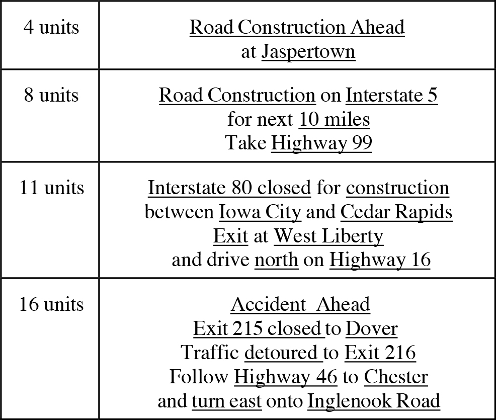
Long Description.
Road Construction Ahead at Jaspertown: 4 units. Road Construction on Interstate 5 for next 10 miles Take Highway 99: 8 units. Interstate 80 closed for construction between Iowa City and Cedar Rapids Exit at West Liberty and drive north on Highway 16: 11 units. Accident Ahead Exit 215 closed to Dover Traffic detoured to Exit 216 Follow Highway 46 to Chester and turn east onto Inglenook Road: 16 units.
EFFECTS OF INFORMATION COMPLEXITY
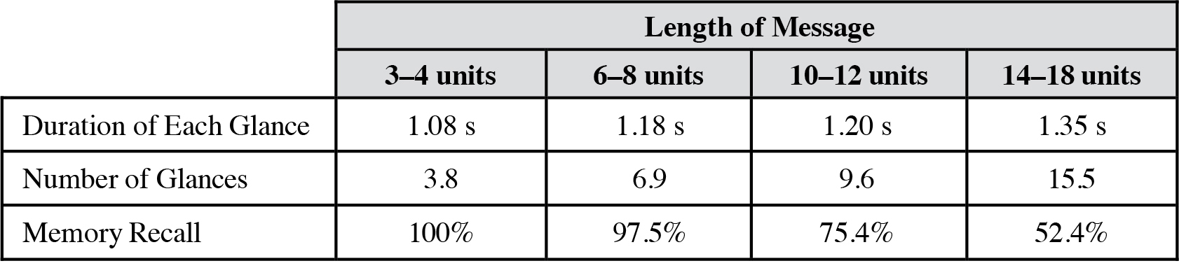
Source: Labiale (2).
Long Description.
The table has 4 column headings: Column 1: 3 to 4 units. Column 2: 6 to 8 units. Column 3: 10 to 12 units. Column 4: 14 to 18 units. ; 3–4 units; 6–8 units; 10–12 units; 14–18 units The data for Row 1, Duration of Each Glance, is as follows: ; 1.08 seconds; 1.18 seconds; 1.20 seconds; 1.35 seconds The data for Row 2, Number of Glances, is as follows:; 3.8; 6.9; 9.6; 15.5 The data for Row 3, Memory Recall, is as follows: ; 100%; 97.5%; 75.4%; 52.4%
Discussion
The longer the message, the more processing time the driver requires; i.e., longer messages may take more time for the driver to read and process. Therefore, messages that require the driver to make an immediate response should be as short as possible. One-word messages informing the driver of the appropriate action to take might work best in these situations. As the response required by the driver becomes less and less urgent, the messages can become more detailed; however, an effort should still be made to make the messages as concise as possible.
Zwahlen et al. (3) analyzed the number of lane deviations that occurred while drivers were operating a CRT touch screen. The results suggest that the number of glances away from the roadway should be limited to three and that glance durations that exceeded 2 s in duration are unacceptable. Zwahlen et al. (3) examined the amount/complexity of information necessary for evoking these unsafe glance frequencies and durations. The results of this on-road study suggest that although the duration of glances does not increase dramatically as the number of information units increase, the number of glances does. Therefore, the shortest information message (3 to 4 units) would be the most appropriate for keeping driversʼ attention on the forward roadway. The driverʼs ability to recall information was also examined in Labiale (2): only 75% of a 10- to 12-unit message could be recalled, in comparison to 100% of a 3- to 4-unit message and 98% of a 6- to 8-unit message. This finding is consistent with Miller (4), which proposed that the maximum capacity of working memory is “seven, plus or minus two” chunks of information. Again, this finding suggests that keeping the message short, 3 to 8 information units, would increase the likelihood that it will be recalled by the driver.
Design Considerations
Complexity is a function of how much information is being provided and how difficult it is to process. The phrase “information units” is used to describe the amount of information presented, in terms of key nouns and adjectives contained within a message.
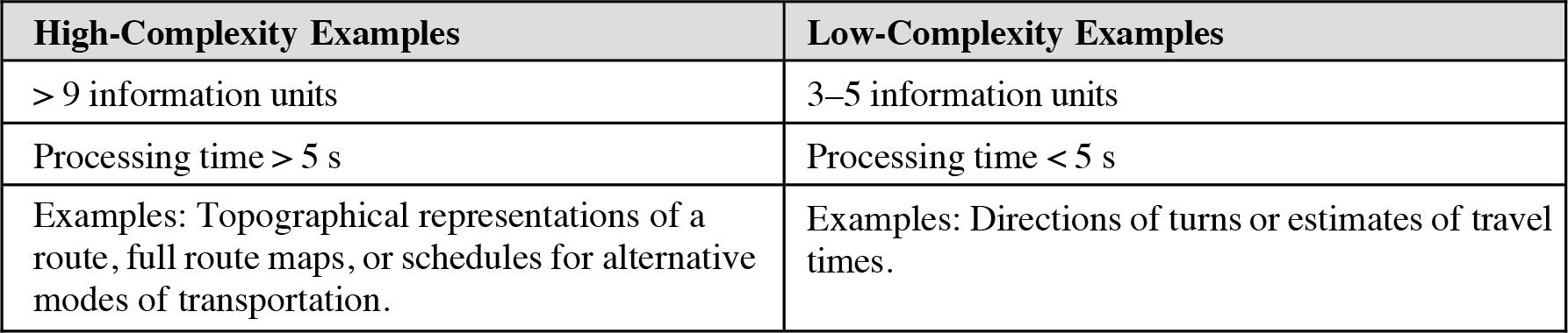
Long Description.
The table has two column headings: Column 1: High-Complexity Examples. Column 2: Low-Complexity Examples. Row 1, Column 1: greater than 9 information units. Column 2: 3 – 5 information units Row 2, Column 1: Processing time greater than 5 seconds. Column 2: Processing time less than 5 seconds Row 3: Examples: Topographical representations of a route, full route maps, or schedules for alternative modes of transportation. Column 2: Examples: Directions of turns or estimates of travel times.
Complexity may also refer to groups of related signs at a particular location. Drivers may benefit from having redundant signs that, while avoiding complexity, may be helpful when they are trying to comprehend complex situations such as sharp curves or guidance information at a freeway interchange. Signs can be presented centrally (overhead) or peripherally, depending on their purpose and existing elements within the broader roadway environment.
Cross References
Key References
1. Campbell, J. L., Carney, C., and Kantowitz, B. H. (1998). Human Factors Design Guidelines for Advanced Traveler Information Systems (ATIS) and Commercial Vehicle Operations (CVO) (FHWA-RD-98-057). Washington, DC: FHWA.
2. Labiale, G. (1996). Complexity of in-car visual messages and driverʼs performance. In A. G. Gale et al. (Eds.). Vision in Vehicles, 5 (pp. 187–194). Bron Cedex, France: INRETS.
3. Zwhalen, H. T., Adams, C. C., Jr., and DeBald, D. P. (1988). Safety aspects of CRT touch panel controls in automobiles. In A. G. Gale et al. (Eds.). Vision in Vehicles, 2 (pp. 335–344). Amsterdam: Elsevier Science.
4. Miller, G. A. (1956). The magical number seven plus or minus two: Some limits on our capacity for processing information. Psychological Review, 63, 81–97.


