Human Factors Guidelines for Road Systems: Third Edition (2025)
Chapter: 22 Changeable Message Signs

CHAPTER 22
Changeable Message Signs
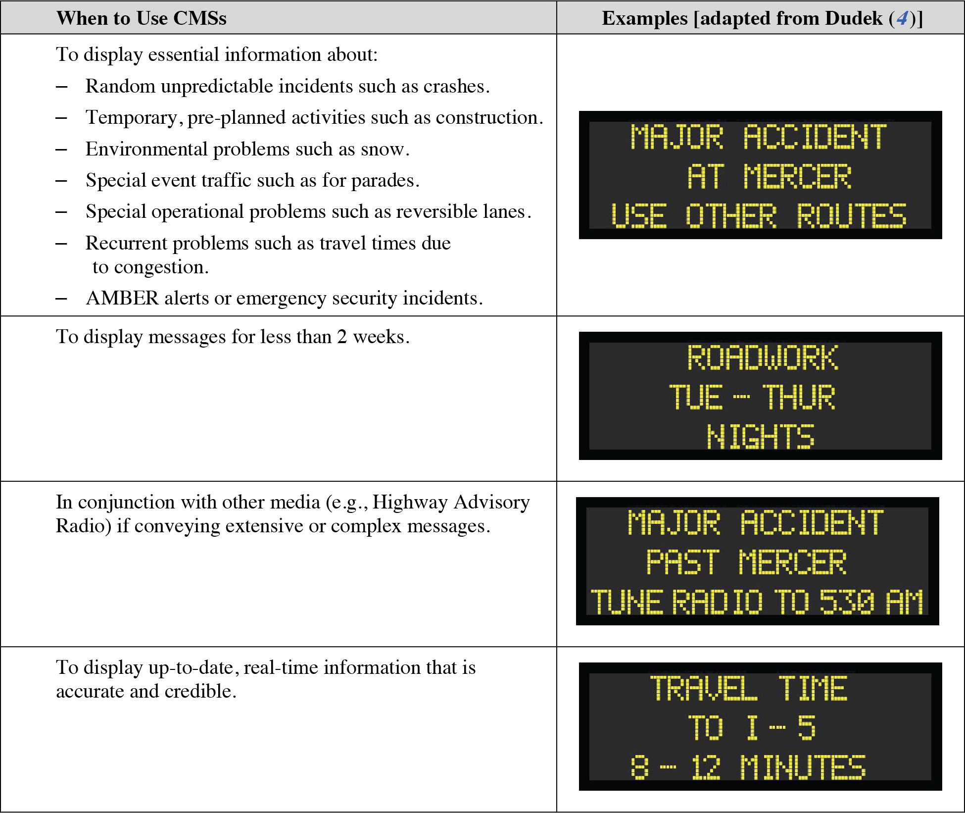
When to Use Changeable Message Signs
Presentation to Maximize Visibility and Legibility
Determining Appropriate Message Length
Composing a Message to Maximize Comprehension
Displaying Messages with Dynamic Characteristics
WHEN TO USE CHANGEABLE MESSAGE SIGNS
Introduction
When to use changeable message signs refers to the general principles regarding the appropriate display of traveler information messages on CMSs. These signs can be used to effectively manage travel, control traffic, identify current and anticipated roadway conditions, and regulate access (1). However, inappropriate application and use can reduce the effectiveness of these signs. Note that the terms “changeable message sign” (CMS), “dynamic message sign” (DMS), and “variable message sign” (VMS) are used interchangeably in the literature to refer to these signs.
Because there is no functional distinction between the terms, “changeable message sign” or “CMS” is used throughout this chapter to refer to CMSs, DMSs, and VMSs.

Discussion
CMSs are an essential part of the driver information system. They are an important link between transportation agencies and the driving public. They allow for the display of time-sensitive or temporary information that affects travel and, in many cases, requires drivers to take an action (1). It is important that drivers find these messages to be relevant so that they will continue to pay attention to the signs. A field study analyzed by Richards and Dudek (2) showed that CMSs that are operated for long periods with the same message may lose their effectiveness. If drivers begin ignoring a sign, they may not notice or may ignore important roadway information when it is available (3). Johnson (1) also states that drivers tend to ignore messages that are displayed for long periods of time and recommends that safety campaign messages be limited to a few weeks.
The content displayed on CMSs is limited by the amount of time that the driver has to read the display. This time is affected by both the legibility distance of the sign and the speed of travel. The legibility distance is influenced by a number of factors, including weather conditions (e.g., rain, fog), geography (e.g., hills), and roadway conditions (e.g., the presence of large trucks) (4). CMS reading times are higher than those for static signs because drivers can scan static signs for essential information, whereas they must read the entire CMS to understand its message. Static signs also have the advantages of being seen daily and of being uniformly formatted. At highway speeds, the CMS message must be readable in 8 s or less (4). Displaying messages that are longer than this limit can affect traffic flow and sign credibility. Thus, it is recommended that extensive messages be displayed in conjunction with other traveler information media (1). These media can include Highway Advisory Radio (HAR), 511, websites, and commercial radio. Dudek (4) provides additional guidance on message length, the number of information units in a message, and message phrasing.
Credibility is an important factor in the use of CMSs. Many factors can cause reduced message credibility, including inaccurate, outdated, irrelevant, obvious, repetitive, trivial, or poorly designed messages (4). The accuracy and relevance of information, such as travel time, are important because they can be easily checked by drivers. If the information is proven incorrect, sign credibility will suffer. Reduced credibility can cause drivers to distrust the system and ignore the sign.
Design Considerations
There are two schools of thought concerning what to display on a CMS when no unusual conditions exist or when there are no essential messages to present: (1) always display a message on the CMS regardless of whether there is an incident or unusual condition and (2) display messages only when an incident or other situation warrants a message and blank the CMS at all other times. The advantage of displaying a message on the CMS regardless of whether there is an incident is that drivers will know that the CMS is functioning. However, only 10% to 15% of English and French drivers assume the CMS is broken when it is not displaying a message (5). (This result could be caused by the policy in these driversʼ jurisdictions of blanking the screen when there are no unusual conditions.) The disadvantage is that drivers may come to ignore the sign entirely if safety campaign or other non-traffic-related messages are displayed when no unusual conditions exist (1).
Thus, this guideline recommends displaying a message only when an incident warrants it and a blank CMS at other times. This policy is followed by 77% of transportation agencies surveyed in a 1997 national survey of 26 agencies (1). It also follows the human factors principles of CMS operation: donʼt tell drivers something they already know, and use a CMS only when a driver response is required (4).
Cross References
Determining Appropriate Message Length
Composing a Message to Maximize Comprehension
Key References
1. Johnson, C. M. (2001). Use of Changeable Message Sign (CMS). FHWA Policy Memorandum response to James A. Cheatham. Retrieved June 19, 2008, from http://www.fhwa.dot.gov/legsregs/directives/policy/pame.htm.
2. Richards, S. H., and Dudek, C. L. (1986). Implementation of work zone speed control measures. Transportation Research Record, 1086, 36–42.
3. Halloin, D. M. (1996). Impediments to the effective use of portable variable message signs at freeway work zones. In C. Dudek (Ed.). Compendium of Graduate Student Papers on Advanced Surface Transportation Systems (pp. Ci–C34). College Station: Texas A&M University.
4. Dudek, C. L. (2004). Changeable Message Sign Operation and Messaging Handbook. (FHWA-OP-03-070). College Station: Texas Transportation Institute.
5. Montoro, L., Lucas, A., and Blanch, M. T. (2004). Specific design parameters: VMS Part I. In The Human Factors of Transport Signs (pp. 185–198). CRC Press.
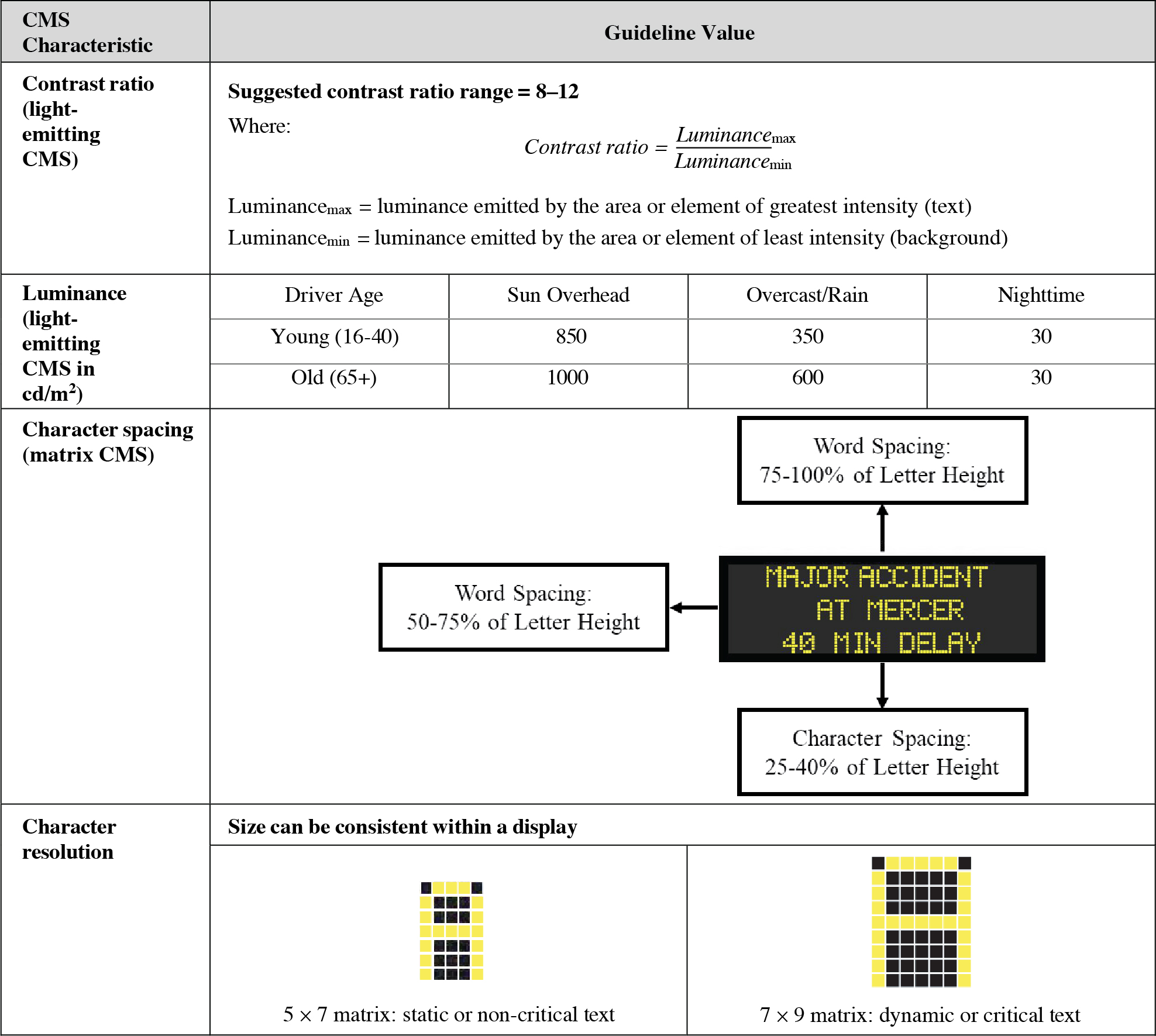
PRESENTATION TO MAXIMIZE VISIBILITY AND LEGIBILITY
Introduction
Presentation to maximize visibility and legibility refers to how the photometric and physical characteristics of a CMS can be employed to positively affect readability. Because CMS characters or symbols are typically constructed using a relatively coarse matrix of pixels, the requirements for their visibility and legibility are more demanding than for standard, fixed signs. Also, the fixed matrix introduces limitations to character size, height-to-width ratio, spacing, and other geometric characteristics available for presenting messages. The MUTCD provides specific guidance about letter height, minimum legibility distance, and other characteristics. Additional recommendations for designing messages within the limitations imposed by CMS technologies, including guidelines for contrast ratio, luminance, character spacing, and resolution, are provided below.

Discussion
Contrast ratio. The photometric and physical properties of signs directly affect the legibility of the sign elements. For example, contrast ratios are affected by photometric properties such as luminance but can be reduced by physical properties such as dirty or scratched protective plexiglass sheeting (1). The guidance on acceptable ranges depends on the conditions present in the ambient environment and whether the CMS is light reflecting or light emitting. Light-emitting CMSs have minimum contrast ratios on sunny days when the sun increases the background sign luminance, whereas light-reflecting CMSs have minimum contrast ratios when the light falling on the sign is at a minimum (2). Weather conditions such as rain and fog can affect contrast ratios for both types of signs by reducing the illumination coming from the sign or light reflected by the sign. The optimal contrast ratio range is between 8 and 12, although Dudek (1) presents other acceptable ranges based upon European research.
Luminance. Driver age and sun position affect the required CMS luminance significantly (3). Generally, greater luminances are required for older drivers than for younger drivers at a given distance. Garvey and Mace (3) found that during extreme backlit (sun behind the sign) and washout (sun directly on the sign) conditions, 1000 cd/m2 is a minimum value. However, at 650 feet, some drivers cannot be accommodated under these visibility conditions, at any luminance level. If luminance values are too high at night, the characters may appear to irradiate or bleed onto the background and blur due to the extreme contrast (4).
Character spacing. Character spacing is limited by physical properties of the sign, such as the matrix pattern of the LEDs. The spacing used should allow drivers to recognize (1) words as items rather than series of individual letters and (2) lines as separate entities. The included guidance is based upon the MUTCD, though Dudek (4) presents different values based on the United Kingdomʼs draft CMS standards.
Character resolution. Character resolution can affect the readability of text. Campbell et al. (5) reported that for characters smaller than approximately 22 arcminutes, a 7 × 9 matrix led to faster reading times and fewer reading errors than a 5 × 7 matrix. A 7 × 9 matrix should be used to display dynamic or critical text, while a 5 × 7 matrix can display static or non-critical text. There are obvious trade-offs between the resolution used and the amount of text that can be fit on the sign.
Design Considerations
Appropriate resolution is also affected by the case of the characters presented. All uppercase letters are often displayed on CMSs and are more difficult for people to read than mixed or lowercase letters (6). People are more accustomed to reading mixed or lowercase letters and can identify word shapes using the ascenders and descenders of letters. However, lowercase letters require a higher resolution matrix (5 × 9) to accommodate these descenders (7). The readability of lowercase letters also depends on the display of curved lines, which is a challenge on matrix displays. Thus, there are trade-offs between readability and practicality for displaying letters in mixed cases.
There are many types of CMSs available that utilize different technologies. Upchurch et al. evaluated shuttered fiber-optic, LED, and flip disk signs to analyze the legibility distance of each. For backlit and nighttime conditions, LED and fiber-optic signs had better legibility distances than flip disk signs (8). For washout and midday conditions, fiber-optic signs performed best for legibility distance. LED signs may interact negatively with sunglass filters. Sunglass lenses that have a notch filter, which attenuates light emissions in the same range that amber LEDs emit light (9), reduce the brightness of the LED, thereby decreasing the contrast and making CMS messages difficult to read.
Cross References
Key Components of Sight Distance
Sign Design to Improve Legibility
Composing a Message to Maximize Comprehension
Key References
1. Dudek, C. L. (1997). NCHRP Synthesis 237: Changeable Message Signs. TRB, National Research Council, Washington, DC.
2. Dudek, C. L. (2004). Changeable Message Sign Operation and Messaging Handbook. (FHWA-OP-03-070). College Station: Texas Transportation Institute.
3. Garvey, P. M. and Mace, D. J. (1996). Changeable Message Sign Visibility (FHWA-RD-94-077). Washington, DC: FHWA.
4. Dudek, C. L. (1992). Guidelines on the Use and Operation of Changeable Message Signs. (FHWA-TX-92-1232-9). College Station: Texas Transportation Institute.
5. Campbell, J. L., Carney, C., and Kantowitz, B. H. (1998). Human Factors Design Guidelines for Advanced Traveler Information Systems (ATIS) and Commercial Vehicle Operations (CVO) (FHWA-RD-98-057). Washington, DC: FHWA.
6. Proffitt, D. R., and Wade, M. M. (1998). Creating Effective Variable Message Signs: Human Factors Issues. (VTRC 98-CR31). Charlottesville: Virginia Transportation Research Council.
7. Hitchins, D. (2001). Lowercase font set development for variable message signs (VMS). Proceedings of the 8th World Congress on Intelligent Transport Systems [CD-ROM].
8. Upchurch, J., Armstrong, J. D., Baaj, M. H., and Thomas, G. B. (1992). Evaluation of variable message signs: target value, legibility, and viewing comfort. Transportation Research Record, 1376, 35–44.
9. Halloin, D. M. (1996). Impediments to the effective use of portable variable message signs at freeway work zones. In C. Dudek (Ed.). Compendium of Graduate Student Papers on Advanced Surface Transportation Systems (pp. Ci–C34). College Station: Texas A&M University.
DETERMINING APPROPRIATE MESSAGE LENGTH
Introduction
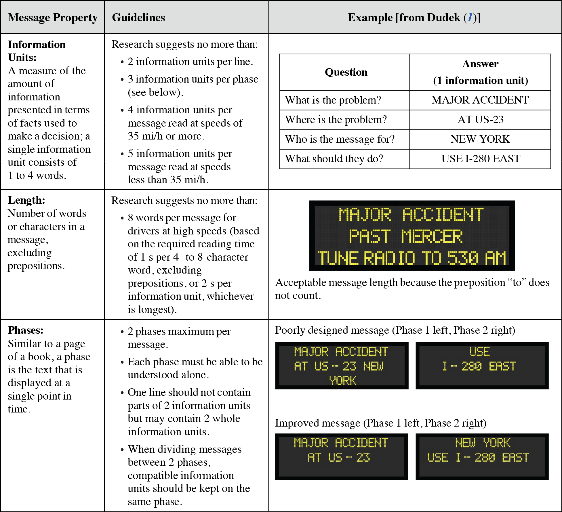
Determining the appropriate message length for a CMS refers to choosing a message length that drivers have the time to comprehend as they pass the sign. Controlling message length is extremely important because there is a limited amount of time to present information to drivers. Message length is described not only by the absolute length in the number of words, but also by the number of information units included in these words. Information units are a measure of the message load, or total amount of information in the message. If there are too many words or information units in a message, it may need to be split into two phases. Dudek (1) provides additional guidance for reducing message length and splitting long messages.

Discussion
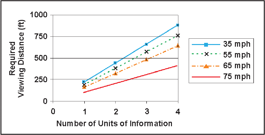
Information units. The recommendations for the number of information units that are appropriate for display are based on research and operational experience (1). Dudek (2) summarizes that 1 s is needed per four- to eight-character word, excluding prepositions, or 2 s per information unit, whichever is longer. Using this assumption, the required viewing distances for different numbers of information units, for drivers traveling at different speeds, are included below.
REQUIRED VIEWING DISTANCE PER NUMBER OF INFORMATION UNITS AT VARYING SPEEDS [ADAPTED FROM DUDEK (1)]
Long Description.
The vertical axis ranges from 0 to 1000 in increments of 250. The horizontal axis ranges from 0 to 4 in increments of 1. The graph has four curves: 35 miles per hour, 55 miles per hour, 65 miles per hour, and 75 miles per hour. All the curves show an increasing trend.
However, the MUTCD states that the minimum phase display time should be based upon 1 s per word or 2 s per information unit, whichever is shorter (3). This direct contradiction of Dudek (2) causes practical consequences for drivers. If the longer time is used (2) and the message includes many short words that do not all need to be remembered, the phase display time could be unnecessarily inflated. If the shorter time is used (3) and the message includes information units composed of multiple important words, drivers may not have time to read all of them. If longer messages need to be provided, they should be shown in conjunction with other information media (See “When to Use Changeable Message Signs,” page 22-2).
Length. Dudek states that the appropriate absolute message length is affected by (1) the amount of time that the driver is in the legibility zone of the CMS, considering traveling speed and environmental conditions, (2) the driver workload including all driver activities such as reading signs, lane positioning, etc., and (3) message familiarity because drivers take more time to read unfamiliar content or unusual messages (1). The eight-word maximum for high speeds is based on the legibility distance, or the distance at which the words on the sign become legible, as well as the speed at which the driver is traveling. This recommendation assumes drivers are traveling at 55 mi/h and the legibility distance of the sign is 650 ft (which is the approximate legibility distance for a lamp matrix sign with 18-in. character heights) (2). If the message is too long for drivers to read at normal speeds, it is likely that some drivers will slow down to be able to read the message, affecting the traffic flow (1). In general, the message length should be reduced as much as possible without losing the message intent (1). The message length can be reduced by the use of alternative phrases or appropriate abbreviations and the removal of redundant and unimportant information.
Phases. Dudek (1) reports that research has shown drivers have difficulty reading messages that are on more than two phases. Because either the first phase or the second phase may be read first by a passing driver, each phase should make sense by itself. This is accomplished by keeping compatible information units in the same phase. In addition, portions of two different information units should not be displayed on a single line because it is confusing to drivers and increases reading time (1).
Design Considerations
The legibility distance for a CMS is affected by a number of factors. If the sign is placed off to the side of the roadway rather than directly over the travel lanes, additional sight distance is required (1) because a driverʼs field of view is assumed to be between 10° right and left of head-on. Proffitt and Wade (4) support rotating the CMS 5° to 10° toward the roadway to increase the amount of time that roadside signs are at an optimal reading angle. However, conflicting ideas exist regarding the assumed angular range of the legibility distance. This distance is also affected by lighting conditions, sun position, vertical curvature, horizontal curvature, spot obstructions, rain, fog, and trucks in the traffic stream (1). If the legibility distance of the sign is reduced, then the time that the driver has to read the sign is reduced, necessitating a reduction in the number of information units contained on the sign.
Cross References
Key Components of Sight Distance
When to Use Changeable Message Signs
Presentation to Maximize Visibility and Legibility
Composing a Message to Maximize Comprehension
Displaying Messages with Dynamic Characteristics
Key References
1. Dudek, C. L. (2004). Changeable Message Sign Operation and Messaging Handbook. (FHWA-OP-03-070). College Station: Texas Transportation Institute.
2. Dudek, C. L. (1992). Guidelines on the Use and Operation of Changeable Message Signs (FHWA-TX-92-1232-9). College Station: Texas Transportation Institute.
3. FHWA. (2023). Manual on Uniform Traffic Control Devices for Streets and Highways. (11th ed.). Washington, DC.
4. Proffitt, D. R., and Wade, M. M. (1998). Creating Effective Variable Message Signs: Human Factors Issues. (VTRC 98-CR31). Charlottesville: Virginia Transportation Research Council.
COMPOSING A MESSAGE TO MAXIMIZE COMPREHENSION
Introduction
Composing a CMS message to maximize comprehension refers to message formatting issues that affect driver understanding or reading times. Driver comprehension is important because the message may provide a legitimate safety warning that requires the driver to take an action. Drivers have a limited amount of time to comprehend the information and make a decision. Messages that are easy to comprehend reduce the amount of time required to read and grasp the meaning of the message, facilitate decision making, and promote faster responses. The following guidelines can be used to increase driver comprehension of signs.

Discussion
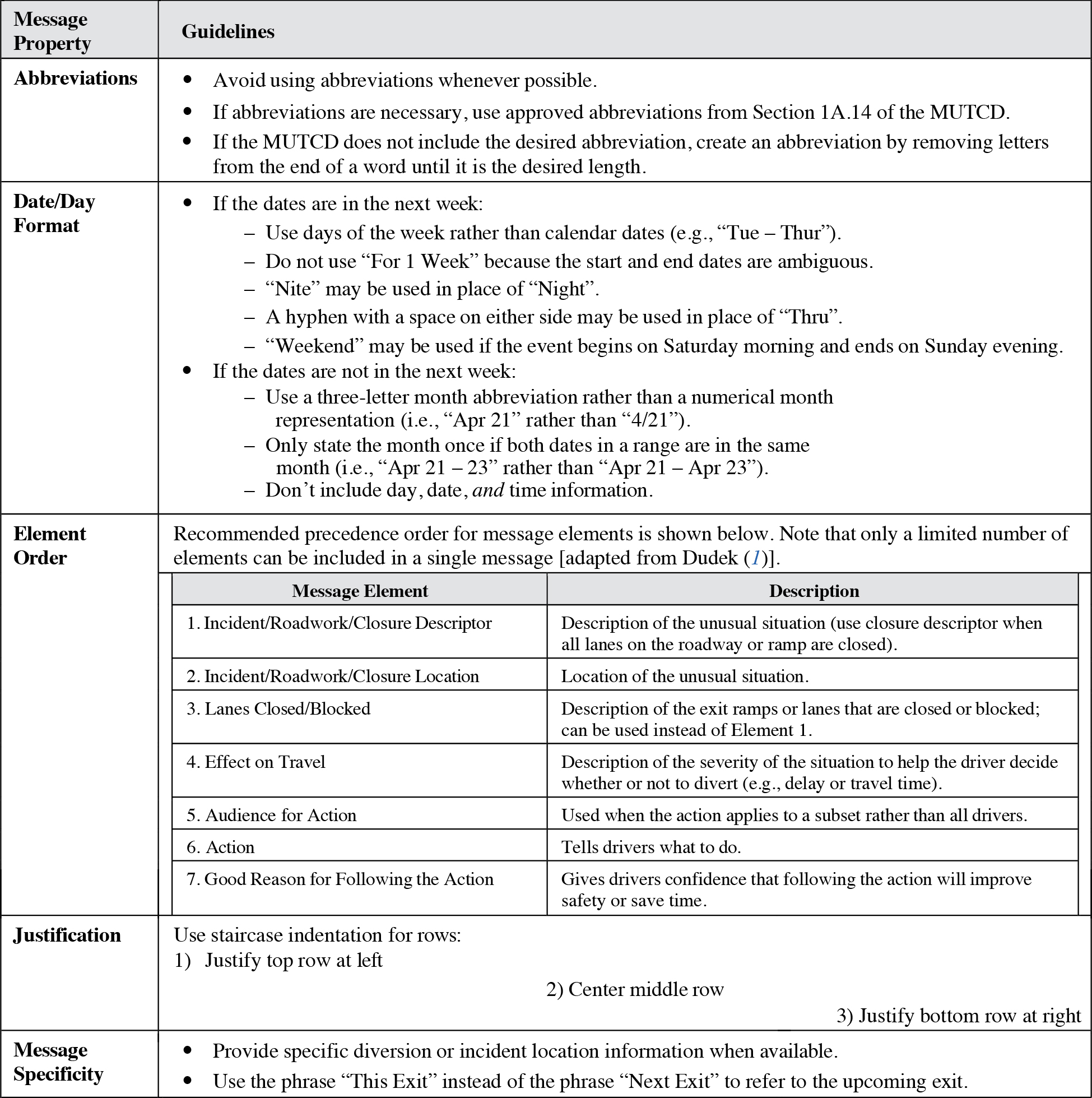
Abbreviations. Abbreviations provide the benefit of reduced message length; however, their use is discouraged because they have been found to decrease message comprehension (2) and increase reading times (3). However, due to fixed sign size and message length recommendations, abbreviations can be necessary to convey the information to the level of specificity desired. Proffitt and Wade (3) report that in a study of sonar operators, viewers preferred truncated abbreviations over conventional (created by experts) or contracted (vowel removed) abbreviations. Truncated abbreviations proved to have faster response times and improved decoding times with subsequent trials.
Date format. Research has shown that drivers have difficulty converting calendar dates to appropriate days of the week (1). However, it is often desirable to present closure or other information more than 1 week in advance, necessitating the inclusion of numeric date information in the message. In a laptop study examining date formats, Ullman, Ullman, and Dudek (9) found that regardless of the format that was used to present the day and date information, only approximately 75% of drivers could tell if the event would impact their current or future travel.
Element order. The order of elements in a message varies widely depending on what information is known and appropriate to describe the incident. The MUTCD (4) suggests that on portable message signs, the message should be as brief as possible and contain three elements: the problem, the location or distance to the problem, and the recommended driver action. This recommendation loosely maps to the recommended order of message elements by Dudek, included on the previous page (1).
Justification. Greenhouse (2) found that staircase-justified messages increase reader comprehension, perhaps because this style better matches driversʼ eye movements as they read the message. This recommendation contradicts the MUTCD standard that all text should be centered on the sign (4).
Message specificity. Message specificity is a message property that is affected by many different message aspects, including space available on the sign, the information available to the Traffic Management Center, information unit limits, and message length limits. Wang, Collyer, and Yang (8) found through participant questionnaires that more specific messages (i.e., “Accident at Exit 12/Major Delays to Boston/Use Route I-295”) are preferred to less-specific messages (i.e., “Accident at Exit 12/Major Delays/Use Other Routes”). Pedic and Ezrakhovich (5) also report that drivers are more likely to correctly interpret a message when it includes a specific diversion task instead of a generic task. Drivers are also more willing to divert if given the incident location, expected delay, and best detour strategy rather than just a subset of that information (6). Survey data show that precise location information was preferred so drivers could make informed decisions about exiting/re-entering the roadway (7). When expressing exit information, “This Exit” instead of “Next Exit” was preferred to refer to the upcoming exit (7).
Design Considerations
When used in messages, signal words (e.g., “Danger,” “Warning,” “Caution”) may not be interpreted as intended and do not affect driver performance (3). Avoiding the use of such words can reduce reading time, conserve sign space, and prevent driver confusion.
Sign comprehension also depends on driver literacy. Weak readers depend more on the message context for comprehension, are more affected by text degradation (similar to bulb burn-out on CMS), and hold more parts of a message in memory at a single time due in part to slower reading (3). Thus, Proffitt and Wade (3) recommend the use of context about the message subject, standardized message formats to enhance familiarity, and distinct directional statements. Because there is no literacy test required for driver licensing, message composition should accommodate varying reading competencies.
Another aspect that affects comprehension is the use of symbols. Symbols can convey information without requiring driver literacy. In general, symbolic signs are recognized better, faster, and from further away than the corresponding text signs (3). However, care should be taken in their use because the meaning of symbolic signs is not always as well understood. Using a CMS to display television pictures of conditions or maps was not positively received by a majority of survey respondents (7).
Cross References
Presentation to Maximize Visibility and Legibility
Presentation of Bilingual Information
Key References
1. Dudek, C. L. (2004). Changeable Message Sign Operation and Messaging Handbook (FHWA-OP-03-070). College Station: Texas Transportation Institute.
2. Greenhouse, D. (2007). Optimizing Comprehension of Changeable Message Signs (CMS). (UCB-ITS-PRR-2007-24). Berkeley: University of California Partners for Advanced Transit and Highways (PATH).
3. Proffitt, D. R., and Wade, M. M. (1998). Creating Effective Variable Message Signs: Human Factors Issues. (VTRC 98-CR31). Charlottesville: Virginia Transportation Research Council.
4. FHWA. (2023). Manual on Uniform Traffic Control Devices for Streets and Highways. (11th ed.). Washington, DC.
5. Pedic, F., and Ezrakhovich, A. (1999). A literature review: The content characteristics of effective VMS. Road & Transport Research, 8(2), 3–11.
6. Peeta, S., Ramos, J. L., and Pasupathy, R. (2000). Content of variable message signs and on-line driver behavior. Transportation Research Record, 1725, 102–108.
7. Benson, B. G. (1996). Motorist attitudes about content of variable-message signs. Transportation Research Record, 1550, 48–57.
8. Wang, J. H., Collyer, C. E., and Yang, C. M. (2005). Enhancing Motorist Understanding of Variable Message Signs (FHWA-RIDOT-RTD-06-1). Providence: Rhode Island Department of Transportation.
9. Ullman, G. L., Ullman, B. R., and Dudek, C. L. (2007). Evaluation of alternative dates for advance notification on portable changeable message signs in work zones. Transportation Research Record, 2015, 36–40.
DISPLAYING MESSAGES WITH DYNAMIC CHARACTERISTICS
Introduction
Dynamic characteristics refer to message properties that specify character movement. These characteristics include the time to display each message phase, blanking between phases of a multi-phase message, flashing one or more lines of a message, alternating lines in multi-phase messages, and looming (making text or symbols increase in size over time). Improper use of dynamic message characteristics can lead to increased reading times and reduced message comprehension.

BLANK TIME BETWEEN CYCLES [FROM DUDEK (1)]
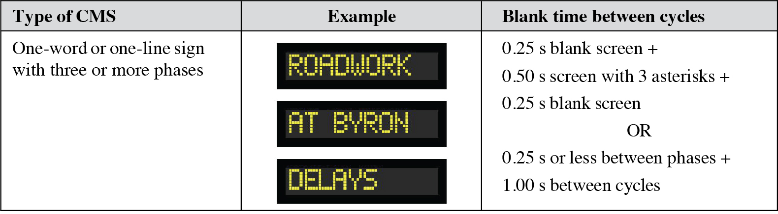
Long Description.
The following notes on blank times between cycles accompany the illustraiton: 0.25 s blank screen + 0.50 s screen with 3 asterisks + 0.25 second blank screen OR 0.25 seconds or less between phases + 1.00 seconds between cycles
EQUATION: HOW MUCH TIME SHOULD BE USED TO DISPLAY EACH PHASE?
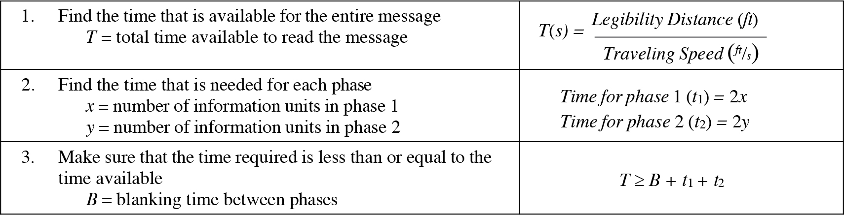
Long Description.
T open parenthesis s close parenthesis equals start fraction Legibility Distance open parenthesis feet close parenthesis over Traveling Speed open parenthesis feet per second close parenthesis end fraction
Long Description.
open parenthesis t subscript 1 close parenthesis equals 2x
Long Description.
open parenthesis t subscript 2 close parenthesis equals 2y
Long Description.
T greater than or equal to B plus t subscript 1 end subscript plus t subscript 2
Discussion
Only a limited amount of research has been conducted on the dynamic properties of message signs (2). In addition, most of the studies have been conducted in laboratory or simulator settings rather than on the road.
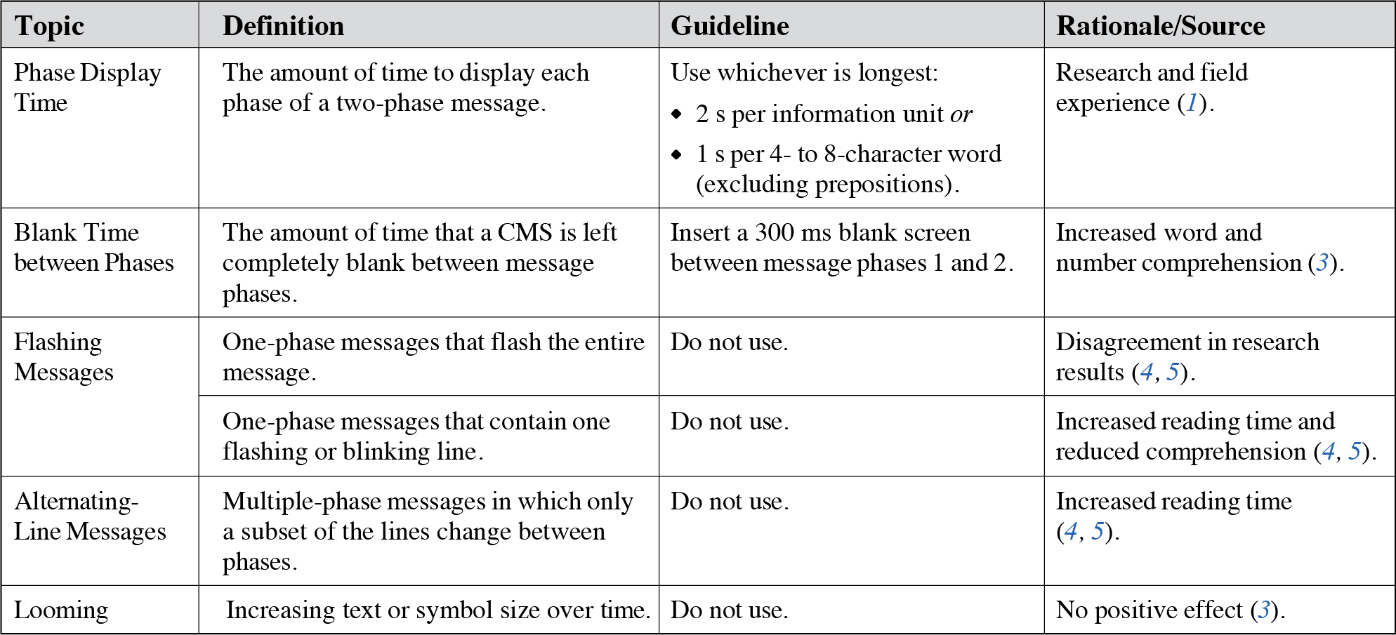
Phase display time. The amount of time that a single phase should be displayed is determined by the amount of content in that phase. Dudek (1) summarizes that either 1 s is needed per four- to eight-character word excluding prepositions or 2 s is needed per information unit, whichever is longest. The total time available to divide between the phases is reduced by the blank time between the phases, discussed below.
Blank time between phases. Greenhouse (3) found that inserting a 300 ms blank screen between phase 1 and phase 2 of a portable message sign improves comprehensibility. This improvement is possibly because a refractory period helps information processing between screens. Although this conclusion applies directly to portable message signs, it may be true for permanent message signs as well. Note that the blank screen was only tested between phase 1 and phase 2, not between phase 2 and phase 1 when the message cycled. It is unknown if providing a blanking time between phase 2 and phase 1 would provide a further benefit. It is reasonably conceivable that drivers who see a blank between phases 1 and 2, but not between phases 2 and 1, would reverse the order of the phases and possibly have trouble understanding the message. Dudek (1) recommends that blank time and/or asterisks be displayed between cycles of a message that contains three or more phases (on one-word or one-line signs). Because these signs are more limited in the amount of information that they can display at one time, the phases may not make sense independently and drivers who read later phases before phase 1 may not understand the message. Thus, giving an indication of where the message is in the cycle gives drivers an idea of their location in the cycle.
Flashing phase. There are many ways in which all or portions of messages can be flashed in an attempt to draw driver attention. One method is to flash the entire display for a one-phase message. Research (4, 5) in laboratory and simulator settings disagreed with regard to the effects on comprehension and reading time. In the laboratory, comprehension was not affected, but reading times were significantly longer when the message was flashing. In the simulator, comprehension was negatively affected for unfamiliar drivers, but reading times were not affected. Full-phase flashing messages are not recommended because of this disagreement in research results.
Flashing line. Another flashing method is to flash one line of a message. Research in laboratory and simulator settings (4, 5) showed that comprehension levels and reading times were both negatively affected by this method. Thus, flashing one line is not recommended.
Alternating line. In alternating-line messages, a portion of the message is held constant between the two phases (usually the first two lines) while the other portion is alternated between two pieces of information (usually the third line). Research (4, 5) on this method showed that although comprehension was not affected, reading times greatly increased. Thus, alternating-line messages are not recommended.
Looming. In a study by Greenhouse (3), looming was shown to negatively affect some driver demographics more than others. However, it did not help any group of drivers comprehend messages. It also seemed to function as an additional driver distraction and a negative effect on intelligibility. Given the lack of demonstrated positive effects, looming is not recommended.
Design Considerations
As noted above, full phase flashing, flashing one-line, alternating-line, and looming messages are not recommended.
Cross References
Composing a Message to Maximize Comprehension
Key References
1. Dudek, C. L. (1992). Guidelines on the Use and Operation of Changeable Message Signs (FHWA-TX-92-1232-9). College Station: Texas Transportation Institute.
2. Dudek, C. L. (2004). Changeable Message Sign Operation and Messaging Handbook (FHWA-OP-03-070). College Station: Texas Transportation Institute.
3. Greenhouse, D. (2007). Optimizing Comprehension of Changeable Message Signs (CMS). (UCB-ITS-PRR-2007-24). Berkeley: University of California Partners for Advanced Transit and Highways (PATH).
4. Dudek, C. L., and Ullman, G. L. (2002). Flashing messages, flashing lines, and alternating one line on changeable message signs. Transportation Research Record, 1803, 94–101.
5. Dudek, C. L., Schrock, S. D., and Ullman, G. L. (2005). Impacts of Using Dynamic Features to Display Messages on Changeable Message Signs (FHWA-HOP-05-069). Washington, DC: FHWA.
CHANGEABLE MESSAGE SIGNS FOR SPEED REDUCTION
Introduction
CMSs for speed reduction refers to situations in which a reduction in the speed of the traffic flow is desirable due to work zones, adverse weather conditions, incident control, or heavy congestion. Applications that are temporary or variable in nature are the primary candidates for using a speed-reduction CMS. Areas that experience recurring heavy peak traffic can also benefit from the proper application of a speed-controlling CMS.

SIGN PLACEMENT IN A WORK ZONE
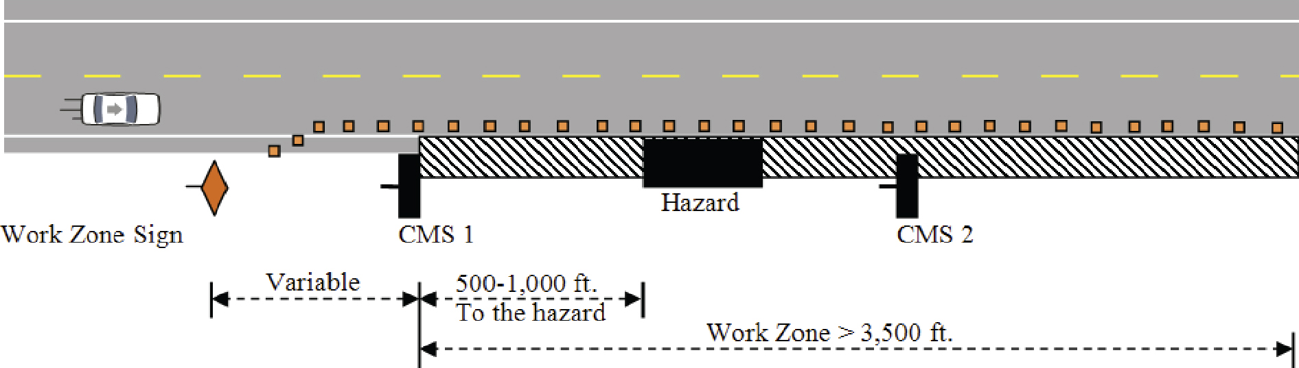
Source: Adapted from the MUTCD (6).
Long Description.
The work zone is greater than 3500 feet. This zone has CMS1, Hazard, and CMS2. The distance from CMS1 to Hazard is 500 to 1000 feet. A work zone sign is before CMS1. This distance is variable.
MAXIMUM SPEED REDUCTIONS IN WORK ZONES
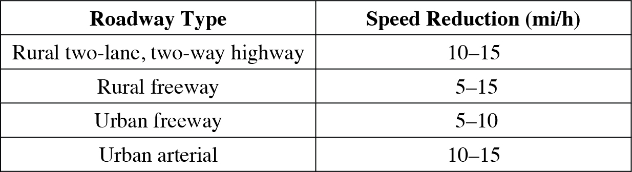
Source: Richards and Dudek (4).
Long Description.
The table has two column headings: Column 1: Roadway Type. Column 2: Speed Reduction in miles per hour. Row 1, Column 1: Rural two-lane, two-way highway Column 2: 10–15 Row 2, Column 1: Rural freeway Column 2: 5–15 Row 3, Column 1: Urban freeway Column 2: 5–10 Row 4, Column 1: Urban arterial Column 2: 10–15
Discussion
General applications. Speed-reduction CMSs are used to reduce speeds during a wide range of events such as work zones, adverse weather conditions, traffic incidents, and heavy congestion. When CMSs are provided to reduce driver speeds, compliance is increased when a reason for the reduced speed is displayed (1). These signs are still effective after 7 weeks of exposure, continuing to cause significant speed reductions (2). In a simulator study by Jamson and Merat (3), little change in driver behavior was observed when the safety campaign message “Watch Your Speed” was displayed (maximum 0.5 mi/h speed reduction). However, it was found using eye-tracking data that drivers continued to look at CMSs along the route even though the message was repeated. Drivers who witnessed 33% of the CMSs on the route displaying safety campaign messages changed lanes significantly faster in response to an incident message than those who saw either all blank CMSs or 100% of the CMSs showing safety messages. These drivers also spent significantly more time looking at the incident message than any other group.
An FHWA Policy Memorandum states that driver safety campaign messages should be limited to a few weeks so that drivers do not begin to ignore them (see “When to Use Changeable Message Signs” on page 22-2).
CMSs can also use radar to reduce speeds. Garber and Srinivasan (2) refer to a number of studies that show CMS with radar to be effective in reducing the speeds of passing vehicles. The message “You Are Speeding/Slow Down” proved to be the most effective message for reducing speeds (5). This message reduced average speeds, 85th percentile speeds, and traffic speed variance by statistically significant amounts.
Work zone applications. CMSs have a limited range of effectiveness. The first CMS should be positioned 500 to 1,000 ft upstream from the hazard in a work zone to give drivers time to react before reaching that hazard. However, this distance cannot be too long because drivers need to remember the message and maintain the reduced speed when they reach the hazard. In longer work zones, drivers tend to increase their speeds when they near the end of the zone, far away from the first CMS (2). Thus, if hazards continue to exist throughout a long zone, a second CMS may be needed.
The visibility and prominence of CMSs are important. Ideally, drivers will not be overloaded with information and will have sufficient available attention to focus on the CMS (4). Thus, the guidance is to place the CMS away from work zone signs and out of high driver workload areas such as ramps, intersections, or lane-closure tapers.
Credibility is a general issue with CMSs that also applies to the application of CMSs in work zones. The selection of an unreasonably low speed causes drivers to lose respect for the signs, which leads to a loss of credibility (4). This loss of credibility can lead to reduced effectiveness of signs at other sites as well.
Richards and Dudek (4) report that drivers will only slow down a limited amount regardless of the posted limit. The reductions in average work zone speeds were found to be 5–20 mi/h, depending on the site. Thus, Richards and Dudek suggest maximum speed reductions in work zones (4) as shown in the table on the previous page.
Design Considerations
Speed reductions as supported by CMSs can cause reductions in roadway capacity and congestion (4). Placement of successive CMSs (e.g., CMS1 and CMS2 in the figure on the previous page) should reflect site-specific considerations related to the overall complexity and nature of the work zone, expected vehicle speeds, complexity of information presented on the CMSs, and the time required for drivers to read and process each signʼs information.
Cross References
When to Use Changeable Message Signs
Displaying Messages with Dynamic Characteristics
Key References
1. Pedic, F., and Ezrakhovich, A. (1999). A literature review: The content characteristics of effective VMS. Road & Transport Research, 8(2), 3–11.
2. Garber, N. J., and Srinivasan, S. (1998). Effectiveness of Changeable Message Signs in Controlling Vehicle Speeds in Work Zones—Phase II. (FHWA/VTRC 98-R10). Charlottesville: Virginia Transportation Research Council.
3. Jamson, A. H., and Merat, N. (2007). The effectiveness of safety campaign VMS messages—A driving simulator investigation. Driving Assessment 2007: 4th International Driving Symposium on Human Factors in Driver Assessment, Training, and Vehicle Design, 459–465.
4. Richards, S. H., and Dudek, C. L. (1986). Implementation of work-zone speed control measures. Transportation Research Record, 1086, 36–42.
5. Garber, N. J., and Fontaine, M. D. (1996). Controlling Vehicle Speeds in Work Zones: Effectiveness of Changeable Message Signs with Radar. (UVA/529242/CE96/102). Charlottesville: University of Virginia.
6. FHWA. (2023). Manual on Uniform Traffic Control Devices for Streets and Highways. (11th ed.). Washington, DC.
PRESENTATION OF BILINGUAL INFORMATION
Introduction
Bilingual information refers to information that is presented in more than one language on CMSs. Drivers spend 10% to 15% more time reading bilingual than monolingual signs if they have more than one line in each language (1). However, in areas with large culturally diverse populations or areas with heavy international tourism, signs that present messages in more than one language may be required. Presenting bilingual information on a sign can increase reading times for monolingual and bilingual drivers. It is important to minimize this increase in reading times to reduce driver distraction.

Discussion
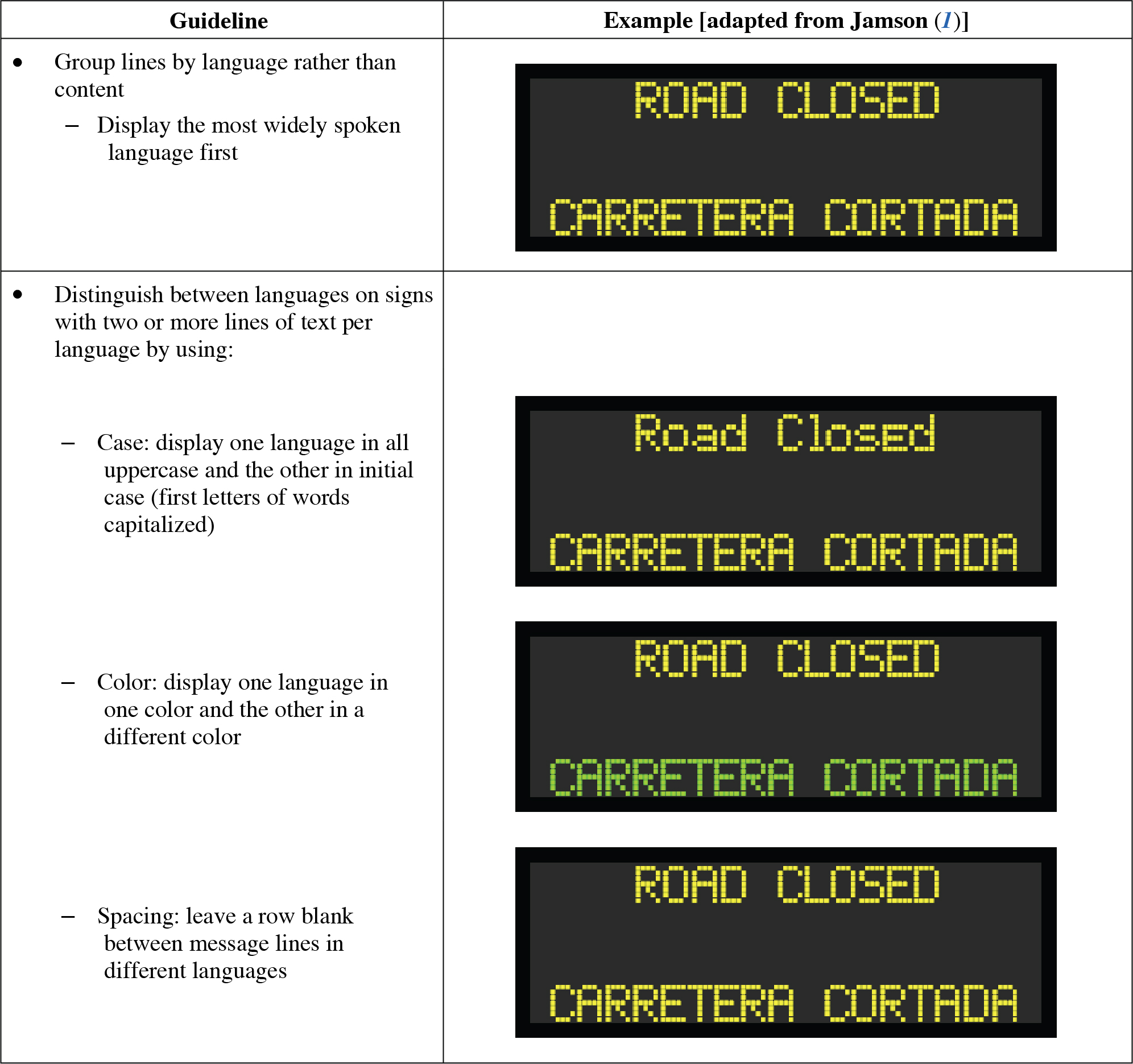
Reading response time for one line of relevant text on a two-line bilingual sign is not significantly different than reading response time for a one-line monolingual sign (1). Also, none of the demarcation techniques for the different languages made an impact on reading times for two-line bilingual signs. However, reading response times for two lines of relevant text on a four-line bilingual sign are significantly longer than reading response times for a two-line monolingual sign. The time required to read two lines of relevant text on a four-line bilingual sign is comparable to the time required to read four lines on a monolingual sign. Thus, introducing two lines of a second language strongly impacts reading performance. This impact can be mitigated through any of the demarcation techniques of color, case, or spacing.
Learning and expectancy effects were tested for case, color, and language order (1). Case showed neither effect, suggesting that drivers did not notice that it was being used to distinguish between languages. Color showed only expectancy, meaning that reading times did not decrease as more signs were viewed with the same color pattern, but times significantly increased when that pattern reversed. Language order showed both effects, showing that drivers learned the pattern and then were confused when it changed. These results speak to the effectiveness of different demarcation methods as well as the importance of consistency across bilingual message signs in an area.
Reading time is minimized when the dominant language of the driver is positioned first on the sign, for signs containing either one or two lines of relevant text per language (1). This finding has been verified for static signs in both English/Welsh and English/French. The effect is greater for monolingual readers, based on bilingual readers in the English/French study seeming to respond to whichever language was first on the sign.
The cited studies on bilingual messages were performed using English and Welsh, which have identical character sets. Identical character sets lead drivers and study participants to attempt to read both sets of messages before finding one illegible (2). Results may not hold for bilingual signs displaying languages that use more distinctive character sets. Additionally, most of the guidance provided above is based upon a single, computer-based study.
Design Considerations
Multiple methods were suggested by Jamson (1) for distinguishing between messages in different languages. Although the methods were proven to provide benefits for drivers, care should be used when applying some of these techniques. When the languages are distinguished by color, the colors selected should have neutral or equal meaning to drivers (1). For example, red can imply urgency, causing drivers to perceive the message in one language as more urgent. The colors should also have equal luminance in changing light and weather conditions.
Language differentiation by case has disadvantages as well. Some studies indicate that mixed font is easier to read, while words written in all capital letters could be seen as higher priority. Also, displaying lowercase letters requires more space on the CMS to accommodate the descenders. Providing a blank row between languages has been shown to improve glance legibility (1). The greatest benefit was provided to monolingual drivers, especially when their language was not dominant. Multiple methods can be used concurrently to distinguish between languages; however, these effects were not studied.
An additional issue is the splitting of bilingual messages into multiple phases. The phase guidelines from “Determining Appropriate Message Length” (page 22-6) should be taken into consideration. Jamson (1) found that if a four-line bilingual message is split into two phases in such a way that each phase contains one line in each language that does not make sense alone, reading times for both phases increase significantly.
Cross References
Determining Appropriate Message Length
Key References
1. Jamson, S. L. (2004). Evaluation of techniques to improve the legibility of bilingual variable message signs. Advances in Transportation Studies: An International Journal, Section B, 4, 71–88.
2. Jamson, S. L., Tate, F. N., and Jamson, A. H. (2001). Bilingual variable message signs: a study of information presentation and driver distraction. Driving Assessment 2001: The First International Driving Symposium on Human Factors in Driver Assessment, Training and Vehicle Design, 153–158.
This page intentionally left blank.


